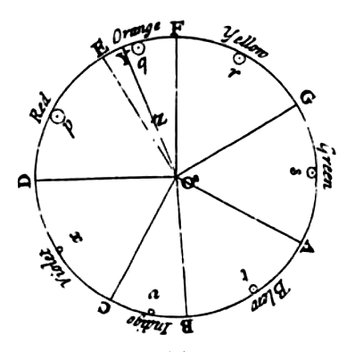
Goethe's symmetric colour wheel with associated symbolic qualitites, 1809
Think of Turner in his London studio - and 100 years later, Mondrian painting in Paris, Malevich in Moscow, and Paul Klee in Weimar. All three artists sit with an array of colours in front of them. They look at their palettes, pick up their paint brushes — and then what?
The choices of those painters made each one of the world’s most iconic modern artists — so how did they make them?
Neither Isaac Newton nor those who reworked his colour wheel over the centuries can claim all the credit, but their work has been a source of inspiration to artists for hundreds of years. You no doubt did all the prism experiments at primary school, so we’ll keep the Newton bit to a speed-of-light recap.
NEWTON
In 1666, Newton discovered (with prisms) that light is made of colours. He divided what is actually a fuzzy rainbow into seven colours for the sake of his rather mystical views on the imprtance of the number seven, and put them on a scale from the shortest wavelength to the longest (violet to red). Then he bent it into a wheel, spun it to prove that all the colours combined in light appear white, and an early colour wheel was born — to be tweaked and changed by Newton’s scientific successors into the 19th century.
Isaac Newton's Colour Circle, published in Opticks in 1704
But of course, light is different to paint, as Tate’s wise curator, Matthew Gale, explains: ‘As Newton found, when all colours are brought together in light you get white - but when all colours are brought together in paint you get black. So essentially, painting is always an inadequate way of trying to match what we see in the world. That’s why Impressionism is such an extraordinary thing, and indeed what the pre-Raphaelites were doing simultaneously; they were trying to capture the impact of light through this material thing.’
Newton’s discoveries were clearly of great significance to these artists — but it was another historical over-achiever who captured the modernist imagination in the early 20th century.
GOETHE
Newton’s error was trusting math over the sensations of his eye.
The German thinker Johann Wolfgang von Goethe was already an established statesman, poet, author and philosopher when he published his colour theories in 1810. Unconvinced by Newton’s belief that colours were contained within light, he thought that it was the interplay of light and dark, as seen through atmospheres like dust and air, that created colour.
In truth, Goethe was not the most sound of scientists — but it was his physiological theories, particularly about how we see colour, that really changed the game.
Stare at the dot on the yellow circle for 15 seconds, then look at the black dot on the right. What colour do you see?
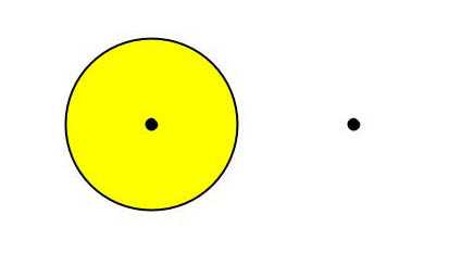
An experiment to show after-images, discovered by Goethe
Hopefully, the answer is purple. Goethe discovered this (likewise with blue to orange and red to green) and made a new, symmetrical colour wheel, putting these primaries opposite their complementaries. These pairings — ‘which reciprocally evoke each other in the eye’ — probably feel very familiar to you; they’ve been widely absorbed into western culture ever since.
Crucially, Goethe also pointed out that colour can impact, and be affected by, mood and emotion. He noted a division between ‘plus’ and ‘minus’ colours; yellow and yellow-red were ‘plus’ colours, because (he claimed) they are positive and life-enhancing in character, while blues, purples and blue-greens were ‘minus’ colours, because they (allegedly) evoke anxiety and restlessness.
Although his associations are of course slightly made up, the idea that colour could be deployed as an emotional force is a powerful one, and it was adopted by many artists over the following hundred years. Among the first was one JMW Turner.
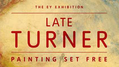
TURNER
The highest degree of light, such as that of the sun… is for the most part colourless. This light, however, seen through a medium but very slightly thickened, appears to us yellow. The density of such a medium be increased, or if its volume become greater, we shall see the light gradually assume a yellow-red hue, which at last deepens to a ruby colour.
This is Goethe’s theory of how the eye perceives light as colour, but it could almost be describing the painting that Turner painted in tribute 33 years later, Light and Colour (Goethe’s Theory) - the Morning after the Deluge - Moses Writing the Book of Genesis, in 1843.

Joseph Mallord William Turner
Light and Colour (Goethe’s Theory) - the Morning after the Deluge - Moses Writing the Book of Genesis
(exhibited 1843)
Tate
Turner owned (and heavily annotated his copy of) the English translation of the Theory of Colours, and was fascinated by many aspects of it, particularly Goethe’s emotional understanding of colour. Here, as well as depicting Goethe’s idea of light seen through an atmosphere, resulting in a variety of colours, Turner deploys a decidedly ‘plus’ palette, presumably intended to evoke the joyful feelings of spiritual reawakening suggested in the title.

Joseph Mallord William Turner
Lecture Diagram: Colour Circle No.1
(c.1824–8)
Tate
Inspired by Goethe’s colour wheel, Turner also created his own diagram to show how the primary colours in light behave when they are represented in watercolour materials, and how these can be used to represent dimension. Blue and red stand for degrees of shade, while yellow suggests light itself. Turner used this and other diagrams to illustrate his lectures on colour and perspective (although, it is widely agreed that his lectures were terrible).
Although contemporary critics thought no more of his semi-abstract paintings than they did of his lectures, Turner has fairly since been dubbed the ‘painter of light,’ and his work went on to influence the lmpressionists and many more.
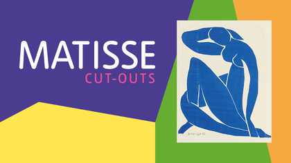
MATISSE
You didn’t think we would talk about colour without mentioning Matisse, did you?
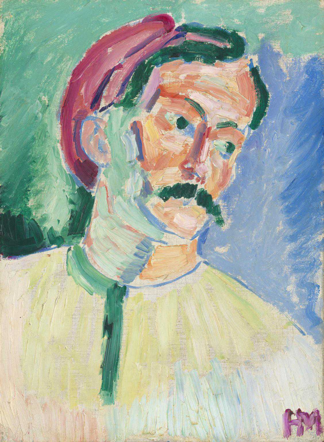
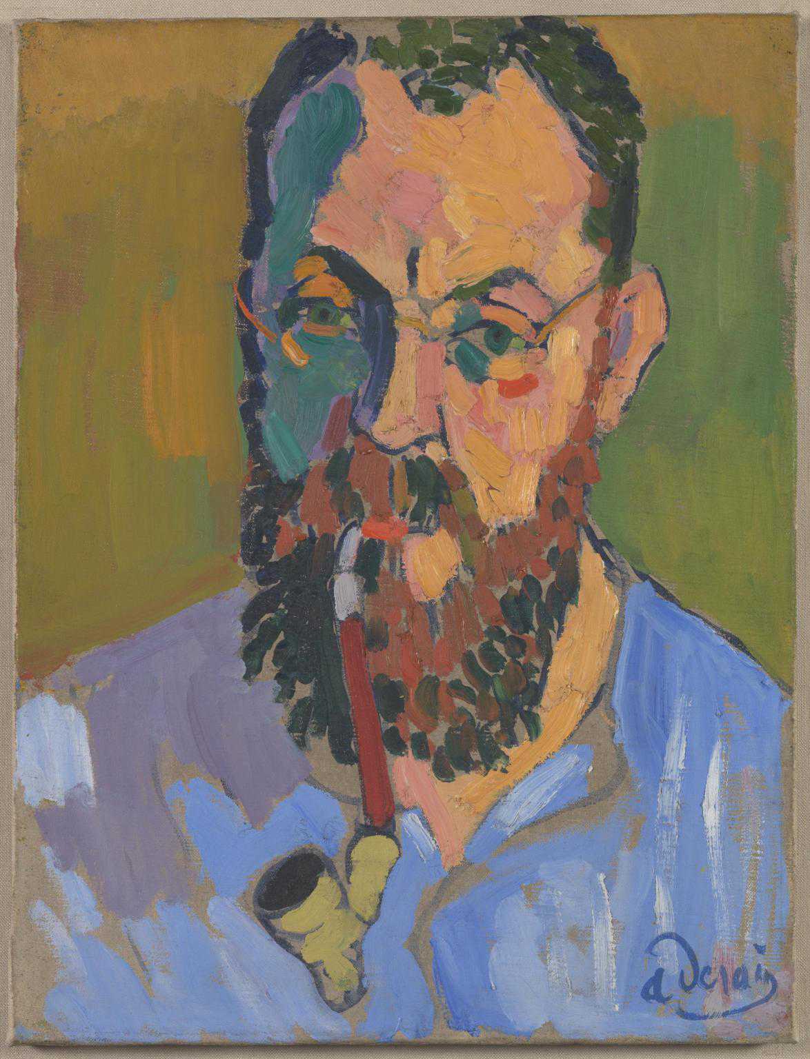
Henri Matisse
André Derain
(1905)
Tate
André Derain
Henri Matisse
(1905)
Tate
In the late 19th century, the Impressionists used Newton’s lessons to recreate scenes of modern life; defying tradition, they started with a bright white canvas and used contrasting strokes of pure colour to create a prismatic effect of light playing on haystacks and water lilies.
Then a French painter came along and tipped tradition on its head again. Before he created the cut-outs currently at Tate Modern, Henri Matisse co-founded what was pejoratively termed Fauvism - meaning the wild beasts — a new use of colour that was bright, non-naturalistic and, well, wild. He and his friend André Derain painted the above portraits of one another to announce their new radical use of colour. They didn’t use a colour wheel to choose them - but their stirring, colour-popping choices form part of a new, expressive and mystical mood in the arts that was in part indebted to Goethe.
Meanwhile, Matisse’s contemporaries across Europe — but in Goethe’s native Germany particularly - were busy founding the related Expressionist movement. In increasingly abstract scenes, colours were applied in free painterly strokes - and again, were not selected to represent nature but to express the emotions it evoked in the artist.
Many German Expressionists, such as Wassily Kandinsky and Paul Klee, went on to develop their use of colour at the Bauhaus, Germany’s iconic design school.
BAUHAUS
Situated in Goethe’s home town of Weimar, many teachers at the Bauhaus were wildly enthusiastic adopters of his theories. Rooted in Expressionism and opened just after the First World War in 1919, the Bauhaus philosophy aspired to a better, more harmonious, utopian ideal of society — with a good splash of Goethe-inspired mysticism.
Johannes Itten, one of the founding members, had some particularly practical lessons to add to the colour canon. He made a new, 12-part colour wheel and taught that there are four qualities of colour: hue (the actual pigment), intensity (how saturated it is), value (lightness or darkness) and the temperature (warmth or coolness) – in fact, you can see Itten’s colour theory at play every time you tinker with the hue and saturation of your mobile phone photographs. He also taught seven useful methods for combining colours, and the impact these could have on the viewer.
Itten brought in the painter Paul Klee, who began teaching in 1921. Adopting Goethe’s complementaries, Klee was interested in the relationships between colours, and taught that, just like the forms in a composition, colours would also affect a canvas’s ‘balance’ - something he was concerned with in his own work. Look at Red-Green and Violet-Yellow Rhythms; an example of two pairs of complementaries used to create an overall balance. Small, powerful squares of warm, popping yellow are offset by larger areas of cooler, receding violet, while green and red are used in similar proportions.

Paul Klee Redgreen and Violet-Yellow Rhythms 1920
Lent by The Metropolitan Museum of Art, The Berggruen Klee Collection, 1984 (1984.315.19) Image © The Metropolitan Museum of Art / Source: Art Resource/Scala Photo Archives
Klee’s friend Wassily Kandinsky, like Goethe, wanted to pin down the emotional impact of colour. Before arriving to teach at the Bauhaus in 1922, he already had his own set of theories about what individual colours ‘meant’ - and went on to develop theories about the relationships between shapes and forms. He famously issued a survey to the students, asking to match the primary colours of red, yellow and blue to the square, triangle and circle. And yes, there is a right answer (yellow triangle, blue circle, red square); Kandinsky believed this to be so based upon the ‘forces’ that these elements of shape and colour impacted on the page, and for one reason or another, the majority taking the survey agreed with him. He used this theory and his sense of the meanings behind colours to create his abstract compositions.
MONDRIAN
Around the same time, a Dutch modernist employed those same three colours to do things differently once again.
Mondrian had began his career in Amsterdam, and graduated from art school painting rather gloomy, naturalistic landscapes, and went through a period of ‘Luminism’ — a strand of late Impressionism with particular interest capturing in light effects — in the early 20th century.
But Mondrian soon became dissatisfied with what he was capturing on canvas, and after moving to Paris in 1911, his work began to shift.
Over the following years, as his signature style emerged, Mondrian was part of a wider tide of wider change in the art world. Reacting to the chaos of the First World War, many began to seek order in their work, searching for deeper, universal meanings and examining their place in the universe. Mondrian was also influenced by a growing interest in Theosophy, which taught that each thought generates a coloured aura that surrounds each person. He recalled in 1941:
‘The first thing to change in my painting was the colour. I forsook natural colour for pure colour. I had come to feel that the colours of nature cannot be reproduced on canvas. Instinctively, I felt that painting had to find a new way to express the beauty of nature.’

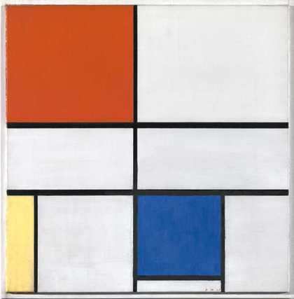
Piet Mondrian
Composition C (No.III) with Red, Yellow and Blue
© 2007 Mondrian/Holtzman Trust c/o HCR International, Warrenton, VA
And his new way was to gradually stop painting things in the real world and to start trying to capture a ‘universal’ beauty that lay beneath them. To do this, Mondrian went back to the colour fundamentals. By the 1920s, he was deploying that familiar, stripped back triad of primary colours — those which can be mixed to create all other colours — ramed in a simple black grids. He called his approach Neo-Plasticism — the foundation of the De Stijl movement he founded with his friend Theo van Doesburg. It was to express ‘the essence of space through the relationship of one colour plane to another.’
Meanwhile, with a slightly shifted social and political background of revolution, one of Mondrian’s contemporaries was facing similar ideological challenges over in Moscow.
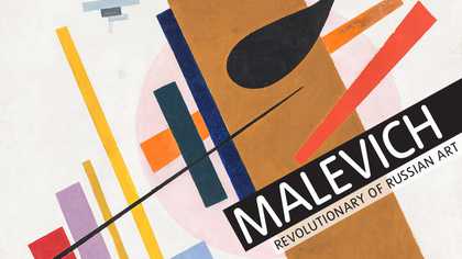
MALEVICH
In the 1850s, the scientist James Clerk Maxwell had outlined a slightly different version of ‘primary colours’, claiming that red, blue and green are the primary colours in light. He wrote that these three colours, along with yellow, black and white, were all the painter needed to imitate the colours of nature in the spectrum.
Like Mondrian, Malevich had graduated in the early 20th century into a Neo-Impressionist trend in which artists were using relatively recent scientific findings like Maxwell’s to devise more structured methods of recreating light on canvas (Seurat’s Pointillism, using networks of dots, is a famous example; have a look at his Le Bea du Hoc currently on display in Tate Britain’s Kenneth Clark show).
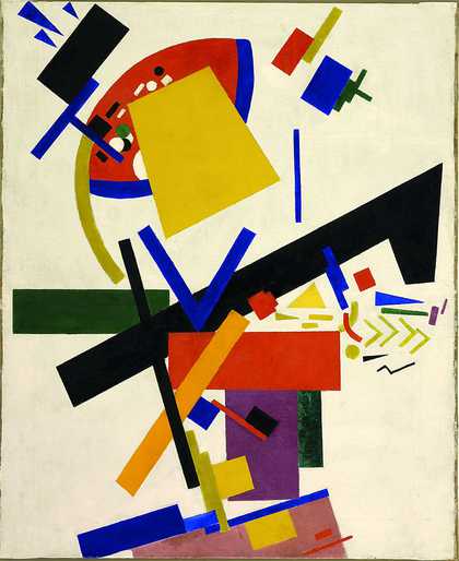
But fuelled by a bubbling spirit of the impending Russian revolution, like Mondrian, Malevich became dissatisfied with using colour to imitate nature, and by 1915 he had arrived at a completely contrasting style. ‘Suprematism’, as he called it, aimed to create a new, autonomous art that was free from centuries of convention, and instead imparted a direct, almost meditative meaning to its viewer.
Malevich was just as interested in recent scientific advances as his contemporaries, but he used them in pursuit of his new style and a new, direct meaning. Swiftly ditching representative imagery and naturalistic colour, he adopted Maxwell’s scheme in its purest form, and painted refined, geometric shapes in this limited, primary palette.

Kazimir Malevich
Dynamic Suprematism
(1915 or 1916)
Tate
Later, he extended his range to brown, pink and mauve, experimenting with dimension, and then ditched colour altogether in instances such as his notorious Black Square — a window of pure ‘darkness’ in which any sense of perspective or reality is removed.