David Hockney is one of the most popular and widely recognised artists of our time. For over sixty years he has enchanted audiences with his bold, colourful, and innovative art.
In the 1950s and 1960s when Hockney was just starting out, lots of artists were experimenting with abstraction. For example abstract expressionist artists such as Jackson Pollock were making paintings using only colour and gestural marks. Although Hockney explored abstraction at art college – simplifying and abstracting people and using expressive marks – he has always been interested in representing the places and people around him.
To me painting is picture making. I am not that interested in painting that doesn’t depict the visible world. I mean, it might be perfectly good art it just doesn’t interest me that much. David Hockney, Audio Arts 1978
Focusing on David Hockney's iconic painting A Bigger Splash we look at the ideas, themes, and inspirations that make Hockney such a great picture-maker.
A closer look at 'A Bigger Splash'
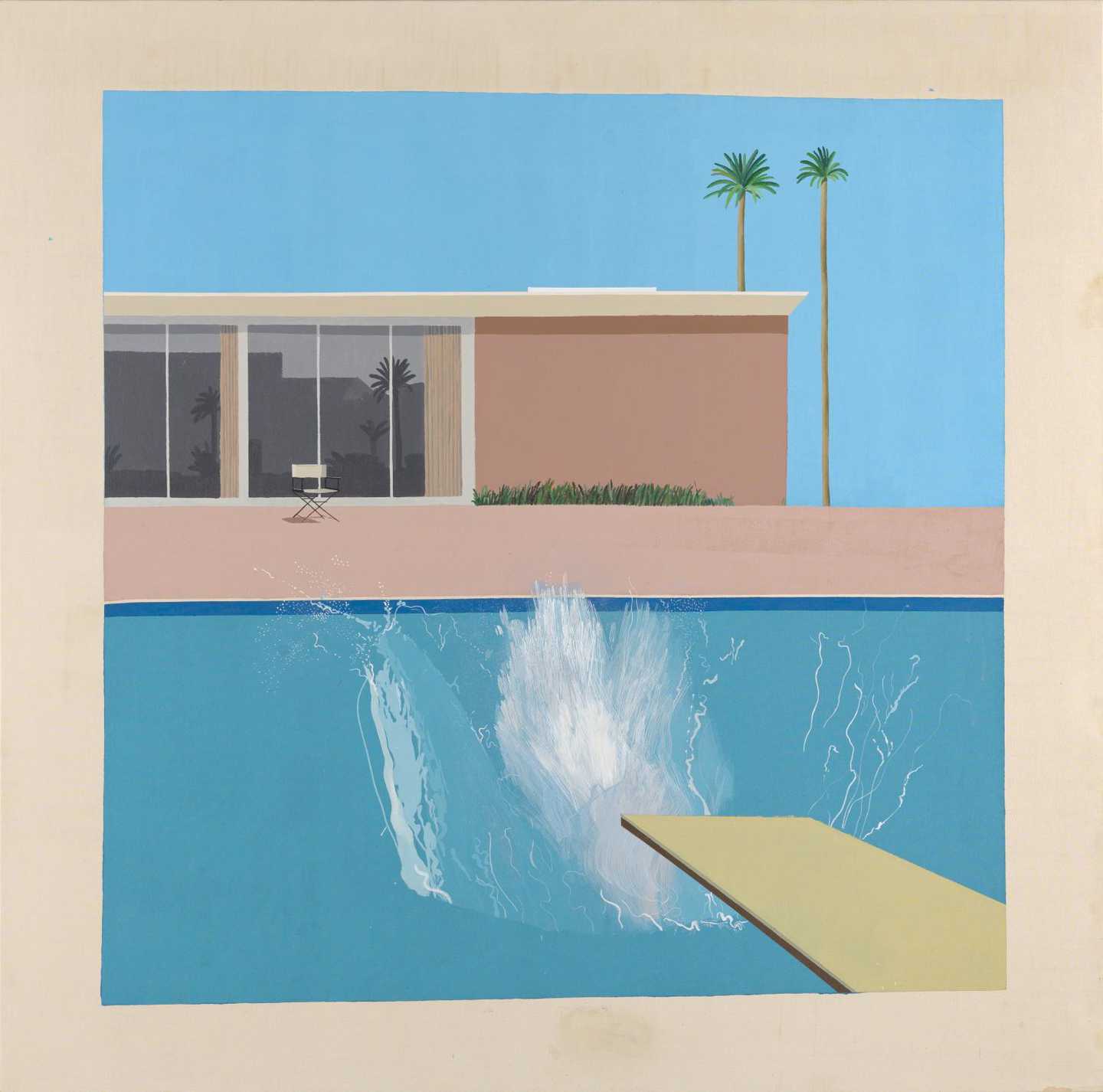
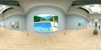
Painted in 1967, A Bigger Splash is perhaps David Hockney's best-known artwork. What is it that makes this painting so iconic and seductive – and still very modern-looking fifty years after it was made?
The painting depicts a sun-drenched swimming pool in Los Angeles. Behind the pool is a pink modernist building and an empty chair. The silhouettes of neighbouring buildings are reflected in the building’s large window. Two spindly palm trees and a neat border of grass suggest carefully manicured gardens. Unusually for Hockney's paintings from this time, there is no-one in sight and the scene is almost entirely still … apart from the splash.
We are left wondering who dived in. The fact that the diver is not shown, adds to the sense that it could be anyone – even us sitting in that empty chair by the pool and jumping into to the cool still water!
What do you think of when you look at A Bigger Splash? Is there a word that sums up how the painting makes you feel? It's OK if that word is 'jealous' as A Bigger Splash is an immediately seductive image. It makes us think of holidays and escapism – or perhaps the sort of life most of us can only dream about.
A ‘promised land’
Hockney first visited California in 1963 and was immediately won over by its sunshine and laid-back lifestyle (quite different from London where he had been living). He described it as his ‘promised land’ and spent much of the next forty years living there.
Did you know… David Hockney was also a reality TV star (well, sort of… )?
This film file is broken and is being removed. Sorry for any inconvenience this causes.
It wasn't only the Californian sunshine and lifestyle that had an impact on Hockney. Hollywood and celebrity beckoned. In 1971, when he was back living in London (he moved back for four years between 1968 and 1972), he agreed to be in a film. The filmmaker Jack Hazan followed David Hockney for three years documenting his work, life and social circle. This culminated in a 1974 feature-length film also titled A Bigger Splash. Like more recent British reality TV series Made in Chelsea or The Only Way is Essex, it looks like a documentary but in fact is a combination of the real and the imagined.
Although a seductive depiction of a dream place, A Bigger Splash is not just about that. According to Hockney, the real subject is the split-second moment of the splash itself, frozen on canvas.
Hockney painted the picture from a photograph of a splash taken by someone else. He later commented how he had spent much longer painting the splash than the house behind it – even though a splash lasts two seconds and a building is permanently there. This contradiction fascinated him.
How was the splash painted?
We may think the obvious way to paint a splash is to use a liquid paint and throw it at the canvas – or use big brushes and expressive, gestural marks to mimic the messiness of a splash. After all, abstract expressionist painters such as Willem de Kooning had been making splashy paintings for years, and Hockney himself had used expressive mark-making in earlier works.
But Hockney instead used small brushes to painstakingly reproduce the splash from the photograph: the shapes made by the upsurging cascade of water, the different areas of transparency and the details and traces of the tiny drips. It took him two weeks to get the splash looking just right.
When you photograph a splash, you’re freezing a moment and it becomes something else. I realise that a splash could never be seen this way in real life, it happens too quickly. And I was amused by this, so I painted it in a very, very slow way.
David Hockney
More Splashes in Art!
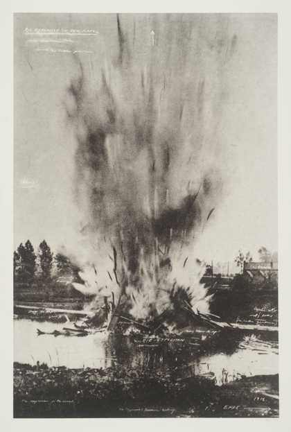
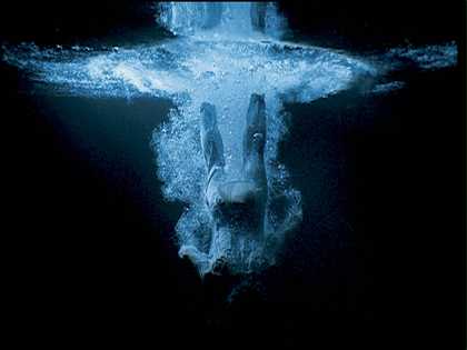
David Hockney isn’t the only artist who has experimented with representing a splash. From videos to postcards of extreme nature, explore more artworks in Tate's collection that make a splash:
Hockney took two weeks to paint the splash in A Bigger Splash. He worked from a photograph of a splash and used small brushes to copy its shapes, shades and details. (He probably experimented with brush strokes and marks to work out the best way of representing the different bits of the splash).
Step 1: Take a photograph (or find a photograph) of a split-second moment of movement. It doesn’t have to be a splash. It could be a darting fly, someone dancing or car headlights whizzing by at night.
Step2: Use filter settings on your camera or computer to render the picture in black and white. (This will make it easier to focus on the details and not be distracted by colour.)
Step 3: Look closely at the details of the photograph. Using a small brush see if you can work out ways of using marks, lines and washes to mimic the blurs and other details of movement.
Add water to your paint or ink and use the whole brush head to create washes. Use the paint or ink neat and the tip of your brush for sharper lines, dots and other details). Don’t worry if it takes a bit of time to get this right – remember Hockney took two weeks!
Top tip: David Hockney often uses the technique of squaring up an image to copy it or enlarge it. This might help to focus on different areas of detail. Draw a grid over your source photograph and a similar grid on your paper. Look at one square at a time and copy the details you see in each square into the corresponding square on your paper.
Materials and Techniques
At approximately 2.5 metres (8 feet) squared, A Bigger Splash is almost life size. By standing in front of it we almost become part of the picture.
What materials did hockney use?
David Hockney used acrylic paint on white cotton duck canvas to paint A Bigger Splash.
Acrylic was a relatively new type of paint first available commercially for artists in America in in the early 1950s. (It didn’t arrive in Europe until a decade later). It is water-soluble and can be used thickly for an opaque surface, or by adding water or other mediums can be used to create thin washes. The beauty of acrylic paint over oil paint is that it dries much more quickly so artists don’t have to wait for ages for sections of painting to dry before working back into them.
Hockney was one of the first artists to make extensive use of acrylic. Being fast drying it suited his technique of painting large areas of flat colour and then adding details. He also felt that the fast-drying acrylic paint was more suited to portraying the sun-lit, clean-contoured suburban landscapes of California than slow drying oil paint.
Usually, when painting on canvas, artists stretch the canvas over a wooden frame (called a stretcher) attaching it with tacks or staples. But to paint A Bigger Splash Hockney stapled the canvas to a wall.
He didn’t draw out the image on the canvas first but painted the blocks of colour directly onto it. To achieve the flat even surface of the sky, the building and the pool Hockney used a paint roller, applying two or three layers of paint so that it was opaque. He then painted the few details, the trees, grass, chair, reflections on the window – and the all important splash – on top of the colour blocks using a small brush.
Hockney left a wide border around the image unpainted. (The yellow colour you see around the edge of A Bigger Splash is the raw canvas.) This raw canvas border developed from his earlier style of keeping large areas of the canvas raw. It also suggests the border of a polaroid photograph, perhaps hinting at his use as photographs as a source for the painting. He also left a narrow line of raw canvas on the top edge of the pool which we can see in the detail below.
Detail of A Bigger Splash showing the thin raw canvas border around the pool and details of Hockney's splash technique
Style and Inspiration
In the early to mid 1960s, Hockney’s painting style underwent a transformation. If we compare A Bigger Splash to a painting Hockney made in 1960, the paintings look as if they could be by different artists. What are the main differences in style?
The earlier painting is more expressive and messier, it does not use such bright colours and it is more abstract in its style.
It was not just the bright sunshine of California that brought about his new colourful, bold, representational style. Hockney is constantly exploring the different possible ways to depict the world around us, and looks at how other artists from different times and places have done this. He sees himself as a researcher as much as an artist.
I believe that the problem of how to depict something is … an interesting one and it’s a permanent one; there’s no solution to it. There are a thousand and one ways you can go about it. There’s no set rule.
David Hockney
The developments in Hockney’s 1960s paintings show a range of stylistic influences and inspirations from photography to Old Master paintings.
Photography
In many of David Hockney’s paintings from the mid to late 1960s, the subject matter is a combination of photographic images and observed details. A Bigger Splash is inspired by a photograph Hockney found in a book about building a swimming pool, while the building in the background is taken from one of Hockney’s drawings of Californian buildings. It wasn’t just ‘found’ photographs that Hockney used as inspiration. In 1967 he purchased his first 35mm camera and began taking photographs as source images for his paintings. For his portrait of art collectors Fred and Marcia Weisman, Hockney photographed the couple in their garden.
Hockney commented: ‘the portrait wasn’t just in the faces, it was in the whole setting.’ As the Weisman’s garden and sculpture collection were as important to the portrait as they were, he felt that it was not necessary to paint the couple from life. Photographing the couple in their garden as a record to work from made more sense. He also drew sketches to plan the composition.
Although inspired by photographs, Hockney does not aim to reproduce an exact replica of the photograph in his paintings. He sees photography as a useful aid to remembering information, but does not think that photographs in themselves are enough. It is the artist’s personal vision that adds extra depth and resonance to the picture and makes it come to life.
I’m quite convinced painting can’t disappear because there’s nothing to replace it. The photograph isn’t good enough. It’s not real enough.
David Hockney
In the 1970s and 1980s Hockney began to use photographs in a very different way. In compositions such as Nathan Swimming 1982 he assembled groups of photographs to form larger compositions that explored multiple viewpoints. In these works we again see Hockney exploring the possibilities of picture making and experimenting with ways of capturing space, time and movement in still, two-dimensional images.
David Hockney Nathan Swimming Los Angeles March 11th 1982 1982 composite polaroid 18 x 30 in 45.7 x 76.2 cm Private collection (002)
Egyptian art
David Hockney first saw Egyptian art at the British Museum in London when he was a student. In 1963 when he was 26, he was commissioned by The Sunday Times to travel to Egypt. This trip marked an important turning point in his painting: 'it was a marvellous three weeks, I didn't take a camera only drawing paper, so I drew everywhere and everything'.
In Egyptian tomb painting, stylised figures – generally shown with heads and legs in profile and the torso facing frontally – are arranged across a flat surface.
Sarenput II on the painted niche in his tomb Photo: By Daniel Csörföly
If we look at the paintings Hockney made after his Egyptian trip, we can clearly see him taking on board this Egyptian approach to representation. The carefully spaced arrangement of people and objects across a flat surface is very different from the all-over busy-ness of his earlier work.
Renaissance painting
Hockney is also greatly inspired by the old masters of Western art. The first great painting Hockney saw, in reproduction, was an Annunciation by the 15th-century Florentine painter Fra Angelico.
Fra Angelico The Virgin of the Annunciation 1437–46 CC BY 2.0
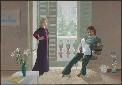
The elegant forms, balanced compositions and clean bright colours of many of Hockney’s 1960s paintings seem to be a tribute to Fra Angelico and other Renaissance masters. The sense of serenity and stilled movement in paintings such as American Collectors (Fred and Marcia Weisman) 1968 and A Bigger Splash also suggest the influence of these earlier works.
Did you Know? … Hockney often slips clues into his paintings to suggest his inspirations
In David Hockney’s portrait of his parents, he adds a number of clues as to his painting, and literary, heroes. Can you spot them?
In the mirror behind where his parents are sitting, we can just about make out a reproduction print of a painting. The painting is Piero della Francesca’s, Baptism of Christ c.1450s. The drapery also reflected in the mirror comes from a work of Fra Angelico.
Hockney’s father (who got bored easily sitting still) is portrayed reading a copy of Art and Photography by Aaron Scharf, reflecting Hockey’s interest in photography both as source material and artistic medium.
If you look on the trolley behind his parents you will see further clues. A book about French painter Chardin, who often painted domestic scenes, suggests parallels between the domestic subject of this painting and the French artist’s work. The other books on the shelf point to a literary love - six volumes of the English translation of Marcel Proust's monumental novel A la Recherche du Temps Perdu.
pop art
I am very conscious in all that has happened in art during the last seventy-five years. I don’t ignore it; I feel I’ve tried to assimilate it into my kind of art. David Hockney
When David Hockney was a student in London in the early 1960s, British pop art was in full swing. Artists such as Eduardo Paolozzi had begun using pictures from popular culture (such as magazines and advertisements), since the 1950s.
Hockney and other young artists at the Royal College including Pauline Boty, Peter Blake and Derek Boshier felt that what they were taught at art school and what they saw in museums did not have anything to do with their lives or what was important to them. They enthusiastically turned to painting film stars, pop stars and the everyday things they saw around them.
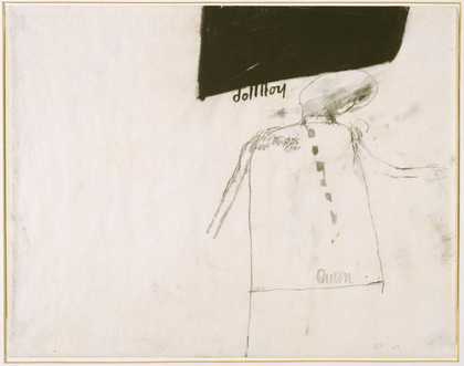
Did you know? … Cliff Richard was an early pin up for Hockney
When Hockney arrived in London as a student in 1959 he felt a tremendous freedom. He came out as homosexual and although not legalised in the UK until 1967, in London he felt a more liberal attitude to sexuality than in his home town of Bridlington.
Other male students had pin-up pictures of female models and celebrities on their studio walls. Hockney pinned up pictures of pop star Cliff Richard, and even made a painting about him: ‘Doll Boy was a reference to the pop singer Cliff Richard, who was very attractive, very sexy … he had a song in which the words were “She’s a real live walking talking living doll” … The title of this painting is based on that line.’
American pop
On arriving in America in 1963, Hockney encountered American pop art. Packed full of all-American pizzazz it reflected the confidence and consumerism of wealthy post-war America. Like its British counterpart, American pop was inspired by the look and language of everyday images such as advertising posters and comic books. In depicting the visual world in a recognisable way, using hard edges and distinct forms, American pop art was a complete departure from the painterly looseness of abstract expressionism which had dominated American art since the early 1950s.
Edward Ruscha Standard Study # 3
(1963)
ARTIST ROOMS Tate and National Galleries of Scotland
David Hockney is interested in exploring ways of translating the real world into paint, pencil or print. In painting swimming pools, he became fascinated generally with the challenge of depicting the appearance and movement of water. He saw water as 'an interesting formal problem' because 'it can be anything – it can be any colour, it's movable, it has no set visual description.'
In Hockney's depictions of swimming pools, garden sprinklers and people showering we see him trying lots of different approaches, techniques and materials to capture and visually describe what water looks (and feels) like.
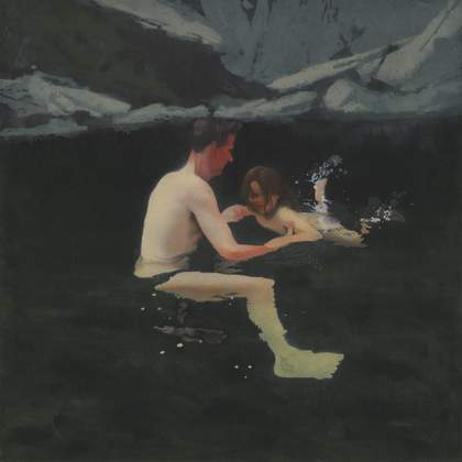
Compare three depictions of water by David Hockney
Look closely at how he has used colour, marks and shapes to suggest the movement and transparency of the water. Which depiction looks the most realistic? Do you think Hockney was trying to make the water look realistic or to put across something else?
In Portrait of an Artist (Pool with Two Figures) 1972, Hockney has focused on capturing the transparency of the water.
He has used light and shadow to do this. Very thin layers – or washes – of turquoise blue paint have been added to the flesh tones of the swimming figure to suggest the water's shadowy movement over the figure. Different shades of the turquoise wash also suggest the depth of the water. Notice how the swimmer's feet look pale and pink, making them appear closer to the surface. Thin lines of white painted in a loose wavy pattern on the surface of the pool and over the figure, represent the reflection of light on the pool's rippled surface. These also help to create the appearance of the transparency of the water, by suggesting that anything underneath these ripples (such as the figure) are underneath the water's surface.
In Peter Getting out of Nick's Pool 1966, the white wavy lines of ripples are more stylised. But although this is a less realistic image, Hockney still suggests the movement of the water. As with the splash in A Bigger Splash, the ripples are the only element within the painting that seems to be moving. They contrast with the stillness of the figure and the static squares and rectangles of the building and pool edge.
Gushing sprays of water also fascinated Hockney. The image below is one of a number of works showing men in showers painted around the time of Hockney's first visit to Los Angeles in 1963. Showers, like swimming pools, were another exotic luxury that he associated with life in California.
Americans take showers all the time ... For an artist the interest of showers is obvious: the whole body is always in view and in movement, usually gracefully, as the bather is caressing his own body. There is also a three-hundred-year tradition of the bather as a subject in painting. Beverly Hills houses seemed full of showers of all shapes and sizes ... They all seemed to me to have elements of luxury ... very un-English that! David Hockney
Like A Bigger Splash these shower paintings are often based on photographs in magazines.
The spray of water from the shower head is painted using a combination of white scuffed brush marks and broken straight white lines. To suggest the gentler movement of water as it hits the man's bent back and bounces off, Hockney has used longer elegantly curved lines in white and pale blue. Notice also the detail of the small semi-circular lines on the shower floor, representing the bounce of the sprays of water as they hit the tiles. As with his swimming pool paintings, the fluid movement of the lines representing the water contrast with the straight lines and rectangles of the background. (In this case the tiled wall and edge of the carpet.) This emphasises the water's movement.
Did you know ... Hockney has trouble painting bare feet!
Hockney is a master draughtsman. Whether drawing or painting people, landscapes – or his pet sausage dogs – his representations are confident and convincing. However there is one thing he has trouble with ... bare feet.
In Man in Shower in Beverley Hills, Hockney had always intended to add the plant to the foreground, but he bent the leaves down further to conveniently hide the showering man's feet. In another of Hockney's iconic paintings Mr and Mrs Clark and Percy, a portrait of textile designer Celia Birtwell and her husband fashion designer Ossie Clark, the deep shagpile rug becomes another helpful bare feet hiding device! So remember, when you feel you are struggling with trying to get something right in a drawing or painting, it happens to the best of us!
Be Inspired by the Shapes and Patterns of Water
Explore more ways artists in Tate's collection have represented water. Use these as a starting point for your own creative project.
Roy Lichtenstein Water Lily Pond with Reflections
(1992)
ARTIST ROOMS
Tate and National Galleries of Scotland. Lent by The Roy Lichtenstein Foundation Collection 2015
David Hockney has always been interested in fashion. In the 1960s he formed a close friendship with British textile designer Celia Birtwell. He drew and painted lots of portraits of her and even collaborating with her on a textile design. Hockney is also something of fashion icon. In 2005 fashion house Burberry centred an entire spring/summer menswear collection around Hockney and in 2012 his close friend fashion designer Vivienne Westwood named a checked jacket after him.
David Hockney's paintings have also proved inspirational for fashion and fabric designers. Watch fashion house Preen as they talk us though a beachwear collection inspired by A Bigger Splash.
Have a go at designing your own Hockney-inspired textile based on the shapes, patterns and colours of moving water
You will need:
a camera
a pencil and coloured crayons or paints
a few sheets of plain paper or a sketchpad
a sheet of tracing paper
Step 1: Gather your source images to get ideas from
Take photographs and/or make sketches of water. (These don’t need to be finished masterpieces but just rough drawings of the shapes, colours and patterns you see in water).
If you have a local park near you with a pond or lake, photograph or sketch the ripples and reflections
If you live by the sea (lucky you!) photograph the waves and surf
Or simply drop a pebble in a bowl of water and photograph the splash and ripples it makes!
Use image sharing platforms on the internet to find inspiring water images.
Step 2: Choose your motif
Look through your source images. Can you see any shapes and patterns you find interesting and would like to use?
It might help to cut out a square 10cm x 10cm from a plain piece of paper (so you have a piece of paper with a square hole in it like a picture frame). Place this over your sketches or photographs and move it around until you see a small section of pattern that you like.
Use tracing paper to sketch the outline of your pattern, this will become your motif.
Step 3: Repeat your motif to create a design
Turn your tracing paper over and place it on a sheet of paper. Trace over the lines of your motif with a pencil to transfer the image to the paper.
Move the tracing paper and trace over the lines again and repeat this process until you have filled your plain paper with pattern*. (You don’t have to repeat the motif in a regular way – try rotating your tracing paper or overlapping your motif to create an unexpected result. How complex can you make it?)
*If you have picture editing tools on your computer you could us these. Scan your motif and use the tools to rotate, flip and your motif to create your all over textile design.
Step 4: Decide on your colours
Look again at your source images. Choose three or four colours. Make swatches of these colours using paint or crayons to see which colours go together.
Now add the colours to your design. You could either fill in the outline shapes of your design or wash (or shade) the colours in abstract patches over the repeated motifs.
We'd Love to Know What you Think ...
Explore More Hockney
Meet the artist
In this video David Hockney tells us what has inspired him to keep making art and innovating with ideas and techniques for over 60 years.
Find out more about Hockney's life and art
Discover more about David Hockney's life; find out more about the places and people that have inspired him; and explore more of the artworks he has created during his extraordinary career.