The Evolution of Painting Technique among Camden Town Group Artists
Stephen Hackney
Camden Town artists shared a devotion to continental art but employed different painting methods. Stephen Hackney surveys the work of the group, looking in particular at draughtsmanship, the use of colour and painting techniques.
There is no single Camden Town Group painting technique. Initially, the artists all had very different approaches to their work or were at different stages in their development, but the period of collaboration brought benefits and strengths, yet this was followed by a divergence of aims cut short by the deaths of Spencer Gore in 1914 and then Harold Gilman in 1919.1
One defining feature of the Camden Town Group is that they looked to the continent for their inspiration, and particularly to France. The senior members, Lucien Pissarro, Walter Sickert and Robert Bevan, had trained and worked abroad: Pissarro learned directly from his father, Camille, himself in personal contact with many artists of the impressionist movement; Sickert also had connections, being strongly influenced by Edgar Degas,2 and having indirectly learned French academic methods from James Abbott McNeill Whistler; and Bevan trained at Westminster School of Art, then in Paris and also worked in the artists’ colony at Pont-Aven in Brittany.
By contrast, the younger members, Gore and Gilman, were trained at the Slade School of Fine Art in London. Nevertheless, along with Charles Ginner, who was educated in Paris, they were alive to the recent advances in French art from Claude Monet to Paul Gauguin, Vincent van Gogh, Paul Cézanne, Edouard Vuillard, Pierre Bonnard, André Derain and Henri Matisse. The period of Camden Town painting, considered very broadly from 1905–18, included the two influential exhibitions organised by Roger Fry in 1910–11 and 1912, which brought some of the best of French post-impressionist works to London. The raw, ‘unfinished’ and deeply colourful paintings shown in these exhibitions were hugely impressive to the Camden Town artists, confirming their developing enthusiasm for Gauguin, van Gogh and Cézanne. While their choice of subject matter may remind us of intimiste paintings by Vuillard or Bonnard, it is possible to observe in their work the artists’ direct response to this onslaught of colour, particularly to current fauvist ideas, and to detect a certain Camden Town colour scheme. It is interesting to consider whether this can be defined more precisely and to review how it evolved.
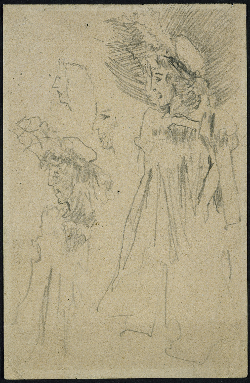
Walter Richard Sickert 1860–1942
The Sisters Lloyd c.1889
Pencil
152 x 100 mm
Walker Art Gallery, Liverpool
© Estate of Walter R. Sickert / DACS
Photo © National Museums Liverpool
Fig.1
Walter Richard Sickert
The Sisters Lloyd c.1889
Walker Art Gallery, Liverpool
© Estate of Walter R. Sickert / DACS
Photo © National Museums Liverpool
During this period, drawing was central to training at the Slade since it accustomed the eye and memory to the depiction of form; Sickert also famously said, ‘Any fool can paint, but drawing is the thing’.3 The purpose of drawing was to develop the skills to record quickly and accurately so that artists could go out into the world and document their observations rather than struggle to paint directly from nature. Sickert carried small pieces of paper to pull out and sketch on quickly in all sorts of circumstances; many of these pencil sketches survive.4 He also carried little painting panels (pochades), to fit in the pocket. For Sickert, this initial drawing was about capturing an idea to jog the memory, not necessarily to be slavishly copied, but to be revisited and developed, just as Degas had repeatedly reworked images in pastels and chalks, known as amenées, a process leading to a further stage or final image (fig.1).5
A feature of Camden Town work is its small scale. In part this derives from the advantage of sketching on the scale that the eye sees, so that the captured image, at a comfortable arm’s length, can be exactly superimposed over the more distant model or scene (figs.2 and 3).6 This is a well-known technique for maintaining accuracy of proportion and relationship.7 The drawing can then be made proportionally larger on a bigger canvas by squaring-up with a grid or grille. A fine grid of vertical and horizontal lines is drawn over the sketch with a pencil and ruler and then a scaled-up grid put on a canvas primed for painting, either by drawing or painting it directly on the ground of the canvas or by using string stretched across the front. The lines in each square of the sketch are then copied onto the appropriate square of the canvas, which keeps the proportions consistent with the sketch. Alternatively, to avoid the risk of lines remaining visible in the final image, an intermediate squared-up image can be produced on a large piece of paper and then transferred to an equal-sized canvas. The transference is done by applying lean paint on the back of the paper, aligning it on the front of the canvas with the lean paint in contact and then going over the lines of the image to press the drawing onto the canvas, thereby transferring the paint on the reverse like tracing paper.
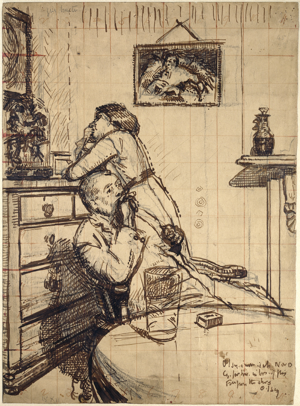
Walter Richard Sickert 1860–1942
Study for ‘Ennui’: Hubby and Marie c.1913
Pen and brown ink over black chalk, with red ink, on pale brown paper
380 x 280 mm
Ashmolean Museum, Oxford
© Estate of Walter R. Sickert / DACS
Photo © Ashmolean Museum, Oxford
Fig.2
Walter Richard Sickert
Study for ‘Ennui’: Hubby and Marie c.1913
Ashmolean Museum, Oxford
© Estate of Walter R. Sickert / DACS
Photo © Ashmolean Museum, Oxford
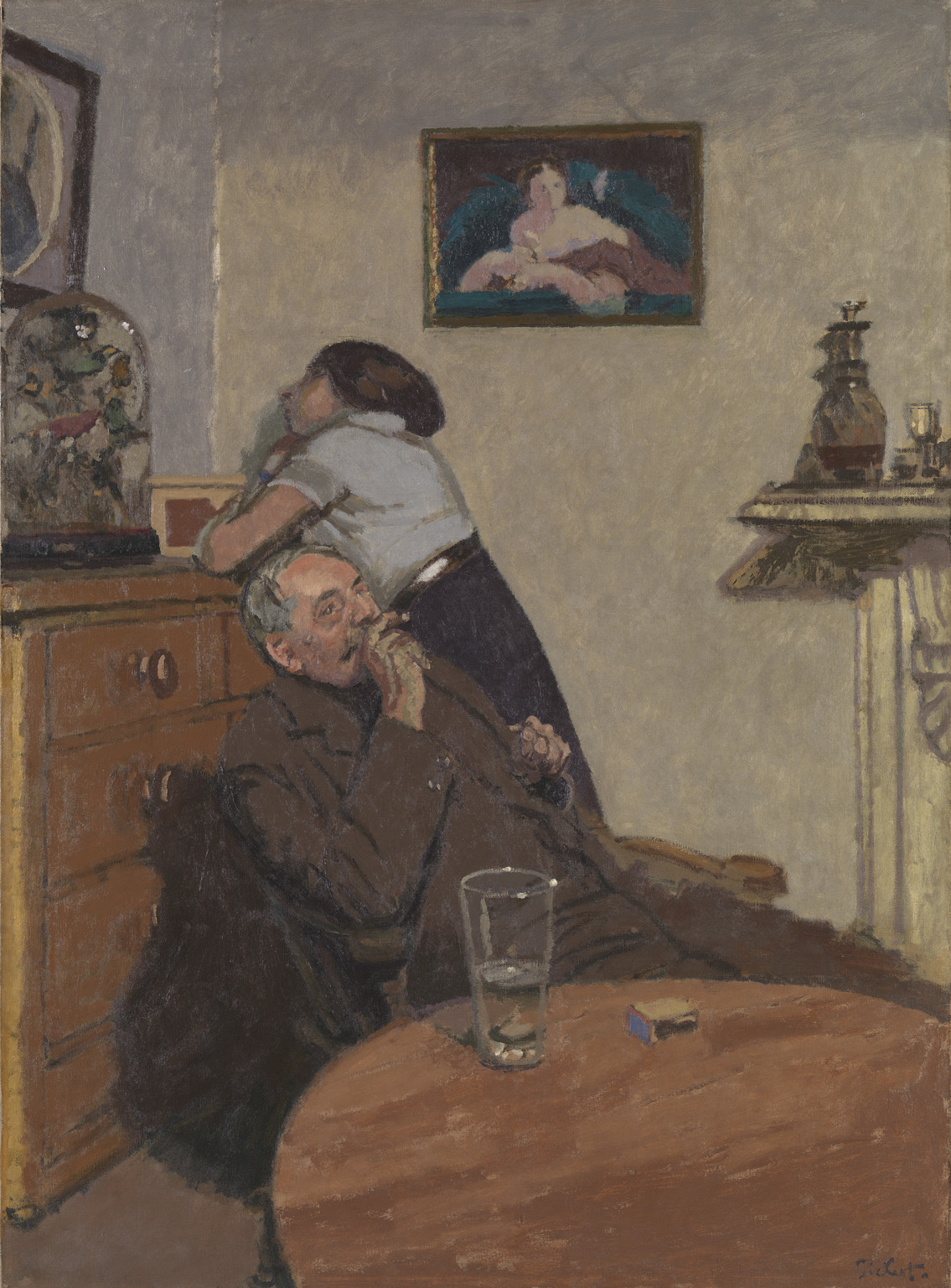
Walter Richard Sickert 1860–1942
Ennui c.1914
Oil paint on canvas
support: 1524 x 1124 mm; frame: 1741 x 1340 x 110 mm
Tate N03846
Presented by the Contemporary Art Society 1924
© Tate
Fig.3
Walter Richard Sickert
Ennui c.1914
Tate N03846
© Tate
Although they still had to square up their images, the Camden Town painters usually preferred to work on a relatively small scale, particularly when they also painted in front of the subject. In the studio, a preliminary sketch or idea could be converted into a preparatory drawing. When drawing from a model or still life, more flexibility was possible, including painting directly from the subject. The propensity for painting in interior settings stems to some extent from practical considerations. The typically urban, public and nocturnal subject matter of Camden Town artists was much less convenient to capture than the semi-rural subjects that predominated in the work of the impressionists, where an artist could work undisturbed on a large canvas.
Through drawing, the subject was translated into pencil or charcoal line on paper before being transferred to a canvas and converted into opaque-coloured paint. There were sound reasons for studying and practising drawing as endorsed at the Slade under the powerful influence of Henry Tonks. This faith in drawing was taken to the extreme by Gilman in his elaborately worked studies for Leeds Market c.1913 (Tate T00143 and N04273) or the Canal Bridge, Flekkefjord c.1913 (Tate T00026 and N03684, figs.4 and 5).8 Similarly, for capturing a specific moment in a music hall act, Gore, in emulation of Sickert,9 went repeatedly to the same performance sitting in the same seat night after night, and sketching very brief scenes in greatly reduced light.
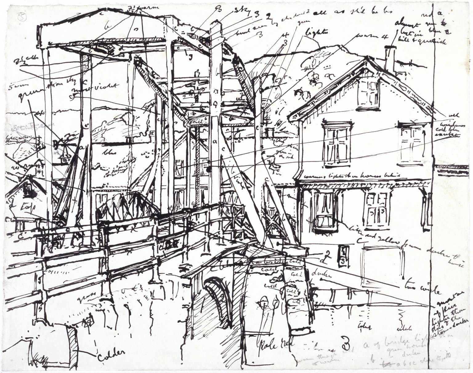
Harold Gilman 1876–1919
Study for 'Canal Bridge, Flekkefjord' c.1913
Ink on paper
support: 230 x 290 mm
Tate T00026
Purchased 1955
Fig.4
Harold Gilman
Study for 'Canal Bridge, Flekkefjord' c.1913
Tate T00026
Harold Gilman 1876–1919
Canal Bridge, Flekkefjord c.1913
Oil paint on canvas
support: 464 x 615 mm; frame: 666 x 816 x 83 mm
Tate N03684
Purchased 1922
Fig.5
Harold Gilman
Canal Bridge, Flekkefjord c.1913
Tate N03684
It might be argued that Slade training concentrated on drawing to the exclusion of painting and consequently disadvantaged students. Lines are figments of the visual system and there are no lines in nature, whereas paint can be applied in patches that simulate surfaces. With relish, Sickert supported his enthusiasm for drawing, describing it as ‘the extraction from nature, by eye and hand, of the limiting lines of an object’. To the artist, drawing a sketch is equivalent to the writing of notes and line is ‘the language of design’. ‘Some day, perhaps, an up-to-date poet will discover that the words we use to denote things are not to be found in the things themselves. Certainly T, R double E is not written on the tall green vegetables on wooden stalks we call “trees”.’10
All the Camden Town artists saw drawing as a means to an end, clearly differentiating between drawing and painting. In later advice to Ethel Sands, Sickert argued for the need to paint not up to lines but across them, so that the painting did not slavishly follow the drawn lines.11 For Sickert, paint should be opaque and expressively applied, like a signature, incorporating the many tiny accidents of viscous material on a heavily clogged brush, worked over an entire surface. Here, his long experience differed from the more slavish paint application of the junior members who had only been taught to draw.
A common technical feature of the Camden Town Group artists is their complete reliance on the colourman’s shop for the purchase of materials and equipment.12 They were fortunate to live in the heyday of the colourman’s trade, at a time when traditional materials coexisted with the reliability and convenience of modern, manufactured supplies. Respectable Edwardian colourmen traded on their reputations by avoiding the adulteration of materials that had been much in evidence in the nineteenth century, and postwar pressure to reduce costs had not yet emerged. A full range of well-tested and relatively stable pigments was available to the professional artist. The good state of most of the group’s paintings testifies to the reliability of the purchased paint and also to the lack of interest these artists had in inventing new materials. They only wished to use their materials properly and to exploit their strengths, rather than to experiment with mediums, megilps and waxes in the hope of making some technical breakthrough that the manufacturers had not considered. This was better than the situation in some other countries, for example, Italy, Spain, Germany or Russia, where good materials were less affordable and where impoverished artists frequently resorted to house paints, distemper or gouache.
For a reasonable price, in London or Paris, an artist could buy ready-stretched and primed canvases (usually white or pale in colour), tubes of paint with a full spectrum of pigments, varnishes, brushes, easels and everything an artist needed, with considerable choice. Canvas stamps reveal that members of the group visited many colourmen, such as Robersons, Percy Young, Percy Smith, P. Shea, George Rowney & Co., L. Cornelissen and Son, Chenil, Brice-Smith and Winsor & Newton. They also bought some of the imported materials that these shops sold (from Percy Smith in particular). Canvases with open-weave Belgian linen of standard French dimensions, such as the marine format,13 occur frequently. A prepared canvas was often of stretched linen with an application of rabbit-skin glue-size, followed by two lean, linseed-oil layers pigmented with lead white and chalk. The first of the layers, applied by the colourman using a spatula, was mainly chalk for economy and the top layer mainly lead white for opacity. Variations include coarser canvases made from hemp or jute and hemp and linen mixtures, and even an unusual cotton canvas purchased by Sickert in Venice. The white ground could also be extended with cheaper and more transparent kaolin, lithopone, barytes or gypsum; and zinc white or lithopone or barium sulphate could be used instead of lead. The primed canvas was prepared in large pieces, cut up and then stretched on small expandable stretchers, attached by tacks and sold, very much as it is done today. Although these artists experimented with technique, their thoughts were about the application of paint and did not extend to the preparation of materials, except occasionally stretching or priming their own canvas. Nor did they question the material nature of a work of art. It was taken for granted that the output of their work was an oil painting on canvas. They assumed that their paintings would be varnished and framed, submitted for exhibition and hopefully be bought and most likely hung in a domestic setting.
Many of the Camden Town Group paintings are varnished but by no means all. Some of the varnishes look to be early and some have been cleaned and re-varnished. There is little documented discussion on the practice of varnishing. For someone who had such strong opinions about art, Sickert said very little on this particular subject. This is odd and raises several interesting questions: Did he assume that every one of his works would be varnished? Was varnishing entirely left to the dealer or new owner? Sickert must have been aware of the impact of varnish. Most of his early work was definitely varnished but later works, like Tipperary 1914 (Tate N05092), have never been, suggesting a change in attitude. Later Sickerts from the 1920s and 1930s were unvarnished, although some works may have been varnished at a later date by others. Certainly many impressionists and post-impressionists did not varnish their work and as a consequence their colours remain looking cool and fresh. It seems likely that the colourists among the Camden Town painters chose not to varnish, and where varnishes currently exist they should be removed.
At the beginning of the twentieth century a tradition of painting derived from notions of academic form and finish was still strong. Diego Velázquez was typically regarded as the standard for skill and good taste. Sickert was from the generation that respected such accomplishment, as did his contemporaries at the Slade and their students. For Sickert, form was defined by tonal contrasts, and despite having broken with Whistler, he could not readily reject his painting methods. Sickert continued, as he had learned from Whistler,14 to paint on a grey ground, using it for the mid-tone of his painting and adding darks and lights to establish the extremes. Gilman, too, learned to paint in this way. This is an efficient method of painting, allowing an artist to quickly establish a composition, with the ground defining the overall colour tone. A grey ground allowed them to create pearly translucent half-tones in flesh to contrast with the warmer flesh tones and deep warm shadows. The method was that used by Velázquez and generations of subsequent painters and portraitists. Copying Old Masters was an important part of academic training, but a student soon realised that a modern range of pigments bore little relation to that available to their Spanish or Flemish predecessors who had frequently managed with a limited palette of lead white, vermilion and earth colours, often without any blue at all.
By contrast, nineteenth-century artists such as John Constable and J.M.W. Turner had welcomed then newly invented pigments, particularly chrome yellow and cobalt blue with their narrow absorption bands and high refractive indices, exploiting the possibilities of painting in a much higher key. Constable’s greens and Turner’s suns would not have been possible without chrome yellow. The Pre-Raphaelites had used a range of colours, such as emerald green, red madder, chrome yellow, cadmium reds and oranges and cobalt blue, often applied in isolation that could be profoundly disturbing within a composition.15 All these painters were able to work to some extent out of doors and were concerned with depicting sunlight and landscape, and significantly they directly influenced the new developments in French landscape and plein-air painting. The impressionists had invented a technique to work directly from nature, exploiting newly invented lead tubes for dispensing oil paints (patented in 1842), which in turn gave rise to post-impressionism, which inspired the Camden Town painters.
However, for the academic figure painter or portraitist working in a studio, high-key pigments needed to be toned down and tamed. Subtle gradations of colour and tone were achieved by premixing tube colours on the palette to limit the range and establish each interval to be used in a painting. Tone was reduced by using earth pigments and the addition of ivory black to each colour; colour harmony was achieved by mixing each pigment into each colour to prevent isolated hues standing out. This was the method used by the French Academy and described by Whistler as he was taught by Charles Gleyre in Paris.16 Only when all the colours were mixed on the palette to define a narrow range of subtle tones and broad hues would the painting commence. The immediate result was a controlled image with the option of creating hardly discernible variations between adjacent applications of paint so as to create discreet gradations of tone and hence form, which was particularly useful for portrait painters.
Walter Richard Sickert 1860–1942
Minnie Cunningham (detail) 1892
Oil paint on canvas
Tate T02039
Photo © Tate
Fig.6
Walter Richard Sickert
Minnie Cunningham (detail) 1892
Tate T02039
Photo © Tate
But it is the French academic technique that was rejected and eventually overthrown by the artists who exhibited in the Salon des Refusés and Salon des Artists Indépendants throughout the period 1874 to 1886. In London, impressionism had already made an impact: talented portrait painters, such as John Singer Sargent, became successful by providing highly competent portraits of their wealthy sitters with an acceptable level of finish. A version of impressionism, inspired by Jules Bastien-Lepage, and practised by Henry Herbert La Thangue and George Clausen, also flourished at Newlyn in Cornwall in the 1880s and 1890s among painters like Stanhope Forbes. But this was toned-down and well-finished impressionism, certainly not the radical post-impressionism that had progressed much further in France and through Fry’s exhibitions created a raw excitement in a new generation of artists in London. The painter Paul Serusier observed that ‘Cézanne has managed to strip pictorial art of all the mildew that it had accumulated over time’.18
In 1904 Gore, with Albert Rutherston, speculatively visited Sickert in Dieppe, but arguably it was Sickert who eventually gained most from the encounter. By the end of the Camden Town period in 1914, Sickert’s technique and in particular his attitude to depicting colour had completely changed: he returned to Camden Town from Dieppe determined to study how to paint colour in shadows. He never looked back. Gore, the supreme and confident colourist,19 emerges as the catalyst of the group, interacting successfully with several dissimilar characters, such as Sickert and Gilman, whose methods and artistic aims were also very different.
Gore initially also looked to Lucien Pissarro and late impressionism for inspiration, directly adopting divisionist techniques using loaded brushes to apply regular isolated patches of colour, often mixed with opaque white over a white ground, exploiting colour contrasts directly on the canvas. When contrasting colours are placed side by side they appear brighter, and when colours are tonally similar they clash strikingly. The brain cannot decide which colour is nearer and so the two colours appear to jump as it tries to resolve the plane. The phenomenon of simultaneous contrast, where two colours placed side by side and observed simultaneously appear brighter, was first explained in the mid-nineteenth century by the chemist Michel Eugène Chevreul.20 The patch of colour must be large enough to be resolved by the eye. However, when the eye is unable to resolve two colours, for instance when small spots or strokes of colour are viewed from a distance, the result is called optical mixing. There is a loss of intensity. Therefore an impressionist painting viewed closely may be very colourful but from a distance the same passage may appear washed out. Georges Seurat explored these effects deliberately.21
Painting using small tachist dabs and strokes of paint is therefore very dependent on distance and inevitably also produced forms that were less precise and which affronted academic painters and critics. However, impressionist technique also had significant benefits such as allowing an artist to paint directly from nature: by sketching directly on a white canvas, spontaneously working from light to dark and introducing colour as required with much more control over the darker passages. The technique made the depiction of light falling on surfaces and reflected into shadows much easier; it was a feature of the success of impressionism that an infinite variety of colours and tones could be introduced into shadows, most obviously in the bluish violet plein-air effects of sunlit scenes.22 Blue shadows are best left unvarnished since mastic or dammar soon varnishes yellow, subtracting blue. A lack of varnish, a dappled or distinctly brushed paint surface, colour values and form fluctuating with viewing distance, and flatter shadows were interpreted by academic painters and critics as a sketchy finish. To avoid this problem, Camille Pissarro, in his early impressionist work, was more controlled and seems to have retained the rigorous pre-mixing of paint on his palette thereby creating more subtle gradations and avoiding the accusation of sketchiness. Nevertheless, he took advantage of a lighter palette, with only a sparing use of ivory black throughout; and even some of his greys were devoid of black, being composed by balancing warm and cool colours. Once the impressionist technique was accepted, later painters such as the pointillists Seurat and Paul Signac carried the method further.
Gore’s music hall scenes owe much to Sickert in subject matter, but most are painted entirely differently and in a higher key. His performers are not only light, but brightly coloured, composed from only sparingly pre-mixed pigments with much added white, and his orchestra pit is in purplish half-shadow achieved by avoiding glazing. Brushmarks are evident and the surface would have been left unvarnished. For painting a dark music hall, Gore’s method is perhaps not as effective as Sickert’s, lacking the drama and focus on the stage. Nevertheless, it is a departure that Sickert would not have contemplated. During his years in Venice and Dieppe Sickert must have been acutely aware of the discrepancy between his low-toned works and those of the successful impressionists. Yet he could not afford to abandon his hard-won expertise to become just another impressionist, since to him their work lacked quality, which he put down to ‘a matter of education and experience’.23 For Sickert, technique was all important: it was central to his identity and he continued to develop and teach technique throughout his long life.24 Yet he clearly needed to evolve a new direction, and so the style of his younger Camden Town contacts would have been welcome.

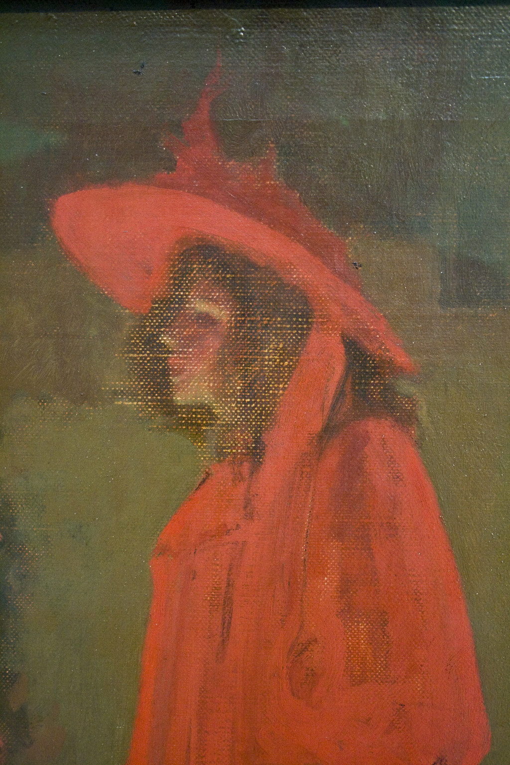
Walter Richard Sickert 1860–1942
La Hollandaise c.1906
Oil paint on canvas
support: 511 x 406 mm; frame: 722 x 630 x 104 mm
Tate T03548
Purchased 1983
© Tate
Fig.7
Walter Richard Sickert
La Hollandaise c.1906
Tate T03548
© Tate
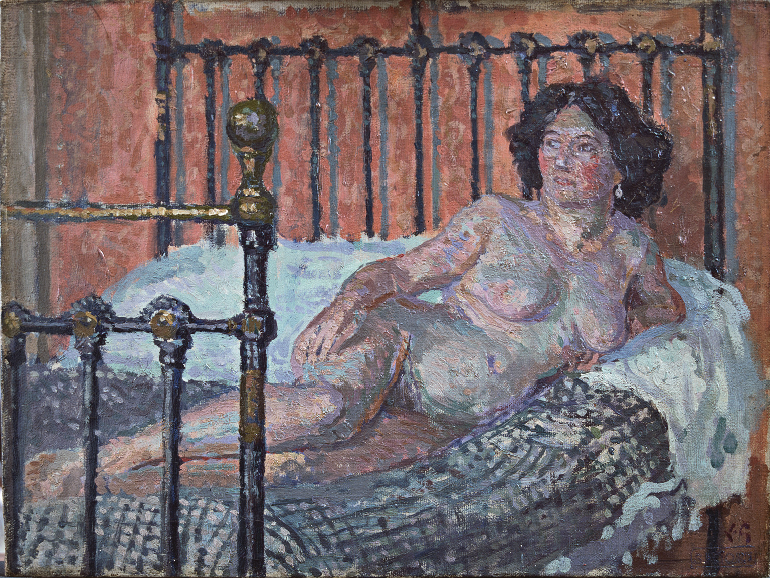
Spencer Gore 1878–1914
Nude 1910
Oil paint on canvas
515 x 610 mm
Bristol City Museum and Art Gallery
Photo © Bristol City Museum and Art Gallery
Fig.8
Spencer Gore
Nude 1910
Bristol City Museum and Art Gallery
Photo © Bristol City Museum and Art Gallery
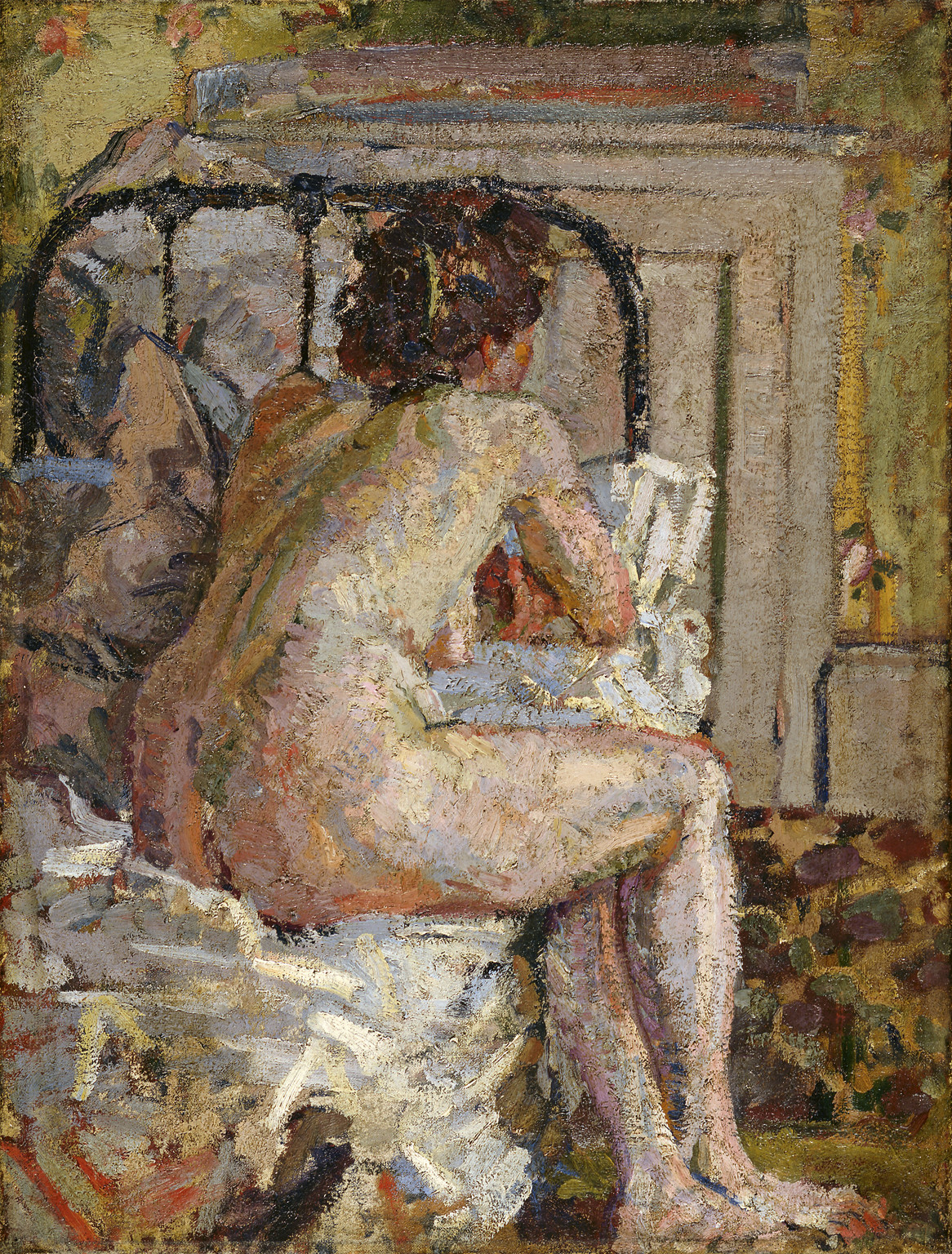
Harold Gilman 1876–1919
Nude on a Bed c.1911–12
Oil on canvas
614 x 467 mm
Fitzwilliam Museum, Cambridge
Photo © Fitzwilliam Museum, University of Cambridge
Fig.9
Harold Gilman
Nude on a Bed c.1911–12
Fitzwilliam Museum, Cambridge
Photo © Fitzwilliam Museum, University of Cambridge
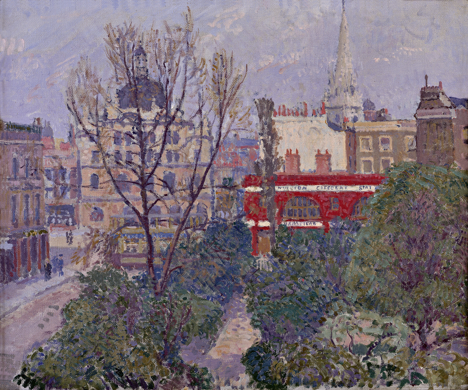
Spencer Gore 1878–1914
Mornington Crescent 1911
Oil paint on canvas
508 x 616 mm
British Council
Photo © Rodney Todd-White & Son
Fig.10
Spencer Gore
Mornington Crescent 1911
British Council
Photo © Rodney Todd-White & Son
In his Letchworth views, Gore applied simple patches of colour painted up to drawn or painted lines, like an opaque watercolour technique with unmodulated patches of paint, allowing his colours to compete with the form, with the red-tiled roofs jumping out of the image (Tate T01960, fig.11).28 This created a very decorative result. More subtly, in the landscape he was experimenting with cubist-like forms, which Roger Fry was also doing at this time but without Gore’s confident use of colour. In The Beanfield, Letchworth 1912 (Tate T01859, fig.12),29 he found forms to compete with the intensity of his colours. Sadly Gore’s progress was cut short by pneumonia in 1914 and we can only speculate on what might have been.
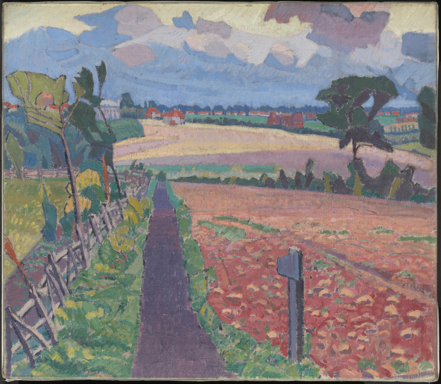
Spencer Gore 1878–1914
The Cinder Path 1912
Oil paint on canvas
support: 686 x 787 mm; frame: 815 x 924 x 73 mm
Tate T01960
Purchased 1975
Fig.11
Spencer Gore
The Cinder Path 1912
Tate T01960
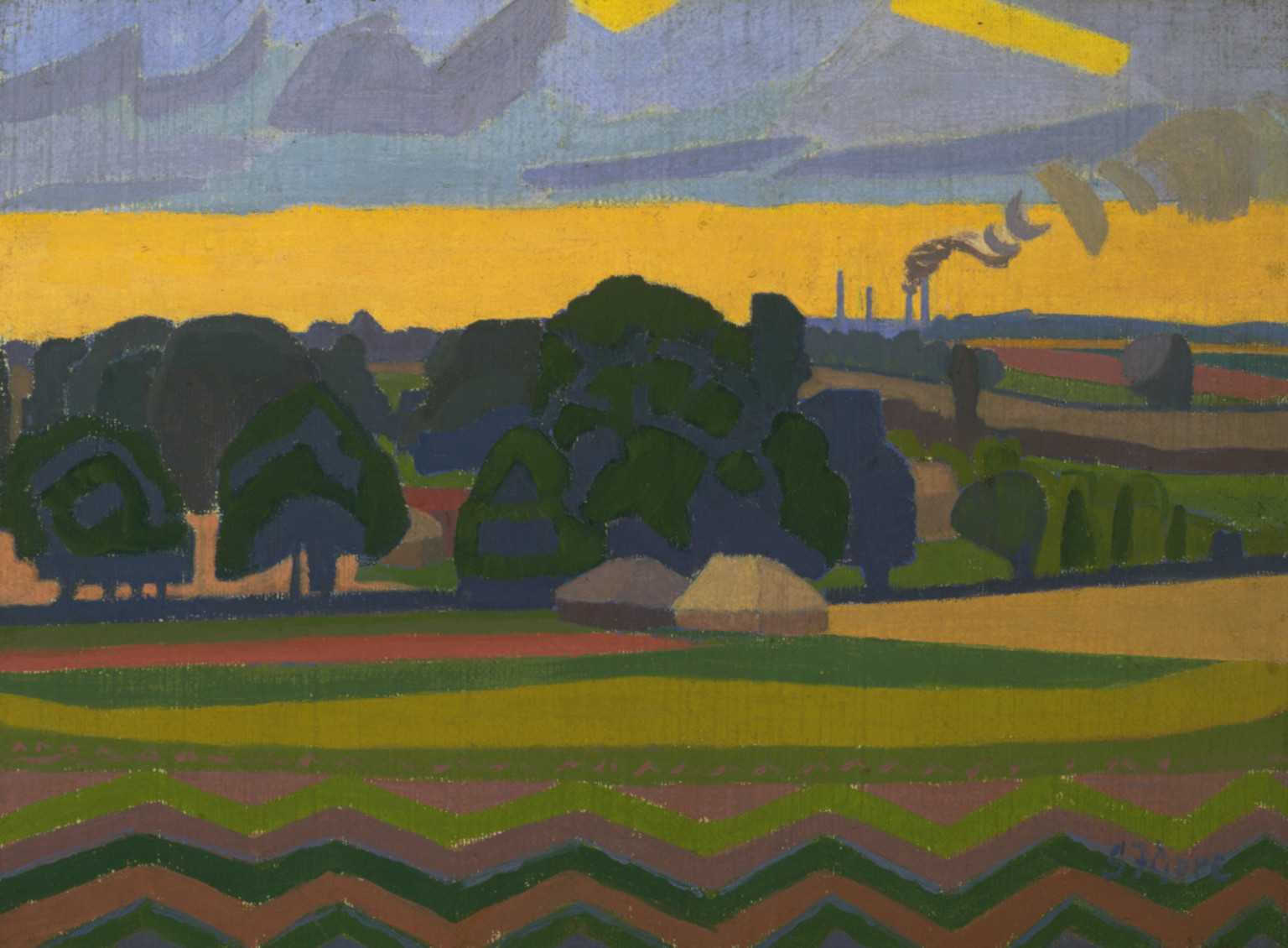
Spencer Gore 1878–1914
The Beanfield, Letchworth 1912
Oil paint on canvas
support: 305 x 406 mm; frame: 462 x 562 x 57 mm
Tate T01859
Purchased 1974
Fig.12
Spencer Gore
The Beanfield, Letchworth 1912
Tate T01859
Gilman was trained in drawing at the Slade under Tonks. He learned to paint by copying works by Velázquez in Madrid and then worked with Sickert in Dieppe. In this way Gilman experienced the same sound but restricted early development as Sickert, but was quick to adapt to new ideas. Like Gore, he readily adopted a white ground and pursued lighter, colourful images, observing colour in his shadows. His Nude on a Bed c.1911–12 (fig.9) is set on the same type of Camden Town brass bed and with similar wallpaper to Sickert’s, but the scene is in full sunlight and is altogether more sumptuous in execution. The paint is laid on in generous dollops directly over a white ground, once again exploring cool and warm reflections.
Charles Ginner 1878–1952
Piccadilly Circus 1912
Oil paint on canvas
support: 813 x 660 mm; frame: 939 x 786 x 65 mm
Tate T03096
Purchased 1980
© The estate of Charles Ginner
Fig.13
Charles Ginner
Piccadilly Circus 1912
Tate T03096
© The estate of Charles Ginner
Ginner became increasingly concerned with developing an original Neo-Realist technique,34 arguing his case with Sickert in the New Age and stating that he would paint ‘as thick as I damn well please’.35 His later work was painted directly from nature, but not before identifying his subject, sketching it on paper and composing a very personal view, rich in surface texture. His paintings were often obsessively detailed to create a static pattern of colours broken by a dominant skeleton of lines. His uncompromising flattened perspective seemed not to have a wide appeal and his later work did not find ready buyers.
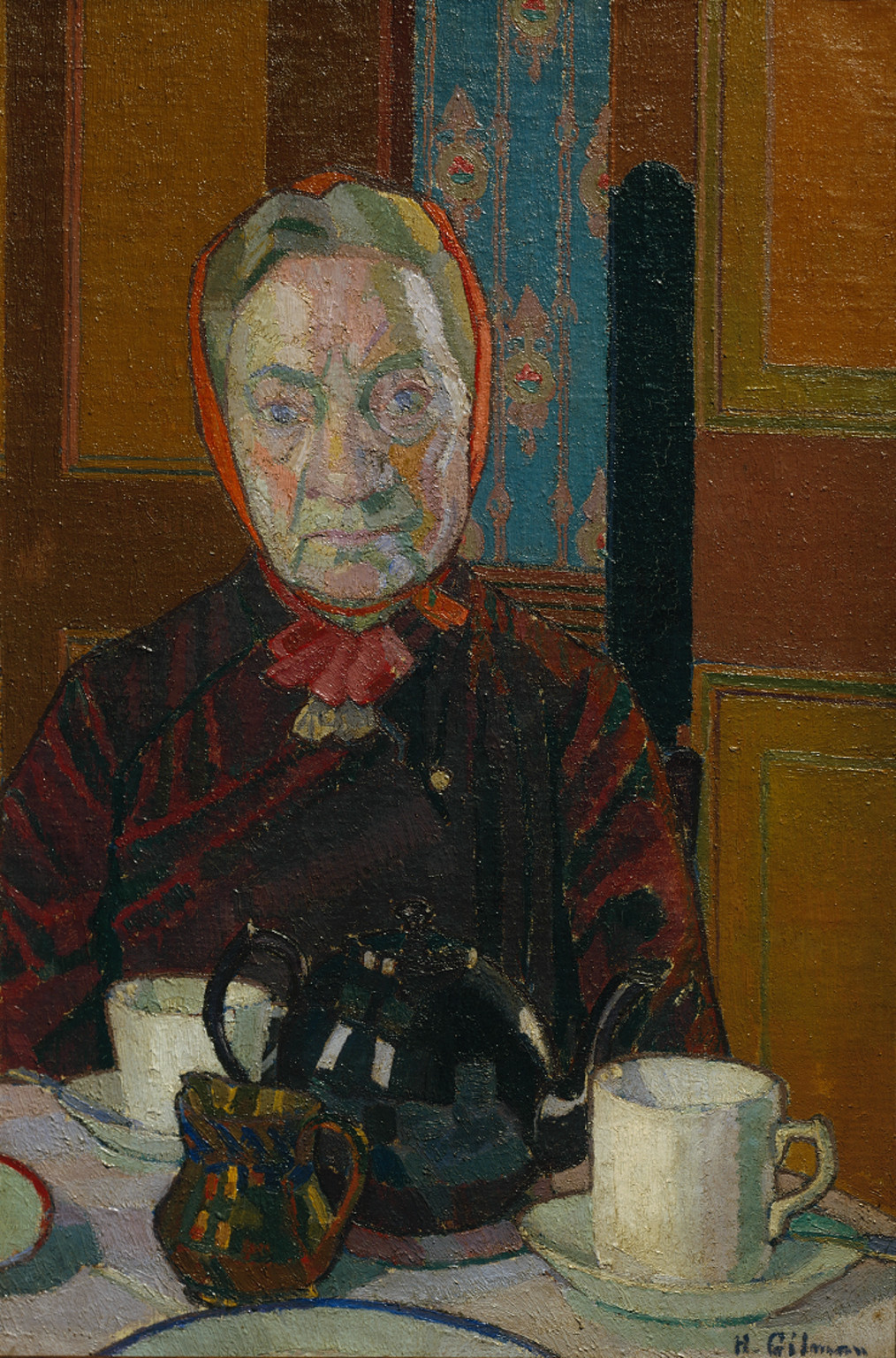
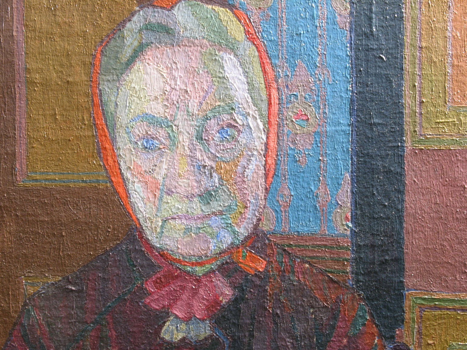
Harold Gilman 1876–1919
Mrs Mounter at the Breakfast Table exhibited 1917
Oil paint on canvas
support: 610 x 406 mm; frame: 808 x 605 x 93 mm
Tate N05317
Purchased 1942
Fig.14
Harold Gilman
Mrs Mounter at the Breakfast Table exhibited 1917
Tate N05317
Harold Gilman 1876–1919
Mrs Mounter at the Breakfast Table exhibited 1917
Oil paint on canvas
Tate N05317
Photo © Tate
Fig.15
Harold Gilman
Mrs Mounter at the Breakfast Table exhibited 1917
Tate N05317
Photo © Tate
Harold Gilman 1876–1919
Mrs Mounter at the Breakfast Table exhibited 1917
Oil paint on canvas
Tate N05317
Fig.16
Harold Gilman
Mrs Mounter at the Breakfast Table exhibited 1917
Tate N05317
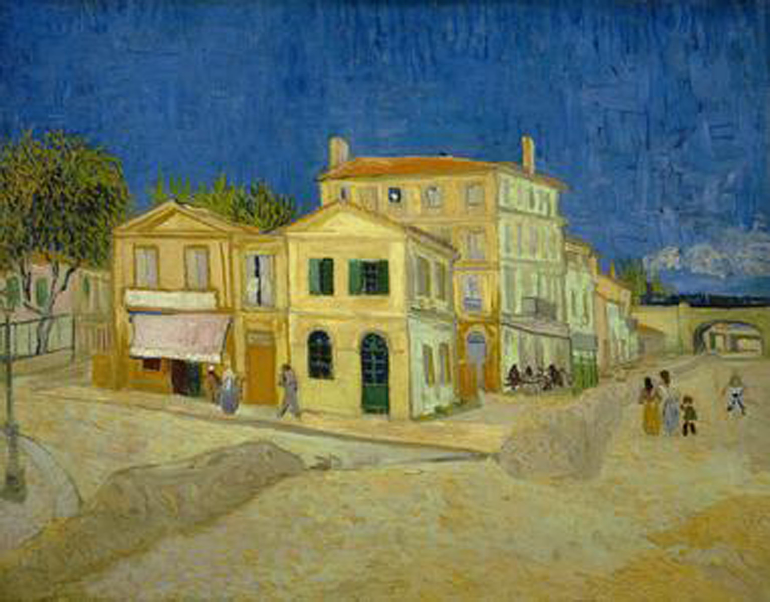
Vincent van Gogh 1853–1890
The Yellow House (The Street) 1888
Oil paint on canvas
72 x 92 cm
Van Gogh Museum Amsterdam (Vincent van Gogh Foundation)
Photo © Van Gogh Museum Amsterdam (Vincent van Gogh Foundation)
Fig.17
Vincent van Gogh
The Yellow House (The Street) 1888
Van Gogh Museum Amsterdam (Vincent van Gogh Foundation)
Photo © Van Gogh Museum Amsterdam (Vincent van Gogh Foundation)
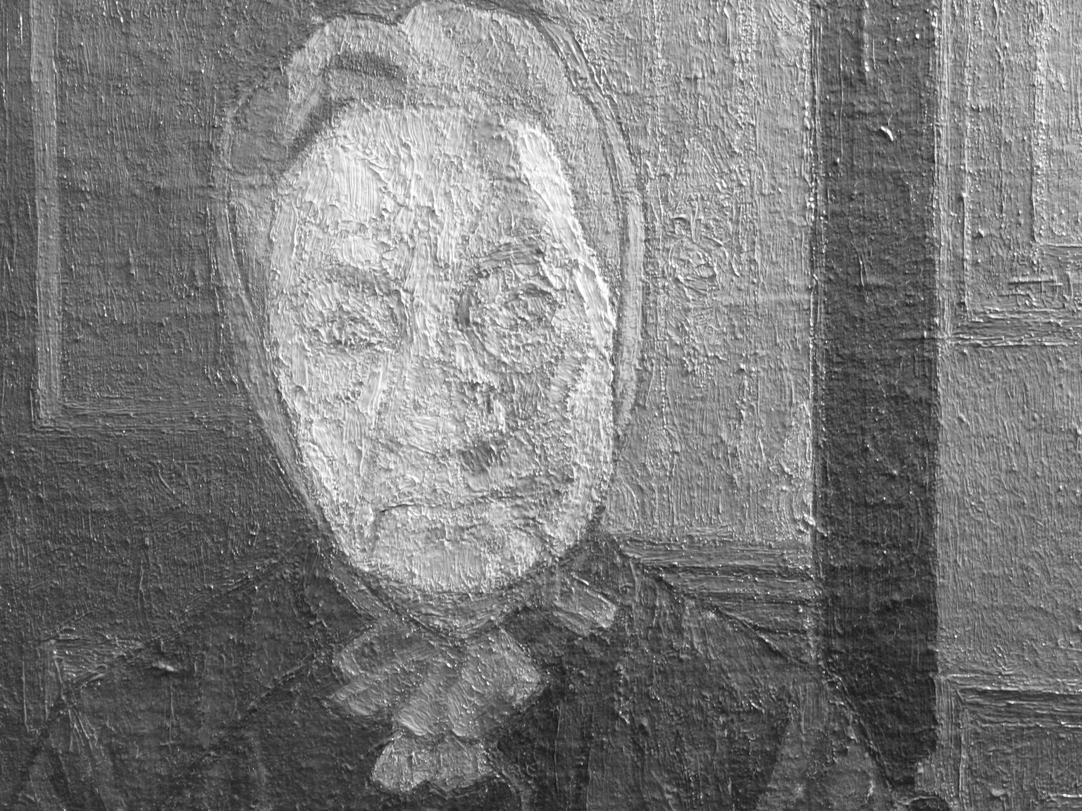
Gilman emerged with a simpler and more dramatic version of this technique using plain areas of mostly mixed colour between less dominant confining lines. Gilman’s most memorable work, Mrs Mounter at the Breakfast Table exhibited 1917 (Tate N05317, figs.14, 15 and 16)36 dispassionately explores the surfaces and green shadows of the sitter’s face, deliberately fixing the viewer with her compassionate gaze. Gilman’s highlights are hardly lighter than his shadows. Essentially, he is using colour rather than shadows to define his forms, depicting warm and cold light sources, intensified by colour contrast, for example in her red scarf set against the blue-green wallpaper. This painting has a psychological content that is rarely achieved so successfully in Camden Town work, more subtle than van Gogh’s tortured faces and just as expressive. A precedent for this use of colour is van Gogh’s The Yellow House 1888 (fig.17),37 which although a landscape also has cool blue shadows that are lighter in tone than the blue sky. But this is not a general feature of van Gogh’s work, and Gilman appears to have developed a mature and original method.
The startling colour of this painting of Mrs Mounter comes not from its intensity but because the colour observed by the artist is exaggerated and the green in particular contrasts with the warm colours elsewhere. Again we see cold and warm light sources depicted. The strong green shadows in the flesh are no darker than the pink cheeks. This enhances simultaneous contrast and provides an alternative way to depict form. The space which Mrs Mounter inhabits is also flattened both by the choice of perspective and by the cloisssonné lines. The interior decorations depicted are colourful and his paint has some of the quality of the house-paint that he frequently depicted in his interiors. In this way, Gilman makes explicit his simplification of form and heightening of colour emphasising the concrete, tactile and visual qualities of the paint.38
Walter Richard Sickert 1860–1942
Tipperary 1914
Oil paint on canvas
support: 508 x 406 mm; frame: 600 x 500 x 55 mm
Tate N05092
Bequeathed by Lady Henry Cavendish-Bentinck 1940
© Tate
Fig.18
Walter Richard Sickert
Tipperary 1914
Tate N05092
© Tate
Walter Richard Sickert 1860–1942
Tipperary (detail) 1914
Oil paint on canvas
Tate N05092
Photo © Tate
Fig.19
Walter Richard Sickert
Tipperary (detail) 1914
Tate N05092
Photo © Tate
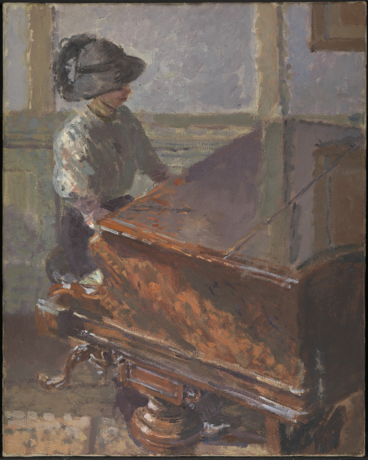
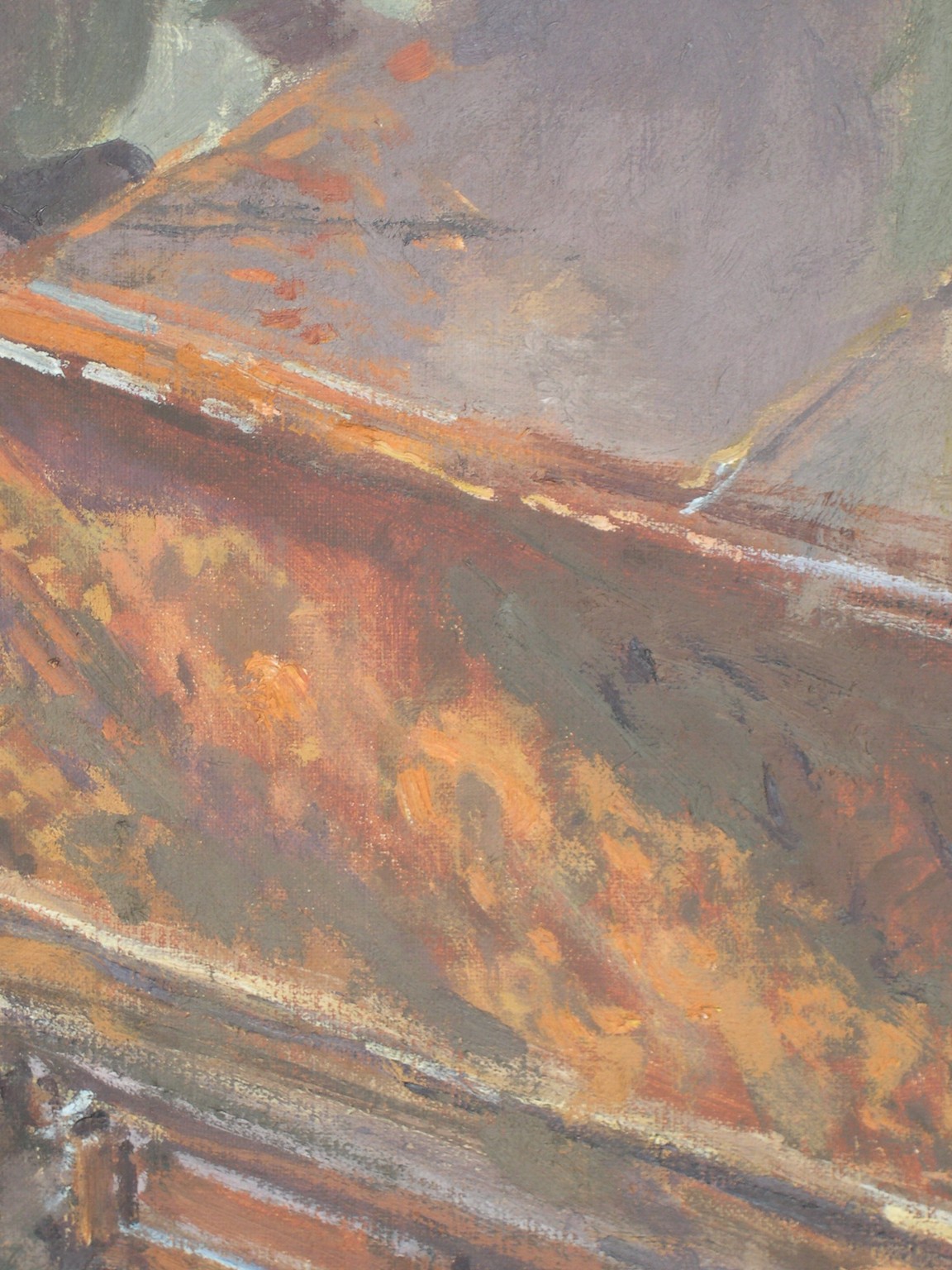
For Sickert, in Tipperary 1914 (Tate N05092, figs.18 and 19),39 the lessons of the colourists’ technique finally begin to work for him.40 Again, Sickert applied his paint undiluted with little medium so that it dried flat in a brushed broken film that left exposed some of the underlayer, gaining simultaneous contrast without resorting directly to impressionist or divisionist technique. Graphically, he described the brushing of such paint as being like the action of a street sweeper, and he wrote about ‘painting across forms’.41 Now, in his lighter passages, he began to emphasise colour in the uneven scattered reflections on walls, somewhat in the style of Cézanne. The reflections on the side and top of the piano in Tipperary bring colour into the lights and half-tones.
Walter Richard Sickert 1860–1942
Brighton Pierrots 1915
Oil paint on canvas
unconfirmed: 635 x 762 mm; frame: 901 x 1030 x 120 mm
Tate T07041
Purchased with assistance from the Art Fund and the Friends of the Tate Gallery 1996
© Tate
Fig.20
Walter Richard Sickert
Brighton Pierrots 1915
Tate T07041
© Tate
Walter Richard Sickert 1860–1942
Brighton Pierrots (cross-section of blue paint) 1915
Oil paint on canvas
Tate T07041
Photo © Tate
Fig.21
Walter Richard Sickert
Brighton Pierrots (cross-section of blue paint) 1915
Tate T07041
Photo © Tate
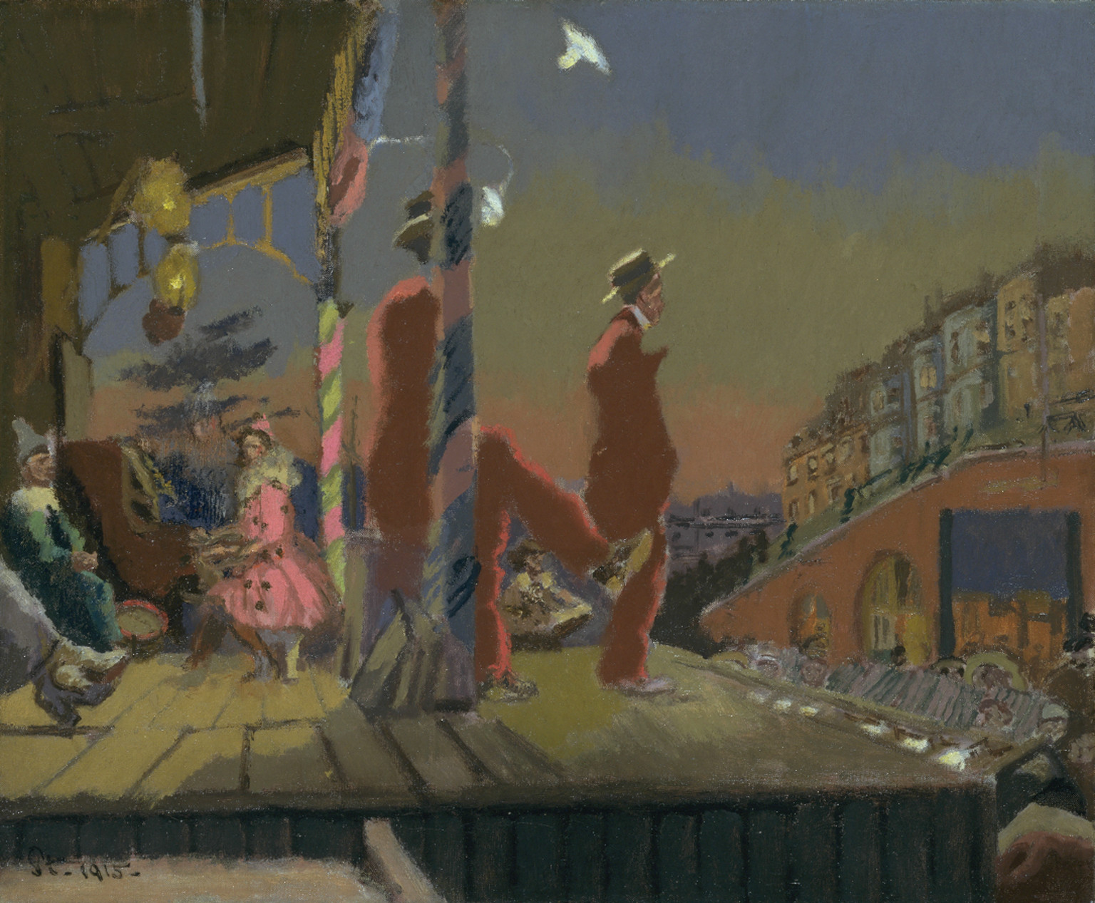
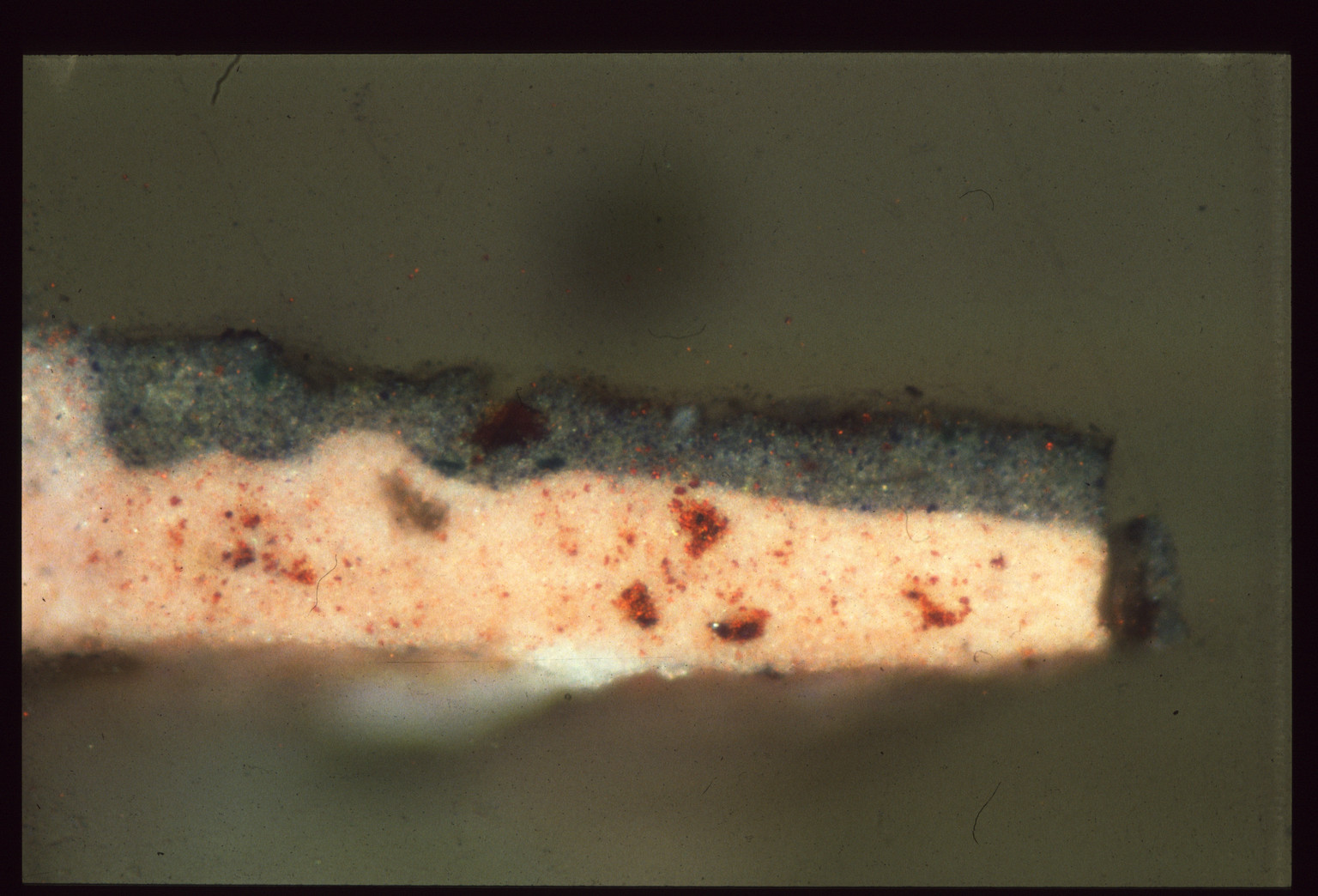
Around 1915 this method evolved into a way of painting that he called camaieu, using a preliminary process to establish flat areas of colour over a bought white ground in order to designate form and shadow (Tate T07041, figs.20 and 21).42 He could create his image in the usual way, from a drawing. Then for his first application of paint on a white ground he blocked in areas with red mixed with white, or green or blue mixed with white, each in several different strengths, to designate light and shadow.43 In his teaching, Sickert mentions up to four strengths of each camaieu colour, which seems excessive, but, since they are largely covered and difficult to see, this cannot be confirmed. He avoided introducing a dark ground for his shadows by keeping this underpaint for the shadow relatively light but in a contrasting hue to that used in the lighter passage. To represent a cool light source, say, from a window, his shadows were light red and his reflections a cool blue; for a warm light source his shadows were green or blue and his lighter patches pink. In his usual way he left the camaieu paint to dry for several weeks and then painted over this with his dry scumbles to put in the local colour and detail. He deliberately brushed over his drawn lines and flat underpaint quickly with viscous paint so that the bristles bounced and split across the surface leaving evidence of the colour underneath showing through, in order to give his shapes form and movement.44 He frequently chose the local colour to contrast with the camaieu underpaint in order to emphasise the simultaneous contrast of the underpaint which remained partly visible, ‘grinning through’.45 His analogy was to scatter a pack of red playing cards across a table followed by a pack of green cards.
Sickert continued to paint in this way, developing it in his later photography-based works and enjoying the random but controlled colour effects that could be manufactured in the studio, rather than depending on the vagaries of the observation of colour in shadows, which he clearly found difficult. This allowed him to introduce colour into his shadows whilst still rejecting impressionist and post-impressionist methods, thereby retaining an academic approach to painting. Sickert emerged from the Camden Town era a very different painter and with a new lease of life.
Notes
John Rothenstein, Modern English Painters, vol.1, third edn, London 1984: Walter Sickert, pp.32–46, Lucien Pissarro, pp.78–85, Harold Gilman, pp.121–32, Charles Ginner, pp.157–61, Spencer Gore, pp.162–9.
Jean Sutherland Boggs, Degas, exhibition catalogue, Metropolitan Museum of Art, New York 1988, pp.225, 367–8, 372.
Alistair Smith, ‘Drawing in the Dark’, in Walter Sickert: ‘drawing is the thing’, exhibition catalogue, Whitworth Art Gallery, Manchester 2004, pp.31–44.
These are a series of sketches in pencil on plain notepaper drawn in a music hall in reduced light to record ideas for future paintings.
The Ashmolean sketch has been squared up for transfer to canvas. Each square was copied individually onto a similarly squared up larger sheet of paper. The enlarged version was coated on the reverse with a loosely bound dark pigment then laid face up on the primed canvas and transferred by pressing on the lines with a stylus. For Ennui, Sickert modified his drawing leading to more than one final painting. The Tate version is larger than most of his work at this time.
Nicola Moorby, ‘“A long chapter from the ugly tale of commonplace living”: The Evolution of Sickert’s Ennui’, in Whitworth Art Gallery 2004, pp.11–14.
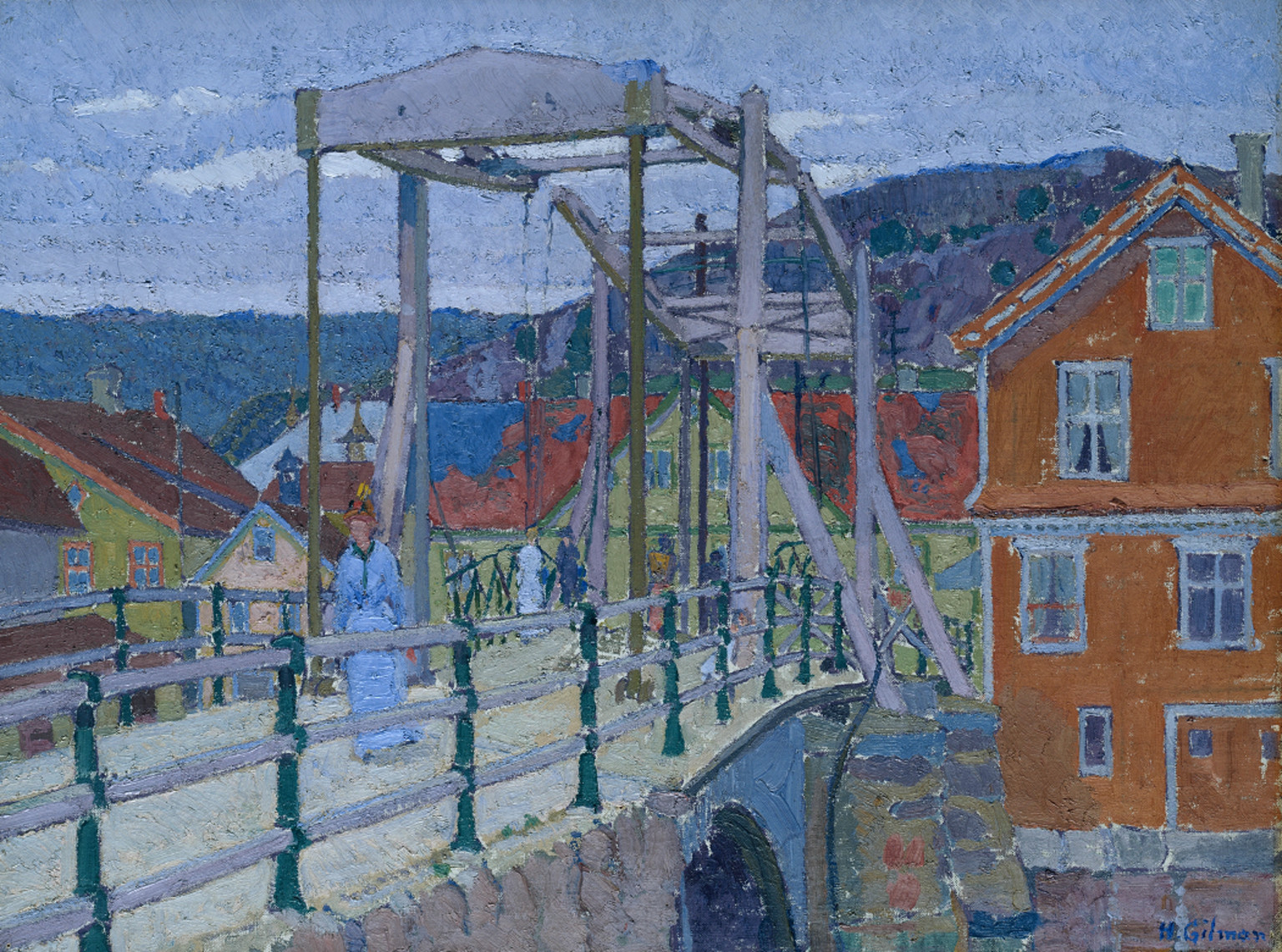
Gilman exploited the art of preparatory drawing to create images worthy of engineering design to depict complex structures such as this iron girder bridge or the roof supports at Leeds market. The painting of Canal Bridge, Flekkefjord is an ambitiously complex image that depended on preparatory drawing.
Walter Sickert, ‘The Study of Drawing’, New Age, 16 June 1910, p.156, in Anna Gruetzner Robins (ed.), Walter Sickert: The Complete Writings on Art, Oxford 2000, p.248.
Sarah Morgan, Joyce H. Townsend, Stephen Hackney and Roy Perry, ‘Canvas and its Preparation in Early Twentieth-Century British Paintings’, in Joyce H.Townsend, Tiarna Doherty, Gunnar Heydenreich and Jacqueline Ridge (eds.), Preparation for Painting: The Artist’s Choice and its Consequences, Archetype, London 2008, pp.132–40.
Marine format is a series of metric sizes for primed canvas sold by colourmen and suitable for seascapes and landscapes. For more information, see ibid.
Stephen Hackney, ‘Colour and Tone in Whistler’s Nocturnes and Harmonies 1871–2’, Burlington Magazine, vol.136, no.1099, October 1994, pp.695–700.
Joyce Townsend, Jacqueline Ridge and Stephen Hackney (eds.), Pre-Raphaelite Painting Techniques: 1848–56, London 2004.
Joyce Townsend, ‘Whistler’s Oil Painting Materials’, Burlington Magazine, vol.136, no.1099, October 1994, pp.690–5.
In this early work, Sickert applied a dark ground to modify the purchased white priming and painted dark to light. Where he needed to make changes he scraped the partly dried paint back to the ground exposing canvas texture, which is now more visible than he intended.
Francois Cachin, ‘A Century of Cézanne Criticism’, in Cézanne, exhibition catalogue, Tate Gallery, London 1996, p.42.
Frederick Gore and Richard Shone, Spencer Frederick Gore, 1878–1914, exhibition catalogue, Anthony d’Offay Gallery, London 1983.
Michel-Eugène Chevreul, ‘Mémoire sur l’influence que deux couleurs peuvent avoir l’une sur l’autre quand on les voit simultanément’, Mémoires de l’Académie Royale des Sciences, vol.11, 1828, pp.99, 447–520; English translation by Charles Martel, The Principles of Harmony and Contrast of Colours and their Applications to the Arts, London 1854, reprint 1887.
Jo Kirby, Kate Stonor, Ashok Roy, Aviva Burnstock, Rachel Grout and Raymond White, ‘Seurat’s Painting Practice: Theory, Development and Technique’, National Gallery Technical Bulletin, vol.24, pp.4–37.
David Bomford, Jo Kirby, John Leighton and Ashok Roy (eds.), Impressionism: Art in the Making, National Gallery, London 1990.
Walter Sickert, ‘Preface’, in A Collection of Paintings by London Impressionists, exhibition catalogue, Goupil Gallery, London 1889, in Wendy Baron and Richard Shone (eds.), Sickert: Paintings, exhibition catalogue, Royal Academy of Arts, London 1992, pp.58–9.
Paula Dredge and Richard Beresford, ‘Walter Sickert at Gatti’s: New Technical Evidence’, Burlington Magazine, vol.148, no.1237, April 2006, pp.264–9.
The three nudes by Sickert, Gore and Gilman owe much in subject matter to Sickert’s earlier studies begun in Dieppe. Most obviously, Sickert’s technique tended to emphasise form using shadows which allowed him to explore colour variations only in the lighter passages. In his Nude, Gore has brought a spontaneous impressionist observation of light, surfaces and reflections, even in the shadows. Gilman, like Gore, explored coloured reflections in the shadows.
Gore was confident in his precise use of colour, exploring the effects of colour breaking up form in this and other works such as Letchworth Station 1912 (National Railway Museum, York).
Ginner built up the composition of Piccadilly Circus by delineating areas with strong dark blue lines and filling each space with demarcated tesserae of opaque colour applied thickly with small dabbing brushstrokes.
Walter Sickert, ‘The Thickest Painters in London’, New Age, 18 June 1914, p.155, in Robins (ed.) 2000, pp.378–81.
Gilman painted Mrs Mounter in a similar way to Ginner’s work. The static brushwork in this case brings a degree of monumentality to the sitter. Seen in black and white, the low tonal contrasts are more evident, revealing Gilman’s exploitation of colour to define form. The surface resulting from his application of paint can be seen in raking light.
A precedent by van Gogh observes the blue reflections in the house wall in shadow but ignores the tonal contrast with the yellow sunlit wall.
Roy Perry, Gilman, N05317, artist’s technique text, Conservation Department Paintings Examination Records, Tate.
Sickert has developed his underpainting technique to achieve interesting variations in colour particularly in the lighter parts.
Nancy Wade, ‘The Painting Technique of Walter Richard Sickert, 1860–1942’, unpublished Diploma research project, Courtauld Institute of Art, London 2001.
Wendy Baron, Sickert, London 1973, pp.131–48. Sickert uses colour contrasts in his camaieu to define form before partly painting over them. By keeping his underpaint light he retains his options to depict variability within the shadows. In his later work he deliberately leaves his first layers visible to reveal his painting process. The cross-section through the paint film shows the top layer of paint covering the camaieu layer below.
Stephen Hackney, ‘Sickert: Brighton Pierrots, 1915’, in Stephen Hackney, Rica Jones and Joyce Townsend (eds.), Paint and Purpose: A Study of Technique in British Art, London 1999, pp.120–5.
Stephen Hackney is former Head of Conservation Science, Tate.
How to cite
Stephen Hackney, ‘The Evolution of Painting Technique among Camden Town Group Artists’, in Helena Bonett, Ysanne Holt, Jennifer Mundy (eds.), The Camden Town Group in Context, Tate Research Publication, May 2012, https://www