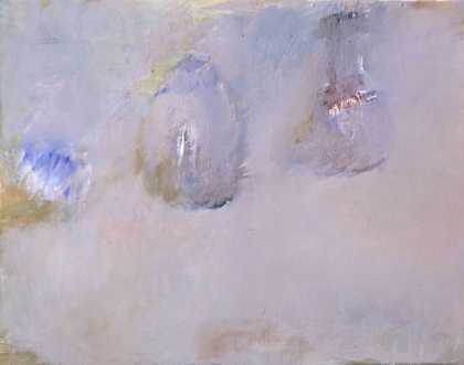
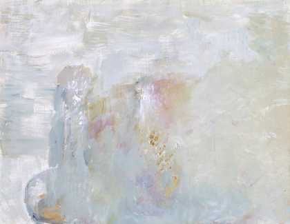
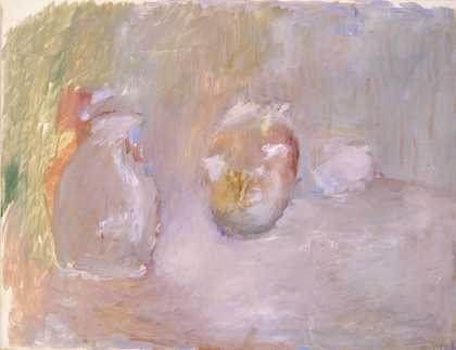
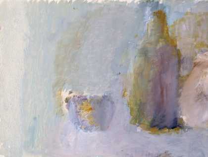
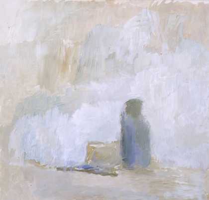
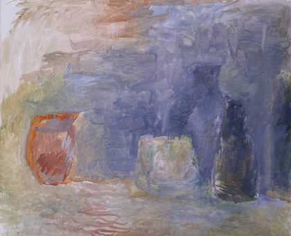
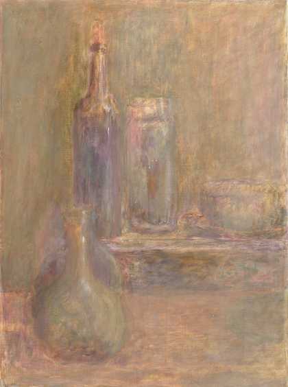
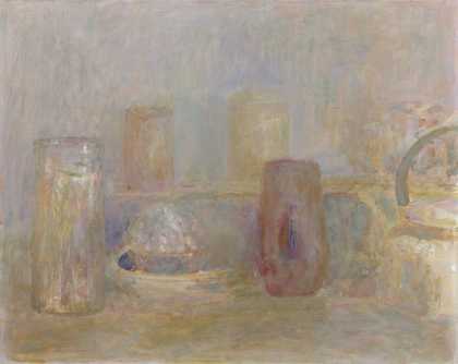
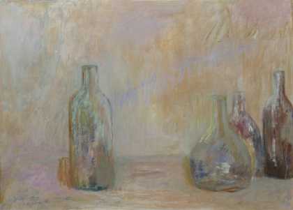
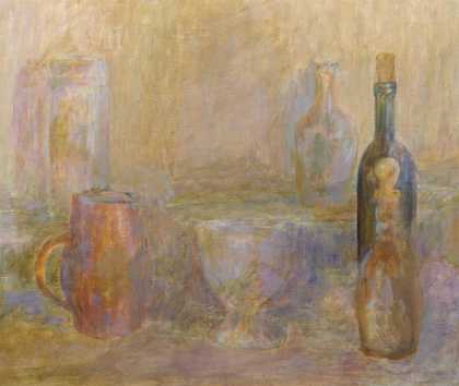
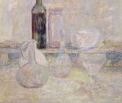
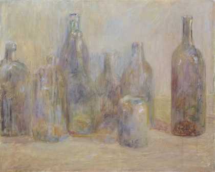
- Artist
- Adrian Stokes 1902–1972
- Medium
- Oil paint on canvas
- Dimensions
- Support: 457 × 457 mm
- Collection
- Tate
- Acquisition
- Purchased 1965
- Reference
- T00720
Catalogue entry
Oil on canvas
458 x 458 (18 x 18)
Inscribed in paint on canvas surplus 'ADS '63' and in pencil '<14> | 16'
Purchased from the artist through Marlborough Fine Art, London (Grant-in-Aid) 1965
Exhibited:
Adrian Stokes, Marlborough Fine Art, London, Jan. 1965 (64, as Still Life XXIV)
Adrian Stokes, Arts Council tour, Serpentine Gallery, London, June-July 1982, Huddersfield Art Gallery, July-Aug., City Museum and Art Gallery, Gloucester, Sept.-Oct. 1982 (68)
Literature:
Tate Gallery Report 1964-5, London 1966, p.54
Adrian Stokes seems to have first painted a still life in the summer of 1939, but from the end of the 1950s the theme can be said to have dominated his output. When he exhibited many of them at Marlborough Fine Art in 1965, he numbered them sequentially with Roman numerals, regardless of their widely divergent dates. This work was listed as the twenty-fourth in the list, but the artist wrote to the Tate Gallery the following month: 'The Still Life does not have the Roman numeral as part of its title. That is a mistake of the cataloguing at the Marlborough Galleries or, rather, of myself when I numbered them separately from the other paintings' (letter, 17 Feb. 1965).
The numbers were most probably appended at the gallery in order to distinguish the different works and by rescinding them later Stokes re-established the individual paintings' anonymity. It was a characteristic of his practice that he used his motif, whether landscape or still life, as a vehicle for an objective formal, or technical, project. Similarly, his insistence upon the primacy of the independent painted object was reiterated by the cataloguing of the still lifes regardless of their date. For the catalogue he dated only two: the first, Still Life I, 1943 (catalogue number 41), and the last, Still Life XXVIII, 1944 (68). The contrast of the proximity of their dates and their distance in the list appears to have been an overt statement of the artist's disregard for an historical, as opposed to emotional, approach to art. The art works' independence of their subject matter was further enforced by Stokes's hanging of the still lifes in one block with the individual paintings abutting each other. Thus, the illusion of objects upon a table was undermined and the individual canvases become allusions to painted or carved wall panels in a manner comparable to Giotto's frescos in the Arena Chapel, Padua or Ghiberti's bronze panels on the Florence Baptistry doors.
The close juxtaposition of twenty-eight still lifes revealed a small number which are considerably lighter in tone and looser in handling. The Tate's Still Life is amongst this group, as is the similar Still Life XIX which suggests that this group was executed around the same time. Despite this distinction, other than the addition of a white layer over the original commercially prepared off-white oil ground, the technique used in this work is typical of Stokes's practice. The paint, which is thin and semi-transparent, was applied as body colour and washes with no scumbling. The finish is matt, there is a little impasto and no varnish. A high thinner content in the paint has caused drips in the top corners and these appear to have been flattened and abraded by contact with another surface while still tacky. The brushwork is not necessarily coincident with the image, particularly in the painting of the wall in the upper left-hand section, where the handling serves to undermine any illusion of depth. Similarly, the relationship of the objects to the table top is unclear in a manner seen in other still lifes.
The emphasis Stokes placed upon a painting's flatness was related to his facination with relief carving and his development of the concept of 'carving colour' (Colour and Form, London 1937). In his still lifes, most especially, he set up spatial ambiguities by the simultaneous definition of volume and denial of space. This, in relation to a comparison with Bonnard, is an aspect of his work that has been singled out by David Sylvester:
Bonnard begins from a flat shape, and Adrian begins very much from volumes in space. Not for nothing was his favourite still life object not an apple but a transparent thing ... lending itself to the play of light and smokiness of the atmosphere. Bonnard seems to begin by seeing shapes as flat, and turns them into relief: Adrian takes the solid and makes it flatter.
(Adrian Stokes, exh. cat., Arts Council, 1982, p.22)
Stokes's insistence on a unified picture plane derived from his appreciation of Cézanne, but was distinct from the formalism of Clement Greenberg which determined the form of much of the abstract painting in Britain in the early 1960s (cf. David Carrier, 'Adrian Stokes and Recent American Painting', in Stephen Bann, (ed.), 'Adrian Stokes 1902-72', supplement, PN Review, 15, vol.7, no.3, 1980). Adopting the Kleinian theory of art as a process of reparation, for Stokes the reunification of the picture plane might be seen as significant of a personal reintegration. It was this pursuit of an overall unity that prompted his desire for an art without gesture or incident. In his only statement on his painting, he wrote of his interest in
an interpretation of volume that is without menace ... in which any section is as prominent or important, or as little so, as any other section ... a status of mutual recognition, as it were, between objects and their spaces wherein there is nothing monumental, no movement, no rigidity, no flourish, no actueness, no pointedness, no drama.
('A Drama of Modesty: Adrian Stokes on his Painting', Studio International, April 1973, reprinted in Adrian Stokes, exh. cat., Arts Council, 1982, p.36)
Stokes's desire for a flattened volume and objective art is illustrated by his repeated painting of a limited range of bottles, pots and decanters against a wall. Though his widow has said that he preferrred ordinary objects such as wine bottles (interview with the compiler, 19 June 1997), grander vessels also appear. This Still Life is typical in this respect, depicting, from left to right, a glass decanter with stopper, a pierced pottery fruit bowl on a stem made by his wife Ann, a green bottle, a glass flagon and a clock face. It was painted in the artist's studio at his home in Church Row, Hampstead. In the background appear to be two similar paintings casting a dark shadow in the narrow space between them. Several of Stokes's still lifes use other paintings as a backdrop in this way, including Still Life XIX in which the same two canvases appear (Arts Council, repr. Adrian Stokes, exh. cat., Arts Council, 1982, p.44). Others include objects raised on a shelf and the painting partially visible on the right-hand side may be of a similar arrangement. The paintings behind and the shelf serve to undermine a sense of recession, emphasising the shallowness of the space. The objects are thus seen close to their background and become even more like the carved forms of a shallow relief.
Stokes's use of still life as a vehicle for more abstract ideas echoes the work of Giorgio Morandi. Both artists achieved a spatial ambiguity and both appear to seek a lack of drama. Though Morandi was not widely known in Britain, Stokes could have encountered his work in Italy before the war and he, no doubt, knew the Natura Morta, 1946 which the Tate Gallery had acquired in 1947 (N05782). Ann Stokes Angus recalled Stokes travelling to London to see the retrospective of Morandi's work staged by the Arts Council in 1954, though she felt Stokes's objects were less formal than the Italian's.
Chris StephensJuly 1998