If the notion of Kline’s ‘breakthrough’ of the late 1940s that has been so central to Kline studies is temporarily bracketed, it becomes possible to offer an additional account of his artistic development – one that emphasises an underlying continuity of purpose and recasts Kline’s breakthrough as an episode within a greater pattern, rather than an exceptional starting or turning point.1 Within the constellation that results, the related, special significance of late paintings like Meryon 1960–1 (Tate T00926) becomes apparent. Not only does Meryon constitute a declaration of Kline’s origins and passions but also a suggestion for the way in which his high-impact paintings should be viewed: closely and slowly, initially for figurative subject matter, but mostly, and at length, for an appreciation of their constituent strokes. This section retells the story of Kline’s development and of Meryon according to one main thread: Kline’s passion for the print, which was persistent, surprisingly pedantic and nothing less than connoisseurial.
That Kline was a pedant with regard to traditional printmaking may seem out of character for a bohemian New York School artist of the 1950s.2 The art critic and historian Dore Ashton, who was a friend of Kline, recalls:
I remember my own astonishment when I discovered that Kline knew about Rembrandt’s visit to Hercules Seghers, that remarkable eccentric whose intimations of the nature of space were highly abstract, particularly in his drawings and etchings.3
Ashton’s surprise was probably due not only to the fact that Kline displayed a specialist knowledge but also because, within abstract expressionist circles, Kline was known and adored as a fun-loving, friendly taleteller and jokester who was uninterested in detailed discussions of serious or weighty issues, whether artistic or otherwise. To take Kline seriously as a connoisseur of prints, for whom invoking historical personages like seventeenth-century Dutch artist Hercules Seghers and nineteenth-century French printmaker Charles Meryon was natural and significant, repositions Kline as an intellectual heavyweight, shifting him from an artist known for his athletic abilities, including football and baseball, to a knowledgeable thinker and close observer. Just as Kline’s athleticism has served as biographical and rhetorical evidence in support of interpretations of his paintings as being strong and active, Kline’s connoisseurial eye for the print demands that his paintings be considered accordingly.4 This is arguably the imperative of Meryon, with its reference to the printmaker of the same name.
This essay will demonstrate that Kline’s reference to Meryon was in keeping with Kline’s artistic background, development and concerns and so must be taken into account despite the painting’s abstraction. Given Kline’s knowledge of the history of printmaking, it is highly unlikely that his citation of the French printmaker was insignificant. Moreover, based upon the evidence presented here it will be argued that this reference was deliberate and loaded with meaning. Kline could have mentioned many other printmakers in his title, which was only one of two in his entire body of work in which he names a printmaker: the other, tellingly, was to another French artist, Alphonse Legros (see Le Gros 1961, Museum of Modern Art, New York). It is thus also necessary to ask why he chose Meryon and Legros in the early 1960s and not Phil May, Rembrandt or one of the very many others of whom Kline spoke admiringly.5

Fig.1
Charles Meryon
Pont-neuf, Paris 1853
Metropolitan Museum of Art, New York
Charles Meryon played a very particular role in the revival of etching in nineteenth-century France. Like Legros and Kline himself, Meryon was inspired by seventeenth-century Dutch etchers such as Rembrandt. Meryon pioneered a refined, artistic, expressive model of printmaking, which during the nineteenth century was positioned against more commercial, industrial, everyday forms of printmaking like lithography, and was correspondingly allied instead, through the efforts of its advocates, with painting.6 However, beyond Meryon’s art historical significance as a leader of etching’s revival, which spread from France to England and the United States, Meryon also played a unique historical role in the memorialisation of Paris. As the medieval city was being bulldozed in the early 1850s to make way for its renovation by Georges-Eugène Haussmann, Meryon depicted what was being lost in his etchings (see, for instance, Pont-neuf, Paris 1853; fig.1). Kline was likely inspired to name his painting after Meryon for a number of reasons: Meryon’s bohemian character; his reputation as a virtuoso, hands-on artist who used his own press; his engagement with the city as subject matter and symbol of modernism; and finally the lofty, artistic and non-utilitarian nature of his interest in printmaking.7 Yet it was a very different, popular kind of print that first awakened Kline’s interest in art making.
From the American cartoon to English illustration in the 1930s
American cartoons of the kind that were published in newspapers inspired Kline’s first drawings, created for his yearbooks at Leighton High School in Pennsylvania, which he attended from 1927 to 1931.8 It was in pursuit of what was evidently a natural talent in draughtsmanship that Kline, who had never had any formal instruction in art, enrolled in art classes at Boston University and the Boston Art Students League between 1931 and 1935, before moving across the Atlantic in October 1935 and studying at the Heatherley School of Fine Art in London in 1937–8. Kline had been exposed to fine art in his youth, but primarily in the form of reproductions, including those of works by Turner, Gainsborough and Leonardo that hung on the walls of his childhood home. The English origin of the first two of these artists is notable and their presence in his home could be attributable to the fact that Kline’s mother was an immigrant from England.9 Altogether, the art that Kline encountered as a youth in provincial Pennsylvania took the form of prints and belonged to the realm of popular culture. Kline would later broaden his knowledge of European and Japanese fine art printmaking when living in London, undertaking close study of original prints on display at the British Museum, as well as in the galleries of dealers of old prints and books.
When Kline decided that it was in London that he should pursue a professional education in illustration, both his choice of destination and his specialisation possessed a certain logic. The shared language of English had long linked the artistic and print cultures of the United Kingdom and the United States, since people as well as prints could circulate between the countries easily. Moreover, the literature on the subject suggests that during the nineteenth century the English were perhaps more interested than all other national cultures in illustration, and it was in this country alone that it was assigned an illustrious name: Black and White Art. England was the place where pen-and-ink drawings, despite the fact that they were in many other places considered commercial and popular and intended for mass reproduction, were taken seriously, including by the social and cultural elite and other artists.
‘And now, Mr. Whistler, what about Black and White Art?’, the American artist James Abbott McNeill Whistler was asked by an interviewer. ‘Black and White Art’, said Mr. Whistler, ‘is summed up in two words – Phil May!’.10 This quotation from Whistler was cited in Augustus Moore’s biographical introduction to The Phil May Album (1900), a copy of which was found in Kline’s studio after his death in 1962.11 True to Whistler’s words, May was the most celebrated Black and White artist of his day, and Kline had amassed a collection of May albums within only one year of his arrival in England, making the most of his $12-a-week allowance. ‘By now,’ Kline wrote in August 1936 to Frederick Ryan, his art-school friend who remained in Boston while Kline lived in London, ‘I have ten books on him [May], some first editions, so you see I still have Old Phil in the blood.’12
May, unlike many illustrators before him, did not consider illustration to be the means to an eventual career in traditional fine art. Black and White Art was his end goal.13 Kline, who professed to have had May ‘in the blood’, even identified himself as a ‘black-and-white man’, as his roommate in London later recalled.14 May had helped to make illustration respectable, and illustration was most respected in England. But May also gave it a bohemian glamour that did not exist anywhere else and that contradicted its stigma of commercialism. As Kline told an art student in the spring of 1958: ‘Phil May got me to go to England. I wanted to draw like he did, that big open confident way.’15 Kline’s first career goal was to pursue illustration in England – a path that had been well travelled by many other American artists. Kline even applied for British citizenship shortly after his arrival.16 If it had not been for the financial constraints imposed by the application and the war brewing on the Continent, Kline might have stayed and become another Edwin Austin Abbey, the American illustrator and member of London’s Royal Academy of Arts who died the year after Kline was born.
Along with Whistler’s oft-quoted words on May, ‘Old Phil’ was the nickname used by writers in the abundant contemporary literature on May, who was not only a celebrated Black and White artist, but even obtained some celebrity as a public figure (see the portrait of May painted by Sir James Jebusa Shannon, Phil May 1902, Tate N03825). Moore’s introduction to The Phil May Album was typical of this literature, insofar as the tone was colloquial, derived from casual conversations with the artist, and yet heroicising, inscribing May within the grand nineteenth-century French tradition of bohemians:
The story of his early life and struggles is not exceeded in interest, perhaps, by that of anybody except that of Henri Murger or that of Honoré de Balzac. The hard life he once led has left his features somewhat hard, but it has not soured his disposition. There is nothing of the cynic in him. He is still careless of everything but his art, generous to a fault not only with his money, but with his lavish praises of the work of those who aspire to be his rivals. High and low, everybody speaks of him as ‘dear Old Phil’, and the applause, even of princes, has not made him a snob. His talents and his temptations would have made a boy of more severe training a pickpocket, burglar, or a gaol bird, as François Villon was. It made Phil May an artist, and his story is one to be remembered as an encouragement instead of a warning.17
It was precisely this encouragement that the words written by those such as Moore and May offered – in what became a set of stories about hunger, homelessness and hopelessness redeemed through perseverance and talent – to artists like Kline, who read them as a twenty-six-year-old student in illustration at Heatherley’s. No matter that this story of rags to riches had been embellished by May and others: when Kline wrote of ‘Old Phil’ to Ryan, he demonstrated their longstanding and mutual membership of this bohemian illustrators’ subculture based in England – albeit decades apart.

Fig.2
Phil May
An Idle Fellow 1900
Published in Phil May and Augustus M. Moore, The Phil May Album, London 1900, p.81
Just as Whistler paid homage to May, so May, in The Phil May Album, tipped his hat to Edwin Austin Abbey in his pen and ink drawing The Idle Fellow, which depicts the artist and mentions him in the caption (fig.2). May’s illustrations were not highly detailed or coloured, as mass market illustrations often were, but deliberately sketchy and dynamic. The final works were the result, according to May, of the elimination of unnecessary lines from preparatory sketches, which would be much the same process that Kline would employ.18 They were always animated by an idea, often humorous, representing May’s own thinking, as can be seen in The Idle Fellow. The personality that May injected into his illustrations is part of what made him interesting to the public. Even if May’s drawings remained illustrations, accompanying journalists’ articles, they were nevertheless separate, allusive caricatures, with titles or captions that were penned by the artist himself. May’s publication of his drawings in his own separate annuals testifies to their independent appeal.
The title as caption
Art historian Harry Gaugh has argued that Kline differed from the illustrators who inspired his early work because he could not and did not make use of language, as in an illustrator’s caption or a caricaturist’s punchline. As Gaugh speculates:
This may be one reason why Kline never became a professional illustrator even though he prepared for at least half a dozen years to be one: he was unable to crystallize in a few written words the essence of a situation. He could provide the sketch, but this could never be more than half the story. And while he was a master at telling funny stories, becoming in effect a participant, not merely a bystander, telling a story verbally with facial expressions, gestures, and inflections of voice requires a skill not necessarily identical to that which tells it visually and in a few crucial words compressed into a caption.19
Here it will be argued to the contrary that Kline did have this capacity and that he employed the titles of his paintings as an illustrator or caricaturist would a caption – except that Kline’s objective was not to communicate one point, or deliver a punch line, as had May in The Idle Fellow, for instance, about the irony of the ‘lazi[ness]’ of an artist who ‘do[es] nothing but dror and paint all day!’. Those who understood this joke secured membership in the fraternity in which the difficulty of art making was fully appreciated – especially the fact that the art that appears to be quickly and easily created often demands the most effort and talent.
When asked about the titles of his paintings in 1960, the year that he began Meryon, Kline responded: ‘I title them myself – I can always think of about four titles!’.20 Even if in Kline’s practice the relationship between the title and the painting is not exclusive, it was intentional, and Kline’s intentions were quite specific. All of Kline’s titles, even if they were invented after the paintings were finished, had significance for Kline. His remark above would seem to be confirmed by his post-‘breakthrough’ or mature body of abstract works, most of whose titles can be grouped according to a few themes, including references to the means and ends of industry, whether trains, bridges or buildings; places, often in Pennsylvania and sometimes also New York; and other artists (see, for example, Cardinal 1950, private collection, and Delaware Gap 1958, Hirshhorn Museum and Sculpture Garden, Washington, D.C.). Tellingly, all of these categories are relevant to the interpretation of Meryon.21 Given the strong similarity in style of Kline’s mature paintings and the corresponding similarity of their titles, it follows that what Kline was building through his paintings and titles was a corpus of works that can and should be treated as a unified whole.
Kline’s etching press and later disavowal of printmaking
To emphasise Kline’s interest in illustration and printmaking is to delve into a past that Kline himself once rejected. As the art critic Thomas Hess recalled a decade after Kline’s death:
Visiting galleries with Franz Kline around 1955, I asked him how he felt about making some prints, perhaps lithographs, thinking that his vivid white and black image would be perfectly suited to the velvety inks and papers of the medium.
‘No,’ he said, ‘printmaking concerns social attitudes, you know – politics and a public…’
‘Politics?’
‘Yes, like the Mexicans in the 1930s; printing, multiplying, educating; I can’t think about it; I’m involved in the private image.’22

Fig.3
Franz Kline
Christmas Cheer from MacDougal St. 1939
Woodcut
National Gallery of Art, Washington, D.C.
© ARS, NY and DACS, London 2017
By the time that he made this visit with Hess, Kline had adopted the attitude towards printmaking held by the abstract expressionists, his new artistic community. Even if Kline rejected printmaking in his conversation with Hess, however, the details of his biography consistently support his interest in the medium. Upon his return from London to the US in 1938, Kline moved to New York, purchased an etching press with a loan from Mathilda A. Roedel, his former high school English teacher, and established a print shop.23 He owned this press until 1953, when he sold it and moved out of his studio on Ninth Street.24 In a pen and ink drawing entitled Studio Interior from around 1943, Kline depicted his etching press against the wall of his studio and himself at work, standing at his easel, with his wife looking over his shoulder.25 Although etching was considered non-commercial and even anti-commercial by artists like Charles Meryon, Kline’s investment in an etching press in order to launch a commercial enterprise was perhaps unsurprising. After all, Kline was born in and had just returned to the United States, the country, in his words, ‘where you eat Shredded Wheat and you’re supposed to grow up and become successful’.26 Kline was an excellent draughtsman, and draughtsmanship was the most important skill that etching required. There was also the inevitable question of money. Kline’s mother had supported him in London but was concerned throughout her son’s education with his eventual ability to make a living.27 In the years before his professional breakthrough to public notice, his print shop did not sustain him. Shortly after arriving in New York, Kline met two patrons, Dr Theodore J. Edlich Jr and David Orr, who would generously support Kline by commissioning work when the artist was in need.28

Fig.4
Brochure for Franz Kline’s first solo exhibition, Charles Egan Gallery, New York, 1950
Franz Kline, Artist File, Museum of Modern Art Library, New York
© ARS, NY and DACS, London 2017
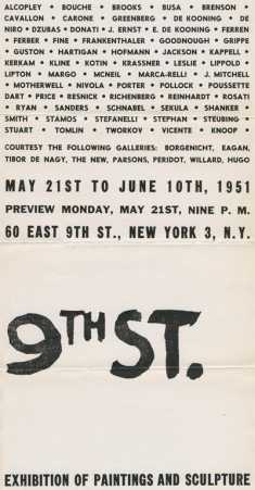
Fig.5
Franz Kline
Poster for the exhibition Ninth Street, New York, 1951
Print
© ARS, NY and DACS, London 2017
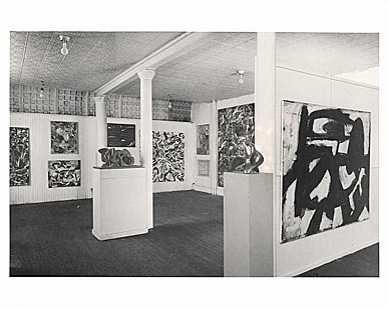
Fig.6
Aaron Siskind
Installation view of the Ninth Street exhibition, New York, 1951, showing Franz Kline’s painting Ninth Street 1951 on the right-hand wall
Leo Castelli Gallery Records, Archives of American Art, Smithsonian Institution, Washington, D.C.
Kline made use of his press rarely, but did so with high impact.29 The comic Christmas card that he produced in 1939 (fig.3) testifies to his talents in illustration and printmaking: a trampish man, scratching his head in confusion, wears a sandwich board advertising the clearly unsaleable ‘CHRISTMAS CHEER’ from Kline’s address. The Christmas card doubles as a business card, as if cheer were Kline’s line of work. Even though it did not support him financially, Kline’s press facilitated his professional ‘breakthrough’ and his position in the abstract expressionist movement: Kline created both the brochure for his first one-man show at the Charles Egan Gallery in 1950 and the poster for the landmark Ninth Street show of the New York School in 1951 (figs.4 and 5). Thanks partially to his printing press, Kline assumed a leading role in the latter exhibition, which he helped to co-organise. His painting Ninth Street 1951 (private collection) would be installed in a prominent position in this exhibition (fig.6).
The question remains, therefore, as to why Kline seemingly disavowed any artistic connection to printmaking by the mid-1950s. It may have risked compromising his success as a fine artist, especially given his black and white painting style. Printmaking threatened to offer a reductive and diminishing lens on his artistic achievement as a painter, since there remained a hierarchy of media wherein painting was the most esteemed. Kline seems to have kept his distance, for instance, from Stanley William Hayter’s Atelier 17, where several abstract expressionists, notably Jackson Pollock, experimented with printmaking.30
‘A sign you can’t read’
Kline’s printmaking arguably had an impact on the reception of his painting. The brochure for Kline’s first solo exhibition at the Egan Gallery, the cover of which bore his full name rendered in black strokes of paint that mimicked his paintings, could have encouraged the interpretation of his first black and white paintings as text, or calligraphy, a reading that gathered remarkable critical consensus. In Art News in 1950, Gretchen T. Munson observed that: ‘Franz Kline’s huge black symbols, surrounded by their white background, at first appear like inflated characters lifted from Chinese calligraphy.’31 In the same year Stuart Preston referred to Kline’s paintings as ‘calligraphic patterns’ in the New York Times.32 In 1951 Paul Brach wrote in Art Digest: ‘The impact of stark unrelieved black and white gives a looming imminence to this artist’s huge calligraphic canvases.’33 Over the course of the 1950s this theme would dominate Kline criticism, as Eugenia Bogdanova-Kummer explores in this In Focus.34
Not only was Kline’s professional breakthrough served by his printmaking, but the print as a medium arguably also influenced his artistic breakthrough. An argument has been made in this In Focus for the significance of Elliott and Fry’s photograph of Nijinsky, which was likewise a print, but another one can be made for that of the telephone book pages on which Kline produced most of his drawings leading up to his breakthrough.35 Art historian Robert Goldwater has argued that the origins of Kline’s paintings, in which ‘the blacks and the whites – for there are many – play with and against each other across a total surface’, can be documented in Kline’s telephone book sketches, ‘where the print pattern prevents any mistaken perspective recession’.36 Kline used telephone book pages because unlike paper or even more so canvas, they were readily available and free. Kline recalled: ‘I could go through the whole telephone book in one night’.37

Fig.7
Franz Kline
Untitled 1951
Ink on telephone book page on board
286 x 229 mm
Museum of Modern Art, New York
© ARS, NY and DACS, London 2017
Contemporary interpreters had regarded the extreme tonal contrasts of Kline’s paintings as varieties of illegible script. As Kline once put it, ‘instead of making a sign you can read, you make a sign you can’t read’.38 In its courting and yet denial of legibility, this is a deliberate form of abstraction that plays with the limits of vision. Kline’s untitled telephone book drawing from 1951 (fig.7), for instance, seems to be a picture of myopia and hyperopia at once. The viewer is unsure if it is Kline’s ink drawing that is clearer or rather the print of the telephone book, because both are equally illegible. The drawing looks like a magnified misprint of an overly inked letter, while the support is a page full of very small fonts that is fuzzy from the distance at which a painting or drawing is normally viewed.
Kline’s act of drawing on telephone book print is interesting and important not only graphically, but also conceptually, as an abstract, corporate, banal and mass-cultural form of figuration. The telephone book lists the names, addresses and phone numbers of people and businesses within a given location. We can accept Kline’s explanation that he used telephone book paper because it was readily available, but this choice was also arguably aesthetic and conceptual. The pages of the telephone book constitute a specifically modern social space, in which individuals are arbitrarily arranged using the alphabet and made accessible to others. People are remarkably absent in Kline’s mature abstractions, in which the infrastructure of industry seems to be allegorised. And yet humanity is implicit, insofar as this industry is the product of and a testament to human ingenuity and labour. If there is a tension in the representation of human work without a human presence – for instance in Meryon, in which a historical figure is named in the title and yet absent in the painting – then this tension has an aggressive edge in Kline’s telephone book drawings: an individual, who is in principle just as anonymous as the graffitist, scrawls and scribbles over dozens of names, rendering them unreadable.
While illustration constituted the antithesis of both abstraction and expression for the abstract expressionists, who were influenced by European surrealism and Mexican muralism, Kline had a different point of origin and of view. He inscribed himself within an Anglo-American fraternity of illustrators, which constituted a family and a lineage. In the August 1936 letter to Ryan, Kline reported:
It’s no use going on ‘On how much I like London’ you can imagine it all. From every standpoint it’s great. Subject matter of all types and the home and working grounds of all our illustrator masters, Whistler, Abbey, May, etc. And if Sargent, Whistler and Abbey liked it enough to work here I certainly would be a Jerry Milliken if I wouldn’t.39
Kline’s pursuit of a professional career in illustration and move from Boston to London would differentiate him from his abstract expressionist peers. To fellow abstract expressionists – sophisticated, cosmopolitan New Yorkers who were tuned in to the latest news from the Continent and Mexico – Kline’s outlook on the world may have seemed traditional, even parochial. For Kline it meant that he did not share his peers’ inferiority complex, especially about French modernism. As Elaine de Kooning recalled: ‘While young Americans in the late thirties were reacting variously to School of Paris and Mexican art, Franz was in London, poring over the work of English and German graphic artists and cartoonists with their references to Daumier, Blake, Fuseli, Rowlandson, Dürer and Goya, and collecting old prints of the Japanese.’40 As we have seen, Kline’s knowledge of printmaking was vast and deep, informed by his study of original prints and books in London museums and dealerships. His travels abroad and deep immersion in English culture, including its popular appreciation of prints, markedly distinguished Kline’s early artistic influences from those of many of his abstract expressionist peers.