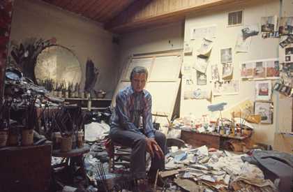
Francis Bacon’s studio with his last painting, possibly the beginnings of a portrait of George Dyer, on the easel 1992. Photo: Perry Ogden Hugh Lane Gallery © The Estate of Francis Bacon, all rights reserved, and DACS, 2008
Linda Nochlin on Triptych May–June 1973

Francis Bacon
Triptych May-June, 1973
Oil on canvas, 198 × 147 cm
Collection of Esther Grether
For me, realism is an attempt to capture the appearance with the cluster of sensations that the appearance arouses in me. As for my latest triptych and a few other canvases painted after I re-read Aeschylus, I tried to create images of the sensations that some of the episodes created inside me.
I could not paint Agamemnon, Clytemnestra or Cassandra, as that would have been merely another kind of historical painting when all is said and done. Therefore, I tried to create an image of the effect that was produced inside me. Perhaps realism is always subjective when it is most profoundly expressed. When I look at grass, sometimes I feel like pulling out a clump and transplanting it inside a frame, but of course that would not “work”, and we are rightly forced to invent methods by which reality can force itself upon our nervous system in a new way, yet without losing sight of the model’s objectivity.
Francis Bacon, letter to Michel Leiris, 20 November 1981
Francis Bacon created this ambitious Triptych in May and June of 1973. In the artist’s terms, as scrupulously articulated in the letter to the French critic Michel Leiris cited above, it is certainly a realist work, although it hardly corresponds to less personal definitions of realism. Its iconography refers to a real event, the death of his lover; its mode of expression to the visceral profundity – Bacon’s reality – of the effect produced by this terrible occurrence.
It was in the late 1960s and 1970s that Bacon created his series of triptychs, not all of them completely successful, but many of them powerful and disturbingly original. According to the French theorist Gilles Deleuze in his Francis Bacon: Logique de la sensation (Francis Bacon: the Logic of Sensation, 1981), the triptych form enabled the artist to engage with the human figure without being drawn into the conventional storytelling mode. “It’s not only that the painting is an isolated reality, and not only that the triptych consists of three isolated panels and the fundamental rule that they never be united into a single frame: it’s rather that the Figure itself is isolated in the painting… And Bacon has often told us why: in order to avoid the figurative, illustrative and narrative character that the Figure would necessarily assume if it weren’t in isolation.”
In this work, however, one of the most memorable of the great triptychs of the 1970s, Bacon is less set than usual on staving off the demon narrative. Here, contrary to Deleuze’s assertion that the form serves an isolating function, it seems to me that the images beg to be read as a story, from left to right. And the story, at once personal and melodramatic, is riveting: the suicide, just before the opening of a major retrospective of Bacon’s work in 1971–2 at the Grand Palais, of George Dyer at the Hôtel des Saint-Pères in Paris.
The ignoble furniture of daily recuperation – the toilet, the sink, the starkly singular light bulb – become the instruments of Dyer’s Passion. To the left, he shits; to the right, he vomits; in the centre, he hovers against the black background, which is transmuted into a giant shadow, his shadow. In the opaque darkness, death itself assumes the form, however inchoate, of a giant bat, a consuming demon, a revenging angel. Sex, death and the throes of creation are at one here, as Jean-Claude Lebensztejn pointed out in a brilliant catalogue essay for the 1996 Bacon retrospective at the Centre Pompidou, an extended analysis of the recurrent squirt of white paint streaking across the surface of many of the artist’s most intense canvases of the period. Figured as a kind of materialised sexual spasm, a jet of sperm, the white spurts up in the final, right-hand image of the triptych, in which Dyer, who has overdosed, spews up his soul into the hotel washbasin.
Why this persistent “fear of narrative”, permeating not only Bacon’s own statements about his work – “ I could not paint Agamemnon, Clytemnestra or Cassandra, as that would have been merely another kind of historical painting when all is said and done” – but most of the critical analyses of his work, both pro and con? Almost everyone who has discussed Bacon – most prominently Deleuze, but David Sylvester as well – hastens to defend the artist from charges of illustrativeness, calling attention to his anti-narrative strategies, strategies in which the format of the triptych, the isolation of the human figure and the patent flatness of the pictorial siting play an important role. Yet if one examines the formal structure of Triptych – May–June 1973, one cannot help but be struck by Bacon’s deliberate effort to create connection among the three images, rather than isolation of the individual elements. The human protagonist at various stages of his dying is bound to his tragic fate by the repeated vertical counterpoint of the architectonic framework of wooden panelling, a motif that plays against the dynamic curvilinear interjections of the human form and its appurtenances, and is bracketed at either end by a realistic light switch and wire, such as might be found in the Hôtel des Saints-Pères and marks the event’s specific time and place. The story is narrated in terms of this structure, its sequential agonies staged against the repeated greyish blankness of the rug at the bottom of each panel. Certainly in terms of Bacon’s definition of realism, it is a realist work, but, to me, it is a realist narrative as well.
Anti-narrative defensiveness is understandable enough in the context of the heady days of Abstract Expressionism (which Bacon ostensibly hated, but which obviously exerted a certain seductive power on his formal language), an era when “illustration”, “decoration” and “narrative” functioned as the signs of artistic failure. Nobody, however, really explains just why illustration and narration are such terrible sins, temptations to be avoided at all costs. After all, British art, from Hogarth to the Pre-Raphaelites and beyond, has had a considerable positive engagement with narration – and often narration in the service of morality at that.

Francis Bacon
Triptych August 1972
(1972)
Tate
Perhaps that is why Bacon and his supporters have been particularly keen to separate the artist from this tradition, to make sure that he is seen and judged as a player in the game of international modernism, as a painter whose formal inventiveness and up-to-date kinkiness and anguish sever his work completely from all connection with the fuddy-duddy past of British pictorial history. But this would be a shame, especially in the case of the 1973 Triptych and some of the other ambitious works relating to it, such as Triptych – In Memory of George Dyer 1971, or Triptych – August 1972, also three-part pictures, recalling, however dimly, the religious triptychs of Christian art.
Almost from the beginning, Bacon’s work has been engaged with temporality, making, at the very least, a flirtation with narration almost unavoidable. Or one might say, more accurately, that Bacon’s imagery, his considerable formal gifts and his technical bravura have been harnessed to change – sexual struggle, the metamorphosis of man into meat, or vice versa; the disruption or coagulation of the structure of face and body, the blatant reduction of the dignity of the human form into a trickle or a puddle of paint; and, at the end, time’s grimmest depredation: the horror, bestiality and meaninglessness of death itself.
Milan Kundera
For a long time, Francis Bacon and Samuel Beckett made up a couple in my imaginary gallery of modern art. Then I read the interview Bacon did with Michel Archimbaud: “I’ve always been amazed by this pairing of Beckett and me,” Bacon said. “I’ve always felt that Shakespeare expressed much better and more precisely and more powerfully what Beckett and Joyce were trying to say.” And then later: “I wonder if Beckett’s ideas about his art haven’t wound up killing off his creation. There’s something at once too systematic and too intelligent in him, that may be what’s always bothered me.” And again: “In painting, we always leave in too much that is habit, we never eliminate enough, but in Beckett I’ve often had the sense that as a result of seeking to eliminate, nothing was left any more, and that nothingness finally sounded hollow.”
When one artist talks about another one, he is always talking (indirectly, in a roundabout way) of himself. In talking about Beckett, what is Bacon telling us about himself? That he is refusing to be categorised. That he wants to protect his work against clichés. Next: that he is resisting the dogmatists of modernism who have erected a barrier between tradition and modern art as if, in the history of art, the latter represented an isolated period with its own incomparable values, with its completely autonomous criteria. Whereas Bacon looks to the history of art in its entirety; the twentieth century does not cancel our debts to Shakespeare.
And further: he is refusing to express his ideas on art in too systematic a fashion, fearing to stifle his creative unconscious; fearing also to allow his art to be turned into a kind of simplistic message. He knows that the danger is all the greater because art is now clogged with a noisy, opaque logorrhoea of theory that prevents a work from coming into direct, media-free contact with its viewer (its reader, its listener). Wherever he can, Bacon therefore blurs his tracks to throw off interpreters who try to reduce his work to an over-facile programme: he bridles at using the word “horror” with regard to his art; he stresses the role of chance in his painting (chance turning up in the course of the work – an accidental spot of paint that abruptly changes the very subject of the picture); he insists on the word “play” when everyone is making much of the seriousness of his paintings. People want to talk about his despair? Very well, but, he specifies immediately, in this case it is a joyous despair.

Francis Bacon
Self-Portrait 1973
Oil on canvas
35.5 x 30.5 cm
Photo: Crane Kalman Gallery, London The Bridgeman Art Library Private collection
From the reflection on Beckett quoted, I pull out this remark: “In painting, we always leave in too much that is habit, we never eliminate enough…” Too much that is habit, which is to say: everything in painting that is not the painter’s own discovery, his fresh contribution, his originality; everything that is inherited, routine, filler, elaboration considered to be technical necessity. Almost all great modern artists mean to do away with “filler”, do away with whatever comes from habit, from technical routine, whatever keeps them from getting directly and exclusively at the essential (the essential: the thing the artist himself, and only he, is able to say). So it is with Bacon: the backgrounds of his paintings are hyper-simple, flat-colour; but in the foreground, the bodies are treated with a richness of colours and forms that is all the denser. Now, that (Shakespearian) richness is what matters to him. For without that richness (richness contrasting with the flat-colour background), the beauty would be ascetic, as if “put on a diet”, as if diminished, and for Bacon the issue always and above all is beauty, the explosion of beauty, because even if the word seems nowadays to be hackneyed, out of date, it is what links him to Shakespeare.
Like Bacon, Beckett had no illusions about the future, either of the world or of art. And at that moment in the last days of illusions, both men show the same immensely interesting and significant reaction: wars, revolutions and their setbacks, massacres, the imposture we call democracy – all these subjects are absent from their works. In his Rhinoceros (1959), Ionesco is still interested in the great political questions. Nothing like that in Beckett. Picasso paints Massacre in Korea 1951. An inconceivable subject for Bacon. Living through the end of a civilisation (as Beckett and Bacon were or thought they were), the ultimate brutal confrontation is not with a society, with a state, with a politics, but with the physiological materiality of man. That is why even the great subject of the Crucifixion, which used to concentrate within itself the whole ethics, the whole religion, indeed the whole history of the West, becomes in Bacon’s hands a simple physiological scandal. “I’ve always been very moved by pictures about slaughterhouses and meat, and to me they belong very much to the whole thing of the Crucifixion. There’ve been extraordinary photographs which have been done of animals just being taken up before they were slaughtered; and the smell of death…” To link Jesus nailed to the cross with slaughterhouses and animals’ fear might seem sacrilegious. But Bacon is a non-believer, and the notion of sacrilege has no place in his way of thinking; according to him, “man now realises that he is an accident, that he is a completely futile being, that he has to play out the game without reason”.
Bacon often spied on that workshop of the Creator; it can be seen, for instance, in the pictures called Studies of the Human Body1970, in which he unmasks the body as a simple “accident”, an accident that could as easily have been fashioned some other way, for instance – I don’t know – with three hands, or with the eyes set in the knees. These are the only pictures of his that fill me with horror. But is “horror” the right word? No. For the sensation that these pictures arouse, there is no right word. What they arouse is not the horror we know, the one in response to the insanities of history, to torture, persecution, war, massacres, suffering. No. This is a different horror: it comes from the accidental nature, suddenly unveiled by the painter, of the human body. © Milan Kundera.
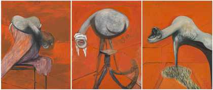
Hugh Davies on Triptych – May–June 1973
Triptych – May–June 1973 is Bacon’s tribute to his friend and lover George Dyer. I saw this painting in his studio over a number of weeks as it was being painted. At the time I was doing my doctoral dissertation on Bacon’s work, so I got to meet and talk with him many times during the course of 1973. The studio was small, so he could do only one panel at a time, and would lean the others against the wall.
This is more or less his record of what happened. In 1971 Dyer committed suicide on the eve of Bacon’s retrospective at the Grand Palais in the Paris hotel in which they were staying. Dyer overdosed from pills and alcohol and, from the evidence in the bathroom, he vomited in the sink. He was found slumped on the toilet. They had two bedrooms with an adjoining bathroom, so Bacon then painted the panels from different perspectives. One is from Dyer’s side and the other is from Bacon’s. He was very influenced by film as we know, and using the triptych format was a way of capturing time, but he wanted to avoid the obvious linear narrative, which is why he changed the order of events in the picture so you can’t read it from left to right. Dyer vomits in the right panel, and is dying, or dead, in a foetal position in the first panel.
When I was first writing about the work, Bacon was still alive, so we tended not to write about the fact that Dyer had committed suicide. People who have written subsequently have criticised me for making a literal interpretation of events, as they believed the artist was painting a metaphorical depiction of death. However, the reality is, I believe, that this painting is the most graphic narrative engagement he ever made. When I spoke to Bacon at the time, I might have expected him to be dispassionate about the event, and to talk about the painting in formal terms, but it was clear that he was deeply affected by it. The painting was, for him, a form of catharsis. He had said how extraordinarily unfortunate and sad the incident was, but not in terms of “oh, I wish I’d come back to the room a few hours earlier”. I felt that he thought there was a sort of inevitability about Dyer’s death.
Bacon painted two earlier triptychs that also deal with the subject, which to me are works that lead up to Triptych – May–June 1973. The first is Triptych – In Memory of George Dyer 1971, which is like an honest diaristic memory of him. In the centre panel you see Dyer turning a key in the door – a reference to T S Eliot’s “I’ve heard the key turn in the lock”. But, for me, it’s Bacon envisaging George returning to the hotel room. In the second, Triptych – August 1972, he has painted a grey section roughly in the centre of each of the three canvases. It resembles a wrestling ring, a platform or a theatre stage. The figures sit on the “stage”, projecting out to the viewer, their forms highlighted by the black background. However, in Triptych – May–June 1973 the figures have crossed the threshold and into the darkness, which I think was a very conscious decision on his part to represent Dyer’s passage into death. As for the two arrows that he painted in the bottom section of both the left and right panels, he said that these additions gave the figures a specificity and formality that he likened to police photographs. He wanted to make the paintings seem more clinically distanced. He also told me that the source of these arrows – aside from police photographs – were sports books, and in particular a golfing book by Jack Nicklaus. The illustrations of Jack playing out of various predicaments were embellished with blocky red arrows indicating the direction of the club and intended ball flight.
In a similar fashion, Bacon used the arrows in Triptych – May–June 1973 in an attempt to bring a form of professional objectivity to the painful process of both recording and coming to terms with the death of his partner. I think he managed to depict that loss with great honesty and empathy. It’s a singularly powerful, contemporary and cathartic depiction of the death of a loved one.
John Maybury on Love is the Devil: Study for a Portrait of Francis Bacon (1998)
I used to live in a squat in Queen’s Gate, Kensington, and on my way to art school I would often see Francis Bacon pottering about, as his studio was nearby. When I was researching the making of my film Love is the Devil, I would revisit his work. Actually, it didn’t require that much revisiting because he had been my hero since my student days. If you like Bacon, you tend to obsess about him. He was, and is, a part of my language, and I continue to use his work as a reference.
His paintings dictated the palette of Love is the Devil, the key colours being those of bone, blood and flesh. We couldn’t include either the actual paintings or direct quotes from Bacon in the film, which turned out to be an advantage, as it forced me to use the mechanics of filmmaking in a Baconesque way. Distorting mirrors – well, mirrors in general – which are such a central part of his work, leant themselves beautifully as a device within the film. It was also exciting that Bacon had such a cinematic approach to his own paintings – from being influenced by Eadweard Muybridge’s photographs of humans and animals in motion to the triptych format which made me think of Cinemascope. I wanted to get across a sense of that fragmentation that would relate both to him and his work.
I made a very deliberate decision to focus on George Dyer, Bacon’s lover, partly because the Dyer paintings were always my favourites and partly because his suicide played into the theme of Bacon as this dark painter. However, despite the darkness, I have always found an incredible beauty and affection in his work – words, I suspect, that he would have hated. Even in something as visceral as the figure of Dyer vomiting in the sink, Bacon manages to put across a poetry that is amazingly moving. In the film I gave one of the characters a line about the sensitivity of the brushstrokes in the Dyer paintings being like the caress of a lover. I do believe there is tenderness towards his friends and lovers in his paintings.
One of the things that came out of all the interviews and conversations that I did at the time was that very few people could tell me anything about Dyer. Few people liked him. They resented him and his closeness to Bacon. I think the same thing translated into John Edwards’s relationship too. So I deliberately portrayed Dyer as a character who was completely outside the whole Colony Room scene. He was an outsider in Bacon’s world on every level, but there was an intimacy between the two of them which nobody could penetrate. I think that’s what Bacon loved about him, and loved about John Edwards. They weren’t intellectuals or people who had much interest in his work.
When I made the film I can’t really say I got to know Bacon (I had met him at the Colony Room in 1980 when I was a young little punk, and found him terrifying). There were still enough of his friends alive to talk about him to give a degree of insight, but he was almost sphinx-like in his ability to mislead and misinform, and he hated people talking about his work. So the mythology around him is thick and dense. There was a kind of dark, sarcastic witticism at large with all those people, and Bacon in particular.
I think he was very much of his time, in that up until 1967 he was carrying out illegal practices and actually making very public statements about it in his painting. For example, the beautiful picture of two men on a mattress, Two Figures 1953, is clearly a homosexual image. But beyond that, he’s certainly not a gay artist. That point was very much top of my agenda in Love is the Devil. I got a lot of criticism from the gay community about this – but I was insistent that this isn’t and wasn’t a gay film, because there was no such thing as “gay” in that sense, and “homosexual” was something else, even, at that time.
Mark-Anthony Turnage

Francis Bacon
Study after Velazquez’s Portrait of Pope Innocent X 1953
Oil on canvas
153 x 118 cm
Photo: Michael Tropea, Chicago Purchased with funds from the Ciffin Fine Arts Trust © Nathan Emery Coffin Collection of the Des Moines Art Centre, Iowa
I knew about Bacon’s work from a young age. I voraciously read everything about him, in particular the interviews that he did with David Sylvester. I’ve never marked up a book in the margins as much as that one. I agreed with the ideas about process that Sylvester and Bacon discussed, and it correlated with what I was thinking about in my music at that time.
In 1985 I went to see the Bacon retrospective at Tate and was so knocked out by it that I went back several times. I became obsessed with his paintings. I’m not sure why; it was a strange combination of feelings. Despite the gruesome imagery, I thought his work was beautiful and visceral, and that really stimulated me. As well as the classic triptych Three Studies for Figures at the Base of a Crucifixion c.1944, I liked the series of paintings of the screaming popes based on Velázquez’s Portrait of Pope Innocent X. In the exhibition they showed three in a row, so they also looked like a triptych. The open screaming mouth in some of them implies something vocal – but, of course, we don’t hear anything. I found that very powerful. I knew that Bacon was obsessed by mouths – he sourced images of diseases of the mouth from medical books, but he had also been influenced by the image of the screaming nurse in Eisenstein’s Battleship Potemkin (1925).
I stored up the title of “screaming popes” in my head, but it would be three years before my thoughts and ideas would turn it into music. I had originally contemplated doing a requiem, and then I thought about writing a piece which distorted a set of Spanish dances, in the same way that Bacon had distorted Velázquez, but in the process of writing it, the dances – a bit like the first layers of paint being put on canvas – became so submerged in the other textures of the music that only a faint trace is visible. I ended up doing something more spontaneous. What I hope that comes across is the coloured intensity and emotional immediacy of his paintings.

Francis Bacon
Blood on Pavement 1988
Oil on canvas
198 x 147.5 cm
Courtesy private collection © The Estate of Francis Bacon. All rights reserved
I met Bacon twice in 1987, both times with my teacher Hans Werner Henze, who had commissioned me to do an opera for the Munich Biennale festival – Greek, based on Steven Berkoff’s East End reworking of the Oedipus myth. I was meant to ask Bacon to design the set for Greek, but I just knew he wouldn’t say yes. Instead, we got drunk. I was terrified, and completely in awe of him. Several years after that, another one of his works – a late painting from 1988 called Blood on the Pavement – was the influence for a movement in my piece Blood on the Floor. His works have stayed with me.
Chantal Joffe

Francis Bacon
Figure in a Landscape
(1945)
Tate

Francis Bacon
Dog
(1952)
Tate
The first Bacon picture I saw was Study of a Dog 1952 at what is now Tate Britain as a seventeen-year-old teenager. I tried to paint a version of it, thinking it would be easy, but of course it wasn’t. The composition reminded me of the view out of the bay window in our house. I liked it because he was painting everyday things. Several years later, when I went to art school, I wanted to be Bacon, to be closer to him in some way. He always painted on the unprimed backs of canvases, so as a student I would paint on canvas that had only been sized with rabbit skin glue. It made the paint seem fresher, and I liked the touch of it on the canvas, as you got seepage into the surface that you don’t get with acrylic paints, for example. I also liked the directness of his method. I learned that in the middle of doing one painting, Figure in a Landscape 1945, he picked up dust and fluff from the floor and pressed it into the canvas.
I think Bacon used colour to great effect: black, purple, cobalt blue, egg-yolk yellow. In Lying Figure with Hypodermic Syringe1963 the figure has been flattened out with pink and yellow colours. When you see one of these paintings from a distance, there is a seductiveness, a creamy beauty about the colours – especially those beautiful tangerines. But then when you see it close up, everything seems more destructive.
Bacon managed to balance his art well. As well as the seemingly spontaneous approach to his painting, he depicted scenes that gave a sense of control – figures in cages and enclosed spaces. I think he reinvented space for an artist. He was able to conjure a specific place or time without using a kind of realistic linear language, placing the viewer above, so it’s almost like looking down into a floodlit operating theatre. Often the spaces appear circular, rather than ones that you might read from left to right. A good example is Portrait of Isabel Rawsthorne Standing in a Street in Soho 1967. Even though it’s based on a real place, he has re-imagined it. When you look at other artists at that time, their sense of space was much more turgid. In one sense, Bacon is a figurative painter without being a realist, but his spaces feel incredibly real. He never strays into the territory of whimsy or mannerism.
Rudolf Stingel
I don’t remember when I first saw Bacon’s work, and honestly, I never really thought that much about it. Obviously, I knew about it, had seen it and respected it. It was only recently, as I started doing my own self-portraits, that I began to run into Bacon, or he began to run into me. It was as if I had found myself in a place similar to where he was. His work became something that I had to deal with somehow; to navigate around or take on. So I decided to take him head-on; to do Bacon as I would do Bacon, to remake him as I would make him, only to amplify and isolate further the same thing in my own language, in the same way musicians do a cover song, to play it air guitar. I don’t really know how to explain the decision I made in remaking his work; I bought all the Bacon books I could find, and found the image that resonated the most. And then I distorted it until it was my own image, until it was no longer in my way. The cliché is to kill the Buddha when you meet him on the road, so I suppose this is just the corpse of that Buddha.

Rudolf Stingel
Untitled 2007
Acrylic on canvas
336 x 827 cm
Courtesy Sadie Coles HQ, London © Rudolf Stingel
Nigel Cooke on Study for a Portrait of van Gogh VI 1957 and van Gogh in a Landscape 1957
These two paintings are from a larger group of “assaults” on van Gogh produced in 1957. Bacon works the Dutchman over thoroughly in the riveting series, throwing up a vividness of colour and handling rarely seen elsewhere in his output. There is a magnetic ambivalence to these works that sees Bacon squeezing out his own twisted homage from the contrary need to bury Vincent’s ghost in paint. The man himself is scarcely a shadow, a comical little black spider in a web of expression, which is the trace of Bacon’s drive to compress the space and make it his own. Although we get to see him up close, he is featureless; carbonised under the glare of the sun (Vincent’s own personal obsession), this charred multi-legged thing with his textbook straw hat and wretched easel has been supplanted by the language he himself set in motion 70 years earlier, on his daily pilgrimage to paint out in the fields and streets surrounding his little yellow house.
Pillaging for his own ends, Bacon’s “portrait” despatches van Gogh to an elsewhere of painterly rivalry, mad brushwork and screaming colour. Picasso went after Velázquez’s Las Meninas 1656 in his way too, squaring up to Velázquez at ground level like a boxer; Bacon is more pitiless, an assassin – we see the painter from an aerial distance as though through a telescopic sight. Bacon’s vulnerable quarry is loaded up with painting gear and dwarfed by a vigorously painted grassy arena. The speed of the painting is all here – in the grass.
Bacon’s journey through painting is a story of manual thought, a narrative at the intersection of action and image. The grassland that threatens to engulf Van Gogh is the paint speaking on its own terms, scrubbing up an amalgamation of both natural space and human energy. This is the forerunner to Bacon’s “clear and precise” abstraction, as David Sylvester called it, the formally defined zone of action that exerted such strange pressures on his bodies in later years. Yet the trapezes and arenas are present in the van Gogh series in a surprising way. Bacon has imported his London-made, circus-like arena into Van Gogh’s Arles.
A reproduction of the painting Vincent made of himself on the road with painting kit and straw hat in 1888 is the starting point for Bacon’s picture, yet the highway has been warped into a bowl-like mini-stadium. The road to Tarascon, a linear dirt track that took van Gogh to many of his favourite painting sites from the house he shared for nine weeks with Gauguin, has been bent into an inescapable ring, the flatness of which recalls the interest in oriental art shared by both van Gogh and Bacon. We get the sense of a Beckett-like habitual routine being ground out, a clockwork daily round on a provincial scale. Bacon has created a feedback loop of this dirt road that amplifies the agony Vincent faced when tackling the impossible project of recording his sensations on canvas. In this florid and critical painting series, the daily slog of Vincent’s painting routine is parodied in an infinite return to the site of disappointment. In this way, Bacon’s van Gogh paintings represent one of twentieth-century art history’s most passionate, if slightly sadistic, back-handed compliments.
Barnaby Furnas

Francis Bacon
Jet of Water 1988
Oil on canvas
198 x 147.5 cm
Collection of Mr and Mrs J. Tomlison Hill © The Estate of Francis Bacon
I went to an arts high school. My painting teacher would bring books of his favourite artists for us to look at for inspiration. Bacon was an instant hit – he is probably the first contemporary artist I felt I could understand. His combination of visceral subject matter and magic painting style – a style so slick as to make accidents appear perfect. For a teenager who has pulled the wings off flies and poked at road kill, Bacon’s horrifying beauty fitted perfectly into my primal scream phase – his screaming popes echoed my screaming hormones. The paintings should be corny – maximum subject matter delivered with maximum skill. The wonder of them, I think, lies in their perfection – they look found, they are so perfect. There is a seeming absence of intentionality in their making, which is why I think they are so hard to copy and why the images startle, as if glimpsed out of the corner of the eye.
In graduate school, while casting about for a way to begin painting again, I came across Jet of Water 1988. The jet of water is not painted in a conventional sense, rather it’s splattered à la Jackson Pollock – it must have been done flat (no?) – which is analogous to the way real water would behave. This suggested to me the possibility of a kind of material realism, found in the employment of paint itself. Making paint a voodoo substance in its own right, devoid of the need to capture an image, which, as Bacon has said, was photography’s job anyway. This is why I think his paintings resonate so terribly, and, of course, we are fascinated by what scares us. This is why pictures of something so horrible can become so ravishing and is a big part of how a spectacle (capital S) works. A spectacle offers a safe glimpse of death, a safe perch. It’s also what a photograph does. Bacon talks a lot about loving photography, but it seems telling to me that he would treat them so harshly in his studio. It is as if he had to kill them to get his paintings to exist.
Peter Doig
I first saw Bacon’s work in reproduction – I was painting and decorating a home in late 1970s Cabbagetown, Toronto, and I leafed through a coffee-table book. I was surprised, shocked and excited by what I saw. There was an immediacy and aggression to the work that was appealing to my adolescent self; paintings that included sinks and toilets, hypodermic syringes, swastikas, blood and flesh. There seemed a cockiness and swagger in his relation to his subjects, and his photographic source material was alarming and daring and sometimes disturbing. Seeing this as a young artist (seventeen years old), he appeared to be looking in very unlikely places for painting material.
The immediacy of his work is partly because he has such a strong sense of design. Not just in the way he frames and glazes his works, but especially in the settings he creates within his paintings – these rooms and spaces where the activity takes place. Bertolucci picked up on this and used this room idea in Last Tango in Paris. The background setting is often very precise and designed, whereas the figures are where all the action and painting takes place. I don’t think Bacon could really draw, but he could really paint, and although there is control, he also seems able to do this by any means necessary when it comes to his figures. Having said this, I think he also has the ability to find the appropriate way to describe whatever he needs to in paint; be it grass or an umbrella, he makes it work without killing it. His painting technique seems wholly evolved out of his own acts of trying; even when he famously makes reference to other artists’ works, his language remains his own – one that he has invented.
Up until the van Gogh paintings, Bacon seemed to be a tonal painter. In this series he starts really to work with colour. These are some of my favourite works of twentieth-century painting. After this, his colour palette appears to become more distinctive and considered. He is certainly the best ever painter to use orange – although when I first saw the cricket paintings, I found them repulsive. The stumpiness of them. In the end, I think the colour is electrifying, and he uses it in a way to draw you into the picture so that you almost no longer are aware of it being a colour.