Natalya Goncharova
Linen
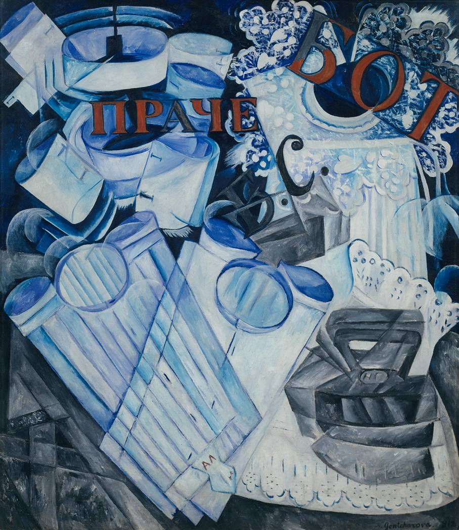
Transcript
Structurally, Linen can be divided vertically in half. On the right hand side of the painting are all the items of female linen while all the men’s clothes are on the left. As a couple, many of Goncharova and Larionov’s views would have been seen as radically different to the accepted social norm, including, for example, a belief in free love. So it is interesting to note that the iron is not just situated on the female side of the image but is also inscribed with Goncharova’s initials, indicating perhaps that Larionov’s views on the division of domestic duties were somewhat more conventional.
However, even if the division of labour in this painting is traditional, its appearance in 1913 was not. Rayonism was an early form of abstract art. Its manifesto stated that every object reflects rays of light and rays emanating from different objects intersect each other. Rayonist artists believed that it was their role to reveal not just the rays themselves, but also the forms created by the intersecting rays in the spaces between objects. The appearance of Rayonist paintings can be quite similar to early Cubist paintings as forms are broken up, rearranged, repeated and often shown from various different viewpoints. Consequently objects seem to quiver on the surface of the canvas and this sense of movement combined with the repetition of forms also resembles the look of Italian Futurist paintings. However, where Futurism was interest in speed as a way of celebrating technology and modernity, Rayonism was principally concerned with light and space.
For viewers today, Linen contains a curious contradiction. A still life painting usually depicts objects that are timeless, such as fruit, bottles, furniture or musical instruments. However, Linen contains items of clothing and equipment that are strikingly ‘old fashioned’ and seem at odds with the radical, abstracted painting style. The men’s shirts are stiffly starched with button-on collars and stud cuffs, while the woman’s elaborate lace collar and apron indicate fashion from the early twentieth century. Equally, the iron is a solid cast iron type that would have been heated on a stove prior to pressing clothes. However, these items of historical curiosity do serve to highlight just how shocking this painting must have seemed to audiences in 1913.
In the top right corner of the picture is a very large and intricate lady’s lace collar, which billows out from the neck like elaborate petals. The lace is very fine and seems to be made up of a combination of floral and heart-shaped motifs. we can see through it to the cotton apron, part of which lies beneath.
Visible through the fine lace of the collar is a heavily pleated apron. It has a thick waistband and two long ties that hang parallel to the right hand edge of the canvas. The lower part of the apron is also overlapped. Toward the bottom of the canvas is another, larger piece of white cotton with a ruffles of broderie anglais lace along it’s top and bottom edge. It could be a blouse, or possibly a petticoat but it’s impossible to tell for certain.
The iron appears to sit on top of this third garment. The three items of women ’s linen have all been represented fairly naturalistically and from a single viewpoint. But there are traces of the iron’s presence in several different positions, each one only a slight shift away from the most clearly depicted view, which asserts itself through the shadowy mass of shapes and lines that surrounds it. In this view, the iron is seen roughly in profile, with its narrow point facing towards the centre of the painting and its blunt end toward the right hand edge. The triangular handle sits above a circular disc in the centre of the flat top of iron which carries not the manufacturer’s logo, but Goncharova’s initials (in the Cyrillic alphabet). Surrounding the iron like a quivering halo are multiple repetitions of its shape which seem to mimic the jerky movement of ironing itself. Two ghostly handles appear above the main handle, the pointed end of the iron is also duplicated and the deep sides of the iron’s base are repeated like a reflection below both the actual iron and its misaligned duplicates. In addition to these repetitions and placed below them is a two thirds view of the underside of the iron, resembling a burn mark on the linen beneath.
On the ‘male’ side of the picture, opposite the iron in the bottom left, is a man’s folded white cotton shirt. At the top of the shirt we can see the circular opening where a stiff collar would be attached. Either side of the collar are the smaller circular openings of the cuffs, which look slightly incongruous as the shirt sleeves themselves are not visible, having being folded behind the shirt. The shirt front has eight sharp pleats running in stiff vertical lines and in the centre at even intervals are three slits, which are the openings for the shirt studs to fasten the shirt together. At the bottom of the pleats is a diamond-shaped tab that would have fixed the shirt into the waistband of a pair of trousers, ensuring that the shirt stayed tucked in. The slit to fasten the shirt to the trousers is visible on the tab as are what appear to be Michel Larionov’s initials, embroidered in red.
The shirt is lying at a diagonal angle across the bottom left corner of the picture. Crossing it from the opposite angle is another shirt, more simply tailored than the first. It has no pleats on its front or tab at the bottom, although like the other shirt three stud apertures are present. The cuffs are more realistically portrayed and they appear slightly pinched at the edge as though joined with cuff links. The outlines that define both shirts overlap each other, so that neither one appears above or below the other. This second shirt also overlaps the lowest of the three women’s garments, straddling the two halves of the painting and uniting them.
Above the men’s shirts are two shirt collars surrounded by at least five cuffs. While the shirts below them give the impression of being viewed from above, it is a more side-on view with which we see the collars and cuffs, as if they are attached to invisible shirts running parallel with the surface of the painting. Similarly to the depiction of the iron, each cuff and collar has multiple silhouettes vibrating outwards like ripples in water.
Circles and semi-circles cover this painting. They are predominantly formed by the collars, cuffs and necklines of the shirts, but are subtly repeated in the patterns of the lace, the disc on the iron bearing Goncharova’s initials and in a number of semi-transparent soap bubbles that emerge from the background around the linen. In places they are distinctly painted as individual elements in the picture. Elsewhere they are barely present and only noticeable by the way they distort the shape or colour of an object seen through the bubble. These suds not only reinforce the laundry narrative, but also contribute to the pattern of circles across the whole canvas, binding the disparate objects and the two gendered halves of the painting. Our awareness of a circular pattern across the surface of the canvas works against any sense of depth the artist might have achieved through the use of perspective or layering objects. It serves to shift our focus to the realities of the painting’s production, an idea central to the thinking of many avant-garde artists at the beginning of the twentieth century and one which would ultimately lead to pure abstraction.
The background of the painting is in dark shades of grey-blue. The background in the bottom left corner is made up of splintered, geometric forms, whilst in the bottom right corner, around the lacy blouse or petticoat, the background is more blurred and smudged. These dark abstracted forms throw the central items of linen into sharp relief. Although predominantly white, Goncharova has used a lot of blue paint in her depiction of the clothing, so much so that the pleated shirt and the inside edges or the cuffs and collars are bright blue. However, when combined with the grey background, the effect of this blue is to make the white cottons appear crisp and clean, as well as hinting at the soapy water used in their washing.
The final element in this painting is the commercial lettering written in Russian across the surface of the canvas in red and dark grey-blue paint. The two sets of red letters are fragments of words associated with cleaning clothes. ‘Prache’ in the upper left part of the painting is from the Russian word for ‘laundry’, while ‘BOT’ in the upper right is probably part of ‘rabota’ which means ‘work’. The two dark letters in the centre of the painting are ‘b.s.’ which is an abbreviation of the term for ‘white wash’. All of these letters suggest commercial signage in a laundrette window. The choice of subject matter might not be entirely coincidental, since one of Goncharova’s ancestors founded the first linen factory in Russia. Like her Futurist colleagues, Goncharova was also interested in modern mechanical inventions and machinery, so the commercial laundry might have been a subject that attracted her for both personal and modernist reasons.
The year after Linen was painted, Goncharova designed a production of Le Coq d’Or for the Ballet Russes in Paris. It was received with much acclaim, attracted numerous commissions and in 1917 she made Paris her home until her death. In both her painting and her theatre designs, she was instrumental in bringing the ideas and innovations of the European avant-garde to Russia. At the same time, she brought her very Russian aesthetic which was influenced by folk art, woodcuts and icons, to the Paris-based artistic community. Goncharova was also unusual because as a woman, she broke the codes of accepted behaviour by being active in the artistic avant-garde. The response of the Russian establishment was to publicly ridicule her art in the press, calling it pornographic and even prosecuting her for indecency. However, her use of stencilled lettering, multiple viewpoints, a limited palette of colours and her fracturing and rearranging of forms, managed to synthesise elements of Cubism and Futurism in order to create Rayonism, and works that prefigure pure Abstraction.