As a colorist with a specialty in the psychology of colour, delving into artists’ works, especially their rationales for their colour choices, has always fascinated me. Agnes Martin’s work is particularly compelling, as her style has evolved dramatically over the years, imparting meaningful insights and clues into her choice of colour.
Although I did not know her personally, organising the research for this article has given me the opportunity to get a better understanding, not only of her work in colour, but a deeper glimpse into Agnes Martin as a person. Research invariably includes delving into books, catalogs, and various online resources; however, there are videotaped interviews conducted with Martin that gave me the greatest insight. Fortunately, they allowed me to both see and hear her express her own thoughts, philosophy, and emotions. What became immediately apparent is that Agnes Martin’s work is all about emotion, and one of the key components in expressing emotion is through the use of colour.
In her own words:
We respond to beauty with emotion.
Beauty speaks a message to us………the message is about different kinds of happiness and joy.
Beauty illustrates happiness: the wind in the grass, the glistening waves following each other, the flight of birds, all speak of happiness.
Indeed, joy and happiness, along with innocence, are recurrent themes that she spoke of frequently. She related to painting as a “kind of map” to your inner responses resulting eventually with a sense of calm and that painting is a key to the “art within you.”
To better understand her use of colour (or any other artist’s work) it does help to look into her background and upbringing. Some of the most meaningful insights came from her long-time associate and personal friend, Arne Glimcher, the founder of the Pace Galleries. In a videotaped interview, he spoke of her love for the water, as she was an avid swimmer and sailor in her younger years and even navigated canoes in Alaskan waters.

Pantone colour swatches
© Pantone
This could certainly have accounted for her dedication to blue, in many variations, including the greenish teal blues of a New Mexico mountain landscape from 1947, the very light blue biomorphic shapes in her early paintings, as well as her work with the India ink washes of the 1960s. In the ensuing years, the names of some of her other works employing variations of blue are evocative of both the hue and the mood portrayed, including: Falling Blue, Night Sea, The Wave, and Stars, plus a number of untitled works executed in blue.

Agnes Martin
Untitled 1965
Watercolour, ink and gouache on paper
© Estate of Agnes Martin/DACS, London, 2015
It is the latter part of her life when the “bleached out blues,” as they have been called, were used so poignantly with a number of other colours, most notably with rosy pinks, peach, salmon, and the palest yellows, demonstrating the inherent balance she attained so beautifully between the warmer embracing tones and the cooler tranquil blues. It is well-known that the artist suffered from schizophrenia and the juxtaposition of these subtle colourations, including her favored blue tones, might very well have brought her a soothing sense of order and peace.

Agnes Martin
Untitled #3 1974
Acrylic, graphite and gesso on canvas
Des Moines Art Center, Iowa

Agnes Martin
Untitled 1963

Agnes Martin
Happy Holiday (1999)
ARTIST ROOMS Tate and National Galleries of Scotland
Arne Glimcher also revealed a very personal note about Agnes Martin in that her favorite song was Blue Skies and for anyone unfamiliar with the lyrics, the blue skies are happily “smiling at me—nothing but blues skies, do I see.”
Again in her own words: “The clear blue sky illustrates a different kind of happiness and soft dark night a different kind. There are an infinite number of different kinds of happiness.”
At various times in her long career, she made ample use of black and white as well as variations of gray, especially within her work with geometric shapes. Perhaps this was an effort in some of her pieces to paint with a “vacant mind,” a deliberate attempt to exclude the possible distraction of more chromatic hues.
She also used warm browns, tans, and other earthy tones, as well as the golden yellow of the mesas and the desert sunlight, that spoke to her love of the New Mexican landscape, an area that she lived in during her younger years and returned to during the latter part of her life.

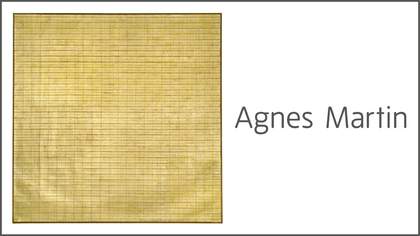
Agnes Martin
Friendship 1963
incised gold leaf and gesso on canvas
Museum of Modern Art, New York
In her body of work, there is the interesting dichotomy of her painting painstakingly within carefully measured lines, yet using unusually soft, diaphanous, and ethereal shades that seemed to float —the seeming contradictions of depicting a joyful, expansive feeling, yet containing her work within a rather rigid grid. This could very well be an interesting commentary on her structured Protestant upbringing as contrasted by the Zen Buddhist and Taoist philosophies that she ultimately embraced. She firmly believed that “spiritual inspiration and not intellect creates great work.”
In the words of art historian, Sister Wendy Becket: “No one who has seriously spent time before an Agnes Martin, letting its peace communicate itself, receiving its inexplicable and ineffable happiness, has ever been disappointed. Her work awes, not just with its delicacy, but with its vigor, and this power and visual interest is something that has to be experienced.”
I heartily agree.
Agnes Martin is on display at Tate Modern until 11 October 2015. Book tickets
Join the conversation #AgnesMartin