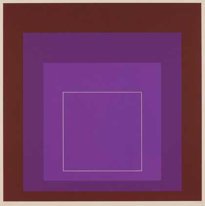
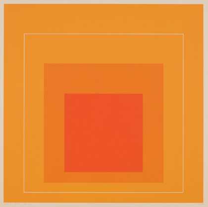
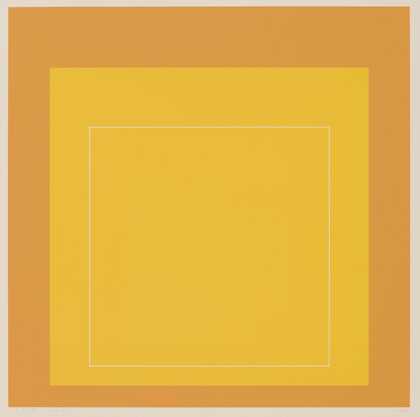
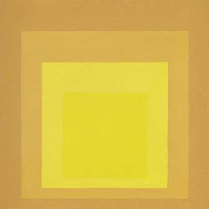
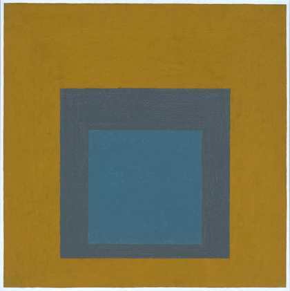
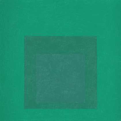
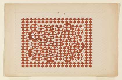
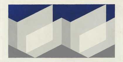
- Artist
- Josef Albers 1888–1976
- Medium
- Oil paint on fibreboard
- Dimensions
- Support: 762 × 762 mm
frame: 780 × 780 × 30 mm - Collection
- Tate
- Acquisition
- Presented by Mrs Anni Albers, the artist's widow and the Josef Albers Foundation 1978
- Reference
- T02310
Summary
Study for Homage to the Square: Beaming is an oil painting on fibreboard by the German artist Josef Albers. The painting shows a series of three quasi-concentric squares in varying shades of blue. The largest square is painted in bright blue and stretches to the outmost edges of the fibreboard. This large square contains within it a smaller blue painted square, darker and more muted in tone. This, in turn, contains a much smaller blue-green painted square. Set inside one another, these quasi-concentric squares seem to drift towards the bottom edge of the painting.
Study for Homage to the Square: Beaming was made while Albers was living in New Haven, Connecticut, his home from 1950 until his death. As its title indicates, the painting is a study for one of Albers’s Homage to the Square series of paintings, which he began c.1949–50. Albers made more than 2,000 of these paintings between 1949 and 1976 and there are four other examples in Tate’s collection (see Tate T00783, T02311, T02312 and T12215). This example is dated 1963 and therefore falls approximately in the middle of the series chronologically.
In this and other paintings in his Homage to the Square series, Albers investigates the interaction of colours with one another, adjusting hue, tone and intensity to explore optical effects. In his writings of the period Albers also examined the psychological effect of such optical experiences on the viewer. The paint was applied with a palette knife directly from the tube (with some exceptions) onto a panel prepared with a white ground. Isolated flat squares of colour give the illusion of receding or advancing. At times the isolated colours seem to fuse to generate new colours that appear to hover in front of the picture plane, leaving the viewer with after-images.
Albers’s pragmatic exploration of colour and form in the Homage to the Square series was accompanied in 1963 by his book Interaction of Color. The book offers ‘an experimental way of studying color and of teaching color’, in which Albers emphasises the practical exploration of colour above any theoretical concerns (see Albers 2006, p.1). For Albers, working with colour was about engaging with materials in a subjective manner: ‘as we begin principally with the material, color itself, and its action and interaction as registered in our minds, we practice first and mainly a study of ourselves’ (Albers 2006, p.52).
From 1908 to 1915 Albers worked as a schoolteacher. Following a period of illness in 1916, he trained in art schools in Essen and Munich. In 1920, a year after the Weimar Bauhaus opened, he joined as its eldest student and began teaching there in 1923. When the Bauhaus moved to Dessau in 1925, Albers was made a professor and taught Basic Design. Following the closure of the Bauhaus in 1933 and the rise of Nazism in Germany, Albers and his wife Anni moved to the United States to teach at the newly founded Black Mountain College in North Carolina. The couple left Black Mountain College in 1949, the same year that Josef Albers began his Homage to the Square series. In 1950 Albers was invited to teach in the Design Department at Yale University, where he remained until 1958.
These works, austere at first glance, deploy ‘minimum means for maximum effect’ (Albers quoted in Nicholas Fox Weber, ‘Josef Albers Paintings’, in Waddington Galleries 2009, p.5). Yet their precision and apparent simplicity belies the sensitivity behind their making. In his analysis of Albers’s correspondence with the poet Franz Perdekamp in 1916, Nicholas Fox Weber identified some of the crucial terms and ideas in Albers’s conception of the artwork:
When he wrote, in 1916, that he loved ‘the square and hard,’ he had no idea, of course, how prescient this was of the extraordinary body of art he would create on the other side of the ocean and after yet another world war. But the value system – the idea that ‘firm and wild’ is valuable, but that it has to grow from ‘warmth and softness’ are the essence of the spirit in which he painted the Homages. Albers believed that art work, while it should be done well and done carefully, fails if it lacks tenderness.
(Weber 2009, p.4.)
Further reading
Josef Albers, Interaction of Color [1963], revised and expanded edn, New Haven and London 2006.
Josef Albers: Paintings, exhibition catalogue, Waddington Galleries, London 2009.
Tone Hansen and Milena Hoegsberg (eds.), Josef Albers: No tricks, no twinkling of the eyes, exhibition catalogue, Henie Onstad Kunstsenter, Oslo 2014.
Beth Williamson
May 2016
Supported by Christie’s.
Does this text contain inaccurate information or language that you feel we should improve or change? We would like to hear from you.
Catalogue entry
T02310 Study for Homage to the Square: Beaming 1963
Inscribed 'A 63' br. and on back at top '6 x liquit - permt Bright Green (Grumbacher Inc) - Cobalt Green Lt (Lefebvre) - Cerul Blue (W&N) 63'; also on back 'Ground: 6 coats of liquitex (permt pigment) | painting: paints used - from center : | Permanent Bright Green (Grumbacher Inc) | Cobalt Green Light (Lefebvre) | Cerulean Blue (Winsor & Newton) | all in one primary coat | all directly from the tube | Varnish: BUTYL METHACRYLATE Polymer in Xylene | DANIEL Goldreyer LTD. JULY 1963'
Oil on masonite panel, 30 x 30 (76.2 x 76.2)
Presented by Anni Albers and the Josef Albers Foundation 1978
Exh: Josef Albers: Homage to the Square, Museum of Modern Art, New York, exhibition touring South and Central America, March 1964-August 1965, and US museums, October 1965-January 1967 (33) as 'Homage to the Square: Beaming'
This and the three paintings T02311, T00783 and T02312 belong to a very large series of square pictures and prints entitled 'Homage to the Square' on which Albers was working from 1949 up to his death in 1976. The works of this series are based on a compositional schema consisting of four squares nested together, symmetrically set within each other on the horizontal axis and asymmetrically placed below centre on the vertical in accordance with a rigid system of proportions. This can be seen in its complete form (sometimes known as format A) in T00783. However because of the need for greater quantities of a particular colour he frequently omitted one or other of the three inner squares. Thus there are some pictures, such as T02311 and T02312, in which the largest of these squares is omitted (format B); some such as the present work in which the intermediate square is omitted (format C); and some - though there is no example of this in the Tate - in which the small inner square is omitted (format D). Each area is painted in a single colour, the paint being applied with a palette knife direct from the tube to the panel as thinly and evenly as possible in one primary coat.
In a note on this series published in the catalogue of his 1965 exhibition at Gimpel Fils, London, Albers wrote:
'Seeing several of these paintings next to each other makes it obvious that each painting is an instrumentation in its own.
'This means that they all are of different palettes, and, therefore, so to speak, of different climates.
'Choice of the colors used, as well as their order, is aimed at an interaction - influencing and changing each other forth and back.
'Thus, character and feeling alter from painting to painting without any additional "hand writing" or, so-called, texture.
'Though the underlying symmetrical and quasi-concentric order of squares remains the same in all paintings - in proportion and placement - these same squares group or single themselves, connect and separate in many different ways.
'In consequence, they move forth and back, in and out, and grow up and down and near and far, as well as enlarged and diminished. All this, to proclaim color autonomy as a means of plastic organization.'
In a letter of 16 May 1966 to the Tate Gallery he added: 'Although the constant aim of my painting is color interaction caused by color interdependence - with other colors and factors as quantity, placement and shape - I continuously try to change the color instrumentation, that is the palette of my paintings, as often as possible ...
'In this endeavor, after the first very small color sketches, I usually execute the first paintings in sizes of 16 x 16" or 18 x 18". After that I enlarge them to 242 or 302and 322. And in each case as complete paintings.
'I do this to find out whether an increase of the outer scale, and consequently of the inner quantities, will increase the interaction of the colors used, which for a precise record are always listed on the back of the masonite panels (I prefer them to canvas as more durable and more wall-like).
'As to the term "Study for Homage to the Square": the stepping up in size often demands intervals of time - sometimes through years - for continued and repeated observation as to possible improvements, intensification.
'All preparatory studies up to the largest and last execution - the "widest stage of performance" - I call "Studies" which term is not used for the sizes of 40" 2 and 48" 2 (the latter is the largest square available in masonite) ...
'To explain the small white margin around my paintings: it is a characteristic of all my paintings. Because first I do not see an excuse to cover parts of a painting by a frame. Then, paintings are more than "cut outs" of nature, as seen through windows - without starts and ends.
'Furthermore I want my presentations (performances) - like any saying or story - to have distinct beginning and ending in left-right direction and opposite as well [as] down-up and opposite.'
Whereas T00783 is inscribed on the back 'Study for Homage to the Square: "Departing in Yellow"', the other three pictures [T02310-12] have no titles on the backs and were presented to the Tate by Anni Albers, the artist's widow, and the Josef Albers Foundation simply as 'Homage to the Square'. However the present work has a Museum of Modern Art, New York, loan label on the back with a number which identifies it as a picture lent to the travelling exhibition Josef Albers: Homage to the Square as 'Homage to the Square: Beaming'. The other pictures T02311 and T02312 do not seem to have been exhibited and it would appear that Albers never gave them subtitles.
Published in:
Ronald Alley, Catalogue of the Tate Gallery's Collection of Modern Art other than Works by British Artists, Tate Gallery and Sotheby Parke-Bernet, London 1981, pp.4-5, reproduced p.4
Explore
- abstraction(8,615)
-
- non-representational(6,161)
- formal qualities(12,454)
-
- symmetry(220)