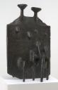
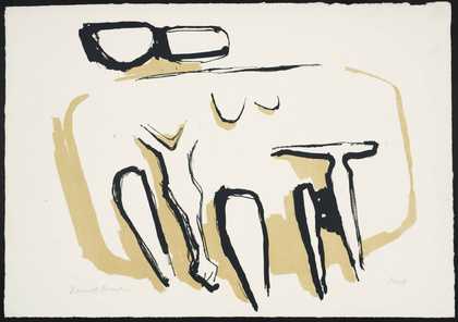
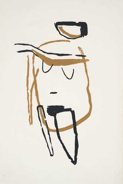
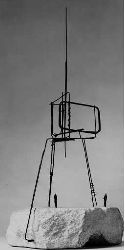
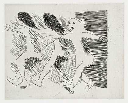
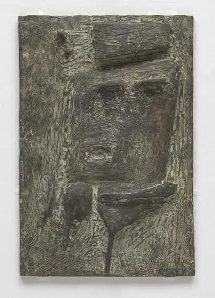
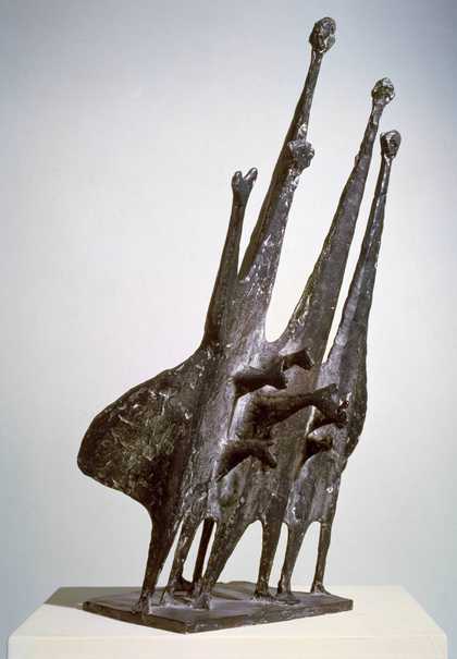
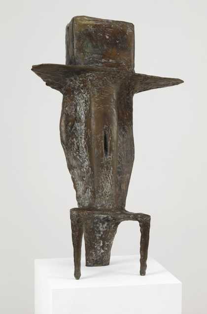
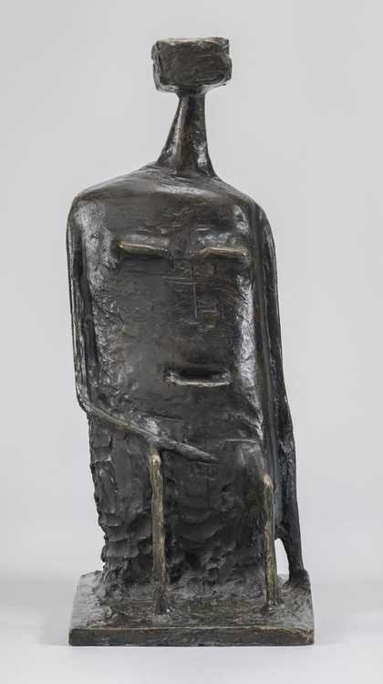
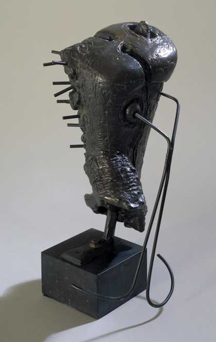
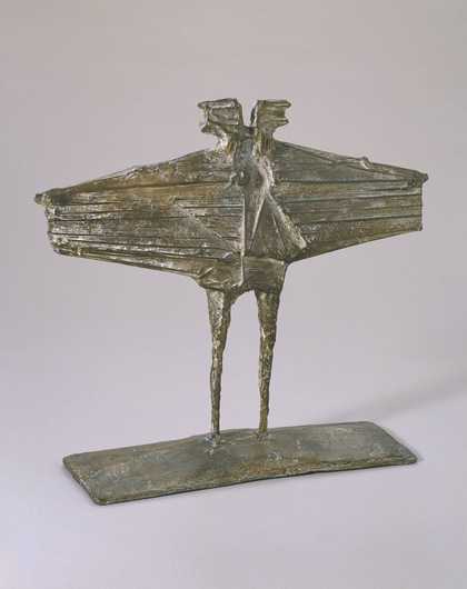
- Artist
- Kenneth Armitage 1916–2002
- Medium
- Bronze
- Dimensions
- Object: 1708 × 1086 × 1003 mm
- Collection
- Tate
- Acquisition
- Purchased 1971
- Reference
- T01268
Catalogue entry
Kenneth Armitage 1916-2002
T01268 Diarchy 1957
Inscribed ‘K.A.’ on reverse at lower left, with foundry stamp (a blank rectangle).
Bronze, 67¼ x 42¾ x 39½ (171 x 108.5 x 100.5).
Purchased from Marlborough Fine Art (Grant-in-Aid) 1971.
Exh: [the first cast] British Pavilion, XXIX Biennale, Venice, 1958, and many subsequent occasions; [this cast] Dix Ans d’Art Vivant 1955–1965, Fonda- tion Maeght, Saint-Paul (Alpes Maritimes), May-July 1967 (10, repr.).
Lit: Roland Penrose, ‘Artists of our Time’, VII, Kenneth Armitage, Bodensee, 1960, pp. 12–13 (Cast No. 1 repr. plate 22); Norbert Lynton, Kenneth Armitage, 1962 (repr.; no page numbers).
The artist owns some drawings for this sculpture. The maquette, measuring 30.5 cm. high and also dated 1957, was reproduced in the catalogue of the British Pavilion, XXIX Biennale, Venice, 1958. It is in an edition of seven bronze casts. ‘Diarchy’ was cast by Susse, Paris, in an edition of two, after which the plaster was destroyed. T01268 is the second cast; the first is in a private collection in the United States. ‘Diarchy’ is closely related to ‘Triarchy’, 1958–9(108 in. long; repr. Lynton, op. cit.). Both works deal with a theme with which by 1957 Armitage had been concerned for many years—the projection from a single, wall-like mass of the heads, breasts and limbs of more than one figure.
In answer to questions, the artist wrote (12 June 1971): ‘I seem always to make walls (still do) from inclination. Why I don’t know—nor want to. It might have something to do with liking immensely Cycladic carvings as a student before the war. A wall contains, divides or conceals — it isn’t even a reality and I have often wanted to add things to an endless or continuous surface. The out-facing frontality just might have something to do with work during the war although I can’t be clear on this. Because it was found I was good at these things (to my surprise and even embarrassment) I was asked to form a War Office training centre in Tank and Aircraft identification and I knew by heart the shape and detail of every tank and aircraft in existence and much of this training we did with silhouettes in three elevations. After 6½ years in the army I shut off all memory of it on leaving but have sometimes wondered if certain images lingered on in spite of this —sometimes wings or flattened shapes, or the irregular oval of heads or bodies (side elevation of tank track important means of identification)—in no way consciously for one tends to absorb shapes and impressions and then later regurgitate them without knowing why (I had three screens in my first studio 23 years ago). This doesn’t explain anything really or why the wall must be square or rectangular, can have a zig-zag plan like a screen but must never curve. I just accept it as an inclination of which I never tire...’ Commenting on the device of integrating more than one figure into a single mass: ‘An easily identifiable whole of utmost simplicity was what I normally needed ... I don’t believe there was any intention of making one [of the figures] female and one male — usually the very thing I tried to avoid was such obvious division (unless it suited me) my habit then (and now) being to amalgamate groups of figures into simple masses in which an indefinite number of limbs, sex appendages etc could then fully be used in a space game provided all were contained within the stable rigid corpus or envelope. The breasts are bigger on the side with no arms probably because there’s more space there.’
T01268 has ‘no connection at all so far as I know’ with Henry Moore’s ‘King and Queen ‘, but its hierarchical character might have been influenced by ancient Egyptian art: ‘before the war as a student, there being only rarely anything new to see and because direct carving was to be seen everywhere, one spent much time in the British Museum especially in the Egyptian galleries.’
‘The piece was made just before the 1958 Venice Biennale and the British Council, wanting to include it, pressed for a title although I couldn’t think of the right one. Somebody suggested King and Queen but I disliked this unintended meaning and anyway Moore had recently used it. I asked the British Council to refer to its big dictionary for alternatives and out of this came Diarchy which could also cover the similar three-headed piece Triarchy — it was open, less obvious & specific than King and Queen and therefore acceptable.’
T01268 is incised here and there with lines. ‘Diarchy’ and ‘Triarchy’ contained the largest plain surfaces that Armitage had yet made and he thus ‘perhaps felt it irresistible to make marks on the plaster, or allowed them to remain if they happened accidentally (they look deliberate). The piece is stiff and frontal and I may have felt it needed the looser marking. Over the years I made drawings and also sculpture often concerned with the same ideas. In the last four years I started combining drawing and sculpture, and all work now has blown-up images silk-screened or mounted on simple structures or shapes and I find this satisfying—all other works concerned solely with shape space or structure now look empty or lacking. The marks on Diarchy might therefore have been early fumbling towards this (it happened later from time to time).’
Published in The Tate Gallery Report 1970–1972, London 1972.
Explore
- abstraction(8,615)
-
- from recognisable sources(3,634)
-
- figure(2,270)
- actions: postures and motions(9,111)
-
- sitting(3,347)
- figure(6,809)
- government and politics(3,355)
-
- diarchy(1)
- government(24)