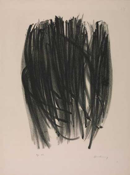
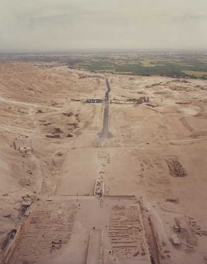
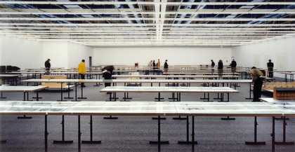
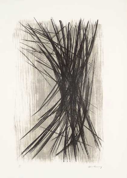
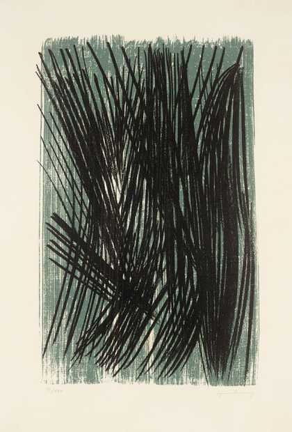
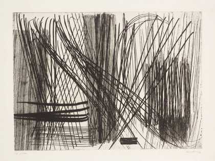
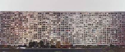
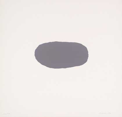
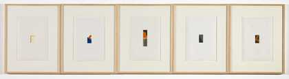
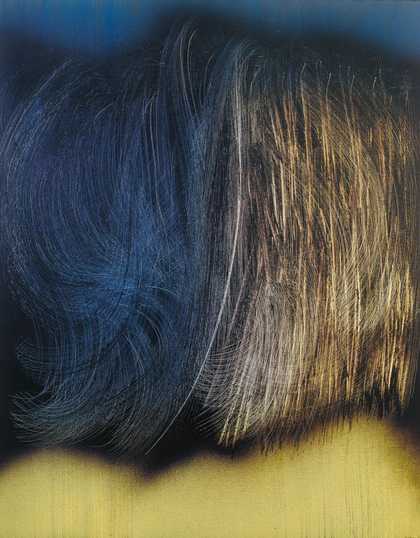
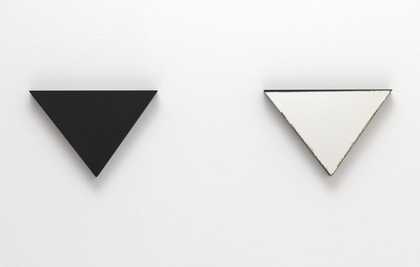
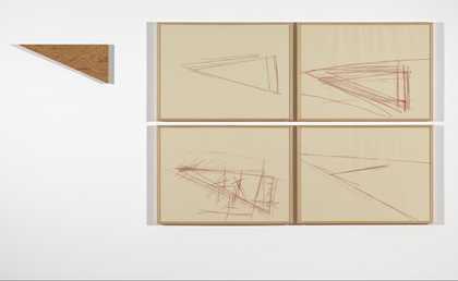
- Artist
- Hans Hartung 1904–1989
- Medium
- Acrylic on canvas
- Dimensions
- Support: 1850 × 3000 × 40 mm
Frame: 1910 × 3058 × 55 mm - Collection
- Tate
- Acquisition
- Purchased 1998
- Reference
- T07401
Summary
T1982-E15 is a large abstract oil painting in a horizontal format, which combines thick gestural strokes and splatters with a very smooth background. This background exhibits a continuous colour gradation that runs across the painting from left to right, beginning with a dark blue on the far left and proceeding through pale blue, dark red, another pale blue, light green and finally bright yellow on the right hand side of the composition. Aside from the red area, the background lacks any visible brushstrokes and the paint is applied very thinly. Although the transition between each of the background hues is not delineated by a clear boundary, the red section is differentiated by its distinctly uneven, curving edges, which contrast with the neater arrangement of the other tones. Laid over the red section is a large patch of gestural marks that are executed in black and a very dark blue paint, forming a loose block that runs vertically down the middle of the work and curves up towards the left, with several isolated flecks on either side of it. The textured appearance of these brushstrokes contrasts with the smoothness of the coloured background, and while they are densely arranged at the top of the painting, lower down and around the edges of the block they are generally more diffuse and there are areas in which the dark paint appears to have been scratched away.
This work was produced by the German artist Hans Hartung in 1982, when he was living and working in Antibes in south-east France. It was executed on a single piece of medium-weight, commercially primed linen, which was placed on top of a second piece of unprimed linen, after which both were attached to a softwood stretcher. The background tones were most probably applied using a spray gun, and it is likely that Hartung applied the thicker red paint with a brush over an initial sprayed-on layer of the same tone. The black and dark blue paint at the centre of the work was applied vigorously and then worked over with a combination of brushes, a palette knife and the ends of brush handles. At this time Hartung commonly worked by dipping olive branches in paint and using them to thrash the canvas powerfully and it is likely that he employed the same method for this painting (see Mundy 2006, p.198). In the central area of the work Hartung has occasionally scraped back the paint, revealing the white primer beneath. The painting has a uniform gloss, suggesting that it has been lightly varnished, and is presented in a wooden batten frame that is thought to be original. Like all of Hartung’s mature works, this painting is titled using a numerical designation: the letter ‘T’ at the start of the title stands for the word ‘toile’ (French for ‘canvas’), and this is followed by the year of the painting’s execution, 1982, and the reference ‘E15’, which is unique to this work.
The use of gestural marks was extremely common in Hartung’s work from the late 1920s onwards. Since the 1950s, his dynamic strokes and splatters have been compared frequently with techniques used by many European abstract painters who emerged around that time, including Michel Tapié, Georges Mathieu and Jean-Paul Riopelle, who are often labelled as ‘Tachiste’ artists and commonly created energetic works, with marks that appear to have been vigorously applied. Hartung’s work can also be compared with that of American artists such as Jackson Pollock and Franz Kline, who also used techniques involving splashed and dripped paint in the 1950s. According to the art historian and critic Donald Kuspit, Hartung’s gestural marks often seem ‘fierce’ and ‘combative’, evoking a sense of ‘violence’, an observation that could be applied to T1982-E15 (Donald Kuspit, ‘Hans Hartung, Indomitable and Independent’, in Aichi Prefectural Museum of Art 1998, p.157).
However, this work is also an example of Hartung’s tendency to combine gestural marks with smooth fields of colour. According to Kuspit, this latter technique often evokes a sense of ‘infinity’ or ‘formlessness’, as well as a feeling of ‘tranquility’ in contrast to the artist’s more aggressive strokes (Kuspit in Aichi Prefectural Museum of Art 1998, p.171). Hartung has claimed that the large scale of his paintings from the 1980s, such as T1982-E15, is of critical importance to the impact of the works, stating that ‘I am convinced that in abstract art the size of a painting is of enormous importance ... A line across a canvas two metres high expresses violence, energy and force. If it were only ten centimetres long, it would be a line without importance.’ (Quoted in Cristiano Isnardi, ‘Three Spaces’, in Via Lambruschini 2006, p.226.)
Further reading
Hartung, exhibition catalogue, Aichi Prefectural Museum of Art, Nagoya 1998.
Hans Hartung: In the Beginning was Lightning, exhibition catalogue, Via Lambruschini, Milan 2006.
Jennifer Mundy, ‘The Very Late Style of Hans Hartung: A Problem?’, in Hartung: 10 Perspectives, Milan 2006, p.198, reproduced p.197; also published in Tate Papers, no.9, 1 April 2008, http://www.tate.org.uk/research/publications/tate-papers/very-late-style-hans-hartung, accessed 1 March 2015.
David Hodge
March 2015
Supported by Christie’s.
Does this text contain inaccurate information or language that you feel we should improve or change? We would like to hear from you.
Technique and condition
The painting was executed on a single piece of medium-weight, commercially-primed linen fabric, whose threads have a rather uneven thickness. This piece of fabric was stretched around an expandable softwood stretcher with a second piece of (unprimed) linen fabric (a 'loose lining') and both piece of fabric were attached together along the edges with copper tacks. The commercial priming has been analysed as an acrylic emulsion gesso material.
The paint is oil paint and appears to have been applied in a variety of techniques over the stretched face of the canvas. The first layer was the very thin background colour, which exhibits a smooth gradation from black through blue to a yellow-green and was possibly applied with a spray gun. Certainly no brushstrokes are visible in these areas. Then the red colour was applied. In the central region it is much thicker and appears applied by brush and was probably used straight from the tube, but it also extends right to both ends over the initial thin applications of colour. Here it is only present at the peaks of the canvas texture, which may indicate the use of a roller and a very dry, lean paint. Then the thicker black paint was applied, which appears to have been vigorously applied and quickly worked into the canvas with a combination of brushes, palette knife and the ends of brush handles. A dark 'prussian' blue layer was also applied in the same way. The result is a variety of surface textures and layering, with instances of each paint layer remaining distinct but also areas of two or more colours being blended together. In addition, the paint has sometimes been scraped right back to reveal the white of the priming. The overall uniformity of gloss suggests that the painting was then lightly varnished and the current 'two-level' batten frame is thought to be the original.
The painting is in excellent condition, with the stretcher and combination of two canvasses providing exceptional support for the paint layers. The paint itself appears in pristine condition.
Tom Learner
July 2000
Explore
- abstraction(8,615)
-
- non-representational(6,161)
-
- gestural(891)
- formal qualities(12,454)
-
- texture(466)