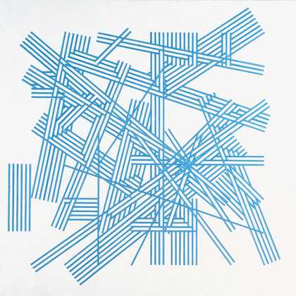
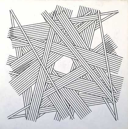
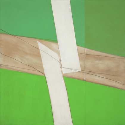
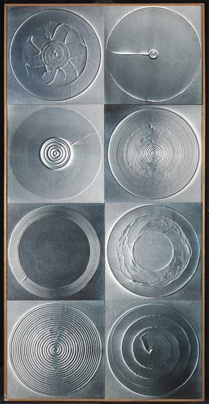
- Artist
- Mark Lancaster 1938 – 2021
- Medium
- Acrylic paint on canvas
- Dimensions
- Support: 1727 × 1727 mm
- Collection
- Tate
- Acquisition
- Purchased 1969
- Reference
- T01109
Catalogue entry
Mark Lancaster b.1938
T01109 CAMBRIDGE GREEN 1968
Inscribed on canvas turnover at top: ‘Cambridge Green 1968 Liquitex/cotton duck 68×68 in. 173×173 cm [arrow indicating top] Mark Lancaster’.
Liquitex on cotton duck, 68×68 (173×173).
Purchased from the artist through the Rowan Gallery (Knapping Fund) 1969.
Exh: Arts Council Gallery, Cambridge, January–February 1969 (13, repr.); Rowan Gallery, June–July 1969 (catalogue not numbered).
Repr: Art and Artists, IV, July 1969, p.56.
Lit: For a general discussion of Lancaster's ‘Cambridge’ series, see Richard Morphet, ‘Mark Lancaster's painting since 1967’ in Studio International, CLXXVII, June 1969, pp. 270–273.
Since painting ‘Zapruder’ 1967, Lancaster has often used the repetition of identical-sized rectangles as a principal system within an individual work. By contrast with ‘Zapruder’ and its sequel ‘Zapruder II’ 1967 (where this regularity is broken by rows of rectangles being cut short along two edges of the painting) in all the paintings so far completed in the ‘Cambridge’ series (each measuring 68×68 inches) a rectangle of a given size is repeated intact, whatever subdivisions may occur within it, eight times in the same work in two vertical rows of four. All variations from painting to painting within the series occur within the rectangles, the divisions of bare canvas between them conforming to a standard format and always being uninterrupted. Lancaster began the ‘Cambridge’ series shortly after taking up appointment as artist in residence at King's College, Cambridge, in September 1968.
The artist wrote (17 June 1969, text annotated by him 24 June) that T01109 was begun on 21 or 28 October 1968 and completed in November. It was both conceived and executed second (after ‘Cambridge Blue’) in the ‘Cambridge’ series, which so far numbers nine paintings. He added: ‘Pre-conceptions of the series included that there be a grid, that the grid could be subdivided progressively as suggested in Prince of Wales, or within a simple “reading” system such as bottom left top right, that the colour could change from rectangle to rectangle in relation to other rectangles and to the whole, that a colour change could occur within a rectangle (precedent in Untitled 67/8).
Landscape-associated colours in Cambridge Blue and Cambridge Green continued the use of Red Blue and Green in e.g. Actual Location, where their order is progressively foreground/middle/background or figure-image/landscape/sky suggestive. Exposure I used three different pairs of blues and yellows, which had been preceded by Beach, preceded by experience and drawings made in South Carolina in summer 1966. of the land/sand/sea/sky sequence and its orderings, looking from the beach towards the sea green/yellow/ blue/blue, looking back from the water blue/yellow/green/blue, and the interference of different horizons, etc., etc. (Looking out the window at Cambridge, or looking anywhere has these possibilities. It could be familiarity that makes one more interesting than another.)
Cambridge Green set out to use blue and yellow with a soft junction whose extent is controlled by the amount of water in the paint and on the canvas. One rectangle was painted at a time, the first colour being allowed to partially dry with the canvas on a slope to allow slow penetration of (as yet unpainted but wet) remaining approximate half. The second colour was painted just before the first was dry and the slope reversed to allow penetration back into the first colour. This method was kept under about the same degree of control for each rectangle in turn.
Cambridge Blue had concentrated on different treatments of bottom left and top right rectangles through a subdivision in bottom left (split-image postcard association) and a solid blue in top right. A reversal of the blue/yellow relationship was proposed for top right of Cambridge Green, but the reversal was finally made in the rectangle below top right. Had it been made in top right, a blue diagonal passing ‘through’ three rectangles would have resulted. This, though of recurring interest in later paintings of the series, would it seemed have interfered to much with the identity of the rectangles. By making the reversal occur in the rectangle below top right, the resulting yellow diagonal does not cut across the corner of the picture, but crosses two rectangles and is then cut short, which tends to concentrate an interest on the top right rectangle which it does not actually have in that sense, being similar to six other rectangles in the painting.
The bottom left rectangle, originally subdivided into quarters with a quarter-inch line, as in Cambridge Blue, was first painted a ‘straight’ green. This was found to be overpoweringly complex and its subdivisions were painted over. It then became clear that at least as much as the subdivisions, the tone of the colour was unsatisfactory (over-dramatic); it was gradually lightened up to a point where its tone just locked with that of the rest of the painting; it was not cut off in all senses from its neighbours and the painting remained visible as one object. The brilliance and solidity of this rectangle could be seen as a kind of corrective to the suggestion the other rectangles made of ‘infinite space’. That blue and yellow make green is neither here nor there. (These blues and yellows couldn't make this green).
I cannot see any other colour going where the green goes, though the use of that green seemed an act of self-indulgence unprecedented in my work which I put down to middle age. The painting was named on completion.’
The artist added that a short passage in Christopher Isherwood, The World in the Evening, which he had re-read and recalled after completing T01109, seemed highly relevant to the experience of the painting. The passage, from ‘Whenever I'd thought ... ‘to’ ... I should see nothing but a lot of adjectives’, appears in the first edition (Methuen, 1954) between p. 34 line 34 and p. 35 line 14.
Published in:
The Tate Gallery: Acquisitions 1968-9, London 1969
Explore
- abstraction(8,615)
-
- non-representational(6,161)
- formal qualities(12,454)
-
- order(41)