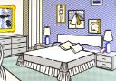
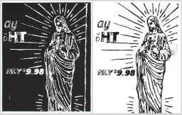
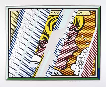
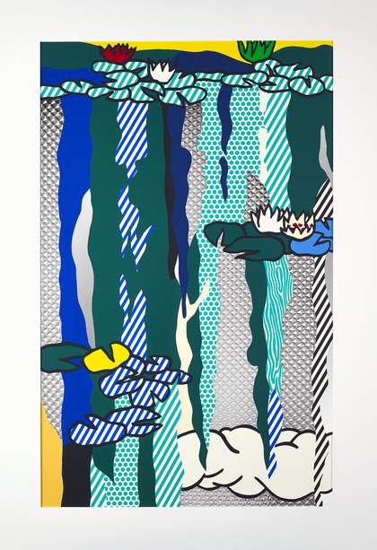
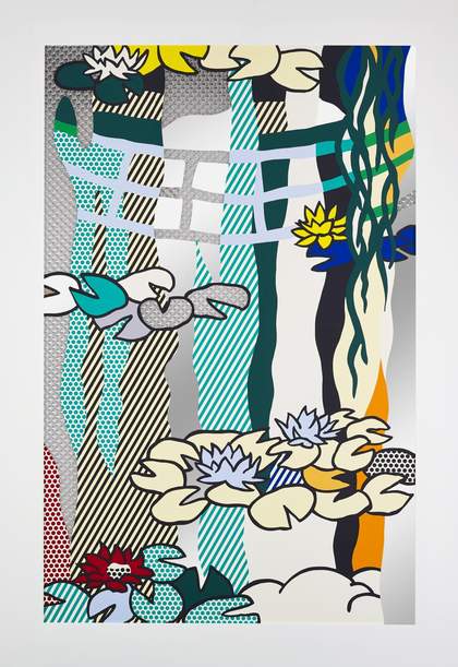
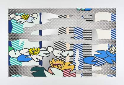
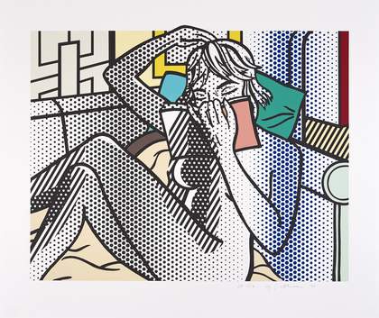
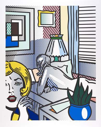
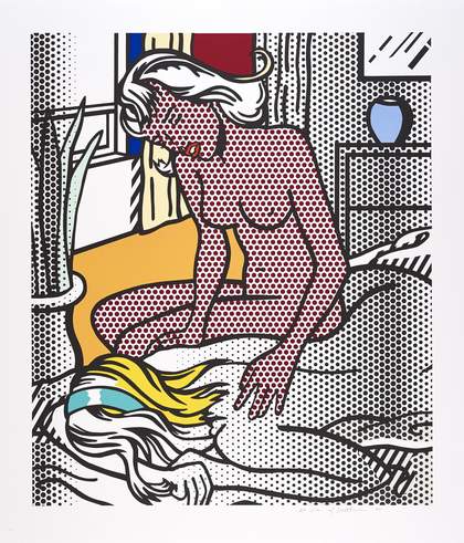
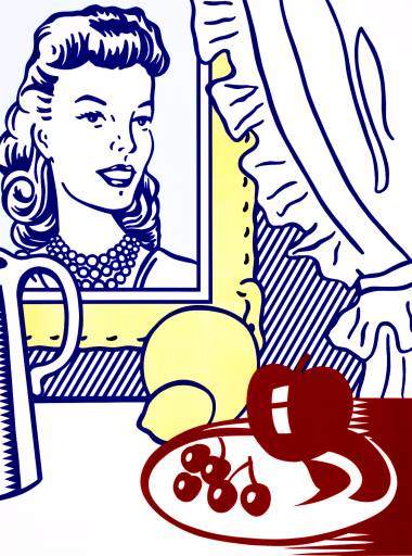
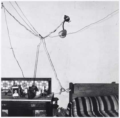
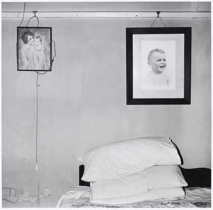
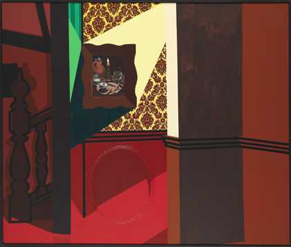
- Artist
- Roy Lichtenstein 1923–1997
- Medium
- Oil paint and acrylic paint on canvas
- Dimensions
- Support: 3209 × 4553 × 65 mm
- Collection
- Tate
- Acquisition
- Presented by the Douglas S. Cramer Foundation in honour of Dorothy and Roy Lichtenstein 1997
- Reference
- T07339
Summary
This work is one of a series of paintings Lichtenstein made in the early 1990s depicting domestic interiors. Painted on a very large scale, they were inspired by a billboard advertisement for a furniture store Lichtenstein had seen outside Rome in 1989. Lichtenstein, a leading figure of American Pop art, is best known for his 1960s paintings derived from comic strip panels, such as Whaam! 1963 (Tate T00897). Throughout his career he continued to base his paintings on imagery from popular culture and the mass media. He sourced the images for this painting, as for others in his Interiors series, from advertisements found in the Yellow Pages.
In the US, Pop artists reacted against the Abstract Expressionism and post-painterly abstraction that prevailed in the art of the 1950s by incorporating imagery appropriated from popular culture and features of design into their work in an attempt to introduce aspects of life into art. In Interior with Waterlilies, Lichtenstein continues this Pop tradition, exploiting both commercial techniques and imagery. Blown-up to this monumental scale, the stripes and Benday dots – used to represent colour and tone in the print technology of the source material – become conspicuous features of the design in their own right. Whereas earlier works were drawn directly on the canvas from smaller sketches, in this series Lichtenstein made use of a projector to enlarge the design to the appropriate size. His characteristic use of paper stencils, used to mask off areas of the canvas to be left blank, is evident in the sharp raised edges of the painted shapes.
As in much of Lichtenstein’s work, there is a sense of detachment to the painting; the bedroom furniture represented here is generic, the colours are bland pastels, and the rendering flat, unreal and illustrational. But offering only a minimum of information, Lichtenstein gives enough detail for the viewer to complete the picture, for the work to become a believable representation. The vast scale of this painting and the strong perspective of the bed – painted roughly life-size, with its corner seeming to jut out into the gallery space – almost invites the viewer into the work. There are personal references within the composition too. The paintings depicted on the walls in this image represent Lichtenstein’s own works, some of which themselves make reference to the works of other artists. This self-referentiality is a constant in Lichtenstein’s work throughout his career, where much of his art quotes or comments on earlier aspects of his work. His interior paintings themselves refer back to the domestic interiors in his paintings of the early 60s. The picture above the dresser on the left of the composition is from Lichtenstein’s Waterlilies series of the early 1990s, based on iconic works by Claude Monet (1840-1926). This feature provides the title for this painting.
Further reading:
Roy Lichtenstein: Interiors, exhibition catalogue, Gallery Ulysses, Vienna, 1992, reproduced p.19 in colour
Roy Lichtenstein, exhibition catalogue, The Solomon R. Guggenheim Museum, New York, 1993
Roy Lichtenstein: Interiors, exhibition catalogue, Museum of Contemporary Art, Chicago, 1999
Maria Bilske
October 2004
Does this text contain inaccurate information or language that you feel we should improve or change? We would like to hear from you.
Technique and condition
The painting is on a very large single piece of thick cotton duck, stapled on to the reverse of a deep-edged, ten member softwood stretcher. This stretcher can be folded if the metal plates holding the two halves are removed and slightly adjusted in size using the turnbuckle expansion system at the joints. The canvas is primed with a white 'Golden' mineral spirit acrylic priming. This was applied by brush in several fluid layers to produce an even ground of medium thickness on the front and turnover edges of the canvas. A small amount of additional white paint was applied by brush to the front of the painting.
The design was drawn out in pencil, some of which is still visible on the finished painting. The paint is probably spirit based acrylic, possibly with some oil (untested). Even and opaque layers of a fairly limited range of colours (pigments not analysed) were brushed over tape and templates, which were used to mask off the areas intended to stay white. This technique has produced distinctive hard, slightly raised edges to the paint. There is no surface coating and the difference in gloss of different areas of paint creates a play of surface textures.
The painting is in good condition with no major loss or damage. There is some cracking of the brittle ground, and the paint ontop of it, particularly in the centre where the stretcher was folded for transport in the past. Thin cracks are also visible following the vertical canvas weave throughout the painting and small cracks have also opened up running along the sharp edge of the turnover and at the corners. However these cracks are not very noticeable, and there is no associated delamination of paint at present. There are some other minor damages to the edges and reverse which are not visible when the painting is on display.
Sam Hodge
November 1997
Explore
- picture(248)
- bed(401)
- chest of drawers(24)
- cushion(35)
- light / lamp(264)
- lifestyle and culture(10,247)
-
- advertising(536)