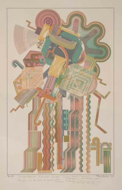
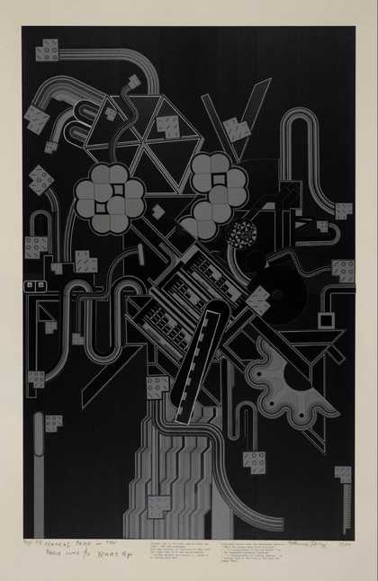
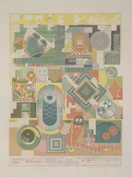
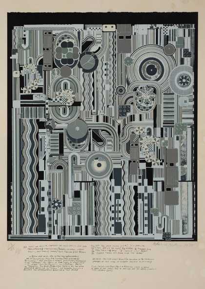
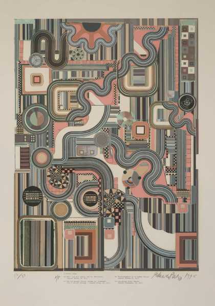
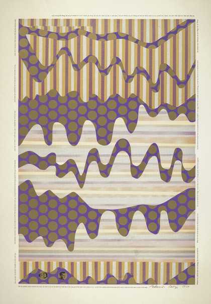
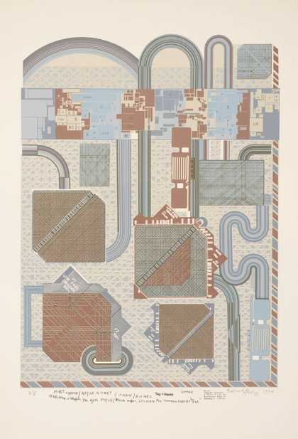
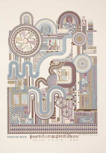
Prints and Drawings Room
View by appointment- Artist
- Craig Wood born 1960
- Part of
- London
- Medium
- Screenprint on paper
- Dimensions
- Image: 662 × 861 mm
- Collection
- Tate
- Acquisition
- Acquired by purchase and gift from Charles Booth-Clibborn in memory of Joshua Compston 1997
- Reference
- P77924
Summary
London is a portfolio of eleven prints made by eleven artists based in London. It was commissioned by Charles Booth-Clibborn and published under his imprint, The Paragon Press, London. The images were printed and editioned at Coriander Studio, London. The portfolio was produced in an edition of sixty-five, the first forty of which are portfolio sets and the remainder are the artists' copies. A further fifteen sets were produced for artists and collaborators. Tate's copy is number five in the edition. The title and colophon pages were designed by Phil Baines using his own typeface. The portfolio is contained in a black buckram-covered wooden case bearing the title in yellow. London is the second group portfolio published by The Paragon Press since its inception in 1986. It was conceived as a portable group exhibition containing work by emerging artists of the same generation. There is no particular common theme. Factors linking some of them are studying art at Goldsmiths College, London in the late 80s (where they were taught by Conceptual artist Michael Craig-Martin, born 1941), working with Jay Jopling (who later opened White Cube Gallery in London) and being exhibited at the Saatchi and Karsten Schubert Galleries in London. Booth-Clibborn had already collected work by a number of the participating artists, few of whom had done any printmaking before embarking on the project. Most chose to work with screenprinting, with the exception of Langlands and Bell, whose image is embossed. Screenprinting is ideally suited to reproducing appropriated and photographic images. Its adoption reflects a characteristic use by young British artists (the group to which most of the London artists belong) of objects or images appropriated from everyday life. Individual prints vary in size, the type of paper used and the orientation of the image.
Craig Wood's contribution to the portfolio, Safeway's Gel Air Freshener, Alpine Garden (Detail), is a one-colour screenprint with mould-cut sections on 500gsm card. It is varnished, resulting in a glossy, plastic surface. The colour is a monotone, synthetic light green based on the 'Alpine Garden' variety of gel air freshener produced by the British supermarket, Safeway. Wood has also produced larger versions in pink and lilac related to other fragrances in the range. A naturalistic pattern suggesting leaves or petals has been cut out of the card. This cut out pattern is a stylised graphic version of nature, just as air fresheners are synthetic versions of fresh air. However, instead of removing stale and malodorous elements from the air, chemical air fresheners operate by adding other, stronger smells to mask what is not wanted, thereby in fact doing the opposite of what they claim. Safeway's Gel Air Freshener, Alpine Garden (Detail) provides an ironic comment on the paradoxes and deliberate mental blind-spots in which consumers and manufacturers collaborate in late twentieth century capitalist culture. Wood 'started off as a landscape painter in Wales' (quoted in Frieze, p.38) but on moving to London began to investigate urban space and issues. In 1991 he made an installation of cut out holes in the panels of a company library in Florence, Italy, which was based on early computer, hole-punched print-outs. The holes provided the means to view the internal workings of the company - its books and other tools - normally hidden behind decorative panelling.
Further reading:
Contemporary British Art in Print: The Publications of Charles Booth-Clibborn and his Imprint The Paragon Press 1986-95, exhibition catalogue, Scottish National Gallery of Modern Art, Edinburgh 1995, pp.19 and 46-51, reproduced (colour) p.51
'Mapping the Future: Interview with Craig Wood', Frieze, issue 3, 1992, pp.38-41
Jeremy Cooper, no FuN without U: the art of Factual Nonsense, London 2000, pp.39-41
Elizabeth Manchester
July 2002
Does this text contain inaccurate information or language that you feel we should improve or change? We would like to hear from you.
Explore
- abstraction(8,615)
-
- from recognisable sources(3,634)
-
- organic(827)
- non-representational(6,161)
-
- colour(2,481)
- geometric(3,072)
- monochromatic(722)
- formal qualities(12,454)
- social comment(6,584)
-
- consumerism(102)