Space is not a static, inert thing. Space is alive; space is dynamic; space is imbued with movement expressed by forces and counterforces; space vibrates and resounds with color, light and form in the rhythm of life.
Hans Hofmann1

Fig.1
Hans Hofmann
Radiant Space 1955
Indianapolis Museum of Art, Indianapolis
© The estate of Hans Hofmann/Artists Rights Society (ARS), New York

Fig.2
Hans Hofmann
The Golden Wall 1961
Art Institute of Chicago, Chicago
© The estate of Hans Hofmann
Beginning in the 1950s, architectural and spatial motifs began to show up in the titles of Hans Hofmann’s paintings. Radiant Space 1955 (fig.1) is a grouping of messy, not-quite-rectangular slabs of colour, which hang together like bricks on a sun-dappled wall. Radiant Enclosure 1961 (private collection) continues this theme, this time suggesting not open space but a bounded, enclosed realm. The Golden Wall 1961 (fig.2) and Sun at the Wall 1962 (private collection) are bright slab paintings suggestive of both architecture and landscape. Combinable Wall I and II 1961 (fig.3), painted across two canvases, literalises the hints of modularity and repetition in so many of the slab paintings by doubling the rectangular support. Viewers and critics, too, sensed that Hofmann was exploring new, more architectural directions. One critic called the painter’s 1960 solo show at the Samuel Kootz Gallery ‘the most vital, constructive, architectural Hofmann show yet seen’, and deemed the slab paintings ‘Pompei [sic], Indian Summer and Cathedral the finest examples of the plastic equivalents of a natural architecture’.2

Fig.3
Hans Hofmann
Combinable Wall I and II 1961
University of California, Berkeley Art Museum and Pacific Film Archive, Berkeley
© The estate of Hans Hofmann

Fig.4
Exhibition pamphlet for The Muralist and the Modern Architect, Kootz Gallery, New York, October 1950
Hans Hofmann Papers, Archives of American Art, Smithsonian Institution, Washington, D.C.
One avenue through which Hofmann explored this burgeoning interest in architecture was muralism. In the years just before and during his development of the slab paintings, Hofmann collaborated with architects on three different mural projects. These murals – planned for a Peruvian plaza, an office lobby and a public school – were part of a broader interest in muralism among abstract painters of the 1950s and 1960s. The new mural interest spanned abstract styles (geometric, lyrical, gestural) and milieux: the abstract expressionists, the School of Paris and former Bauhaus figures in the United States all explored muralism at mid-century. At Harvard’s Graduate School of Design, architects Walter Gropius and Josep Lluís Sert ensured that new campus buildings included abstract murals by Hans Arp, Herbert Bayer, Joan Miró, Costantino Nivola and Mark Rothko. Abstract wall paintings also proliferated in the beach houses and suburban homes of Long Island in these years, where murals by Le Corbusier, Fernand Léger, Norman Lewis, Nivola and Jackson Pollock, among others, graced the walls of modern structures. In New York City, much abstract mural production in the early post-war years depended on the organisational energies of New York gallerist Samuel Kootz, whose 1950 exhibition The Muralist and the Modern Architect crystallised the nascent phenomenon (fig.4). The exhibition, which showcased collaborations between the gallery’s stable of artists and a host of eminent modern architects, served as Hofmann’s introduction to the mural form.3 Kootz would also go on to play a decisive role in Hofmann’s next two mural projects.
Hofmann’s engagement with murals was relatively short-lived, covering a mere eight years in a six-decade career and consisting of just three projects, only two of which were realised. Yet its impact on Hofmann’s subsequent work cannot be overstated.4 Hofmann’s mural work influenced the development of his slab paintings in a variety of ways: it introduced the artist to mosaic, the glistening, repetitive properties of which would appear in early, proto-slab paintings of the 1950s; it suggested the rectangle as a modular, stackable unit; it prompted Hofmann to think in architectural terms that informed the geometric underpinnings of paintings like Pompeii 1959 (Tate T03256); and it brought a new scale into his work. Considering the three mural projects in depth allows us to understand their influence on slab paintings such as Pompeii and to compare their related – but also divergent – approaches to space, scale and geometry.
Chimbote plaza: The ‘heart of the city’

Fig.5
Paul Lester Wiener and Josep Lluís Sert
Aerial Perspective Sketch of Chimbote Civic Center, Showing Main Square and Standing Bell Tower 1949–50
Paul Lester Wiener papers, Bx155, Special Collections and University Archives, University of Oregon Libraries, Eugene, Oregon
© Paul Lester Wiener and Josep Lluís Sert

Fig.6
Hans Hofmann
Chimbote Mural Fragment of Part II 1950
Oil on board
2140 x 920 mm
© Renate, Hans and Maria Hofmann Trust
Photo © Doug Young
Hofmann’s first mural project was for a far-away, and perhaps unlikely, location: a public plaza in Chimbote, a small coastal city in Peru. The city had recently commissioned a plan for a new civic centre from Town Planning Associates, the urban design and architecture firm of Josep Lluís Sert and Paul Lester Wiener. Sert and Wiener had presented the plan in a variety of formats, including at the 1949 meeting of the Congrès Internationaux d’Architecture Moderne, and Samuel Kootz’s 1950 mural exhibition gave them another venue to do so (fig.5). Kootz paired Sert and Wiener with Hofmann, who had been showing at the gallery since 1947. The painter produced two mural plans for the civic centre: the first was designed to unfurl horizontally along the mosaic pavement of the main plaza, while the second would sprout upwards from the first, extending vertically along the surface of a giant, slab-like bell tower, which stood near the plaza’s centre (for an example of one of Hofmann’s studies for the mural, see fig.6). As conceived, the two works would have created an explosion of colour at the city’s centre, cladding the ground itself below citizens’ feet and jutting twenty-four feet into the air along the tower.5
The architects saw the plaza as the social and political ‘heart of the city’6 and thus as the appropriate place for public artwork. In 1943 Sert had co-authored an important manifesto on this topic along with artist Fernand Léger and architectural critic and historian Sigfried Giedion. Countering the antipathy towards decoration and monumentality that had characterised pre-war modern architecture, the manifesto asserted the necessity of monuments as ‘the expression of man’s highest cultural needs’, entities that ‘satisf[ied] the eternal demand of the people for translation of their collective force into symbols’.7 For Sert and his co-authors, creating effective monuments required the collaboration of ‘the planner, painter, sculptor, and landscapist’.8 The writers envisioned ‘vast open spaces’ – much like the plaza at Chimbote – where ‘monumental buildings’ could ‘stand in space’, and where ‘large plane surfaces’ could be exploited by mural painters and sculptors.9 Hofmann, too, was inspired by the idea of a monumentality for the masses, one freed of fascist overtones and subjected to modern aesthetic principles. ‘In democratic thinking’, he mused in his notes, ‘space is not any more conceived for the voluptuous and luxurious living of kings and a dominating upper class, nor for an inflated glorification of dogmas and ideologies – but for a living that will enable modern man to stay healthy in body and soul by creating living and working conditions where work again will become an enjoyable part of life’.10
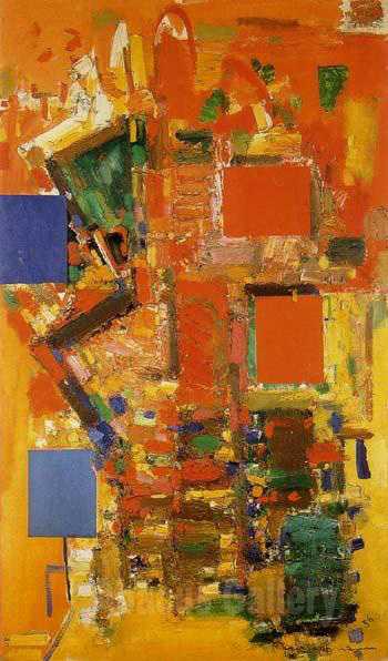
Fig.7
Hans Hofmann
Towering Spaciousness 1956
Brooklyn Museum of Art, New York
© The estate of Hans Hofmann
In his work on the Chimbote project Hofmann tackled the question of how to make modern art monumental and integral to the post-war city. The idea that modern art ought to occupy a central role in public life would inform his next two mural projects which, unlike the one for Chimbote, were eventually realised and remain extant today. But the Chimbote project also influenced the direction of Hofmann’s painting. In the mid-1950s, as Clement Greenberg, Sam Hunter and many subsequent writers have noted, ‘small color bricks and mosaic[-like] pieces’ emerged in Hofmann’s paintings.11 In Towering Spaciousness 1956 (fig.7) – painted six years after the Chimbote mural proposals and as Hofmann was completing his first realised mosaic project at 711 3rd Avenue in New York – four clear rectangles emerge from a whirlwind of smaller, more irregular lines and dots, the mass of them glistening like the proliferating tesserae of a mosaic wall. Such works would eventually become the slab paintings of the later 1950s and 1960s – works like Pompeii. Furthermore, the scale and planarity of the large bell tower in the Chimbote designs prompted Hofmann to explore a more strictly geometric approach to colour areas. In his notes Hofmann wrote about creating an ‘architectural rhythm’ along the tower’s surface, ‘enlivened by shifting color planes of enormous dimensions’. These planes would function, he hoped, like ‘the small color areas function in a [work by Dutch modernist Piet] Mondrian’, against a ground of white, but at greater scale.12 In the slab paintings later in the decade, Hofmann would generally eschew a white ground but would continue to exploit the rhythmic and architectural properties of geometric colour.
711 3rd Avenue: A pulsing rhythm of colour blocks

Fig.8
Hans Hofmann
Mosaic mural for the lift banks at 711 3rd Avenue, New York, 1956

Fig.9
Hans Hofmann
Mosaic mural for the lift banks at 711 3rd Avenue, New York, 1956

Fig.10
Gene Lesser
William Freed, James Gahagan and Max Spoerri Preparing Artwork for Hans Hofmann’s Mosaic Mural for 711 Third Avenue 1956
© Gene Lesser
A few years after the Chimbote works, Hofmann embarked on a second mural project, again with his gallerist Samuel Kootz as the intermediary.13 Unlike Chimbote, this project resulted in a large-scale, finished work, which still stands today: the gleaming, dynamic mosaic that clads the lift banks at 711 3rd Avenue in New York (figs.8 and 9). Hofmann began by executing mural designs in gouache, which he gave to his studio assistant, artist James Gahagan, to trace into linear blueprints (‘Don’t copy my drawing’, he purportedly told Gahagan, ‘but use the sketches freely’).14 Once Gahagan had ‘freely’ translated the designs, they were photographed, reversed and enlarged sixteen times. Hofmann, Gahagan and other assistants then used the enlarged, reversed blueprints as the building blocks for working out the final composition in colour: laying them out on the floor of an empty building, they experimented with different arrangements and effects (fig.10). The final versions were sent to mosaicist Vincent Foscato in Long Island City, who matched the colours to his stock of mosaic glass (and, in some cases, custom-ordered new colours from his supplier in Venice). After further adjustments and communication between Hofmann, Gahagan and Foscato, sections of the mosaic tiles were glued to backing paper and delivered to 711 3rd Avenue, where they were laid into the cement-prepared walls and the backing was peeled off – reversing them, finally, to their original orientation. Collaboration threaded through every step of the process, from initial design, to translating and enlarging the sketches, to translating them once again into mosaic. If the Chimbote mural encouraged Hofmann’s consideration of site and architecture, these considerations had remained largely theoretical. With the office lobby mural, Hofmann was thrust into a sea of logistical concerns, regarding not only site and collaboration but also the needs of the building’s various stakeholders – according to Gahagan, one of the building’s owners objected to the final designs and had to be convinced before finally approving them.15
The result of the months of collaboration was Hofmann’s first realised mural: 366 square metres of vibrant colours and abstract motifs wrapped around the cube of the lift bank at the centre of the building’s lobby. From the street, tantalising glimpses of the mosaics glistened through the glass façade; inside, the oranges, yellows, reds and blues harmonised with the warm tones of the speckled, pink-hued floor and blue ceiling.16 The lift housing gave Hofmann two kinds of surface to work with: unbroken expanses of nearly 4.5 by 8.8 metres on the north and south walls; and, on the east and west, vertical strips interspersed with the silvery sheen of the lifts themselves. Hofmann designed a palette that gave each surface its own, dominating colour. On the north wall, blues provided a cool background for the wending motifs, while on the south, reds and oranges took over. These distinct colour swathes met visually on the east and west walls, where, turning their respective corners, they served as bookends to the lifts – red on one side, blue on the other. A column of bright yellow ran between the lifts themselves.

Fig.11
Photograph of Hans Hofmann’s untitled sketch for the 711 Third Avenue mural, 1955
Location of sketch unknown; photograph held in the Kootz Gallery Records, Archives of American Art, Smithsonian Institution, Washington, D.C.
© The estate of Hans Hofmann
Like the Chimbote mural, the mosaics at 711 3rd Avenue employ both organic motifs and solid, geometric blocks of colour. Yet they differ from the Chimbote design in several important respects. White, which played such a central role at Chimbote, is squeezed out in the lobby, reduced to small blocks or the role of silhouette for a particular motif. This is closer in approach to the proto-slab and slab paintings of the 1950s, in which white or neutral ground rarely makes an appearance. Furthermore, the rectangles, rather than standing out as singular, individual shapes as in the Chimbote mural, abut and overlap one another, creating a pulsing rhythm of colour blocks. Akin to the play of shapes in the slab paintings, the mosaic rectangles here overlap like stacked transparencies, and generate L-shaped blocks and stripes of colour in the negative spaces. The effects of this space-wrapping in Hofmann’s mosaic are particularly apparent when we compare his sketches to the finished work (fig.11). What is a diagonal braided motif in the sketch becomes, in three dimensions, an almost animate yellow squiggle, snaking its way down one wall and reaching around to the next. A straightforward set of repeating red ‘V’s is invested, in the lobby, with a syncopated rhythm as it slides over the ridge of the corner. These bending, folding shapes actively lead the viewer around the central cube, each motif bleeding into the next plane and pulling the spectator along with it.
In addition to deepening Hofmann’s engagement with mosaic, the office lobby mural entailed another aspect that would prove influential for the slab paintings: the use of colour rectangles as planning tools in outlining a composition. As others have documented, Hofmann had made use of coloured pieces of paper in his classes in Munich, tacking or pinning planes to the surface as a classroom exercise.17 Yet the process of moving giant colour shapes around for the lobby mural seems to coincide roughly with Hofmann’s increased interest in the rectangle as a modular, testable component in his paintings at large. In Circles 1956 (private collection), as curator Cynthia Goodman notes, Hofmann ‘stapled a number of rectangular pieces of green and orange paper onto a brilliant whirlwind of squiggles and spheres’ to produce a work that is part painting and part collage.18 Later, after ‘rectangles had become entrenched in his artistic vocabulary, he still tested their locations by tacking planes of various sizes and colors onto a surface before painting them’. ‘Close examination of many of his pictures with rectangular components’, Goodman continues, ‘reveals tack marks where his application of pigment was not thick enough to cover them’.19 In laying out the coloured areas of Bristol board to plan and re-plan the lobby mural, Hofmann developed a new appreciation for the colour rectangle as a fundamental building block of painting – an insight that would structure compositions such as Pompeii.20
The New York School of Printing: ‘A vibrant note on a depressing street’

Fig.12
Hans Hofmann
Mural for the New York School of Printing 1958
Mosaic
© The estate of Hans Hofmann

Fig.13
Photograph of the architectural model of the New York School of Printing, designed by architects Kelly and Gruzen, 1958
Hans Hofmann papers, Archives of American Art, Smithsonian Institution, Washington, D.C.
Just a few months after the lobby mosaics were unveiled, Kootz reached out to Hofmann with the prospect of another mural, this time for the New York School of Printing (now the High School of Graphic Communication) on the city’s far west side.21 New York City’s Board of Education was investing in several new buildings to meet rising enrolment, and the New York School of Printing, designed by the firm Kelly and Gruzen, became a symbol of cutting-edge technology and operation: it included glass walls and escalators, and, with its doors open from 8.30 am to 10 pm, was deemed a ‘three-shift school for a three-shift industry’, the bustling newspaper trade in New York.22 Hofmann’s mural was smaller than the one he made for the office lobby at 711 3rd Avenue, and it extended as a flat slab rather than a corner-turning envelope. Nevertheless, the mural, completed in 1958, is eloquently integrated into the structure, a ribbon of colour that emphasises the building’s horizontal sweep (fig.12). Situated at street level, the mural creates a human scale in what is a hulking, seven-story block (fig.13). A slanted lip of stone connects the pavement to the bottom edge of the mural itself, subtly tying the two together. When the deputy mayor suggested a fence be erected to protect the mural, Hofmann refused, perhaps sensing that this would create an unwanted division between the art and its built environment.23

Fig.14
Hans Hofmann
Mural for the New York School of Printing, detail
© The estate of Hans Hofmann
Photo © Emily Warner

Fig.15
Hans Hofmann
Mural for the New York School of Printing, detail
© The estate of Hans Hofmann
Photo © Emily Warner
Completed a year before he created Pompeii, the New York School of Printing mural has several aspects in common with the painting, and with the other slab works that Hofmann was by then making in great number. The rectangle forms the organising principle of the mural, from the long, horizontal shape of the work itself to the many blocks and columns that mark its surface. As in the slab paintings, these rectangles abut and occasionally overlap one another, or leave slivers of negative space in between. The New York School of Printing mural also emphasises a contrast between the gestural and the geometric that characterises several of the slab paintings, particularly Pompeii, with its fluid, aqua-blue passage and murky dark reds. Hofmann and Foscato, his mosaicist collaborator, imitate the textural quality of loosely brushed oil paint in several places in the mural, most notably in the tall blue and white column near the centre, in a small powder-blue square a few feet to the right (fig.14) and in a green rectangle at the far right edge (fig.15). In Pompeii, similarly, rectangles of pink, yellow, red and mustard float like pure Euclidean forms with knife-sharp edges, while below, painterly areas disturb the canvas’s rectilinear environment.
Despite their different composition, placement (on the façade versus in the lobby) and site (institutional versus corporate), Hofmann’s two realised murals received remarkably similar responses. In both cases, Hofmann’s mosaics were seen as bringing warmth and humanity to the building. ‘Hans Hofmann’s mosaic wall [at the school] is a vibrant note on a depressing street’, wrote one reviewer. Such murals ‘contribute an element of vitality to their architectural and urban environment’ and ‘offset the severity of straightforward, structural design’, lending ‘a note of gaiety, sparkle, a more human and less institutional atmosphere’.24 Similarly, in the 3rd Avenue office, the building’s developers hoped the mural would ‘vitalize the lobby and infuse it with the sense of the life that throbs so strongly all about us on Manhattan Island’. After all, they noted, ‘business people spend most of their lives in and about their offices’.25 Hofmann echoed these sentiments, noting how, in the office lobby designs, ‘I thought of the people working there and I wanted to make it as spring-like, as gay as possible’.26 Architectural Forum devoted a two-page spread to the office and its mosaics, explaining how ‘Color and Art Help an Office Building’.27 Hofmann was not the only New York painter whose work was characterised as the joyful and emotional counterpart to architectural modernism. In 1951 critic Jules Langsner envisioned the entire New York School – with its ‘color’, ‘sensation’ and ‘feverish charm’ – located in modern buildings. ‘This kind of painting’, he wrote, ‘with all its Dionysian delirium, belongs, oddly enough, on the pristine walls of modern architecture. Here is ornamentation, conceived in an idiom of our times, to clothe these often dispirited surfaces’.28
Shaping space
The school mural would be Hofmann’s last: although he was willing to experiment with what he called ‘architectural painting’, he never considered himself a true muralist, turning down an invitation for membership of the Architectural League of New York shortly after completing the New York School of Printing mural.29 But his mural experiences of the 1950s would prove incredibly influential for his post-war paintings, as we have seen. As Hofmann scholar Tina Dickey summarises, ‘In a truly creative dialogue, the aesthetic challenges’ of Hofmann’s early work, especially his interest in colour, ‘generated the mural, and the technical challenges of the mural would shape’ attention to the ‘floating rectangle’ in his later work.30

Fig.16
Hans Hofmann
Pompeii 1959, detail
Tate T03256
© The estate of Hans Hofmann
Photo © Tate

Fig.17
Hans Hofmann
Pompeii, detail
© The estate of Hans Hofmann
Photo © Tate
We might also speculate that working on the mosaic murals gave Hofmann a new sense of the tactility and weight of two dimensions. The proposed Peruvian bell tower, conceived as a plane, would still have taken up space, its colourful front backed by several inches or feet of physical mass. In Pompeii the painted rectangles are themselves built up into slabs: the central yellow block is raised like a low relief out and away from its neighbours; at the left edge, two panes of red and magenta rise up like upper and lower lips to meet one another (fig.16); near the top, an extra smear of mustard yellow, slathered on with a palette knife, adds yet another hillock of thickness to an already weighty rectangle (fig.17).
In the end, the most significant difference between Hofmann’s murals and his slab paintings lies in the way they shape the space beyond their borders. The mural on the façade of the school building is more than just a planar composition: it also condenses the vastness of the edifice into a concrete strip of colour, exerting a visual pull on the spectator who approaches from across the street. At the plaza in Chimbote, the bell tower would have energised the void of space rising off the ground, which, with a slab slicing through it, would have come to assume a palpable quality. As Hofmann observed in his notes from this time, ‘A good easel painting has the faculty of assimilation with any environment. But the mural painting must predominantly serve an architectural purpose – it must not contradict the architectural idea’.31 In the three mural projects of the 1950s, Hofmann investigated how to unite colour and form with the ‘architectural idea’ of a given space, unfurling his abstractions over façades and walls and wrapping them around architectural cubes.32 These works did not merely ‘assimilate’ themselves into a given environment, but instead actively conditioned it, transforming the very space around them.