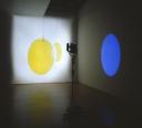
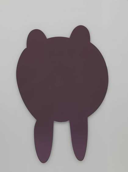
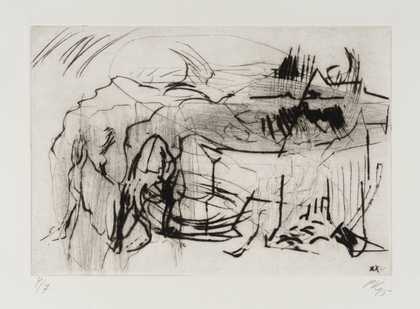
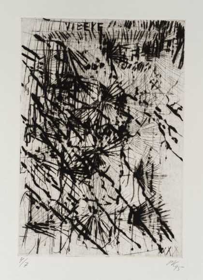
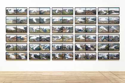
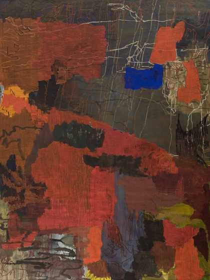
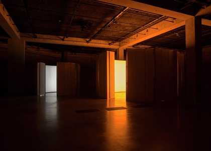
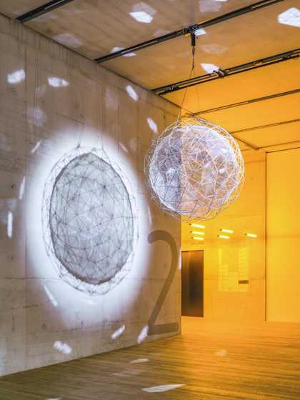
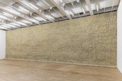
- Artist
- Olafur Eliasson born 1967
- Medium
- Colour-effect filter glass, spotlight, tripod, motor and wire
- Dimensions
- Variable
- Collection
- Tate
- Acquisition
- Purchased with funds provided by the 2003 Outset / Frieze Art Fair Fund to benefit the Tate Collection 2003
- Reference
- T11806
Summary
Installed in a darkened room, Yellow versus Purple 2003 comprises a transparent yellow disc of colour-effect glass (750 mm in diameter), which is suspended from a steel cable linked to a motor attached to the ceiling, and a floodlight mounted on a tripod that shines a wide beam of light directly at the disc and onto a white wall behind. The disc and the floodlight are both positioned 140 cm off the floor so that as the light passes through the glass it creates a yellow shadow on the wall behind that changes shape, from a circle to an ellipse and back again, as the disc rotates. At the same time, the particular properties of the glass also serve to reflect the light, producing a purple form that moves along the walls of the room as though orbiting the space. Like the yellow shadow, this purple light changes shape in accordance with the angle of the disc, but it also changes size depending on the distance between the disc and the wall. Viewers are able to walk through the installation so that the shapes and colours cover their bodies. The choice of colours for Yellow versus Purple, and the title’s playful suggestion of competition between them, reflects the fact that they occupy opposite positions on a colour wheel.
Yellow versus Purple was made in Berlin, where Danish-Icelandic artist Olafur Eliasson moved in 1995. At the time he made this work he was sharing a studio in an old train depot with other artists including Thomas Demand and Tacita Dean. The disc of colour-effect glass was a ready-made product that Eliasson bought from a company in Germany.
Eliasson began making works that explored the artistic and scientific characteristics of light and colour while he was a student at the Royal Academy of Arts in Copenhagen, where he studied between 1989 and 1995. An early precursor to Yellow versus Purple is Room for One Colour 1997, which comprises a bank of lights (installed in different formations on the ceiling according to the dimensions of the location) that flood the gallery space in yellow, and create an after-image effect, as viewers’ eyes attempt to compensate for the lack of other colours, which makes the adjacent rooms appear to be coloured purple. In a short essay published in 2002 Eliasson wrote:
Colour has in its abstraction enormous psychological and associative potential, and even though this has been collectively cultivated to the extreme, individual differences in experiencing colours are extreme. Colour doesn’t exist in itself, only when looked at. The fact that ‘colour’, uniquely, only materializes when light bounces off it into our retina indicates that analyzing colours is in fact about analyzing ourselves.
(Olafur Eliasson, ‘447 Words on Colour, 2001’, in Grynsztejn, Birnbaum and Speaks 2002, p.130.)
From 2003 onwards Eliasson’s work became more concerned with the psychological and physical effects of light and colour. For The Weather Project 2003, the artist installed a giant ‘sun’ composed of around 200 yellow mono-frequency lamps in Tate Modern’s Turbine Hall. After Yellow versus Purple Eliasson created a series of works in 2004 and 2005 also featuring colour-effect glass, including Your Yellow versus Red versus Blue 2004 (reproduced in Kunstmuseum Wolfsburg, p.173), in which beams of light from a projector pass through and are reflected by three revolving glass discs (moving at different speeds) to create an interplay of colours and shapes on the gallery walls.
Further to Eliasson’s suggestion that ‘analyzing colours is in fact about analyzing ourselves’, curator and critic Holger Broeker has emphasised the importance of understanding a viewer’s encounter with Eliasson’s work when considering its potential meanings. Broeker claims that visitors experiencing works like Yellow versus Purple ‘not only take part in the work as viewers, but also become projection surfaces themselves as they move around the room, which means they are simultaneously both subject and object’ (Holger Broeker, ‘Light – Space – Color: Olafur Eliasson’s Experiment Set-ups with Light’, in Kunstmuseum Wolfsburg 2004, p.50).
A precedent for Eliasson’s installations may be found in the kinetic sculptures created by the Hungarian modernist László Moholy-Nagy (1895–1946). Moholy-Nagy’s Light Prop for an Electric Stage 1930 (a replica of which was commissioned by Tate for a 2006 exhibition at Tate Modern of the work of Moholy-Nagy and Josef Albers, and is now owned by Harvard Art Museums) used a series of discs and screens on pivoting rods, powered by an electric motor, to produce intricate patterns of light and colour. Eliasson’s work might also be considered in relation to the immersive colour environments that the American artist James Turrell began creating in the late 1960s, and to the interplay of lights and shapes in works by Anthony McCall, such as Line Describing a Cone 1973 (Tate T12031).
Yellow versus Purple was shown in the major exhibition Take Your Time: Olafur Eliasson, the first comprehensive survey of Eliasson’s work staged in the United States, which began at the San Francisco Museum of Modern Art in September 2007.
Further reading
Madeleine Grynsztejn, Daniel Birnbaum and Michael Speaks, Olafur Eliasson, London 2002.
Olafur Eliasson: Your Lighthouse. Works with Light 1991–2004, exhibition catalogue, Kunstmuseum Wolfsburg, Ostfildern-Ruit 2004.
Madeleine Grynsztejn (ed.), Take Your Time: Olafur Eliasson, exhibition catalogue, San Francisco Museum of Modern Art, London 2007, p.223, reproduced p.225.
Richard Martin
March 2014
Supported by Christie’s.
Does this text contain inaccurate information or language that you feel we should improve or change? We would like to hear from you.
Explore
- abstraction(8,615)
-
- non-representational(6,161)
- formal qualities(12,454)
-
- light(150)