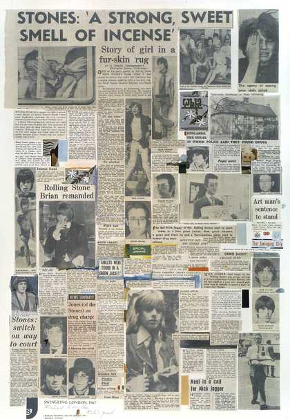
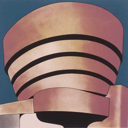
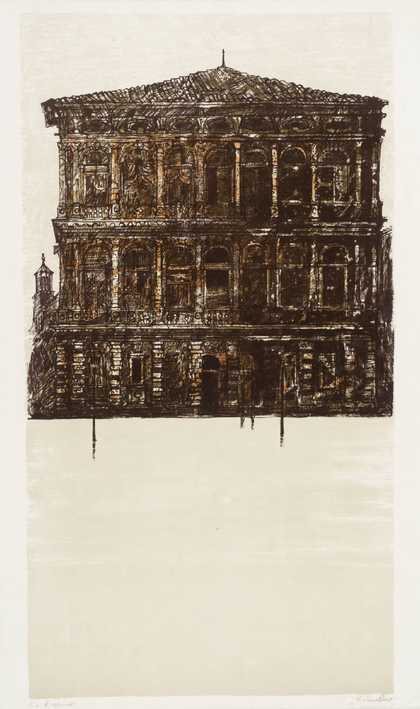
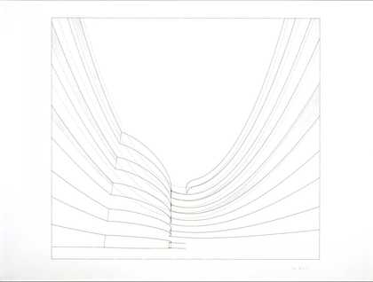
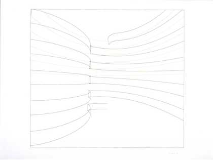
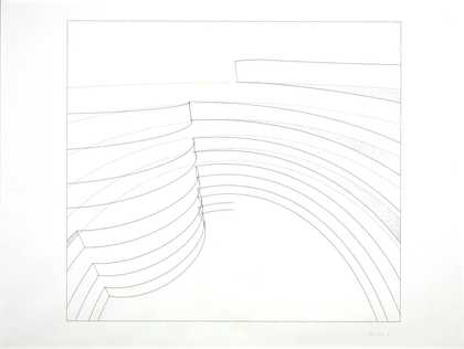
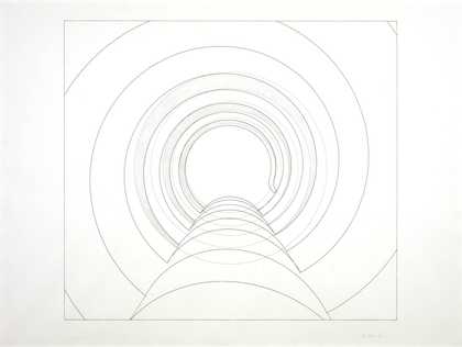
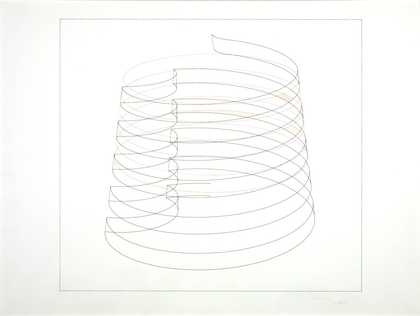
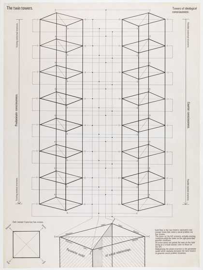
- Artist
- Richard Hamilton 1922–2011
- Medium
- Fibreglass and cellulose
- Dimensions
- Object: 1219 × 1219 × 178 mm
- Collection
- Tate
- Acquisition
- Purchased 1970
- Reference
- T01195
Summary
This is one of six large reliefs the artist created in 1965-6 as part of his analysis of the structure of the Solomon R. Guggenheim Museum in New York. Each relief is based on the same full-frontal view of the building, moulded in fibreglass and painted differently. Three versions are in the collection of the Museum itself: Black, Black and White and Spectrum, coloured as their subtitles suggest. The Gold model, covered in gold leaf, is in the collection of the Louisiana Museum of Modern Art, Humlebaek, Denmark and the Metalflake relief is in a private collection. The title of the Neapolitan version reflects its combination of the three colours pink, cream and green which reminded the artist of the colours of Neapolitan ice cream (traditionally strawberry, vanilla and chocolate).
The inspiration to create a portrait of a building came from some coloured postcards of the Museum that Hamilton came across. Frank Lloyd White’s controversial new building completed in 1959, the year of its architect’s death, suggested a striking sculptural form on an architectural scale. The postcards, in tinted blues, pinks and buffs, had altered the character of the building sufficiently, and in a range of sufficiently different ways, to suggest its potential as the basis for a series of variable interpretations of its structure through the use of line and colour. When Hamilton began to think of the museum as a relief object, it became clear to him that he would need more information than was supplied by the postcard images. His friend and former collaborator at the London Institute of Contemporary Arts, Laurence Alloway (1926-90), had been working as a curator at the Guggenheim Museum since 1961 and was able to send the artist photographic and other related material. The reliefs were preceded by an architect’s visual, a study (both 1965, Museum of Modern Art, New York), two drawings (drawing I, whereabouts unknown; drawing II, 1965, Solomon R. Guggenheim, New York) and the screenprint The Solomon R. Guggenheim, 1965 (P04252). Hamilton has explained:
Architect’s visual ... was an attempt to make a very dramatic rendering of the building conceiving it as ... any heroic architect might conceive the idea for his new building ... I was following ... the mode of creation of architecture by first of all getting the dramatic feel ... as though I was starting from scratch with this kind of concept and revisualising it ... [When] I began to work on ... the relief, I found it necessary ... to study ... the plans of Frank Lloyd Wright, because it’s a very difficult building to understand from the exterior ... I found myself trying to relate the plans to the kind of viewpoint I had taken ... Having a better understanding of the building I then began to make drawings which approached his problem at the technical level. I had to make plans ... elevations and sections of my own ... and then came the stage of construction, building it up with thick laminations, shaping down. So I was thinking of myself ... as covering the whole ground from visualisation of the building to the planning to construction and even later to photographing and publicising. It was an attempt to mirror the whole activity of architecture in the confines of a small panel ... four feet square.
(Quoted in Lullin, p.72.)
To make the relief model, Hamilton started with a square wooden panel, just over a metre square. Onto this he screwed and cemented each element of the façade, made from Weyroc (a kind of chipboard), before spraying the whole object with cellulose paint. He took several unsuccessful moulds from this object before achieving a cast that worked in fibreglass. After extensive refinement, this fibreglass body could be sprayed with the paint appropriate to its final state. Of all the colours, the Neapolitan version involved the most complex process. First Hamilton sprayed a relief with an even coat of white and then lit it carefully, from both sides, and took a colour photograph. He then sprayed the relief with a vanilla tint, forming the basic body colour, followed by a graduated layer of pink (strawberry) to simulate the tonal articulation of the lighting in the photograph. Finally, to complete the effect, he sprayed the recessed bands with pale green (or pistachio). The finished object is rich and glossy, showing the building’s elegant curves in dramatic receding bands and providing an exaggerated interpretation of the original structure. Using a title that refers to a fashionable ice cream, Hamilton suggests that the building has a similar status as a desirable consumer object. This is emphasised by the titles Gold, Spectrum, Metalflake – the latter two particularly fashionable in the mid 1960s. Like so many designer objects and ice creams, the relief portrait of the Guggenheim Museum is available in a range of attractive colours and flavours.
In 1970 Hamilton was invited to produce a run of 750 small-scale multiples of his Guggenheim relief by xartcollection, Zurich. The idea was to vacuum-form the reliefs in Perspex and offset the cost of expensive moulds by creating a large edition. In the event, the project was more technically difficult than anticipated and the edition, in three different colours – black, white and chrome – ran to a total of 271. A further twenty examples, not in the edition, were spray-painted by the artist in 1976.
Further reading:
Etienne Lullin, Richard Hamilton: Prints and Multiples 1939-2002, exhibition catalogue, Kunstmuseum Winterthur and Yale Center for British Art, New Haven 2003, pp.72-3, 250-1 and 264.
Richard Hamilton: Retrospective: Paintings and drawings 1939-2002, exhibition catalogue, Museu d’Art Contemporani de Barcelona, 2003, pp.43-7.
Richard Hamilton, exhibition catalogue, Tate Gallery, London 1992, pp.94-9 and 162-3, reproduced p.95 cat.38 in colour.
Gene Baro, ‘Hamilton’s Guggenheim’, Art and Artists, Vol.1, No.8, November 1966, pp.28-31, reproduced p.30.
Elizabeth Manchester
October 2007
Does this text contain inaccurate information or language that you feel we should improve or change? We would like to hear from you.
Catalogue entry
Richard Hamilton b. 1922
T01195 The Solomon R. Guggenheim Museum (Neapolitan) 1965–1966
Not inscribed.
Relief of cellulose on fibreglass, 48 x 48 x 7 (122 x 122 x 18). Purchased from the artist (Grant-in-Aid) 1970.
Exh: Robert Fraser Gallery, October-November 1966 (11); Alexandre Iolas Gallery, New York, May 1967 (5, repr. in colour); Tate Gallery, March–April 1970, and tour (May–August) of Stedelijk van Abbemuseum, Eindhoven, and Kunsthalle, Bern (110, repr.).
Lit: Gene Baro, ‘Hamilton’s Guggenheim’, in Art and Artists, I, November 1966, pp. 28–31, repr.; Richard Morphet, catalogue of Tate Gallery retrospective 1970, pp. 66–9, repr.
Repr: Christopher Finch, ‘Richard Hamilton’, in Art International, X, October 1966, p. 22.
Hamilton’s work since the mid-1950s had dealt with a variety of archetypal themes of the mass media. In the mid-1960s, he extended his preoccupation with themes from popular culture, by reinterpreting some of the cliché subjects of traditional art. In the two years 1965–7 he produced a still-life, a landscape, a self-portrait, bathers and a mother and child theme. Another class of subject matter he took up was the single building. Lichtenstein’s paintings of classical temples and Artschwager’s of skyscrapers stimulated Hamilton to tackle a building which, being largely curved, would be their structural antithesis. He was also interested to know if a successful work could be based on a new building and one which, like the supremely elegant Braun appliances in relation to florid car-styling for a mass market, was conceived as a work of high art in itself. The Guggenheim Museum was, however, also a popular cliché, exemplifying ‘modern architecture’, as familiar as those Hamilton had earlier used from girlie magazines and the automobile industry.
The Solomon R. Guggenheim Museum on Fifth Avenue, New York, was designed by Frank Lloyd Wright in 1943–6 and built in 1956–9. The final form of Hamilton’s interpretation of it was a set of reliefs in false perspective. His choice of this subject and treatment was a curious concentration of his earlier interests. The spiral form of the museum—a building assertively organic by contrast with its classical opposites—looked back to Growth and Form, the exhibition concerned with the way in which, in nature, function produces particular forms, which Hamilton had organised in 1951. The spiral form also related to the illusionistic spiral structure of the Exquisite Form bra in Hamilton’s ‘Hommage à Chrysler Corp’, 1957, and facilitated a diagrammatic treatment. The perspective problem was one of exceptional difficulty in which, as often in Hamilton’s work, the spectator was made very conscious of shifting view- points, while the use of heavy relief was a culmination of an obsession which could be traced back through Hamilton’s work to 1951. Both these concerns had been central in Hamilton’s ‘Five Tyres abandoned ‘, 1963; in that work, the perspectival problem was explicit, while in Hamilton’s ‘Five Tyres remoulded’, 1972, it would culminate in actual curved relief.
In both their appearance and the process of their making the ‘Guggenheim’ reliefs contrasted with Hamilton’s work to date. A single centralised image was a wide departure from anthologies of shape, technique and source; the Guggenheim reliefs were a deliberate move to an opposite extreme. They were made, with careful preparatory plans, in a manner consciously analogous to the construction of a building. Hamilton asked Lawrence Alloway, who was then working at the Guggenheim Museum, to send him photographs of the museum. Alloway sent three postcard views of it, from which Hamilton chose one as the basis for a drawing in pastel and gouache, ‘The Solomon R. Guggenheim—architect’s visual’ (coll. Museum of Modern Art, New York). In an unpublished, pre-edited transcript of a conversation with Christopher Finch and James Scott for a film (1969) on his work, Hamilton explained that ‘the drawing was labelled Architect’’s visual and… was an attempt to make a very dramatic rendering of the building conceiving it as… any… heroic architect might conceive the idea for his new… building… I was following… the mode of creation of architecture by first of all getting the dramatic feel... as though I was starting from scratch with this kind of concept and re-visualising it… [When] I began to work on... the relief, I found it necessary... to study... the plans of Frank Lloyd Wright, because it’s a very difficult building to understand from the exterior... I found myself trying to relate the plans to the kind of viewpoint I had taken… Having a better understanding of the building I then began to make drawings which approached his problem at the technical level. I had to make plans... elevations and sections of my own... and then came the stage of construction, building it up with thick laminations, shaping down. So I was thinking to myself... as covering the whole ground from visualisation of the building to the planning to construction and even later to photographing and publicising. It was an attempt to mirror the whole activity of architecture in the confines of a small panel... 4 feet square.’
The information contained in the starting point of the ‘architect’s visual’ was made more precise in ‘The Solomon R. Guggenheim—study’ (coll. Museum of Modern Art, New York) and ‘The Solomon R. Guggenheim—working drawing’. This ‘working drawing’ was enlarged onto a 4 ft. panel, and many full-size studies of profiles and cross-sections, followed by extensive and subtle hand-modulation of the resulting master, were necessary before a mould could be made, from which to cast six fibreglass reliefs (Hamilton’s work on the Guggenheim reliefs coincided with perspective calculations of great complexity in his reconstruction of Duchamp’s ‘Large Glass’).
An aim common to all six of the Guggenheim reliefs is the illusionistic subversion of the building’s clear-cut and assertively three-dimensional form by the super- imposition of a skin of colour and texture with quite independent associations and effects. The reliefs were completed in the following order. ‘Black and White’ contradicts the literal relief by resembling a drawing or diagram flat on a sheet. ‘Neapolitan’ (T01195) derives its colouring from the modelled effect of the fall of light. The relief was photographed when plain white, under careful lighting conditions. It was then sprayed a creamy hue (‘vanilla’), over which Hamilton sprayed a soft ‘strawberry’ hue so distributed as to simulate the tonal gradations of the surface shown in the photograph; lastly, the recessed bands of the relief were sprayed ‘pistachio’ green to complement the overall effect of soft blushes.
The colour in T01195 works both with and against the literal relief according to the setting in which the work is observed. The work is intended to be seen as analogous to ice-cream in both its colour and its form.
In ‘Black’ Hamilton developed possibilities perceived in the recessed bands of ‘Black and White’. The highly reflecting surface merges the rigid form of the relief with the shifting appearance of the surrounding environment. ‘Gold’ was made to resemble a traditional precious object of special veneration, and appears simultaneously to absorb and to dispense light. ‘Metalflake’ refers back to Hamilton’s car-styling preoccupations. Particles of anodised metals (in a mixture entitled ‘Bouquet’) were sprayed in a clear laquer, a technique from the car customising industry of California. Each particle retains its own colour, giving the relief an effect faintly analogous with Neo-Impressionist painting. It is also the most pictorial of the reliefs, being the only one in which the sky is separately coloured. In ‘Spectrum’, originally conceived as painted in heavy impasto to oppose the relief’s smooth lines, the colours of the spectrum pass at right-angles across the parallel curves. Hamilton had considered superimposing the spectrum at every angle from the vertical to the horizontal. The form of the Guggenheim Museum is reminiscent of that of a rainbow but overlaying one rainbow on another here inevitably disrupts the first, whether by accentuating the distinctness of each palpable ‘Guggenheim’ band, or by implying, as in ‘Spectrum’, a contradictory undulation across it.
‘Black and White’, ‘Black’ and ‘Spectrum’ were bought by the Solomon R. Guggenheim Museum in 1967. In addition to the six reliefs and the three preparatory works mentioned above, the following further versions of the ‘Guggenheim’ motif exist. There are two drawings in sprayed ink on plastic film, of which one is in the collection of the Solomon R. Guggenheim Museum, which also owns a study in gouache on photograph for an unexecuted version of the relief which would have had a gestural paint surface of heavy impasto. There are four small studies (private collection, U.S.A.) for ‘Spectrum’. In addition there are trial proofs of several states of a screenprint which was published in an edition of 50. In 1970, a set of three multiple versions of the reliefs, in a smaller size (60 x 60 x 10 cm.) was published in Switzerland in an edition of 750. The versions, black, white and chromium-plated, are all highly reflective. Statements by Hamilton on the ‘Guggenheim’ screenprint and multiples are printed in the catalogue of his prints and multiples retrospective, Stcdelijk Museum, Amsterdam, February-March 1971. Four working drawings of details of the large reliefs are reproduced in the catalogue of Richard Hamilton, Edizioni Recenti, Studio Marconi, Milan, January 1971. In 1968, Hamilton made a print in etching and silkscreen derived from a postcard of the interior of the famous opera house, ‘La Scala Milano’. The architectural image is an inversion of that in the ‘Guggenheim’ works.
Published in The Tate Gallery Report 1970–1972, London 1972.
Explore
- architecture(30,960)
-
- periods and styles(5,198)
-
- modernist(155)
- public and municipal(2,385)
-
- museum(141)
- USA(622)
- lifestyle and culture(10,247)
-
- cultural icon(63)
- contemporary society(640)