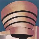
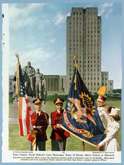
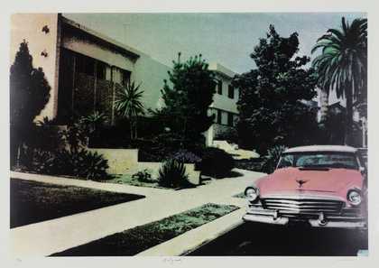
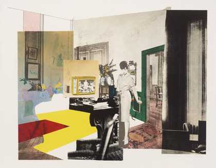
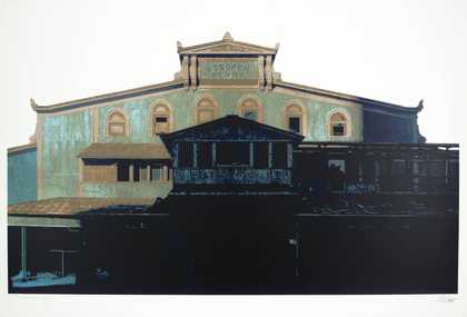
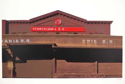
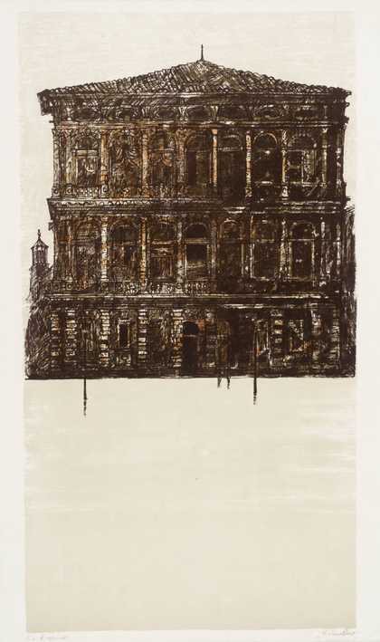
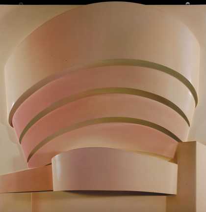
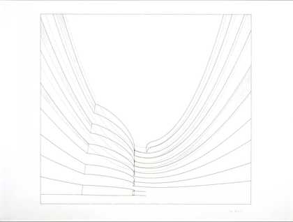
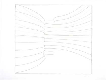
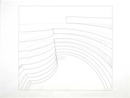
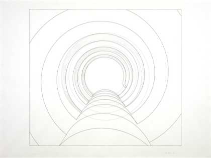
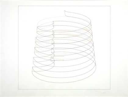
Prints and Drawings Room
View by appointment- Artist
- Richard Hamilton 1922–2011
- Medium
- Screenprint on paper
- Dimensions
- Image: 559 × 559 mm
- Collection
- Tate
- Acquisition
- Presented by Rose and Chris Prater through the Institute of Contemporary Prints 1975
- Reference
- P04252
Summary
Hamilton created the print The Solomon R. Guggenheim during the process of designing six large sculptural reliefs of the same form. The Solomon R. Guggenheim (Neapolitan), 1965-6 (T01195) is one of these. The print and the reliefs show the same full-frontal view of the building set in a square background. When he coloured five of the reliefs, Hamilton did not distinguish between the museum and the sky behind; only the Metalflake version has a different colour in the narrow flat margin behind the relief structure differentiating the figure from the background. The screenprint – like The Solomon R. Guggenheim –
architect’s visual, 1965 (Museum of Modern Art, New York), the initial pastel and gouache study Hamilton made for this project – shows the museum’s dramatic curves against an intense blue sky. The building itself is shaded tan and brown, with bands of black depicting areas of shadow under the massive contoured concrete walls.
The inspiration to create a portrait of a building came from some coloured postcards of the Museum that Hamilton came across. Frank Lloyd White’s controversial new building completed in 1959, the year of its architect’s death, suggested a striking sculptural form on an architectural scale. The postcards, in tinted blues, pinks and buffs, had altered the character of the building sufficiently, and in a range of sufficiently different ways, to suggest its potential as the basis for a series of variable interpretations of its structure through the use of line and colour. When Hamilton began to think of the museum as a relief object, it became clear to him that he would need more information than was supplied by the postcard images. His friend and former collaborator at the London Institute of Contemporary Arts, Laurence Alloway (1926-90), had been working as a curator at the Guggenheim Museum since 1961 and was able to send the artist photographic and other related material. After his realistically coloured visual, Hamilton made a pencil study (1965, Museum of Modern Art, New York) and two drawings (drawing I, whereabouts unknown; drawing II, 1965, Solomon R. Guggenheim, New York) before completing the screenprint. Hamilton has explained:
Architect’s visual ... was an attempt to make a very dramatic rendering of the building conceiving it as ... any heroic architect might conceive the idea for his new building ... I was following ... the mode of creation of architecture by first of all getting the dramatic feel ... as though I was starting from scratch with this kind of concept and revisualising it ... [When] I began to work on ... the relief, I found it necessary ... to study ... the plans of Frank Lloyd Wright, because it’s a very difficult building to understand from the exterior ... I found myself trying to relate the plans to the kind of viewpoint I had taken ... Having a better understanding of the building I then began to make drawings which approached his problem at the technical level. I had to make plans ... elevations and sections of my own ... and then came the stage of construction, building it up with thick laminations, shaping down. So I was thinking of myself ... as covering the whole ground from visualisation of the building to the planning to construction and even later to photographing and publicising. It was an attempt to mirror the whole activity of architecture in the confines of a small panel ... four feet square.
(Quoted in Lullin, p.72.)
In 1970 Hamilton was invited to produce a run of 750 small-scale multiples of his Guggenheim relief by xartcollection, Zurich. The idea was to vacuum-form the reliefs in Perspex and offset the cost of expensive moulds by creating a large edition. In the event, the project was more technically difficult than anticipated and the edition, in three different colours – black, white and chrome – ran to a total of 271. A further twenty examples, not in the edition, were spray-painted by the artist in 1976.
Hamilton has spoken of ‘the peculiar mixture of reverence and cynicism that “Pop” culture induces in me and that I try to paint’ (quoted in Richard Hamilton: Collected Words 1953-1982, Stuttgart and London 1982, p.78). His images of the Guggenheim museum transform the building into a Pop icon by simplifying and idealising it. During the 1950s to the end of the 1980s, Hamilton derived most of his imagery from magazines, newpapers, advertising and film stills, playing on the iconography of popular culture. His treatment of the Guggenheim museum transforms it into a glossy symbol, anticipating the corporate branding through identification with logos that became common practice at the end of the twentieth century.
The Solomon R. Guggenheim was screenprinted from five stencils by the artist and Chris Prater at Kelpra Studio, London on J Green Imperial paper. It was produced in an edition of fifty plus an unknown number of artist’s and printer’s proofs. Tate’s copy is one of the unnumbered artist’s proofs. It was published by Editions Alecto, London.
Further reading:
Etienne Lullin, Richard Hamilton: Prints and Multiples 1939-2002, exhibition catalogue, Kunstmuseum Winterthur and Yale Center for British Art, New Haven 2003, pp.72-3, 250-1 and 264, reproduced p.73 in colour.
Richard Hamilton, exhibition catalogue, Tate Gallery, London 1992, pp.94-9 and 162-3.
Richard Hamilton: Prints 1939-1983, Stuttgart and London 1984, pp.46-7, cat.60, reproduced p.47 in colour.
Elizabeth Manchester
October 2007
Does this text contain inaccurate information or language that you feel we should improve or change? We would like to hear from you.
Explore
- architecture(30,960)
-
- periods and styles(5,198)
-
- modernist(155)
- public and municipal(2,385)
-
- museum(141)
- formal qualities(12,454)
-
- space(177)
- USA(622)