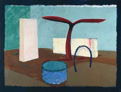
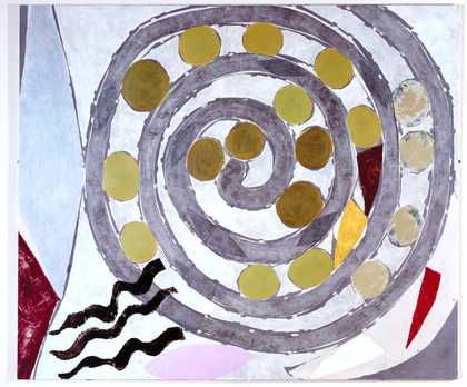
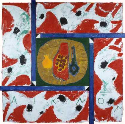
- Artist
- Tim Head born 1946
- Medium
- Acrylic paint on canvas
- Dimensions
- Support: 2136 × 1526 mm
- Collection
- Tate
- Acquisition
- Purchased 1987
- Reference
- T04932
Catalogue entry
T04932 Deep Freeze 1987
Acrylic on canvas 2136 × 1526 (84 × 60)
Inscribed ‘Top “Deep Freeze” Tim Head’ on top canvas turnover and ‘TIM HEAD “DEEP FREEZE” 1987’ on horizontal stretcher bar
Purchased from Anthony Reynolds Gallery (Grant-in-Aid) 1987
Exh: Appropriate Pictures: Head, Hemsworth, Wallinger, Anthony Reynolds Gallery, Feb.–March 1987 (no cat.); Tim Head, Whitechapel Art Gallery, Dec. 1992–Feb. 1993, Manchester City Art Galleries, May–July 1993 (no number, repr. p.45 in col.)
Lit: Sarah Kent, ‘Tim Head’, Time Out, 4 March 1987, p.34, repr. (detail); John McEwen, ‘Report from London: Britain's Best and Brightest. Prizewinners: Head and Hoyland’, Art in America, vol.75, no.7, July 1987, p.35, repr. p.36 (col.); Mary Rose Beaumont, ‘Tim Head’, Arts Review, 26 Feb. 1988, p.116; Adrian Searle, ‘Tim Head’, Artforum, vol.26, no.9, May 1988, pp.160–1; Gray Watson, Tim Head, exh. cat., Anthony Reynolds Gallery 1988, [pp.3–6], (listed as no.1 but not exhibited), repr. [p.9] (col.); Richard Shone, Tim Head, exh. cat., Nicola Jacobs Gallery 1990, [p.3]; Marco Livingstone, ‘Return of the Body-Snatcher’ in Tim Head, exh. cat., Whitechapel Art Gallery 1992, pp.43–7, repr. p.45 (col.); Roger Malbert, ‘London and Manchester: Tim Head’, Burlington Magazine, vol.135, May 1993, p.365
‘Deep Freeze’ consists of an all-over pattern of schematic shapes, derived primarily from cuts of meat but also from sections through brains and diagrams of chromosomes. Each shape is executed in silhouette in matt black with an ice blue surround. The shapes are distributed evenly across an uninflected white ground.
During the past fifteen years, Head has manifested his concern for the environment through imagery that calls attention to man's destructive intervention in the natural order through, for example, genetic engineering or the generation of lethal waste. In conversation with the compiler on 2 February 1990, the artist said that although he had previously made installations and photographic works alluding to these themes, it was not until 1980–1 that he started to pursue them more thoroughly.
According to Head, T04932 is one of a series of at least sixteen map-like paintings completed between 1986 and 1987 where he took images of organic matter and presented them in a deliberately flattened, sterile and unreal manner. These were some of the first paintings the artist had made since he had been a student in the 1960s. When they were first exhibited Gray Watson wrote that, in these works, Head was examining ‘the implications of, for example, the way in which natural products are packaged for our consumption and the promulgation of a grotesquely sanitised version of the “natural” with which this is associated’ (Watson 1988, [p.3]).
Head has combined images of organic and inorganic material in his work since the early 1960s (see Livingstone, ‘The Man-Machine’ in Whitechapel Art Gallery exh. cat., 1992, p.29). In conversation he told the compiler that there were many sources for the shapes in T04932:
I was working on a lot of images of meat, based on various symbols of meat in food advertisements I'd seen. What fascinated me was the way an image can be simplified so that you instantly recognise it as a piece of meat but it's clearly not like a real piece of meat at all. Then there are things on a different biological level ... chromosomes and sperm which are from various textbooks originally. As they are given the same scale, ... all these elements have the same sort of ‘non-scale’ in the painting.
Head also told the compiler that in works like T04932 he had referred to Abstract Expressionism, emphasising an all-over surface quality and the interdependency between ground and image. He found that the synthetic images he had been using indicated a simulated reality and opened up an imaginative, non-literal space which contrasted with the real spaces he had addressed in his earlier installations:
I suppose there is a ... family resemblance amongst all these images, so that whatever scale you are looking at, things have a resemblance. But I think [that there is a] difference between artists, say in the fifties, who were using organic imagery in a natural ... way, to the approach that I am using, which is very removed from the natural. In fact, even though I might start from the source of the actual material for a lot of these meat images I was drawing simply to get them to the point when they read as processed graphic symbols.
The artist told the compiler that he had decided on the title ‘Deep Freeze’ for T 04932 because:
For years I would collect cuttings from newspapers of fast food chains and food processing and cold storage, the whole process of contemporary food production ... I suppose there is also something quite chilling about it all. And, in a way ... I saw these images as being frozen. In terms of composition ... they are [the opposite] of that school of painting that is organic, of Henry Moore looking at nature ... or even somebody like Matisse ... Some of these images are quite close [to Matisse] in a way. He talks about working on images until he ‘freezes’ them but I suppose my freezing is more inert. The composition is frozen and stuck. It's not vital and organic. It's as if it is trapped in a frozen block.
Head told the compiler that he regarded his works as a general comment about the way daily life is made acceptable by corporate packaging and presentation: ‘the disturbing thing about the use of signs and logos is that they sanitise things and make them more palatable than they might otherwise be.’
Head has made art in a range of media but, until he began to paint again in the 1980s, he had chiefly used mechanical means of reproduction, for example, photocopiers, cameras and ink-jet printing, to enlarge photographic images and transfer them onto canvas. In the 1970s he made large installations of real and represented objects. These involved slides of interiors or objects, projected over or juxtaposed with their original sources, for example, ‘Displacements’, 1975 (T02078, repr. Tate Gallery Report 1976–8, 1979, p.78). Head also made smaller black-and-white editioned photographic prints such as ‘Equilibrium’, 1975 (P 07515, repr. Tate Gallery Report 1980–2, 1984, p.256). In 1982 he showed a tape-slide work, titled ‘Compass’, at the Tate Gallery. The accompanying broadsheet (Tim Head, Tate Gallery 1982) included a statement indicating his concern about the artificial manipulation of the environment and anticipating the imagery that was to appear first in his prints, and then, from 1987 onwards, in his paintings. In ‘Compass’ and other works made at the same time, Head introduced colour-coded signs, for example, credit cards, bar-codes and a radio-active warning sign, continuing what Gray Watson has referred to as ‘his exploration of the contemporary, cibernetic, digital, plastic, defence and security obsessed landscape’ (‘Tim Head at Anthony Reynolds’, Artscribe, no.59, Sept–Oct. 1986, pp.69–70).
During the 1980s Head continued his exploration of the world of consumer artifacts in brightly coloured high-focus cibachrome prints of assemblages of small mass-produced objects, such as toys, electrical goods and lipsticks, arranged to resemble artificial landscapes or cityscapes, for example, ‘State of the Art’, 1984 and ‘Erasers’, 1985 (both repr. Whitechapel Art Gallery exh. cat., 1992, p.33 in col.). He also made a series of photographs of sections of landscapes filled with discarded domestic products, for example, cleaning materials (see, for example, ‘Alien Landscape’, 1985, repr. ibid. p.37 in col.).
The series of paintings to which T04937 belongs was anticipated by a slightly earlier work, ‘Cow Mutations’, 1986, which won first prize in the John Moores exhibition (repr. John Moores Liverpool Exhibition 15, exh. cat., Walker Art Gallery, Liverpool 1987, no.36). This painting, which is more obviously figurative than those that followed it, is based on images of cows taken from a Sainsbury's milk carton. Head took the Sainsbury's design as his key and gradually distorted it to create an all-over flat pattern of black silhouetted cows against a white ground. The result is somewhat menacing but Head admitted to the compiler that there was also element of humour in his choice of imagery, and made a connection with Andy Warhol's ‘Cow Wallpaper’ of 1966 (repr. Warhol, exh. cat., Tate Gallery 1971, figs. 59–60). ‘I'd done “Cow Mutations” the previous October ... and I think I was in the process of doing a couple of other paintings at the same time as “Deep Freeze” but “Deep Freeze” was the second painting to be finished in that series.’
Seven paintings from the same series as T04932 were exhibited in 1988 at the Anthony Reynolds Gallery and reproduced in the catalogue. All dated 1987, these were: ‘Living Dead II’ (repr.fig.2 in col.); ‘Prime Cuts II’ (repr. fig.3 in col.); ‘Replicator’ (repr.fig.4 in col.), ‘Little Creatures’ (repr. fig.5 in col.); ‘Gold Nuggets’ (repr. fig.6 in col.); ‘Living Dead I’ (repr.fig.7 in col.). Also included but not listed or reproduced was a large landscape format work, titled ‘Dark Planet’, 1988 (1530 × 3660 mm, repr. Whitechapel Art Gallery exh. cat., 1992, p.48 in col.), which Head finished just before the opening of the exhibition. T04932 was listed in the catalogue but not included in the exhibition. The artist subsequently supplied the titles of eight other works from 1987, that form part of the same series, none of which has been reproduced: ‘Prime Cuts I’ (the artist's collection); ‘Prime Cuts III’; ‘Flesh and Blood’ (private collection, USA); ‘Dark Planet II’ (private collection); ‘Frozen Stock’; ‘Mutations’; ‘Flesh and Blood II’ (private collection, London); ‘Frozen Planet’ (private collection). Head told the compiler how, in all these works, he had removed his images from their natural colour associations and tried to use colours with a synthetic ‘look’:
There is a definite bias towards making sure that the paintings read as synthetic images, so the colours often have the appearance of being synthetic... Obviously, you can find these colours in nature but somehow there is a sense that they are like the colours you get in plastic objects or in colour-coded packaging ... In ‘Deep Freeze’ the colour-coding says its frozen because it is ice blue but the ‘meat’ is black ... that is unatural but it reads instantly as a piece of frozen meat.
Commenting on the other paintings he had exhibited at the Anthony Reynolds Gallery in 1988, Head told the compiler that although ‘Dark Planet’ was larger than the other pictures in the 1988 exhibition and also larger than ‘Deep Freeze’, it contained the same ‘family’ of imagery. It was taken from a radar satellite image of the earth showing ocean depths. The photograph had ‘split the world’, so that one half of Africa appeared on the righthand edge of the image and the other half on the left. The oceans were colour-coded in relation to their relative depths, whereas the land masses were black. What had interested Head was about this image was the unfamiliar presentation of a familiar subject: ‘You are looking at something that is your own planet but because of the way it is split up and because of the fact that the land is just black and dead ... it had this very alienated look.’
He said that ‘Living Dead’ reflected his interest in the horror films of George A. Romero (for example, Night of the Living Dead, 1968, where flesh-eating zombies are activated by radiation from a space rocket):
I suppose what I liked about them was the way the whole notion of the body and living matter is put on its head in those films. They are treated in such a macabre and bizarre way and it seems to have connections both with consumerism and cannibalism. ‘Living Dead’ was also a reference to genetics... The brain seems to be the organ of the body that is most exciting for people in genetics, because it is the most unknown part and the most complex. But then you can't treat it like a piece of meat.
Head said that T04932, like ‘Prime Cuts’, was based on images of sections through meat and brains, commenting:
again it's equating the brain with a slice of meat and also equating human and animal parts and giving them the same status through signs. ‘Replicator’ also contains imagery such as sperm, chromosomes and brains ... I don't think it's got any meat but it's got images that look very organic, which are taken from these strange potato crisps that are processed into wierd shapes for kids and are artificially flavoured and have jaws or fangs. They looked like organic parts but their flavouring and colouring is entirely synthetic. In this painting you get those images floating in among images of real chromosomes.
Head said that the images in his painting ‘Little Creatures’ were based on chromosomes and that the title came from a song from 1985 by the group ‘Talking Heads’, titled ‘Little Creatures of Love’. Head saw the painting and the song as sharing the same humour and ‘Disney cartoon quality’. Both also had a ‘rather sinister aspect which linked technology with reproduction’.
The painting titled ‘Nuggets’ examined the way food is processed into recognisable shapes:
you have a food substance which might be anything. It could be fish or meat. It's just processed stuff. To sell it as ‘fish’, they have to mould it into fish shapes so that you recognise it as a piece of fish. It could be a piece of plastic. The shapes in ‘Nuggets’ were either taken from food shapes or from other things. There was an advertisement for a gold watch, which was advertised as a ‘Texan Gold Nugget’ wrist-watch. The strap had cast shapes which were like nuggets ... It's so strange because you know what it's meant to be alluding to but then you suddenly think of the elaborate processes it's been through.
The artist regards T04932 and the paintings in the same series as:
a comment, in a perverse way, on notions of naturalism and the English landscape tradition. I look at a lot of these works as being landscapes but they are synthetic landscapes, artificial landscapes and so it is a criticism of accepting a notion of naturalism, or the landscape as being untampered with, or pure in some sense. It is becoming increasingly difficult to separate what you would call natural and what you would call artificial ... I think it does alter your view of landscape inevitably. You can't look at landscape as a bit of raw uncontaminated terrain anymore.
‘Deep Freeze’ was completed between January and February 1987. Head had anticipated the paintings in the series in collages made at least a year before, probably at the end of 1985. The works were made to ‘a size that was taller than a person and seemed to be a portable size that gave you a good expanse of image ... when you stood in front of it’. The works were painted in Liquitex on cotton canvas in a studio where Head still works, at Mornington Crescent in north London. He chose acrylic paint because it was the most appropriate medium to create the very flat, synthetic-looking images he required. Head commented on his method of working during this period:
The process for these paintings was to work on the images separately in various drawings, using a photocopy process for enlarging and re-drawing them and then to make a study, bringing all those images together ... Then, when the studies seemed right, to make a final drawing which was used like a map to project onto the canvas. These images were then mapped out in pencil, they were used as a guide. I was not going exactly by the drawing - they were just a placement, a shape - and the painting was done fairly freely. It is not a very meticulous way of painting. It's quite free but it ends up looking quite precise. In [T04932] the composition actually changed more in the painting than in a lot of the others, but the composition was, on the whole, fairly pre-determined so it did have that mechanical look to it. The choice of colours and the way it was painted means that the images have the look of graphic signs. That is a lot to do with the drawing and the colour and I suppose that gives them that synthetic look. So they are not painterly shapes.
Head made a number of preliminary drawings for T 04932:
The first ideas for this were done on backs of envelopes, sketches really, and small notebooks ...there were a lot of drawings that don't look like the painting but were definitely related to it. The painting actually changed a lot from the first ideas but the notion of things being deep frozen, frozen into these graphic signs, was consistent.
Head said it was difficult to isolate the sketches that referred only to T04932 from those that were used for other works because ‘there was a bit of cross-breeding going on’. He thought that for T04932 he must have made about sixty small sketches and notes, mostly drawings for individual elements. In 1986 he had made collages with photographs and drawing of meat. In addition, he made two small finished drawings, working out the position of the individual elements on the canvas. Head showed these drawings to the compiler and provided photocopies of them and of seven annotated sheets of sketches for the Tate Gallery files. He noted that one small crayon and ink sketch, while not giving a proper impression of the finished painting, nevertheless, had ‘a sense of the mosaic quality of the painting’. This was the point at which he finalised the ice blue and black colours.
Head told the compiler that, following the sale of T04932, he needed to refer to its imagery and made an A3 ink and watercolour version of it. This was not his usual practice. This work on paper and a slightly larger one were exhibited at the Marlene Eleini Gallery in 1988 (no catalogue) and are now in a private collection in London.
Between 1988 and 1989, following the series of works that includes T04932, Head made four paintings that were also based on processed food. Three of these were titled ‘Cold Turkey’ and the fourth was titled ‘Deep Fried’. They have not been illustrated but the artist told the compiler (18 February 1995) that they related closely to an installation he made, also titled ‘Cold Turkey’, for the Discreetly Bizarre Gallery in 1988 (repr. Whitechapel Art Gallery exh. cat., 1992, p.49). He then went on to paint a series of what he has described as ‘synthetic landscapes’ focusing on the texture of synthetic objects (see Tim Head, exh. cat., Nicola Jacobs Gallery 1990).
This entry has been approved by the artist.
Published in:
Tate Gallery: Illustrated Catalogue of Acquisitions 1986-88, London 1996
Explore
- abstraction(8,615)
-
- from recognisable sources(3,634)
-
- organic(827)
- non-representational(6,161)
-
- irregular forms(2,007)
- formal qualities(12,454)
-
- silhouette(388)
- artifice(96)
- food and drink(980)
-
- meat(55)