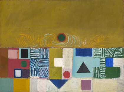
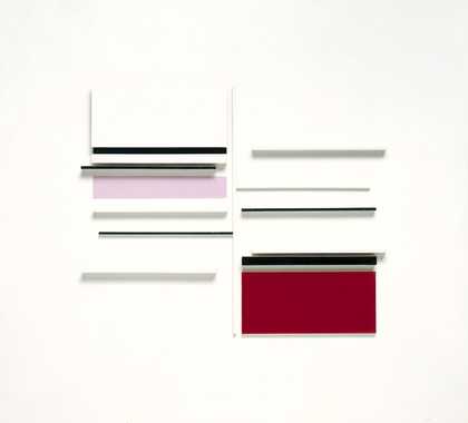
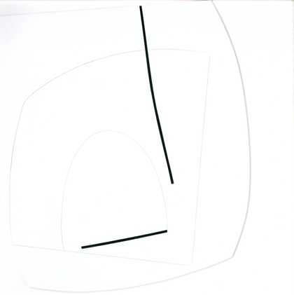
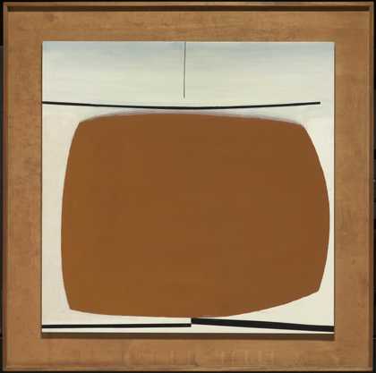
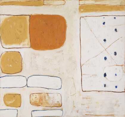
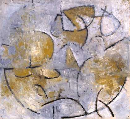
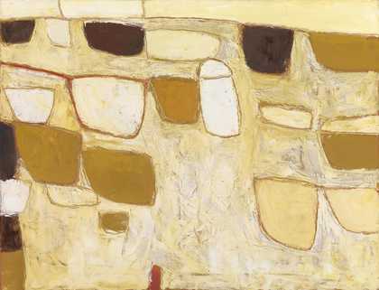
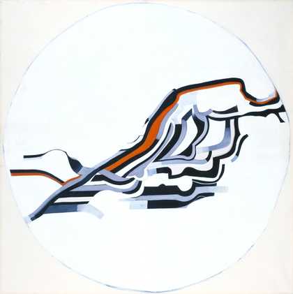
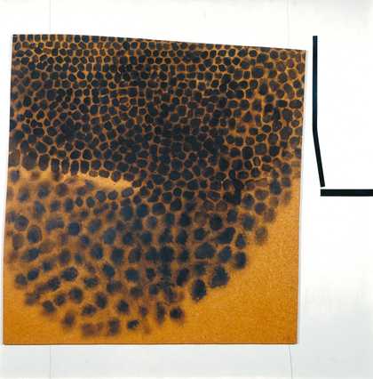
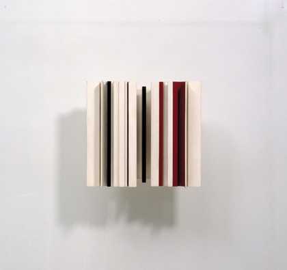
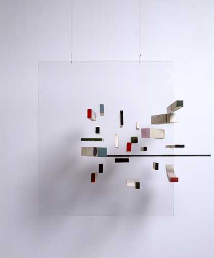
- Artist
- Victor Pasmore 1908–1998
- Medium
- Graphite, paper and printed paper on canvas
- Dimensions
- Support: 407 × 509 × 18 mm
Frame: 742 × 640 × 95 mm - Collection
- Tate
- Acquisition
- Presented by John Piper 1956
- Reference
- T00094
Catalogue entry
Victor Pasmore 1908-1998
Abstract in White, Grey and Ochre
1949
T00094
Pencil, coloured papers and newspaper on canvas 506 x 405 (20 x 16)
Inscribed in charcoal ‘VP.’ b.r.
Presented by John Piper 1956
Provenance:
Puchased from the artist by John Piper through the Redfern Gallery 1949
Exhibited:
Victor Pasmore, Redfern Gallery, London, Nov. 1949 (14, as Rectangular Motif in Yellow and Grey)
Ten Decades: A Review of British Taste, 1851-1951, Institute of Contemporary Arts and Arts Council, London 1951 (246 as Rectangular Figure in Yellow and Grey)
Victor Pasmore: Selected Works 1926-54, Arts Council Gallery, Cambridge, Feb.-March 1955 (23, as Rectangular Motif in Yellow and Grey)
Victor Pasmore: Retrospective Exhibition 1925-65, Tate Gallery, London, May-June 1965 (75, pl.43)
Decade 40s: Painting, Sculpture and Drawing in Britain 1940-49, Arts Council tour, Whitechapel Art Gallery, London, Nov. 1972, Southampton City Art Gallery, Dec.-Jan. 1973, Carlisle Public Library, Museum and Art Gallery, Jan.-Feb., DLI Museum and Arts Centre, Durham, Feb.-March, Manchester City Art Gallery, March-April, Bradford City Art Gallery, April-May, Aberdeen Museum and Art Gallery, May-June 1973 (no number)
Victor Pasmore, Yale Center for British Art, New Haven, Conn., Nov. 1988-Jan. 1989, Phillips Collection, Washington D.C., Feb.-April 1989 (19, repr. p.32)
Literature:
Tate Gallery Report 1956-7, London 1957, pp.17-18, repr. between pp.16 and 17
Mary Chamot, Dennis Farr and Martin Butlin, Tate Gallery: The Modern British Paintings, Drawings and Sculpture, II, London 1965, p.510
Andrew Forge (ed.), The Townsend Journals: An Artist’s Record of his Times 1928-51, London 1976, p.85, repr.
Alan Bowness and Luigi Lambertini, Victor Pasmore, with a Catalogue Raisonée of the Paintings, Constructions and Graphics 1926-1979, London 1980, 294, no.136, repr. p.292 (as Abstract in White, Grey and Ochre No.1)
Adrian Lewis, ‘British Avant Garde Painting 1945-56, part III’, Artscribe, no.36, Aug. 1982, p.17, repr.; Laughton 1986, p.328
Also reproduced:
Tate Gallery Report 1956-7, London 1957, between pp.16 and 17
Jasia Reichardt, Victor Pasmore, London 1962, p.[12]
In 1948 Victor Pasmore made his first entirely abstract paintings, which he exhibited at the London Group in May and at the Redfern Gallery in November. The following year his search for an objective art led to the production of a number of Cubist-like collages, of which Abstract in White, Grey and Ochre was one of the first. The dramatic change of direction of such a well known artist was seen as a hugely significant event by both the supporters of abstraction and its detractors. Herbert Read described Pasmore’s reorientation as ‘the most revolutionary event in post-war British art’.[1]
The change was, nevertheless, part of a broader recovery of abstraction and of the ideas of pre-war modernism.
Abstract in White, Grey and Ochre is made up of various pieces of paper and card glued to a primed and painted linen canvas. A basic pencil design was drawn on a surface prepared with a thin coat of white oil paint over a commercial white ground. The collage pieces were similarly marked before the shapes were cut out. These elements are of a widely varying range of grades and colours, from the cream coloured watermarked paper of the lower semi-circle to the sandy card rectangle and two ochre triangles at the bottom. The upper section is of thin buff-coloured card, on one section of which parallel charcoal lines have been drawn. The composition is dominated visually, however, by the newsprint set on its side. In 1996, the artist was able to identify the source as the Daily Worker;[2] the text confirms this. There are numerous pinholes in the collage elements. Both these and the scuffs and fingermarks did not concern the artist, who stated: ‘perfect new surfaces make me inhibited - the dirtier or scratched the better.’[3] There is some bubbling of the papers where the glue layer is incomplete. Both the papers - most especially the newspaper - and the excess glue around the individual elements have discoloured and in 1994 the artist said he did not like this discolouration.[4]
This was the first of two almost identical compositions. The second was also shown in the 1949 Redfern exhibition, as Rectangular Motif in Brown and Black (cat. no.6) and reproduced on the front cover of the catalogue. It was purchased by Dr J. Rake, subsequently shown in Pasmore’s 1954 ICA retrospective as Rectangular Motif and catalogued later as Abstract in White, Brown and Ochre.[5]
This repetition has contributed to a confusion over the title of the Tate’s work, which was known as Rectangular Motif in Yellow and Grey until 1956. At the time of acquisition the artist wrote to John Rothenstein, ‘the collage should be called Abstract in White, Brown and Ochre’.[6]
This revised title is consistent with the discolouring of the paper elements. A misunderstanding of the artist’s letter would seem to have prompted an earlier Tate Gallery catalogue entry in which this work was thought to have been transposed with the Rake version in the Redfern catalogue. In retrospect, the artist related the repetition of this work to numerous other occasions on which he had made variations of a particular image.[7]
A comparison of the two versions reveals one or two slight alterations. In the later work, the quadrilateral of black paper in the middle, towards the bottom was raised so as to protrude over the top of the cardboard on which it lay; the right hand semi-circle was made of a darker material and the triangular point a quarter of the way along the bottom touched the edge of the main composition with more precision.
Pasmore’s very first abstracts of 1948 derived from Paul Klee’s work and were based upon the development of the square and the triangle. This is a feature of the collages and similar paintings of the following year. In this regard he was also influenced by his knowledge of J.W. Power’s The Elements of Pictorial Construction (Paris 1933)[8] to which he had been introduced by his colleague at Camberwell, Elliott Seabrooke.[9]
Power developed Hambidge’s theory of rectangular proportions,[10]
articulating a method for moving and rotating geometrical forms. The effect of Pasmore’s understanding of this is to be seen in Abstract in White, Grey and Ochre: if the black quadrilateral, middle bottom, was a square its diagonal would be the same length as the side of the larger semi-circle. In this regard the work is comparable to the collage Triangular Motif in Pink and Yellow (Ferens Art Gallery, Hull)[11]
and to the very similar, Klee-like painting Abstract in Indian Red, Crimson, Pink, Olive and Crimson, 1949 (Earl Haig).[12]
Both of these are dominated by a square standing on its corner which, if rotated, would define a circle similar to that suggested by the semi-circle in the Tate picture.
The earlier title of the work suggests that its structure is based upon a rectangle. Pasmore’s practice of using geometry as a starting point and occasional aid, rather than as a dogmatic system, makes it difficult to identify the exact processes he followed. Nevertheless, if the quadrilateral of the main piece of newspaper is imagined as a rectangle (whose bottom edge is defined by the top of the smaller, sandy coloured rectangle), that has been swung away from the left hand edge of the painting, the result is the same size as the rectangle of primed canvas in the bottom right hand corner. The shorter dimension of that rectangle is the difference between the horizontal dimension of the overall composition and its golden section, that is to say, the reciprocal of the horizontal.
In his use of collage Pasmore sought a more concrete art form, the abandonment of painting facilitating his break from figuration. In retrospect he has seen these works as a major transition in his career. The adoption of the technique of papier collé is an example of his exploration of earlier styles, specifically the Cubist use of newspaper. David Sylvester, however, has maintained that they depend more upon Arp’s collages of 1915-16 than on Cubism.[13]
Pasmore’s use of collage as a means of achieving a more concrete art suggests a knowledge of Arp’s similar ends. He may have read Arp’s On My Way: Poetry and Essays 1912-47, published in English in 1947, and would have known reproductions of Arp’s work from various publications including Circle, 1937.
While he has insisted on the paper’s purely visual function, common themes can be found in the fragments Pasmore used in different works. Both versions of Abstract in White, Grey and Ochre include the racing page of the Daily Worker as their main form, the headlines ‘winners, prices at two meetings’ in the Tate’s picture and ‘winners, prices at three meetings’ in the other providing a light-hearted link. All the works of the series include fragments of Left-orientated news stories. Abstract in White, Grey and Ochre includes pieces on cotton workers’ pay and child health care, Triangular Motif in Pink and Yellow, 1949 juxtaposes ‘Franco’, ‘all workers’ and the news of the proclamation of the People’s Republic of China and Abstract in Brown, White, Black, Blue and Ochre (Museum of Modern Art, New York)[14]
is dominated by the word ‘LIBERTY’.
The political content is the consequence of Pasmore’s use of cuttings from The Daily Worker, which Alastair Grieve has said he used along with The Times to give balance; he used the sports and political pages for the same reason.[15]
The combination of sports news and social affairs seen in Abstract in White, Grey and Ochre also appears in Rectangular Motif in Black and White, 1949 (Adrian Heath collection),[16]
in which cricket scores are juxtaposed with a report on the anniversary of the Paris Commune. The Daily Worker was an organ closely tied to the Communist Party of Great Britain and associated with the Artists’ International Association, of which Pasmore had been an active member before the war. Its use, therefore, would invite a political reading of the work, though the title might be seen to undermine such an interpretation.
Chris Stephens
Feb. 1998
[3] Interview with Tate Gallery conservator, 2 March 1994, Tate Gallery conservation files
[4] Ibid.
[6] Letter to John Rothenstein, 28 June 1956, Tate Gallery acquisition files
[7] Letter to the author, 19 Nov. 1996, Tate Gallery cataloguing files
[9] Alastair Grieve, Victor Pasmore, exh. cat., Arts Council, London 1980, p.37
[10] Jay Hambidge, The Elements of Dynamic Symmetry, New York 1926
[11] Repr. Bowness and Lambertini 1980, p.292
[12] Repr. ibid., p.97
Explore
- abstraction(8,615)
-
- non-representational(6,161)
- formal qualities(12,454)
-
- cubist space(86)