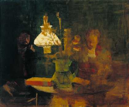
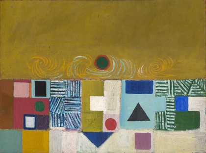
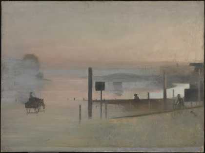
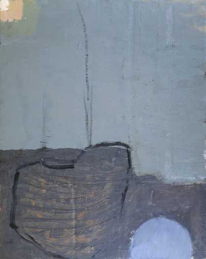
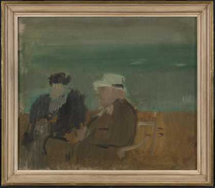
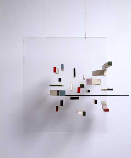
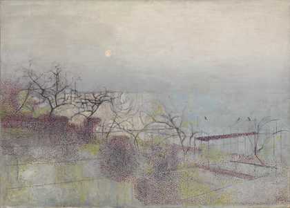
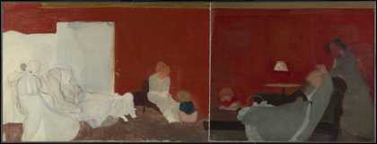
- Artist
- Victor Pasmore 1908–1998
- Medium
- Oil paint on canvas
- Dimensions
- Support: 813 × 1003 mm
frame: 1080 × 1264 x100 mm - Collection
- Tate
- Acquisition
- Purchased 1953
- Reference
- N06191
Catalogue entry
Victor Pasmore 1908-1998
Spiral Motif in Green, Violet, Blue and Gold: the Coast of the Inland Sea
1950
N06191
Oil on canvas 812 x 1003 (32 x 39 1/2)
Inscribed in red oil paint ‘VP.’ b.l.
Purchased from the artist through the Redfern Gallery (Cleve Fund) 1953
Exhibited:
Victor Pasmore; London Painter-Printers; John Harrison; French Paintings and Original Prints, Redfern Gallery, London, Dec. 1950-Jan.1951 (11, repr.)
Important New Paintings, Redfern Gallery, London, Feb.-March 1951 (121)
Summer Exhibition, Redfern Gallery, London, June-Aug, 1951 (253)
Selection from the Summer Exhibition, London, Redfern Gallery, Aug.-Sept. 1951
Contemporary British Paintings, Redfern Gallery, London, May-July 1953 (20)
Coronation Exhibition: Contemporary British Paintings, Redfern Gallery, London, June-July 1953 (20, repr. in col.)
Victor Pasmore: Paintings and Constructions, Venice Biennale, June-Oct. 1960 (4)
Pasmore and Paolozzi, British Council European tour 1960-1, Umetnicki Paviljon, Malum, Kalemegdanu, Belgrade, Nov. 1960, Musée des Arts Décoratifs, Paris, March-May 1961, Stedelijk Museum, Amsterdam, June 1961, Städtische Kunstgalerie, Bochum, July-Sept., Palais des Beaux-Arts, Brussels, Sept.-Oct. 1961, Gallery A.P.I.A.W., Liège, ?Oct.-Dec., Kunstnernes Hus, Oslo, Dec. 1961-Jan. 1962, Louisiana Museum of Modern Art, Humelbaek, Jan. (5)
Victor Pasmore: Retrospective Exhibition 1925-65, Tate Gallery, London, May-June 1965 (89, col. repr. pl.2)
Forty Years of Modern Art, Tate Gallery, London, Feb.-April 1986 (no number)
Literature:
Tate Gallery Report 1953-4, London 1954, p.22
John Commander, Victor Pasmore: Selected Works 1926-54, exh. cat., Arts Council Gallery, Cambridge 1955, p.6
Patrick Heron, The Changing Forms of Art, London 1955, p.197
Anton Ehrenzweig, ‘Victor Pasmore’s Architectural Constructions’, Quadrum, 4, 1957, p.54
John Rothenstein, The Tate Gallery, London 1958, p.118, repr. (col., as ‘The Inalnd Sea’)
Alan Bowness, ‘The Paintings and Constructions of Victor Pasmore’, Burlington Magazine, vol.102, no.686, May 1960, p.202
John Rothenstein, The Tate Gallery, col. 1962, p.137, repr. (col.)
Mary Chamot, Dennis Farr and Martin Butlin, Tate Gallery: The Modern British Paintings, Drawings and Sculpture, II, London 1965, pp.509-10
Simon Wilson, British Art: From Holbein to the Present Day, London 1979, p.165, repr. p.163 (col. )
Alan Bowness and Luigi Lambertini, Victor Pasmore, with a Catalogue Raisonée of the Paintings, Constructions and Graphics 1926-1979, London 1980, p.294, no.154, repr. p.85 (col., as Spiral Development in Green, Violet, Blue and Gold: the Coast of the Inland Sea)
Alastair Grieve, ‘Charles Biederman and the English Constructionists I: Biederman and Victor Pasmore’, Burlington Magazine, vol.124, no.954, Sept. 1982, p.542, repr. p.543, fig.4
Bruce Laughton, The Euston Road School: A Study in Objective Painting, Aldershot 1986, p.329, repr. p.330 (as Spiral Development in Green, Violet, Blue and Gold: The Coast of the Inland Sea)
Reproduced:
David Sylvester, Britain Today, Dec. 1950, p.38; Victor Pasmore, ‘The Artist Speaks’, Art News and Review, vol.3, no.2, 24 Feb. 1951, p.3
‘Exhibitions’, Architectural Review, vol.109, no.650, Feb. 1951, p.126
Michael Middleton, ‘Painters and Pictures’, Vogue, vol.108, no.2, Feb. 1952, p.75 (col.)
Stephen Spender, ‘English Artists vs English Painting’, Artnews, vol.52, no.7, pt.1, Nov. 1953, p.17
Andrew Forge, ‘Paul Klee’s Influence on English Art’, Listener, 7 April 1955, p.608
John Rothenstein, The Tate Gallery, London 1958, p.118 (col.); Cross 1984, p.135, pl.88
The perceived importance of Spiral Motif in Green, Violet, Blue and Gold: the Coast of the Inland Sea at the time of its first showing was reflected in its extended display at the Redfern Gallery in 1950 and 1951. Rex Nan Kivell of the Redfern later told the Tate Gallery that Pasmore considered it ‘the most important picture of that period’.[1]
The work is characteristically painted in oil on to a commercially white-primed linen canvas. The design was drafted in charcoal and then apparently sketched in with very liquid, but rich paint. Dribbles on the edges of the canvas indicate that it was laid flat when the first layers were applied. Later paint layers are thicker, though still quite fluid, the lightly brushmarked surface showing varying degrees of gloss. In the upper part of the composition extensive areas of the ground are bare, revealing that earlier spiral forms were painted and scraped off, leaving residues of paint in the weave of the canvas. The paint has crackled in places and scratches towards the left hand side occurred while it was still wet.
In a manuscript prepared for Lawrence Alloway in 1954[2] Pasmore stated that this painting‘was one of a limited series of landscape themes developed by means of a free construction of pure form elements, either the spiral line as in this case or the square as in the “Eclipse”’ (Tate Gallery N05974). This body of work drew on Pasmore’s appreciation of Paul Klee’s painting and theory, in which the objective composition of the work from basic formal blocks - spirals or squares for instance - was combined with the artist’s intuitive sense. In a contemporaneous statement Pasmore described how he would choose ‘as a theme or subject, a particular combination of two or more such [formal] elements’ and begin to draw. ‘As these elements combine with each other on the canvas, so are emotions and ideas evoked - the act of drawing a spiral in a variety of ways will evoke emotions similar to those associated with the spiral movements of nature.’.[3] The work, he said, was ‘not the result of abstraction in front of nature, but a method of construction emanating from within’. He used forms such as the spiral not because he wished to create a geometrical art but because ‘these forms, being already abstracted from nature and universally recognised, have become concrete elements in themselves and, as such, lend themselves to free interpretation by the painter’. In this regard he compared such painting to music: ‘Painting, like music, is not an imitation of nature; it is a concrete object which operates and infects the spectator like nature’.
The reworking of the upper area and the apparently ad hoc changes made to the curvilinear forms around the sun indicate the way the composition was developed as it was painted. It is evident that just under the sun the area that appears as land was raised so that the blue lines of the sky mingle with its greens. Similarly, to the right of the sun partially erased dark green lines cross from the sky into the sea. Nevertheless, it would appear that some sort of geometrical system has been employed as a compositional aid. The horizon marks the golden section of the painting’s vertical dimension and the bottom edge of the sun is exactly half way down. The visibility of the intersection of three compositional lines at the top right hand corner of the sun suggests the use of a proportional system. The cursory marks, which form a downward pointing arrow, are exactly half way across the canvas and the same distance up from the bottom. That distance is the golden section of the vertical dimension, so that the marks divide the painting into two identical squares and the reciprocal rectangle of the whole.
Coast of the Inland Sea was one of several of Pasmore’s important works of the period which were based upon the spiral. Spiral Development: The Snowstorm, 1950-1 (Arts Council)[4] was his contribution to the Arts Council’s major Festival of Britain exhibition, 60 Paintings for ‘51 and he made the comparable mural The Waterfall for the Regatta Restaurant on the Festival’s South Bank site (destroyed).[5] The spiral had been a feature of his work since 1948; its first appearance, according to Ronald Alley, was in Spiral Motif: The Fiery Sky of that year.[6] The spiral had been shown to be a basic form in natural geometry in a number of texts familar to Pasmore. Both Matila Ghyka’s Geometry of Art and Life, 1948 and Jay Hambidge’s The Elements of Dynamic Symmetry, 1926 demonstrate how the logarithmic spiral, like a snail’s shell, is the formal basis for many natural structures, such as the head of a sunflower. Similarly, in On Growth and Form, 1917, d’Arcy Wentworth Thompson attached considerable importance to the spiral form.
On Growth and Form had a significant influence on British art from its re-publication in 1942 to the 1950s: it was promoted by a number of people, notably Herbert Read, and was especially widely read amongst those associated with the Institute of Contemporary Arts. In 1950 Richard Hamilton curated a Growth and Form exhibition there, based on Thompson’s study, which was followed by a conference and related book Aspects of Form: A Symposium on Form in Nature and Art, edited by Lancelot Law Whyte. On Growth and Form was an examination of the structures of living organisms in which Thompson proposed the theory that all natural form is the result of organic growth. This principal of process determining final form, which was to be significant to much subsequent British abstract art, influenced Pasmore’s practice as much as the formal element of the spiral.
An earlier Tate Gallery catalogue entry[7] records that Pasmore refuted the suggestion that his spirals might have been inspired by Leonardo’s Deluge drawings, though he was familiar with them (Kenneth Clark’s catalogue of the collection of Leonardo drawings at Windsor Castle was published in 1935). Insisting that he ‘first discovered the aesthetic force of the spiral’ in his own paintings of the Thames, Pasmore acknowledged that his use of it had been reinforced by his ‘discovery’ of a print by Hiroshige.[8] The work in question would appear to be the late triptych Seascape of Naruto Strait in Awa Province.[9] In another echo of Whistler, Pasmore’s citation of Hiroshige reveals his equal interest in European and non-Western art. The spirals in the sky of Coast of the Inland Sea and especially in the monochromatic works like Snowstorm, are also particularly reminiscent of forms seen in the work of Van Gogh, specifically in the skies of his paintings of cypress trees of 1889 and in the background of his Self-Portrait (Musée d’Orsay.[10]
The strong colouring of Coast of the Inland Sea is also indicative of Pasmore’s debt to Van Gogh, whom he quoted in ‘The Artist Speaks’: ‘“Colour,” wrote Van Gogh, “expresses something in itself. To start from one’s palette, from one’s knowledge of the harmony of colours, is quite different from following nature mechanically”.’[11] The use of bold colouring, different forms and cross-hatching is comparable to Square Motif, Blue and Gold: The Eclipse (Tate Gallery N05974). Both reflect Pasmore’s adoption of the ideas of Kandinsky as well as of Klee and the Post Impressionists. However, Coast of the Inland Sea is considerably less formally arranged than Square Motif, reflecting perhaps his growing interest in the organic aesthetics derived from Thompson.
Pasmore used similarly strong colours in Spiral Motif in Green, Blue, Brown and Lilac, 1950 (private collection),[12] which has been described as ‘a freer, more abstract’ reworking of the Tate’s painting.[13] Though later retitled Linear Development in Green, Blue, Brown and Lilac: The Coast of the Inland Sea, No.2, it is equally comparable to the black and white spiral works like Snowstorm. In particular, its inter-locking forms are similar to those derived from the drawings of rocks on Porthmeor Beach (Tate Gallery T00092). The suggestion of a landscape source is strengthened by the colouring: areas of blue, green and golden yellow in the lower area suggest sea, land and beach. However, the dominating tones of red and an illusionistic, painted frame emphasise the painting’s status as an independent object.
Pasmore’s emotive use of colour reflects his search for an objective art based upon subjectivity. In a later article he explained this apparently paradoxical concept. He quoted Cézanne’s belief that the artist develops a harmony parallel to nature according to a ‘new and original logic’. That logic was objectivity, found in different cultures in geometry, religion or science, reached through ‘subjective processes’. The artist, he said, starts with an ‘objective core’ - the formal motif - which he develops into a ‘subjective circumference’ - the final image. Thus is achieved a beauty which is ‘real and actual rather than imitative and illusionary’. ‘It is both the paradox and the mystery of art that the greater the objectivity the deeper the subjective penetration’, he wrote.[14]
To this end Pasmore insisted upon the non-representational nature of Coast of the Inland Sea. ‘The coast of the inland sea’, he told Alloway, ‘is, in this picture, a sea coast of subconscious experience. It does not refer to any coast known or seen by the artist. The word “inland” here denotes this extreme subjectivity’. As with Klee, the title was suggested by the completed picture. Nevertheless, Coast of the Inland Sea, like The Eclipse, reuses the theme of a landscape dominated by a centrally positioned sun that had also been a feature of Pasmore’s earlier river paintings. It was made at a time when many British artists were using natural forms and the landscape as a vehicle for experiments in abstraction and non-figuration. Specifically, in 1950 Pasmore visited St. Ives which was seen as a centre for landscape-derived abstraction. He went on the invitation of Ben Nicholson, though he had known a number of the younger artists associated with the town, like Peter Lanyon and Terry Frost, for some years. The combination of swirling and more static linear forms seen in Coast of the Inland Sea was later adopted by Frost in his pictures of Cornish harbours.
Pasmore recalled that he abandoned the spiral motif because ‘it did not give adequate expression to modern conceptions of space’.[15] In 1950 he had made his first relief, a mural at Kingston bus depot in Surrey. Drawing on the influence of Nicholson (Pasmore had bought a 1938 Nicholson relief earlier that year) and on his own abstract collages of 1949, this mural signalled the direction of Pasmore’s work towards three-dimensional non-figuration.
Chris Stephens
Feb. 1998
[3] Victor Pasmore, ‘The Artist Speaks’, Art News and Review, vol.3, no.2, 24 Feb. 1951, p.3
[5] Repr. Victor Pasmore, ‘A Jazz Mural’ in Mary Banham and Bevis Hillier (eds.), A Tonic to the Nation: The Festival of Britain 1951, London 1976, p.102
[6] Ronald Alley, Victor Pasmore, exh. cat., Tate Gallery, London 1965, no.72
[8] Ibid.
[9] Repr. Isaburo Oka, Hiroshige: Japan’s Great Landscape Artist, London 1982, p.84
[10] Repr. J-B. de la Faille, L’Oeuvre de Vincent Van Gogh: Catalogue Raisonée, 1928
Explore
- abstraction(8,615)
-
- from recognisable sources(3,634)
-
- landscape(1,191)