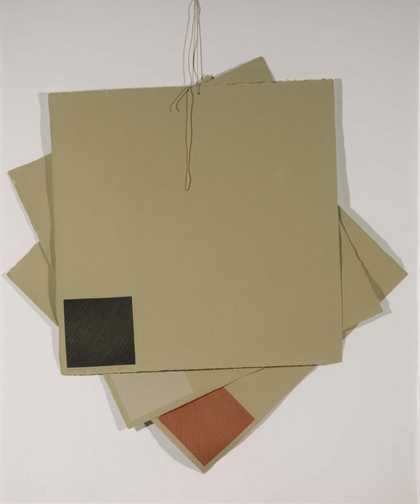
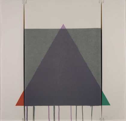
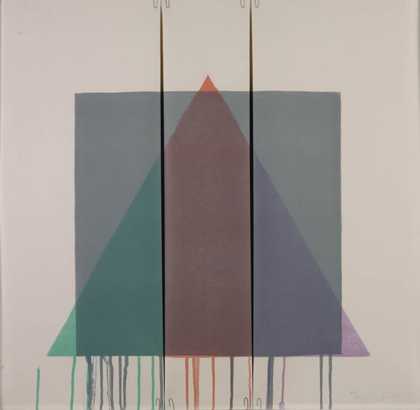
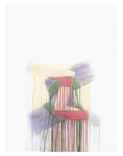
- Artist
- Richard Smith 1931–2016
- Medium
- Acrylic paint on 7 canvases, aluminium and string
- Dimensions
- Support: 2972 × 2020 × 673 mm
- Collection
- Tate
- Acquisition
- Presented by the artist in memory of his father 1987
- Reference
- T04886
Summary
The Typographer consists of seven, irregularly shaped sections of cotton canvas which hang in front of the wall, the individual sections overlapping to create a shallow relief. Each section is stretched between painted aluminium tubing which is attached diagonally to the canvas with lengths of coloured string that hang down towards the floor. The tubing at the back of each shape is stained red, and that at the front dark green. The canvas panels are thinly painted on the front with hard-edged abstract shapes, and Smith's initials have been stencilled onto one of the central panels. The predominant colours are bright acid green, scarlet, dark blue and black. The backs of the panels are painted matt red or green, and each is suspended from its uppermost corner by a length of red string. The work is suspended at a height of ten feet and the lower panels almost touch the floor. Because the brightly coloured panels hang from above, rather than being firmly attached to the wall, they sway as the spectator walks past, evoking the flutter of sails or washing hung out to dry.
The Typographer thus employs techniques that Smith had used since the early 1970s. Described as making 'kites' Smith tied separate pieces of canvas together, stretching them over rods, or hanging them on wires. The work also develops Smith's exploration of the relation between a two-dimensional, kite-like painted surface and real space. In works such as Mandarino 1973 (Tate T01807) or Cartouche 1-10 1979 (Tate T03060), flat brightly coloured panels were suspended on stings in front of the wall. In spite of their experimental character, such works relate to the wall and therefore evoke the traditional conventions of painting. In other works such as the 1973 environmental installation for the Mr. Chow restaurant in Los Angeles, a series of painted discs were hung from the ceiling. Relating to the space of the room, they were simultaneously abstract paintings and also resembled thin, sail-like sculptures. The Typographer is an equally playful work, where two-dimensional elements are used to create a shallow three-dimensional construction, the resulting frieze-like space relating to both painting and sculpture.
Unlike most of Smith's work produced since the mid 1960s, The Typographer has a figurative subject, and is based upon another image, Fernand Léger's (1881-1955) Typographer of 1919. Léger's painting features a stylised image of a man whose body parts have been flattened and simplified into basic machine-like forms. The man wears a schematised beret and smokes a cigarette, elements that Smith incorporates into his image, along with the bold stencilled lettering. Like the Léger, Smith employs brightly coloured panels to suggest the human figure. The suspended, overlapping panels also evoke Léger's Cubist layering of flat colours on top of one another. In an unpublished Tate interview, Smith explained that he intended the panels to replicate as closely as possible the positions of the painted planes in the Léger. The bold harsh colours and simplified abstract patterning also relate to the Léger.
Smith made The Typographer in his Warren Street studio in New York over a period of a few weeks. He did not create a maquette. In an unpublished Tate interview he stated that he found it liberating to make something which had its roots outside his own aesthetic. He was initially drawn to Léger's figurative painting because of its subject matter. Smith's father, who had recently died, had been a printer. The Typographer was created in his memory.
Further Reading:
David Mellor, The Sixties Art Scene in London, exhibition catalogue, Barbican Art Gallery, London 1993, pp.124-131
Marco Livingstone, Pop Art: A Continuing History, London 1990, pp.109-111
Bryan Robertson, Richard Smith Paintings 1958-1966, exhibition catalogue, Whitechapel Art Gallery, London 1966
Imogen Cornwall-Jones
November 2001
Does this text contain inaccurate information or language that you feel we should improve or change? We would like to hear from you.
Catalogue entry
T04886 The Typographer 1986
Acrylic on seven canvas panels, braced by painted aluminium tubing, and string, overall dimensions 2972 × 2020 × 673 (117 × 79 1/2 × 22 1/2)
Inscribed ‘R Smith | 86’ on back of lower of two elliptical panels
Presented by the artist in memory of his father 1987
Lit: Tate Gallery Calendar, March 1988, repr.
This work consists of seven separate, irregularly shaped sections of cotton canvas. Each of the sections is cross-braced back and front with painted aluminium tubing, attached diagonally to the canvas with lengths of coloured string. The tubing attached to the back of each section is painted dark red and that on the front dark green. There are altogether thirty red rods and twentyone green rods, of differing lengths. The lengths of string, which have been painted to match the rods they secure, pass through the tubing and are threaded through metal eyelets on the edges of the canvas. Where the front and back tubes cross, the artist has secured them at each intersection, with shorter lengths of string which pass through the canvas. The canvas panels are thinly painted on the front with a series of hard-edged abstract shapes, with the exception of one section in the centre of the work on which the artist's initials are stencilled. The predominant colours are a bright acid green, scarlet, dark blue and black. Each panel is painted matt red or matt green on the reverse. The work hangs from seven points. Each canvas section is supended from its uppermost corner by a length of red string attached at one end to the canvas though an eyelet, and, at the other end, to a metal loop.
The panels are suspended on cables to a height of ten feet from the floor. At the end of the cables are bull dog clips to which the canvas panels are attached. When T04886 was acquired by the Tate Gallery, Smith agreed that the work could be suspended from a box secured to the gallery wall at a height of sixteen feet. Screw eyes are fitted into the box at seven points. Thin steel cable is attached to the screw eyes and the work is joined to these by strings suspended on bull-dog clips. When installed, the individual sections overlap to create a shallow relief.
The artist presented this work to the Tate Gallery in memory of his father, Charles Walter Smith, a printer who was born in Bethnal Green, London, and worked in the Stationery Office until his retirement. He worked at the Drury Lane Press printing Hansard, the daily parliamentary record. He continued in this job, which, according to the artist, involved working at night to prepare for printing the next day, throughout the Second World War. The artist told the compiler (22 June 1994) that he was close to his father, who always encouraged him and followed his career closely.
In a letter dated 26 July 1986 to Alan Bowness, then Director of the Tate Gallery, Smith described T04886 as a ‘transcription of Léger's painting “The Typographer”’. Although in Smith's painting there is an obvious connection between the title of the work and his father's profession, the artist subsequently confirmed that there are no direct references to his father in the work (conversation with the compiler, 22 June 1994).
Smith based T04886 on two works by Fernand Léger, which are part of a series of four closely related paintings made between 1917 and 1919. He told the compiler that when installed, the panels of T 04886 should replicate as closely as possible the positions of the painted planes in the Légers. The four Léger paintings are: ‘The Typographer’, 1918 (Harold Diamond, New York, repr. Georges Bauquier, Fernand Léger: Catalogue raisonné de l'oeuvre peint. Vol.I 1903–1919, Paris 1990, p.263, no.146 in col.); ‘The Typographer (Second State)’, 1919 (Staatsgalerie Moderner Kunst, Munich, repr. ibid., p.333, no.188 in col.); ‘The Typographer’, 1919 (Rijksmuseum Kröller Müller, Otterlo, repr.ibid., p.335, no.189 in col.); ‘The Typographer’, 1919 (Louise and Walter Arensberg Collection, Philadelphia Museum of Art, repr.ibid., p.337, no.190 in col.). The largest of these works is the painting completed in 1918, also known as ‘Composition’. It measures 248 × 182 cm and is the closest in scale to T04886.
Smith told the compiler that T04886 was inspired by the paintings in Philadelphia and New York (Bauquier 1990, nos.146, 190), and this is apparent when the Smith is compared with illustrations of the four Léger compositions. Smith had seen the work in the Philadelphia Museum and had also seen a photograph of the New York painting in a magazine. He is unable to remember what publication this was.
In Léger and the Avant-Garde (New Haven and London 1976), Christopher Green discusses the ‘Typographer’ series in detail. He traces the source of the image to paintings and drawings made by Léger of a wounded soldier at the Western Front during the First World War. The profile of a pipe smoking soldier, with his head bandaged, was represented by Léger in a number of works from 1914 onwards (see Green 1976, pp.117–18, 151–7). Green writes that the ‘Typographer’ theme was probably suggested to Léger while the artist was working closely with typographers on his illustrations for the volume of poems J'ai tué by the Swiss poet Blaise Cendrars, published in 1918. He describes how the ‘machine-man’ image of the soldier was fragmented and reassembled by Léger in preparation for its return as the ‘peacetime Typographer’ (ibid., p.153). What were bandages in the early soldier paintings became discs in the ‘Typographer’ works. The stylised pipe smoking heads, seen in profile, were flattened and simplified into basic machine-like forms. The works on which T04886 is based are the most abstract in the series. Green writes (p.156):
Here the ellipse has become a brilliant focal area of colour clashes - orange against deep blue against white, white against pale blue against yellow - a focal area at the apex of pictorial activity around which equally strong, flat colour planes emerge from behind and cut in front of austere darker areas and broad expanses of white, creating a floating sensation of spatial depth without perspective.
In T04886, Smith investigates the relationship between illusionistic space and three-dimensional architectural space. He extends the spatial ambiguity established by Léger in two dimensions, by setting up a fairly shallow three-dimensional space. In T04886 he has broadly adhered to the principle divisions within the compositions of the two Légers, simplifying these into seven main sections. However, he suggests the complexity of Leger's overlapping vertical planes and flattened imagery in his painting on the sections which partly camouflages the shapes of his cut-out canvases. T04886 is closest in composition to the New York Léger (Bauquier 1990, no.146): both establish the schematised disc or beret-crowned head and shoulder of the ‘typographer’ in a shallow foreground. The planes in both the New York and Philadelphia Légers are much flatter than in the other versions where the mechanistic images appear more volumetric.
Where Léger introduces vertical white planes in the background, Smith relies on the white wall revealed between his irregularly shaped canvases. As the canvases of T04886 are suspended, rather than attached to the wall, the arrangement of the panels alters slightly with each installation. Smith told the compiler that he had followed Léger's colour scheme in T04886 and, like Léger, had used only reds, dark blues, blacks and white. The only significant change is Smith's use of bright acid green where there was yellow in the Légers.
Léger's ‘Typographer’ series included lettering. What in the Léger paintings are a stencilled ‘R’ and possibly part of an ‘O’ become in T04886 the artist's initials ‘R S’ (centre left). Smith told the compiler that he had been experimenting with a series of works inspired by Cubism, none of which he has exhibited, when he made T04886.
In conversation with the compiler the artist agreed that there was a connection between his proto-Pop works of the 1960s which incorporated images of commercial packaging (see, for example, ‘Gift Wrap’, 1963, T02004, repr. Tate Gallery Acquisitions 1974–6, 1978, p.148) and the way he had incorporated a Léger in ‘The Typographer’. He commented that he sometimes felt that he did not have a subject for his work. He had abandoned Pop imagery around 1964, feeling that it had become too ubiquitous and popular.
Since 1972 Smith has made many banner-like works. Sometimes referred to as ‘kites’, these consist of single sections, or groups of overlapping, sections of canvas or paper, stretched over rods and suspended on strings or wires (see, for example, ‘Early Reply’, 1972, T02005, repr. Tate Gallery Report 1974–6, 1978, p.149, and ‘Cartouche II-10’, 1979, T03060, repr. Tate Gallery Report 1979–80, 1981, p.159.) He has also worked on a number of public commissions in America, using similar techniques on a much larger scale.
Commenting on the scale of T04886, which is smaller than many of his contemporary hanging canvas works, the artist said that it was a problem to make this type of work on a relatively domestic scale. With so many hanging elements, none could be too small or the supporting metal tubes would become too prominent within the composition. As it was, he had had to use a thinner section of tube than his usual 3/8 inch section in T04886. (Smith cited for comparison his 1985 project for the Landmark Center in Orlando, Florida, where the individual hanging elements are over thirty feet long.)
T04886 was made in a period of a few weeks in the studio Smith then had in Warren Street, New York. He did not recall making a maquette. He had found it liberating to make something which had its roots outside his own aesthetic. The process of making this work involved matching the separate planes with the planes in Léger's paintings, within the limitations of the kite structure which Smith has pioneered. Here he had made the work of another artist his own, by superimposing his own structure and method of working.
In conversation, Smith confirmed that prior to its acquisition by the Tate, T04886 had not been exhibited or reproduced and had not been the subject of any published or unpublished writing.
Published in:
Tate Gallery: Illustrated Catalogue of Acquisitions 1986-88, London 1996
Explore
- abstraction(8,615)
-
- non-representational(6,161)
-
- colour(2,481)
- irregular forms(2,007)
- formal qualities(12,454)
-
- space(177)
- inscriptions(6,664)
-
- letter of alphabet(101)