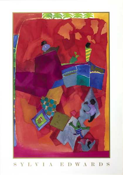
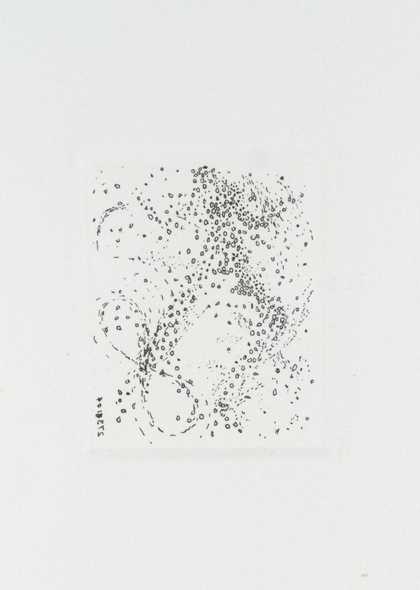
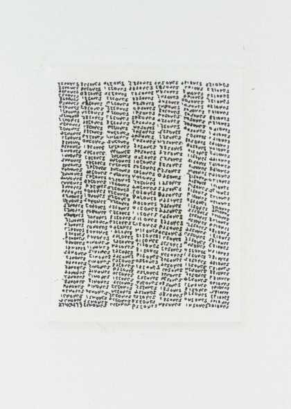
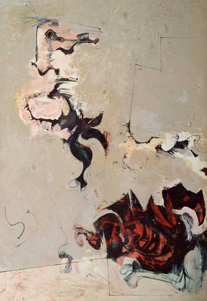
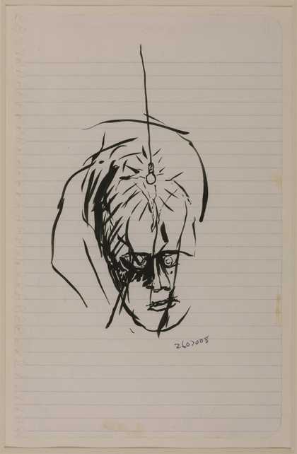
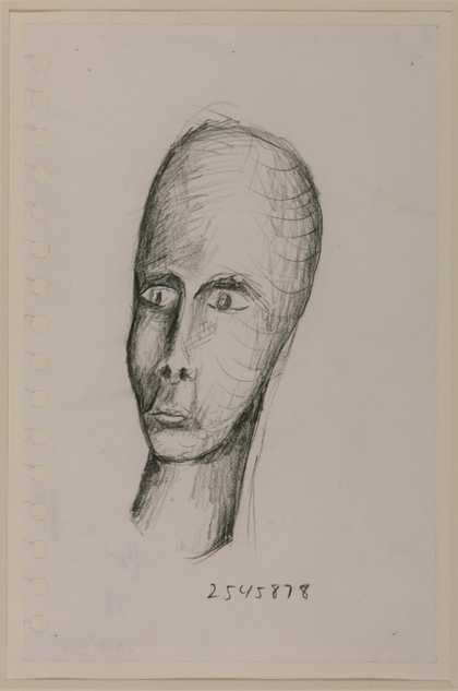
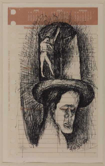
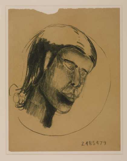
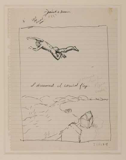
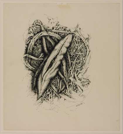
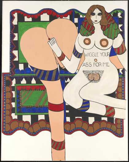
- Artist
- Frank Roth born 1936
- Medium
- Acrylic paint, enamel and oil paint on canvas
- Dimensions
- Support: 1722 × 2541 mm
- Collection
- Tate
- Acquisition
- Presented by William C. de Vry through the American Federation of Arts 1963
- Reference
- T00600
Summary
Transylvania 1962 is a large abstract painting on two adjoining canvases by the American artist Frank Roth. The work consists of a black space that dominates the centre and top left of the composition and is surrounded by irregular areas of colour and more geometrically defined shapes. The lower half of the work features two broad areas of beige and orange, in the left and right corners respectively. More sharply defined projections lead from these areas into the black space, which is also disrupted by organic, pink curves in the upper left corner and a group of green, white and red marks in the centre. These are connected to an area of blue in the upper right of the painting by a predominantly white shape. Transylvania is inscribed on its verso with the artist’s name and the date of its execution (‘Oct. Nov. 1962’).
In order to achieve the desired size for the work, Roth chose to use two canvases on separate stretchers, each measuring 680 x 500 mm. Having first primed the linen of each with three coats of Liquitex gesso, Roth executed the main design of the work using casein paints. When happy with the composition and arrangement of colour and line, he applied two thin coats of shellac over the last layer of casein paint before rubbing flat black oil paint into certain areas. To these areas he applied another thin layer of shellac and finally varnished the entire work. The range of materials and complexity of their application accounts for the rich textures in the finished surface.
Roth painted his compositions intuitively, without any prior planning or sketching, working freely and experimenting as he went. In 1968 he described his process as follows:
I start a painting, usually by working in one area until I have something there I like. I look at it and try to figure out what can go with it, what will work and what really doesn’t belong – but is right.
(Quoted in Perreault 1968, p.47.)
Rather than intending to suggest any preoccupation with the vampires and wolves of gothic horror, the striking title of Transylvania was chosen simply as a means of identification, an arbitrary afterthought that served as a convenient label. As Roth explained, his titles mostly came from encounters, reading matter or sheer whim (Perreault 1968, p.47).
Transylvania is complicated and enigmatic, with no clue offered as to any subject matter within the work. Initially some of the forms seem identifiable: the curls on the left might suggest the leaves of a plant, visible where their flatter parts are shown frontally and swallowed by the black background where side-on; the areas of orange and beige at the bottom of the canvas could imply a beach, making the blue and black areas towards the top form sea and sky; the broken horizontal line through the middle of the canvas might be read as a horizon, with the white shape to the right of the centre forming some kind of coastal promontory. However, each potentially recognisable element is punctuated by the invasion of another form. The geometric definition of the blue vertical rectangle on the right and the pale, diagonal bar below the centre are good examples of this. The eye is led around a lyrical, abstract landscape that denies perspective and offers nothing concrete, only complex interactions between areas and shapes. The fine detail in the use of colour, evident in the greens and reds at the centre of the work, aid in forming the colourful enigma that makes up the whole. Roth’s background in abstract expressionism formed the basis of his wish for his painting to be seen simply in its own terms, without extraneous subject matter. As he stated in 1968:
My emotions are the same primitive set with which we are all stuck ... Why ask more of a painter than paintings? All is explained or cancelled in the picture.
(Quoted in Perreault 1968, p.47.)
After making dark, mysterious works like Transylvania, Roth’s painting later became concerned with more sharply defined angular forms in illusionistic space, often reminiscent of sculptures. Indeed, he later produced and exhibited sculptures based on his paintings (see Moore College of Art 1968, p.4).
Further reading
Frank Roth, exhibition catalogue, Martha Jackson Gallery, New York 1967.
Beyond Literalism, exhibition catalogue, Moore College of Art, Philadelphia 1968.
John Perreault, ‘Fictional Entities’, New York Magazine, 13 May 1968, p.47.
Arthur Goodwin
May 2017
Supported by the Terra Foundation for American Art.
Does this text contain inaccurate information or language that you feel we should improve or change? We would like to hear from you.
Catalogue entry
T00600 Transylvania 1962
Inscribed 'Frank Roth' b.r. and 'OCT. NOV. 1962 | FRANK ROTH' on back of canvas
Grumbacher and Shiva casein paint, shellac and oil on linen, 68 x 100 (173 x 254); the picture is in two sections on separate stretchers, each 68 x 50 (173 x 127)
Presented by William C. de Vry through the American Federation of Arts 1963
Prov: William C. de Vry, Chicago (purchased from the artist through the Grace Borgenicht Gallery, New York)
Exh: Frank Roth, Grace Borgenicht Gallery, New York, December 1962 (no catalogue)
The artist wrote (29 March 1964) that the title of this work has no significance other than helping him to remember which painting it is.
'As to whether the painting is one of a series is a difficult question to answer, for everything I do has some relation to the painting I did before it. So I really wouldn't actually say that it is part of a specific series.
'I wouldn't say that my work is completely abstract, in the sense of being nonobjective. That is I believe my paintings do have a specific mood, or feeling about them, but they are not based on any specific realistic content.'
Published in:
Ronald Alley, Catalogue of the Tate Gallery's Collection of Modern Art other than Works by British Artists, Tate Gallery and Sotheby Parke-Bernet, London 1981, p.656, reproduced p.656
Explore
- abstraction(8,615)
-
- non-representational(6,161)
-
- colour(2,481)
- irregular forms(2,007)