How should we understand the title of James Rosenquist’s Silo 1963–4 (Tate T01829)? A silo, as the artist has explained in relation to the work, is ‘a building where you put corn and grain’.1 Such contents might initially evoke the content of his art: representing, as an article in 1962 put it, ‘his personal comment on American complacency and “corn”’.2 But however one might link the contents of this silo to Rosenquist’s interest in the stuff of consumption, it was a structure that itself had direct resonance for the artist. This section considers how Rosenquist’s work connects not just to his oft-recounted early career painting commercial signs and billboards, but also more particularly to the kinds of spatial and sculptural properties that this commercial practice engaged.
One of Rosenquist’s first commercial jobs had been to paint signs ‘on top of bulk gasoline tanks and gasoline stations’. Such work extended to agricultural storage tanks, and Rosenquist’s autobiography even uses the chapter heading of ‘Grain Silo Painter’ to serve as a shorthand gloss on this stage of his career. The artist’s experience of painting such structures was defined by scalar distortion and disjunction:
[H]ere you’d be with a brush about six inches wide, and here would be this grain elevator that just seemed to go for miles. It was ten to fifteen stories high and hundreds of feet long, and you’d be there like a little fly, painting white on it, like painting a ship. I painted a round gas tank, maybe three, four, five stories tall, like a big golf ball by a railroad track in North Dakota. I’d be left there alone with sun glasses and no shirt and I’d be painting away. It was really spacey out there.3
Something of this unsettling experience of scale was evident to Tate curator Richard Morphet upon the acquisition of Silo, who noted that the work evidenced ‘an unusual sense of scale (of billboard vertigo)’.4 Referring to such effects elsewhere as ‘naturally surrealistic experiences’, Rosenquist’s encounters with such disjunctions of scale were phenomena that would shape his artistic interests.5

Fig.1
Charles Demuth
My Egypt 1927
Whitney Museum of American Art, New York
The impression that such structures left on Rosenquist was far from unique: the drama of the towering silo had occupied the modernist imagination for some time. ‘The American grain elevators and factories’, wrote architect Le Corbusier in 1923, ‘are the magnificent First Fruits of the New Age.’6 American artists such as Charles Sheeler, Ralston Crawford and Charles Demuth cast silos as signs of American progress, their paintings profiling the structures’ powerful and plain masses against the open sky, as can be seen in Demuth’s My Egypt 1927 (fig.1). By the 1940s, the blank exterior surfaces that so appealed to modernists came to be identified as a highly visible space for painted imagery. Arguing for the role of the artist in producing Second World War propaganda, artist Rockwell Kent had claimed ‘the blank walls of the silos of America, the towering walls of grain elevators – the walls of anything that may confront the passer by’ as ‘the proper canvases for artists in this crisis’.7
As post-war consumption replaced such state propaganda with a vast outpouring of outdoor advertising, storage silos and grain elevators thus acquired new value as advertising space. By painting their once-blank surfaces with brand names and logos, these structures could sell things other than the products they contained. It is probably a stretch to suggest that the central sculptural module in Silo retains some memory of such structures, but the combination of its bulky volume and broad blue sky does evince a certain compositional sympathy with the images by Demuth and others, with their towers looming as the modern monuments to industrial civilisation. If Rosenquist’s sculptural container can be viewed as a silo of sorts, it is one filled not by grain or other raw materials, but by the ready-made (even throwaway) imagery of the supermarket, by ‘corn’ in its more pejorative sense.
Perhaps some of the tensions between the utilitarianism of the modernist aesthetic and the commercial motives of an industrial age were already present in the representations of silos produced by precisionists such as Demuth. Certainly the title of his My Egypt seems shot with a certain pop-ish irony, as art historian Karal Ann Marling has observed, insinuating ‘the crass commercialism that machine-tools Egyptian art for the delectation of the pharaohs of Woolworth’s’.8 But Rosenquist’s flimsy timber and plastic armature amplifies such subtle irony to something more outlandish. Depending on whether one views the module from the front or the side, the sculptural container in Silo appears filled to the brim with consumer goods, or alternatively, entirely drained and empty, an ambiguity typical of the artist’s uncertain stance towards the products of American consumer society.
The invitation to read this work according to its title serves as a reminder that the commercial signs Rosenquist painted were, like Silo, frequently three-dimensional objects. The most prominent billboards often featured protruding cutouts and raised sculptural elements, especially in New York’s Times Square. At night, neon and other kinds of lighting augmented their painted content. Such properties merit consideration in relation to the incorporation of similar kinds of elements into Rosenquist’s painting in the mid-1960s. Certainly, this shift also engaged with the increasing interaction between painting and sculpture in the late 1950s and early 1960s, exemplified by Robert Rauschenberg’s combines (see, for instance, Canyon 1959, Museum of Modern Art, New York). But Rosenquist’s amalgamation of painted realism with three-dimensional elements owes less to contemporary art world examples than to the techniques he knew from the commercial world. ‘Painting is probably more exciting than advertising,’ he explained around the time Silo was made, ‘so why shouldn’t it be done with that power and gusto, with that impact.’9

Fig.2
Duncan Slater
New York, Times Square 1958
© Duncan Slater

Fig.3
James Rosenquist
Untitled (Blue Sky) 1962
Private collection
© James Rosenquist
In Times Square, Rosenquist’s first assignment was to paint a billboard for the film The Vikings, the 1958 MGM epic starring Kirk Douglas and Tony Curtis. Located on the adjoining Astor and Victoria theatres, this giant billboard measured 18 by 120 metres. The block-long display cost some $100,000 to mount.10 This particular design featured a three-dimensional Viking ship surmounted by giant hovering heads. As is visible in the left of one period image of Times Square (fig.2), these sculptural elements stood proud of the pale blue background of the billboard. The technique was something like the one later utilised in Rosenquist’s Untitled (Blue Sky) 1962 (fig.3), in which two canvases affixed to the surface, and sharing the same blue colour as their background, appear to serve as blank faces for his disembodied subjects – or perhaps even the hidden mounts awaiting their hovering faces. But as Rosenquist recognised, billboard cutouts were themselves capable of producing bizarre pictorial confusions:
When they cut the movie star’s photos out of magazines for us to copy, each cutout of piece of paper itself would have shape. I was asked to paint Rosano Brazzi and Mitzi Gaynor for South Pacific on a big piece of Masonite that would be nailed onto a billboard. The carpenters had cut the bottom of her sailor suit with a jigsaw, and her foot sort of looked like a whale or a sea otter – some sort of fish. I yelled at the carpenters, ‘You really fucked up my image’. But that gave me an idea, because if you take an existing image and cut it out in contour it could end up looking like something else entirely.11
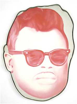
Fig.4
James Rosenquist
Head on Another Shape: Study for Big Bo 1966
Hall Art Foundation, New York
© James Rosenquist
The effect Rosenquist describes here is something like that which he simulated in his Head on Another Shape: Study for Big Bo 1966 (fig.4), in which the profile of the singer deliberately fails to align with the shape of its canvas – like a sign, perhaps, on which one celebrity headshot had to be substituted for another at the last minute.
The final version of this work, Big Bo 1966 (Collection MAMAC, Nice) resolves this calculated mistake, but as a floating head measuring some two metres high, it equally takes its form from the techniques learned from the billboard cutout. In Silo the combination and interaction of Rosenquist’s painted realism and sculptural attachment owe something to his interest in the impact of such techniques, and the billboards with the most impact, those that impressed their message with the maximum ‘power and gusto’, were those with content that, quite literally, stuck out.

Fig.5
James Rosenquist
Astor Victoria 1959
Enamel and oil on canvas
1702 x 2096 mm
Collection of the artist
© James Rosenquist

Fig.6
James Rosenquist
Reification 1961
Oil paint on canvas and chromed steel, with electric lights and sockets
610 x 762 mm
Private collection
© James Rosenquist
In this context, the T-zone unit in Silo reads as a three-dimensional letterform akin to those applied to the surfaces of the Times Square billboards. Rosenquist’s interest in the oversized shapes of the alphabet as they appeared in signage is evident in works he made earlier in the decade. His Astor Victoria 1959 (fig.5) certainly suggests the artist’s understanding of the abstract potential of such enlarged letterforms.12 These interests are made even more concrete in Rosenquist’s Reification 1961 (fig.6). In this work, cropped letterforms on a field of canary yellow and red are punctuated by light sockets. A segment of the canvas is clad in thin steel sheeting, reinforcing its material properties. The title of the work refers to the act of making a subject into an object – in Marxist terms, converting social relations into material ones – such that the doggedly physical properties of the work reinforce Rosenquist’s understanding of billboards not as evanescent fantasies in the sky, but as tangible things designed to fetishise the commodity.
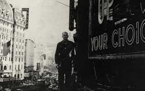
Fig.7
James Rosenquist in Times Square, New York, c.1957–9
A photograph of Rosenquist from the late 1950s shows him in front of one such sign that gives a sense of the sculptural properties of these letters (fig.7). At their largest, they were truly monumental. The Canadian Club sign, for example, featured hollow letters that were over six metres tall and almost one metre deep.13 Rosenquist worked on a sign on which the painted lettering was forty feet (twelve metres) high.14 Especially in its first internally illuminated incarnation, Rosenquist’s T-shaped element in Silo owes something of its inflation – and resulting disconnection from the textual – to such commercial prototypes. It materialises the spatial properties implicit to the graphic itself, performing the acts of translation by which print advertisements would be converted into billboard spectaculars. By following the pictorial logic of the T-zone’s subtle drop shadow (fig.8) to its logical conclusion, Rosenquist turns an already eye-catching graphic design conceit into an arresting three-dimensional object.

Fig.8
‘Your “T-Zone” Will Tell You!’
Advertisement for Camel cigarettes
Published in Life, 17 February 1947, back cover
The T-zone was one of Camel’s most famous ploys in magazine advertising, but it was the company’s Times Square billboard that reached the status of public entertainment (fig.9). This iconic display depicted a man’s head with an animated hand holding a cigarette, puffing a continuous stream of giant smoke rings comprised of steam into Times Square.15 The steam was funnelled from the Con Ed building’s heating system and released by a mechanical piston every four seconds. It was a spectacle matched only, perhaps, by the block-long Pepsi-Cola display that featured two enormous sculpted bottles either side of a real waterfall that teemed with some 50,000 gallons of water (fig.10).

Fig.9
Willem van de Poll
Smoking Camel billboard in Times Square, New York, 1948
Nationaal Archief, The Hague

Fig.10
Pepsi-Cola billboard, Times Square, New York, c.1959
Photo: Walter Reed
Courtesy of Leon Reed
Rosenquist was clearly considering how his art might capitalise on these kind of multimedia effects in a work such as The Space That Won’t Fail 1962 (private collection), which, as the artist describes it, featured:
an extruded plastic box sticking out in front of it with fingerprints in paint showing through from the inside. There was a lady’s face, a guy smoking a cigarette, and a painted can of beans. To activate the painting you would blow smoke through a little tube until it fills the box and says SMOKE inside the box.16

Fig.11
James Rosenquist
Toaster 1963
Frederick R. Weisman Art Foundation, Los Angeles
© James Rosenquist
Indeed, many of Rosenquist’s sculptural experiments from around 1963 and 1964 make use of clear plastic, the possibilities of which he had already explored in his commercial work. In Toaster 1963 (fig.11) – exhibited in Rosenquist’s 1964 exhibition at Dwan Gallery, Los Angeles, alongside Silo – a wooden cube-shaped framework is coated with delicately stippled lettering drawn from supermarket packaging, its moments of transparency allowing the viewer to read its threatening saw blades and barbed wire as they connect the inside and outside of its sculptural module.
Although the plastic is left unpainted in Silo, several other works from this period saw Rosenquist coating it with painted imagery. ‘In 1958, I did glasswork for a theater marquee in Times Square’, he recalled. ‘I had to render objects on Plexiglas with a brush and tap the paint with a cotton pounce, so it looks like printed matter when the fluorescent light shines through the theater marquee.’17 The presence of the illuminated bulb behind the plastic in Candidate, the painting that Rosenquist reworked to make Silo, might have initially suggested, if also confused, such effects of commercial backlit displays.

Fig.12
Kleenex billboard, Times Square, New York, 1959

Fig.13
James Rosenquist
Campaign 1965
Museum of Modern Art, New York
© James Rosenquist
These painted effects were, of course, a cheap (if labour intensive) substitute for neon illuminations. Rosenquist recalls having worked on the spectacular for Kleenex tissues, another of Times Square’s most iconic signs (fig.12).18 The earlier image of Rosenquist standing beside giant illuminated letters in fact shows the artist in front of this site, with the ‘up’ of their slogan used at this time (‘the only tissue that pops up’) visible. Like other long-running signs, its content was occasionally adjusted and updated, but the main feature of this neon display was the brand’s cartoon ambassador Little Lulu and a giant animation of Kleenex being endlessly extracted from an everlasting carton.19 Rosenquist’s early lithograph Campaign 1965 (fig.13) reflects such animations in the implied movement of its hand and the repeated harlequin design of the Kleenex box.

Fig.14
Ruth Orkin
Times Square Billboards, NYC, Early 1950s
© Ruth Orkin

Fig.15
David Klein
New York Fly TWA 1957
© David Klein
But even without illuminated animations, sculptural attachments or other multimedia effects, the more standard billboards that Rosenquist painted – like those that surround an earlier billboard for Schenley whiskey (fig.14) – were equally part of the high-impact sensory experience that Times Square represented. Or consider David Klein’s extraordinary 1957 poster for New York flights offered by Trans World Airlines (TWA) (fig.15), an image in circulation while Rosenquist was working on Times Square billboards. In Klein’s vivid effort to capture the effects of places such as Times Square, billboards are atomised into an abstract visual field that surrounds the body of the implied viewer. His Googie cubism as much preempts the kind of dispersed fields of Rosenquist’s painted fragmentations as it does the screen-based spectacles yet to come. But the overlapping abstract planes in this image also reiterate the profoundly immersive experience of the site, even in the 1950s, imagining Times Square as a canyon-like volume that looms over and surrounds its occupants.
When Rosenquist imagined an art that could achieve the ‘power and gusto’ of advertising, it was the high-impact effects of the billboard – its strange dislocations of scale, its sculptural elements that reach out into the space of the viewer, its capacity to surround and engage the body – that provided his chief model. But even if the increasingly overwhelming size and immersive effects of late 1950s and early 1960s sculpture had captured Rosenquist’s attention, these were equally practices that owed some of their impact to commercial prototypes. Indeed, one way that sign design company Artkraft-Strauss, for whom Rosenquist worked, would find new work outside of billboards was in the burgeoning field of public sculpture. In 1957 the company fabricated Theodore Roszak’s giant bell tower for the Massachusetts Institute of Technology.20 In 1961 they constructed Reuban Nankian’s sculptural façade for New York University, a fourteen-metre-wide abstract design in bent aluminum.21 As Rosenquist transported the techniques he learnt painting billboards into the gallery, his employer was thus also looking to fine art for new commercial opportunities.
Just as abstract artists would turn increasingly to the example of industrial fabrication to achieve new levels of scale and finish, Rosenquist’s melding of painting and sculpture drew many of its central tactics and techniques from the commercial sphere, amplifying the spatial and scalar disjunctions he had observed in the production of billboards to new and even more bizarre heights. Certainly the title of Silo, and perhaps even its design, recalls the monumental structures that hosted his earliest signs and the surreal dislocations of space that they could activate. Rosenquist’s incorporation of three-dimensional add-ons in works such as Silo sought to extend the visual force of his previously flat (and initially often monochrome) early pop paintings, shifting them towards the spectacular effects pioneered by the commercial billboard.