The Making of a Triptych: The Annunciation and Adoration of the Magi 1861 by Edward Burne-Jones
Rachel Scott, Fiona Mann, Katherine Hinzman, Joyce H. Townsend and Alastair Johnson
This paper examines Edward Burne-Jones’s commission to make an altarpiece for St Paul’s church, Brighton. For this, his first major oil painting, he created an ambitious Renaissance style triptych, although he quickly rejected this and produced a second version with an amended composition. Technical examination of the first version reveals how his early experimental painting techniques paralleled his varied use of medieval and renaissance sources and were formed as much by his experience of furniture decoration within the circle of William Morris as by his intense study of the materiality of Renaissance paintings. The paper also reveals early compositional changes in the first version and comparison of this work to the second version has enabled a re-evaluation of the symbolic and theological meanings of the paintings.
Fig.2 Edward Burne-Jones The Annunciation and the Adoration of the Magi 1861, second version, as framed today oil on canvas Frame dimensions 1375 x 3475 mm Private collection
In 1860 architect and designer George Frederick Bodley passed on a rare and prestigious commission to his young friend, Edward Burne-Jones. The task was to paint an altarpiece for St Paul’s, in West Street, Brighton, a recently completed church which had rapidly gained notoriety as a centre of Tractarianism under the leadership of Father Arthur Douglas Wagner.1
It attracted one of the largest congregations south of London. This presented an exceptional opportunity for the twenty-seven-year-old and was testament to his growing reputation as painter and designer. By the close of 1861 Burne-Jones had painted not one but two altarpieces (figs.1 and 2); both were large triptychs, with the adoration of the kings in the centre canvas and the annunciation depicted in the wings.
As his wife Georgiana later recalled, Burne-Jones had felt the need to simplify his first painting, finding the centre canvas’s composition ‘too elaborate to tell its story clearly from a distance’.2
The second version remained in the church until 1977 and is now in a private collection. His rejected first altarpiece found its way, by a circuitous route, into Bodley’s own collection, and was later donated to the Tate.3
The main focus of this paper is this first altarpiece, which was conserved and examined technically for a major Burne-Jones retrospective exhibition at Tate Britain (24 October 2018 – 28 February 2019).4
Burne-Jones began his career without any formal training as an artist within the fine art establishment, having attended the University of Oxford to train as a priest.5
There he spent his time in the company of fellow Oxford student William Morris. They explored the archives and churches of the university and began to read about and write on works of art, inspired by John Ruskin and his lectures on the Pre-Raphaelites. Burne-Jones did not complete his degree at Oxford but instead sought the mentorship of Dante Gabriel Rossetti, who showed him some aspects of the practice of painting. Nevertheless, Burne-Jones was largely self-taught, honing his craft by working across different media and blurring conventional boundaries between fine and decorative art. This lack of formal training inevitably impacted on his methods and techniques. On looking back over Burne-Jones’s career, the artist and author W.G. Robertson commented: ‘whether working in oil, in watercolour in pastel or in pure line, he appeared wilfully to ignore the possibilities of his medium and to put it to uses for which it was never intended’.6
This paper will tell the story of the first version of the altarpiece, by looking closely at Burne-Jones’s creative process in its execution, and by comparing it to the second and final version. New information drawn from the technical examination will show how this, his first major oil painting, might be viewed as a training ground for his techniques, and one in which he reached with a characteristic eclecticism for all possibilities open to him. Recent studies focusing on his watercolours, gouache and pen and ink techniques have already proved Robertson’s observation to be correct, showing inventive and unconventional techniques in these water-based media with which he began his painting career.7
Here, we reveal how he translated some of these into oil paint.
While his stylistic emulation of Renaissance prototypes for this altarpiece has already been acknowledged, this technical examination also shows the degree to which his close study of the materiality of Renaissance surfaces influenced the refinement of his oil painting technique, helping to establish his distinctive early painting style. The analogy of his practice with that of the Renaissance artist/craftsman seems fitting in more ways than one. Indeed it has been convincingly argued that the birthplace for Burne-Jones’s works is something more like the bottega or workshop of a Renaissance artist, rather than the nineteenth century academy or atelier.8
The spirit of the Renaissance workshop aligned closely to the ‘art workers’ company of Morris, Marshall, Faulkner & Co., of which Burne-Jones was a founding member in 1861.9
Technical evidence will also suggest that Burne-Jones may have engaged the help of his fellow artists not only as models, but in a collaborative manner as artist’s assistants.
Early practice
Burne-Jones’s early obsession with the medieval world, shared with Rossetti and Morris, was fostered by a group of young gothic revival architects who were recreating medieval decorative techniques and a collaborative system of working. During the years leading u to 1861, Burne-Jones’s introduction to the medium of oil painting came largely through his collaboration with them on items of decorated medieval-style furniture, often combining oil paints with the use of metal leaf and textured effects using gesso and punchwork. The furniture included: a wardrobe and cabinet designed by Philip Webb (The Prioress’s Tale Wardrobe 1859, Ashmolean Museum, Oxford, and The Backgammon Players Cabinet 1861, Metropolitan Museum of Art, New York); an elaborate bookcase designed by William Burges (the Great Bookcase c.1859–62, Ashmolean Museum, Oxford); an early piece produced by William Morris’s fledgling company (King René’s Cabinet 1861, Victoria and Albert Museum, London); and a piano which Burne-Jones decorated for his own home (Victoria and Albert Museum, London).
The revival of stained glass by pioneering new companies such as Lavers & Barraud and James Powell & Sons, with their belief in the medieval concepts of truth to materials and functional honesty, also brought commissions for Burne-Jones during these early years. He was one of the few designers to produce highly detailed coloured cartoons in oils rather than in black and white, a practice encouraged by Burges. During these years he designed windows for Christ Church Cathedral, Oxford (cartoons for these are in The Cheltenham Ladies’ College) and the church of St Columba, Topcliffe (the cartoon for this is in Birmingham Museum and Art Gallery), and would go on to become the principal stained glass designer for Morris, Marshall, Faulkner & Co.9
Indeed, early collaborative productions for the Morris company situate this altarpiece firmly within the context of his decorative furniture painting. Painted furniture decoration was perhaps his most relevant precedent, and appropriate given an altarpiece’s chief functional role in an ecclesiastic furnishing scheme. The first frame for the altarpiece – which survives around the second version – is dominated by a decorative scheme comprising a painted grid over a gilded surface, similar to that applied to the legs supporting The Backgammon Players Cabinet (fig.3).
This study of both altarpieces has also shed light on Burne-Jones’s innovative use of religious iconography from the very outset of his artistic career. As a student of theology rather than of art, his attention to unique details in the first version and the changes he made for the second version evidence an awareness of the theology behind his art. The changes made in the evolution, within the first and from the first to the second version, allow this paper to discuss his approach to his subject matter, a unique outlook which developed themes of redemption that were integral to Tractarian thinkers such as John Henry Newman, and E.B. Pusey whom Burne-Jones had loved, read and listened to during his early theological studies. Seen within this context, the compositional changes are shown to have further iconographic significance.
The commission
The building of St Paul’s had been commissioned and partially funded by Wagner’s father, Henry Michell Wagner. Completed by Richard Cromwell Carpenter in 1848, it was built in the neo-gothic style strictly according to the Ecclesiastical Society’s specifications. Wagner insisted on the use of ritual, eucharistic vestments, along with ceremonial and choral music, all intended to revitalise belief: ‘Everything which was used for the service of the Altar – patens, chalices, vestments, linen, candlesticks, censers, missals – was to be the fairest and noblest and most precious that skill and devotion could provide.’10
An impressive triptych would have formed an integral part of the decorative design of his church. However, by 1860 it was still without altar furniture.11
The new generation of neo-gothic architects, including Bodley, believed in providing a complete scheme of decoration which encompassed every detail of the building, and so artists were drawn into the realm of traditional commercial firms of church decorators in the burgeoning programme of church building and restoration at mid-century.12
These were the circumstances that led to the founding of William Morris’s company. Bodley also happened to be the church warden and organist for St Paul’s, and had originally been approached to produce a carved wooden reredos, an ornamental screen placed behind the altar, early in 1860. His friendship with Burne-Jones and Morris arose through the architect G.E. Street and meetings with the Medieval Society, and he was clearly influenced by Burne-Jones’s work as stained glass designer for James Powell and Sons of Whitefriars, London.13
As an established architect with Tractarian leanings, Bodley may have exercised some influence over Burne-Jones’s choice of motif for the triptych.14
Bodley had a particular fascination with the patterned fabrics portrayed in late medieval and renaissance paintings, recording them in a sketchbook.15
In addition, the huge stained glass window by Augustus Pugin which lies directly behind the altarpiece was already installed in the church by 1849 and depicts the Tree of Jesse crowned with an image of the Virgin and Child.16
Burne-Jones’s central canvas was to echo this image, unifying the decorative narrative, and drawing the eye upwards from the central canvas of the triptych to the top of the stained-glass window.17
We know that the commission must have been underway by June 1860 when it was recorded in notes from the Ecclesiological Society’s twenty-first anniversary meeting, the subject of which debate was ‘The Tendencies of Praeraffaellitism [sic], and its connection with the Gothic movement’.18
The generosity of this commission for the young and relatively inexperienced artist was commented on later by Georgiana Burne-Jones and it may have helped facilitate the setting of their marriage date in June 1860, after a protracted engagement of four years.
Fig.4 Edward Fox The interior of St Paul’s, Brighton, c.1866, showing an earlier mural on the chancel wall, a crucifixion with saints. Bodley’s gothic tracery had yet to be added to the screen J. Paul Getty Museum, Los Angeles
Fig.5 photographer unknown Postcard showing the interior of St Paul’s, Brighton, c.1915
As suggested by artist and author Fortunée de Lisle, it seems likely that the first version was completed and installed in the church for Burne-Jones to fully appreciate the difficulties of interpreting the narrative.19
A photograph of St Paul’s possibly dating from the later 1860s (fig.4) gives us our earliest sighting of the completed second and final version on the high altar. Even taking into account the limitations of the early photographic process, it illustrates how much furniture stood between the painting and the congregation. This early photograph by the Brighton landscape photographer Edward Fox shows the second version framed in the Morris, Marshall, Faulkner & Co. frame when Bodley’s gothic tracery had yet to be added to the screen. It also shows an earlier mural on the chancel wall, a crucifixion with saints which was later painted over by S. Bell’s Christ in Majesty, seen in a later and clearer image of the chancel (fig.5).20
The chancel was notably long and dark, and the detail of the central canvas was partially obscured from the congregation by the rood screen designed by Bodley, and the altar lights.21
Bodley had even toned down Pugin’s bright stained glass window above the altar by applying a brown glaze to the glass.22
It has also been pointed out that the scene of the kings worshipping the infant Christ was obscured by the altar cross.23
If, as seems likely, a trial installation of the first version marked Burne-Jones’s first visit to the church, he appears to have responded directly to the existing church architecture when he made his changes in the second version of his subject.
He decided ‘for clearness’ sake, that the whole should be painted upon a gold background’.24
He reduced the number of figures from eleven to six by cutting out the shepherds and attendants; he shifted the Virgin and Child further to the left and raised the three kings to a standing position. Although he didn’t paint a gold background, he lightened and warmed its tone, and enlarged and simplified the figures by delineating their profiles and drapery folds with heavier outlines (see fig.2)
Another prompt for the second version may have been provided by the death of his patron, stockbroker and collector T.E. Plint, to whom Burne-Jones and several colleagues still owed works in return for advance payments.25
Georgiana Burne-Jones recalled: ‘Edward took counsel with his friends, and decided to offer the executors this, by far the most important work he had done, and to make another and simpler design for the church.’26
However, if this is the case, Burne-Jones made his decision swiftly. Plint had died on July 1861, and just two weeks later, on 26 July, an entry appears in Burne-Jones’s accounts with the colourman Charles Roberson for the purchase of a new set of canvases for the second triptych. They were of similar size to those for the first version: ‘2 Ex Pd wh. canvases 42 ¾ x 29 [1086 x 737 mm]’ and one ‘Ext. primd white canvas 61 ¾ x 42 ¾ [1568 x 1086 mm]’.27
The abbreviations stand for ‘extra primed white canvases’, or what we might call a loose lined canvas – two layers of primed canvas were mounted onto the stretcher to provide a sturdier support. They were of the same type that was used for the first version, but not identical.28
The current framing around the first version (fig.6) may have been fitted by Burne-Jones when the work passed to Plint’s estate, or by a later owner.29
The style, comprising a pyramidal bolection profile of gilded, unfilled oak, with pressed composition roundels recessed into the vertical sides of the frieze, had already been employed in multiple variants by several artists by the 1860s, notably Ford Madox Brown and Dante Gabriel Rossetti.30
There is a possibility that the roundels (fig.6 inset) are actual coat buttons – as buttons were produced by the same process. Four thread holes can be clearly seen in each of the three designs. Burne-Jones subsequently used similar designs for small-scale oil studies and works on paper, however, the design lacks the originality of the Morris, Marshall, Faulkner & Co. frame and also does not reflect Burne-Jones’s developing preference for full-on Renaissance revival types, which may indicate that he had little or no involvement in the framing.31
The second painting underwent a lining treatment in the twentieth century, in which the original loose lining was removed and the primary canvases were adhered to a new piece of canvas.32
The same treatment was also carried out on the first version’s centre canvas, although its wings have retained their loose linings and have not undergone lining.33
Burne-Jones painted the second version to exactly the same size and unlike the first, it appears to have been completed within six months, as suggested by the review of both paintings in the column headed ‘Fine Art Gossip’, in the Athenaeum in January 1862. The reviewer clearly hadn’t seen the second version – it was presumably already installed in the church – while the first version was discussed in some detail.34
The painted altarpiece was an aspect of the gothic revival which was still emergent at this time, although Burne-Jones’s commission had its parallel in Rossetti’s own commission for an altarpiece for Llandaff Cathedral, which he had begun in 1856 (fig.7). That Rossetti’s altarpiece was not completed until 1864 highlights Burne-Jones’s exceptional industry and diligence in managing to complete two triptychs in the space of eighteen months. A lack of demonstrable technical experience in oils was seemingly not considered a hindrance to either commission. Rossetti had, along with his contemporary Pre-Raphaelites, rejected the traditional painting processes accepted at the Royal Academy as irrelevant to their needs, and while he had received some academic tuition from Brown, at the time of starting his altarpiece, he had only exhibited two oil paintings and so was not completely accomplished in oil painting.
Fig.8 Sandro Botticelli and Filippino Lippi The Adoration of the Kings 1496 (detail) National Gallery, London
Although he attended occasional drawing classes, Burne-Jones had no experience of the standard methods of an artist’s training, through the Royal Academy or Parisian ateliers. He had been guided and inspired by Rossetti, whose focus on watercolours and drawing had directed Burne-Jones’s own preference for drawings, often in pen and ink, or paintings in watercolours and gouaches. Indeed, following this altarpiece, Burne-Jones was not to return to oils for another decade.35
According to Burne-Jones, his training consisted of being allowed to watch Rossetti paint a picture for a few days, a process that both found awkward.36
He must, however, have witnessed the slow evolution of Rossetti’s Llandaff cathedral altarpiece, and again followed suit by planning a Renaissance style triptych and choosing the same subject for his central canvas: the adoration of the Magi, with his first version also incorporating shepherds and attendants. Like Rossetti’s, Burne-Jones’s work drew on a variety of prototypes. While Rossetti had not visited Italy he was able to see exhibitions of early Italian art in public and private collections in the UK. For example, Charles Eastlake’s acquisitions of early Renaissance painting for the National Gallery influenced both artists: motifs taken from The Adoration of the Kings acquired in 1857, then attributed to Filippino Lippi, now attributed to both Sandro Botticelli and Lippi, appear in Rossetti’s central scene of the king kissing Christ’s feet, and the pair of shepherds in the lower right corner, one with bagpipes, are echoed in Burne-Jones’s altarpiece (fig.8).37
Unlike Rossetti, Burne-Jones had experienced an enormous wealth of Italian painting on his first extensive tour of Italy in 1859. It had affected him deeply, leading to his lifelong dedication to Italy, and this altarpiece is expressive of his passionate response to all he had witnessed. His influences are certainly more varied than Rossetti’s. The side canvases, with their shallow spaces and stylised figures, are suggestive of early Florentine artists such as Botticelli, Fra Angelico or Gentile da Fabriano. These contrast with the naturalism of the central canvas which reflects the rich warm colours and mood of sixteenth century Venetian artists, but also a naturalism stemming from northern Renaissance artists such as Jan Van Eyck or Hugo van der Goes whose Portinari Altarpiece 1475–8 (Uffizi Gallery, Florence) Burne-Jones would have seen in Florence.38
Art historian Ronald Parkinson has suggested a number of specific influences including Tintoretto’s Nativity and Adoration of the Shepherds 1578–81 from the Scuola di San Rocco, and Jacopo Bassano’s Adoration of the Shepherds c.1546 now at Hampton Court, London.39
Art historian Elizabeth Prettejohn has pointed out that unlike Rossetti’s altarpiece, Burne-Jones’s sources were not only more eclectic but that in the ‘Venetian’ central canvas he moved away from Rossetti’s medievalism, crossing the boundary into sixteenth century art. She suggests that at this early stage in his career, he was perhaps less anxious than Rossetti about the breadth of his influences and imitative urges.40
That Burne-Jones was under the guidance of John Ruskin and George Frederick Watts perhaps also explains this mixture of sixteenth century Venetian and early Renaissance styles.41
By this time Ruskin had tired of what he saw as the unnatural mannerism and garish colours of the medievalism he had previously fostered. Just two years earlier, Ruskin had written to Watts: ‘I am answerable for a good deal of this fatal mediaevalism in the beginning of it – not indeed for the principle of retrogression – but for the stiffness and quaintness and intensity as opposed to classical grace and tranquillity’.42
He further complained that he was ‘sickened of Gothic by Rossetti’s clique, all the more that I’ve been having a great go with Paul Veronese’ and also promised to ‘get hold of Val [Prinsep] this week and have a serious talk with him’. The following year of 1859, Prinsep was to accompany Burne-Jones on his first trip to Italy and recalled, ‘Ruskin in hand we sought out every cornice, design or monument provided by him. We bowed before Tintoret and scoffed at Sansovino. A broken pediment was a thing of horror.’43
Many of the sketches from this first trip to Italy show how Burne-Jones processed a broad wealth of inspiration. Beyond stylistic effects, his quotations are of small incidental motifs, and the tiny jottings with colours labelled provided Burne-Jones with aide memoires to draw on for his personal interpretation of Renaissance forms and concepts (fig.9).
Portraits
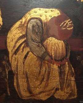
Fig.10 Detail (left) of the shepherds in the central canvas, first version of Edward Burne-Jones’s The Annunciation and the Adoration of the Magi 1861, with photographs of Algernon Swinburne (middle) and Burne-Jones (right) (both photographs National Portrait Gallery, London)
One such concept was the incorporation of portraits, a significant ideological choice echoing the Renaissance inclusion of patrons and indeed self-portraits in religious scenes. In the first version, Burne-Jones’s own self-portrait as a shepherd references Ghirlandaio’s self-portrait as a shepherd in the Nativity and Adoration of the Shepherds 1485 in the Sassetti Chapel, Santa Trinita, Florence, which he would have learned about through Vasari and very likely seen on his tour.44
There was an obvious practical and economic value in using friends as models, which had a strong precedent among the pre-Raphaelite circle. In this way Burne-Jones echoed Rossetti’s example. William and Jane Morris had modelled for Rossetti’s Llandaff altarpiece and here, William Morris is the first kneeling king, the bagpipe-playing shepherd is Algernon Swinburne (fig.10), and the kneeling king in armour is the Italian model Ciamelli (fig.11).45
The figure of Joseph in both versions appear to be the same model, whose identity is unknown, as is that of the models for the Black kings wearing turbans in both versions and the knight in the second version. They are all likely to have been professional models, possibly from the life drawing classes that Burne-Jones was attending and teaching in London at the Working Men’s College or the Hogarth Club.46
Fig.12 Detail (far left) of the Virgin in the central canvas, second version of Edward Burne-Jones’s The Annunciation and the Adoration of the Magi 1861 and (left) Fanny Cornforth as illustrated by Burne-Jones in his drawing The Backgammon Players 1861 (Fitzwilliam Museum, University of Cambridge). Same detail (right) for the first version of Edward Burne-Jones’s The Annunciation and the Adoration of the Magi 1861, and (far right), photograph of Jane Morris (National Portrait Gallery, London)
Later biographers have been left to guess the model for the Virgin, who has slightly different features in each canvas. Jane Morris is generally thought to have sat for the Virgin in the first version’s centre canvas, and possibly Georgiana Burne-Jones sat for the Virgin in the side canvas of the Annunciation.47
The latter identification gains credence when the underdrawing is compared to contemporary photographs. Such comparison of features might also suggest that Fanny Cornforth may have sat for the second version (fig.12).48
Perhaps Georgiana felt it indecorous to name the models for the Virgin. Debates over the suitability of inserting real portraits into idealised religious imagery appeared in numerous publications. While Ruskin had argued in his second volume of Modern Painters that, ‘no face can be ideal which is not a portrait’,49
the reviewer of the altarpieces in the Athenaeum took the opposing view: ‘The same singularity of character may be seen in the treatment of figures, which, beautiful as they are, are in one or two cases more successful as effective portraitures than apt to the highest ideal of the subject’.50
For the first version, there are few surviving preparatory sketches. Most notable is the drawing of the attendant’s head (fig.13) and another which may relate to the Virgin’s profile (fig.14). More of this type must be missing, as well as an overall compositional sketch, because several survive for the second version.51
But with friends frequently calling into the studio, Burne-Jones might have found it as easy to draw from life directly onto his white-primed canvases.52
We don’t have a record of where these were purchased ‒ possibly directly from Roberson’s shop in Long Acre, or from one of several other colourmen.53
The supports are of good quality, and presumably similar to the second set he bought from Roberson in 1861 mentioned above, with two layers of canvas, both layers commercially primed. A glue size layer would have been applied to the canvas before a first layer of priming which was an oil-based paint consisting of lead white with a significant portion of chalk, followed by a second layer of oil-based paint with a greater proportion of lead white to give a brighter white surface.54
Through ageing they have become a rich cream colour. Such loose linings were more expensive but provided a higher quality, ready-made support. Like the panel-insert – so called ‘blind’ stretchers – which Burne-Jones regularly bought in later life, the loose lining protected the raw canvas of the primary support from the damaging effects of urban pollution.55
Infrared reflectograms (IRRs) have given some insight into Burne-Jones’s planning stages.56
The technique enabled us to see through some passages of the paint, rendering visible carbon black-based underdrawing. This included lightly applied hard graphite pencil, black crayon and black or a brown containing carbon black pigments used for underpainting. In the Annunciation canvas, his initial pencil sketch for the Virgin shows a less idealised head, with a higher forehead and centre-parted hair which was later obscured by the thicker dark painted hair applied over the top (fig.15). In the final image he idealised her face, eliminating the lines around her mouth, as he also did with the attendant.
Fig.16 Georgiana MacDonald aged sixteen, at the time of her engagement to Edward Burne-Jones, 1856 Photograph by Walker & Cockerell, reproduced in Georgiana Burne-Jones, The Memorials of Edward Burne-Jones, London 1904, p.134.
Comparison of this sketch to Georgiana’s early portraits (fig.16), and his choice to paint the eyes blue like hers, might persuade us that she sat for this figure. Elsewhere he worked with a softer black pencil or possibly a crayon, which is visible in the IRR of Gabriel’s head, where Burne-Jones has enlarged the mop of thick curly hair, and drawn a single wave, leaving the rest of the curls to be described in paint (fig.17).
With this first painting he may have relied more on sketching directly onto the white priming. Changes in the fingers of Gabriel’s raised hand, for instance, suggest that the artist wasn’t following a detailed preparatory study. With a darker pencil and a little inexperience, he also appears to have rushed into the lettering of the left scroll (fig.18) first – the reflectogram reveals some difficulty in spacing the words, something he had corrected when it came to the scroll on the right.
Fig.19 Edward Burne-Jones The Blessed Damozel 1857 unfinished oil on canvas private collection
Underpainting
There doesn’t seem to be extensive underdrawing in graphite pencil in the first version, although additional underdrawing in chalk or red crayon used for underdrawing would not be detectable by IRR. It is clear, however, that Burne-Jones adopted a traditional academic technique, supplementing this drawing with brown paint washes containing umber, mars brown (a synthetic version of brown ochre) and bone black, for further preparatory undermodelling. Underpainting in monochrome, or ‘dead colouring’, had a legacy that extended back to the seventeenth century, had been notoriously rejected by the Pre-Raphaelites who relied instead on highly detailed pencil underdrawing, to allow their white primings to shine through brilliantly coloured transparent paint.57
Burne-Jones would have understood the principles of dead colouring, not least through practical manuals: George Field’s Chromatography; Or, A Treatise on Colours and Pigments: And of Their Powers in Painting of 1841 which Burne-Jones had probably purchased from Roberson in 1858, discusses pigments suitable for dead colouring.58
It is perhaps curious that Burne-Jones rejected the Pre-Raphaelite technique, particularly as it had been heavily influenced by Eastlake’s description of Van Eyck’s process, seen in his Arnolfini Portrait 1434, acquired by the National Gallery in 1842, in his first volume of Materials for a History of Oil Painting’ of 1847.59
However, even Rossetti didn’t adhere to this method by the late 1850s. While Burne-Jones was in awe of the Van Eyck, he may also have been swayed by Ruskin, whose review of Eastlake’s publication had suggested that its brilliant colours were less to do with the luminosity of the white ground and more with the artist’s ingenuity in manipulating the oil paint; this, according to Ruskin, is what made his works so remarkable for the ‘reality of substance’ and ‘vacuity of space’.60
The unfinished oil painting begun for Plint, The Blessed Damozel 1857 (fig.19), gives us a clearer image of Burne-Jones’s first stages of laying out the design and underpainting.61
This shows equally brief pencil drawing and areas of black and brown underpainting. When Burne-Jones was to take up oil painting again after several years, these early stages of laying in the design were given to his studio assistants in the true Renaissance workshop manner. They transferred his more detailed designs onto the canvas and began the process of preliminary dead colouring, as described by Charles Fairfax Murray, who assisted Burne-Jones from 1866 to 1871, and then by Thomas Rooke, who joined his studio in 1869 and remained with him until his death in 1898.62
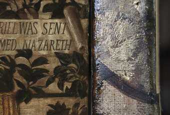
We have a glimpse into this first stage of underpainting on the tacking margin of the left canvas, where we see the dark brown paint, and a first layer of a textured underpainting in thick lead white paint, which itself has another thin wash of brown (fig.20). It is only visible on this left canvas’s margin, because at this point, when the monochrome design was laid in, Burne-Jones chose to untack this canvas and reposition it on the stretcher, shifting the whole design to the right by over 20mm.
IRR also shows careful underpainting in pure black paint, seen marking the boldly painted grid of the garden trellis on the side canvas (fig.21). In some areas the underpainting contributes to the final design – Gabriel’s striped cloak has a delicate rose leaf pattern underpainted in fine black outlines which are partially covered, partially visible on the surface through the paint (fig.22).
Early changes made
Burne-Jones later described his painting process in whimsical terms, as documented by his wife: ‘I do so believe in getting in the bones of a picture properly first, then putting on the flesh and afterwards the skin, and then another skin; last of all combing its hair and sending it forth to the world.’63
We might term the ‘bones’ of the painting these early stages of drawing and dead colouring. The brown underpainting was further modelled with additions of pure lead white paint, and then lead white tinted with colours for the flesh tones of figures. Aspects of Burne-Jones’s later oil techniques changed as his influences broadened from the 1870s to the end of his life – we witness a greater emphasis on drier surfaces with layered and textured white scumbles, glazed in thin, translucent colours to render what has been described as a hard, crystalline quality of surface.64
Yet throughout his life, he remained true to the essence of these important initial stages.
In 1900, his son Philip Burne-Jones’s posthumous account described his later works, when assistants took over the task of transferring detailed cartoons to canvas and laid in the first drawing with burnt or raw umber or terre verte, ‘followed by brighter sections with “pure flake white” lumping it up and patting it on and dragging it over so as to completely cover the warp and woof [sic] of the canvas and form agreeable surfaces which were allowed to get bone dry before the final glazes were applied’.65
He also noted that his father never painted into a tacky or half dry surface, but instead waited for each layer to harden fully before applying a glaze. This necessitated great care in making changes to the composition, and according to Philip, when his father strayed from his original concept he was scrupulous in ‘scraping, turpentining and even chloroforming out original errors before painting over it’.66
The role of the cartoon was to conquer his first difficulties in the comparably ‘irresponsible and easily manipulated material’, rather than have to make corrections on the finished canvas, which however well disguised, might someday make their presence known.67
Examination of the first version of the triptych shows a number of changes which were painted over in subsequent layers. Unlike his later paintings these were more easily masked with thicker, less translucent glazes in the central canvas, or passages of heavily textured gilding. X-radiography usefully reveals all layers of the painting at once with the densest materials such as lead white rendered light in the X-radiograph, giving insight into his working methods, with pentimenti revealed (fig.23). Working out and making changes during the painting process is natural to most artists, and Burne-Jones was no exception. The Virgin and Christ’s head in the central canvas appear opaque in the X-radiograph because they were heavily worked using paint containing lead white, suggesting the artist had some difficulty in finalising their three-quarter profiles.
Fig.24 The Annunciation scene from Giotto’s fresco cycles in the Arena Chapel, Padua, c.1305
The X-radiograph also shows that the standing attendant closest to the Virgin in the central canvas originally held a tasselled cloth over her right arm, which may be a direct allusion to the female attendants in scenes from Giotto’s frescoes in the Arena Chapel, Padua. These frescoes provided clear prototypes for the triptych, the most obvious being the divided annunciation over the chancel arch (fig.24), its composition directly quoted in Burne-Jones’s annunciation.68
The X-radiograph shows that originally the figure on the far right also had a set of bagpipes tucked under his arm.69
The X-radiograph of the left panel illustrated below (fig.29) shows the angel Gabriel’s sleeve was also changed – first painted in white, it fell in long medieval drapes from his forearm. Other changes are more iconographically significant, with Burne-Jones initially placing greater emphasis on the Virgin’s role in the image. When comparing the X-radiograph to the painting’s surface it is also possible to see how the three Kings’ gazes changed from the underpainting stage to the final paint layers: the first King holding the crown, originally looked up, over the head of the child, directly at the Virgin; the others lowered their eyelids. In the final painting all eyes are fixed on Christ (fig.25).
In the right canvas, the space behind the Virgin has been reduced – the patterned gilded curtain above her head covers what was an initially more detailed architectural space including a window, arch and possibly a classical capital at the right edge (fig.26). There were more changes made to the composition of the central canvas which are harder to decipher. The window revealing the golden sky behind the stable was originally divided, and there appears to be unidentifiable shapes looming up behind Joseph. There is possibly another figure in the now blank, dark space between Christ and the first King, or else a change in profile for that King.
Iconography and theological significance
The underpainting and final version of the first altarpiece, and the radical changes that come later in the second, evidence some deep thinking on not only the stylistic and material make-up of the piece but the symbolical, theological meanings at work in the composition. Burne-Jones was passionate about a particular type of theology – Tractarianism, famous for its controversial challenges to the current state of the Church of England and its relationship to government and society at large.70
He was devoted to one of its leaders, John Henry Newman, who astounded his fellow Tractarians by converting to Catholicism in 1845; even when Newman was a Catholic, Burne-Jones would actively seek out Newman for his homilies when he founded a church in Birmingham.71
This had prompted him to pursue his university education in theology and to attend lectures given by another famous Tractarian, E.B. Pusey.72
For the purposes of this paper, it is the Tractarian attention to the sacraments, particularly to the Eucharist, that helps us to unpack the unique iconography Burne-Jones used in this picture as he developed and changed it for this specific commission. This altarpiece would sit at the centre of church worship, and most poignantly, as the backdrop to where the Eucharist would be consecrated and communion made available to the faithful. This was particularly important in the case of this church, which placed more emphasis on the sacraments than others at the time. Burne-Jones’s theological training would have given him a deep academic understanding of the Eucharist – the bread and wine offered by Christ at the Last Supper that is re-presented at the centre of the mass liturgy by a priest. The triptych shows, at its center, the Adoration of the Kings, and is flanked on either side by a split Annunciation – Gabriel to one side and Mary to the other.73
Each portion is set in an enclosed garden, with rose trellises, holly bushes and apple trees, all against a golden sky. By the Mary of the Annunciation there sits a pot of lilies, symbols of purity which were particularly associated with the Virgin Mary and included in many Annunciation scenes either in the hand of Gabriel or in a vase.74
In the lower corner of Gabriel’s canvas, a roughly painted snake slithers barely noticed in the grass. This latter inclusion shows the scene not simply as an isolated event in biblical history, but directly connects it to the very first scenes in that long history. The first appearance of the snake in the Old Testament, to Eve in the Garden of Eden, led to sin and the Fall of Man; this was followed by their expulsion from Eden by the first angel. In the Annunciation scene, this second angel has come to announce the news of the redemption of man to Mary, appearing here as the ‘Second Eve’, whose acceptance of the news would ultimately reverse Eve’s misdeed and fulfill the prophecy that a woman would ‘crush’ the serpent’s head.75
The changes made to the architectural space around the Virgin, as evidenced in the underpainting, further indicate Burne-Jones’s deeper interest in Mary as herself a threshold onto the divine. Often considered the ‘house of gold’ and ‘gateway to heaven’, there is in many pictures through the ages and in this one particularly, the artistic interest in Mary as both enclosed Virgin and open door to salvation in her child Jesus. The compositional space around her, therefore, comes to represent what is paradoxically an enclosed opening. Burne-Jones’s attention to that detail, and the repeated painting over and changing of that detail, shows him trying to depict accurately that iconographic complexity.
The symbolic narrative is straightforward and has theological and artistic precedent – the ‘snake’ and the ‘woman’. It is also a notion Burne-Jones returned to repeatedly in his career, not only in specifically religious images of Mary but those of a more ‘mythological’ origin.76
However, these references take on greater complexity in this instance when compared with what is depicted in the central canvas – the Adoration. In the first version, but not the second, Christ is standing on the lap of his mother gazing upon the first king, who looks directly back at him. In fact, all the kings gaze at the child, a change from the underpainting when the first king appears to look up higher, into the Virgin’s eyes, and the others lower their eyelids. With all the kings looking upwards, our gaze is also directed toward the Christ child, heightening the sacred mood of the picture.
The infant Christ’s small left hand is raised by his mother and in it, quite hard to distinguish in the darkness of the background, he holds and offers the king an apple. The gesture is Eucharistic, echoing how the host is doled out and received in communion. The idea is further developed when the viewer looks at his other hand, which clutches a piece of Mary’s red dress to his chest. This section of dress forms the shape of a heart in a foreboding reference to the blood at his crucifixion and death, and the wine henceforward given at communion. Most profoundly, therefore, the Christ-child, just born but soon to be reborn for all of humanity through death on the cross, becomes that consecrated host which Mary held in her womb on her lap as a babe and in her arms at his death. Much as Mary ‒ holding his hand, bearing him and creating his flesh ‒ is the ‘New Eve’, he is the ‘New Adam’ and this new apple helps to pinpoint all of the history of salvation ‒ creation, sin, and redemption ‒ all at once, connecting each of those pivotal moments to the moments Christ would become the union of heaven and earth in the sacrament of the Eucharist. This Eucharist would be received by the world, just as Morris the ‘king’ is shown receiving the apple from Christ.
The second version eliminates these references. An altogether lighter, clearer picture, it does not show Christ offering an apple – he offers nothing, and keeps his hands neatly folded in his lap while the kings present their gifts. While technical or contextual issues most likely played into the change, such as not being able to see the piece and its figures in the light or behind the altar furniture itself, it can be wondered whether the innovative way Burne-Jones used the symbols had been misread, and therefore taken as too risky at a time when the priest there was facing questions about how he administered the sacraments.
Pastiglia and gilding
Burne-Jones set his figures against sumptuous passages of embossed, toned gold and silver leaf, heavily influenced by the early Medieval and Renaissance altarpieces he had seen. In creating these effects, he must have speculated about the techniques employed by medieval artists, or ‘craftsmen’, and is likely to have read recent publications of medieval technical treatises such as Mary Philadelphia Merrifield’s translation of the fourteenth-century Il Libro dell’arte (The Craftsman’s Handbook) by Cennino Cennini, and Eastlake’s Materials for a History of Oil Painting, published in 1847.77
However, he was also very much guided by his own close observation of such paintings, choosing to emulate their surface appearance using the full range of modern materials available to him, rather than attempting a complete revival of medieval materials and techniques. In these side canvases he borrowed effects from traditional tempera paintings, with their gilded and silvered passages of gessoed pastiglia – low relief decoration – on wooden panels, though here he used oil paint and canvas.78
The medieval decorative technique of mordant gilding or silvering had in essence remained unchanged in the decorative arts over the centuries. It was familiar to Burne-Jones through his experience of helping in his father’s framing business, and from his own decoration of furniture; there may even have been some gratification in knowing that one of the artists he most admired, Botticelli, had trained as a goldsmith, according to Vasari.79
Cennini’s treatise also made it clear that the Renaissance painter’s role incorporated a broad range of decorative arts including the gilding and painting of all manner of surfaces from furniture and book covers to leather for saddles. For the triptych, the yellow tinted oil mordant was applied over a richly textured pastiglia decoration executed in thick lead white paint (fig.27). This choice must have been inspired by viewing Italian cassoni, jewel boxes or tabernacle frames, for which this elaborate medieval decorative technique was more commonly used.
Technical examination of the left canvas is informative of Burne-Jones’s technique for the areas of pastiglia (fig.28). The X-radiograph shows clearly how the brocade curtain design was worked in this paste-like white underpaint, using a brush and likely the brush handle too. Photography in raking light illuminates the contrast between the high relief of the pastiglia, and the thin, flat painting of figures. These reserves were planned before the gilding was applied but painted afterwards, in a manner which possibly unwittingly emulated the traditional sequence of painting in early tempera panel paintings, as described in Cennini’s treatise.80
The stalks, some of the leaves and the halos were also underpainted in lead white. The sky has a broad brushed texture with some reserves left for the textured undermodelling of some leaves in thick lead white paint.
Fig.30 Edward Burne-Jones Chant d’Amour (detail), part of his decoration of a piano made by Frederick Priestley and given as a wedding present to Georgiana Burne-Jones in 1860 Victoria and Albert Museum, London
In his quest to create an object of opulent beauty Burne-Jones used three different types of metal leaf: pure gold leaf for the curtains, a whiter gold containing silver in the skies, and surprisingly, a thicker silver leaf for the haloes in the side canvases, which were then toned with paint to give the effect of differing shades of gold. All areas of metal leaf were toned in this way: the brilliance of the metal leaf was softened and coloured with transparent crimson or warm brown oil glazes, with details of folds in the curtains or clouds in the sky modelled. A few squares of white gold leaf are dotted through the trellis, to allow the glistening gold to shine through pink glazes for the roses (fig.29).
If there was a touch of revivalism in technique, it was in this application of pigmented glazes, traditionally applied to tin or silver leaf to produce golden effects. This is seen here in the halos of the Virgin and Gabriel, and was a technique described by the twelfth century monk Theophilus in his treatise De Diversus Artibus (On Diverse Arts), as well as by Cennini.81
The architect and furniture designer William Burges, who had a fascination with medieval methods and materials, is credited with passing on this technique.82
Shortly before beginning the triptych, in the summer and autumn of 1860, Burne-Jones had used similar effects for the gilding in his wall paintings depicting The Wedding Feast of Sir Degrevaunt for William Morris’s home, the Red House;83
and in his decoration of an upright piano created in the same year, which he gave as a gift to Georgiana Burne-Jones.84
The textured figures on the piano (fig.30) are made from painted and toned gold and silver leaf over a textured white gesso. This possibly provided another opportunity to experiment with this technique in advance of beginning the triptych.
Choosing a canvas support precluded the traditional medieval technique of punching into the gold, seen for example in the piano or the panel Art, made for Burges’s Great Bookcase 1859–62 (Ashmolean Museum, Oxford), which is decorated with toned gold leaf, pastiglia and punch work (fig.31).85
Georgiana recounted the ‘exciting process’ of Burne-Jones heating a shellac varnish for the piano with a red hot poker to deepen its colour.86
Commonly used for the varnishing of furniture, shellac is also present on The Prioress’s Tale wardrobe, and traces were detected in samples taken from the coatings on the glazed gold leaf curtain behind Gabriel.87
While we can’t be sure, it is just possible that this came from an early application of varnish.88
Paint
Burne-Jones’s accounts with the colourman Roberson show a modest number of entries for 1857–61, suggesting that he was buying his painting materials direct from their shop, or from other suppliers, in these years.89
There are a few entries for ‘Colours’ which are assumed to be dry pigments, supplied for the artist to grind into a medium such as oil, but he’s also likely to have bought ready-made paints.90
As with his choice of supports, the quality and durability of his paints was of great importance to Burne-Jones, reflecting his desire to position his art as a continuation of the Renaissance legacy. Like Eastlake, many artists and critics had marvelled at and sought to explain the sustained brilliance of the colours seen in fourteenth and fifteenth century paintings.91
Merrifield, in her translation of Cennini’s Il Libro dell’Arte, drew heavily on Field’s Chromatography, an early purchase of Burne-Jones’s as noted earlier, affirming that his pigments92
were the closest modern approximation to those used by the early Italian painters.93
This was in contrast to Rossetti who was less concerned by the duration of his colours; Burne-Jones recalled to his assistant Rooke: ‘I used to say to him [Rossetti], “why do you paint with colours that you know are not permanent?” but he wouldn’t listen to me’.94
For this altarpiece he appears to have used additional media to give the paint more body, as well as oil.95
In both versions, the transparent red glazes forming the red robes of the kings have an appearance which is suggestive of megilp, a common term for such paint medium modifiers. It is therefore unsurprising to find orders for copal and ‘Medium’ recorded in his Roberson account for 1861.96
‘Medium’ probably referred to Roberson’s ‘Medium for Oil Painting’, advertised as: ’recommended for imparting permanency and richness to Colours’; a copal megilp, it contained drying oil, copal, mastic and spike oil of lavender.97
It was particularly useful for glazing with translucent colours, and was a popular product, which Rossetti also purchased regularly at this time.98
Copal alone was another common addition to unmodified oil, extending the handling properties and making oil paint easier to work with. Its adoption by the Pre-Raphaelites was influenced by painter and chemist Jean-François-Léonor Mérimée who had traced its history back to Theophilus, and who stated that it was used by the Van Eyck brothers in their painting ’which brought forth all the brightness of their colours, and preserved their works from the injurious action of the atmosphere’.99
Burne-Jones clearly experimented with these mediums in glazes, and interspersing layers of differing shades of one colour. So in Gabriel’s cloak (fig.32), a variety of pigments are used. A resinous varnish saturates a first layer of red lead, and this is followed by vermilion lightened with a little lead white mixture, and then glazed with a semi-translucent red lake which is possibly a carmine but is not madder lake, tinted with a small amount of vermilion (fig.33).
The medium-rich surface gloss and glowing saturation of Burne-Jones’s paint surfaces in the triptych belong more to the medievalism of Rossetti and Morris, seen in their furniture and watercolours. As Burne-Jones’s style became more influenced by the paintings of Watts and the classical aesthetic of Michelangelo, his painting style and techniques changed. In later years, accounts of his mature oil painting technique indicate that he grew to avoid such mediums, painting in a succession of thinly glazed, dry and powdery scumbles, using only turpentine as a diluent, and occasionally blotting paper to take the surplus oil out of colours, although he may not have completely abandoned these early materials.100
In 1891, while he expressed a wariness of too much gloss, his concerns with using medium were for the correct use of it, doubtless to avoid the drying cracks that can occur when it is applied too thickly in a top layer: ‘Medium, No, if you must, one medium throughout, be sure that you do not use … medium in the later stages, but as equally as you can throughout’.101
He used a mixture which had some similarities to Roberson’s medium, although without the mastic component: ‘His method for slowing evaporation was a mixture of equal amounts of copal, linseed oil and spike oil (of lavender) that he used sparingly, pouring out just a few drops a day’.102
Analysis of his paints in the first version show that he was using both traditional pigments, such as iron-containing brown, yellow and red pigments ochres, terre verte, bone black, red lakes and vermilion, well-established pigments such as Prussian blue, and pigments introduced in the nineteenth century such as cobalt blue and emerald green (an aceto-arsenate green), the latter of which was also popular with the Pre-Raphaelites.103
In the side canvases, Burne-Jones re-created the surface appearance of egg tempera using oil paints. Having closely studied the surfaces of early panel paintings, he even went as far as to underpaint Gabriel’s flesh in green (figs.17 and 34), recreating the optical device used by fourteenth century Italian painters, to suggest the cool mid-tones of skin. Here, however, he employed the modern, bright emerald green, rather than the traditional terre verte, or verdaccio method, described by Cennini.104
He also experimented with a recreation of the tiny, hatched brushstrokes that the egg tempera medium necessitates, painting the flesh using watercolour brushes with cross hatching strokes, as Rossetti is said to have done for The Girlhood of Mary Virgin 1848–9 (Tate N04872).105
The artist Edward Clifford later described how Burne-Jones sometimes ‘scumbled like an impalpable mist’, and that ‘his finest effects are got by scraping’.106
Such scumbling techniques are not seen in these early oil paintings, but instead Burne-Jones adopted unconventional methods to create highlights and textures. Borrowing from his pen and ink and watercolour techniques, he scraped back through paint that was touch dry, uncovering the lead white underlayers, just as he had revealed the paper through scratching into his watercolours, in works such as Clara von Bork 1860 (Tate N05878) and Clerk Saunders 1861 (Tate N04390). It is seen here in the white highlights of the bull’s horns in the central canvas, the highlight of the shepherd’s pipes or to achieve the naturalistic highlights on the feathers of Gabriel’s wings (fig.35).
The scraping back of dried paint to reveal underlayers (fig.36) is also used for the minutiae of detail, a characteristic feature of his small-scale work of these years and seen here in the sgraffito technique which describes each individual chain mail link. The deep grey armour is painted over a red and yellow patterned underlayer. There’s also some scraping through to the underlayers to render the flutes of the armoured shoulder plate in a low relief.
Burne-Jones was later recorded as being scrupulous in allowing the lower layers to dry thoroughly before application of the next.107
For the speckled linen of the headdresses, brown glaze paint was brushed on and wiped away when touch dry from the hardened and textured white underlayer, so leaving its remnants in the troughs (fig.37).
The minutiae of detail are also seen in his rendering of material surfaces and this reflects his known passion for the work of Van Eyck. In the 1890s he commented: ‘I’ve always longed in my life to do a picture like a Van Eyck and I’ve never never done it, and never shall.’108
Here, the individual golden threads of Christ’s hair, the tiny crystal and gold ring on the King’s thumb and the reflections of figures in the convex ‘mirrored’ surface of the casket may represent an explicit homage to Van Eyck (fig.38).109
Elsewhere there are surprisingly roughly painted patches, broad washes, blotchy brush work and large drips of medium. In outlining the Virgin on the right, Burne-Jones used a thick dark paint composed of Prussian blue mixed with a natural resin as well as oil, which has left drips. This process is also found in The Prioress’s Tale Wardrobe, perhaps indicating no more than a learning phase in the handling of this medium. For example, the lumps and bumps in the gilded pastiglia following the contour of the Virgin’s lap may show where partially hardened white paint was dragged horizontally. The artist commented on the tension between small individual detail and large scale in his conversations with Rooke: ‘The kind of painting I should like would be what would look lovely under a magnifying glass and yet cover an acre in extent and be quite right on that scale too – and that’s what I never do’.110
Creating an Old Master
Unlike Rossetti’s brightly coloured Llandaff Cathedral triptych, Burne-Jones clearly intended his own altarpiece to look authentically old. In his first version, not only did he manipulate his materials to echo techniques found in early paintings, he also seems to have made a conscious choice to apply a harmonising ‘patina’ of age, subduing his colours with ample warm brown toning glazes. The extent to which he toned down his surfaces became evident even after dark layers of discoloured varnish and soot had been removed during the 2018 conservation treatment.111
The first version is significantly darker and more subdued in tone than the second, a factor which must have contributed to its rejection; not only did he feel the composition was too elaborate to tell its story from a distance, but also simply too dark for visibility within the church. The second version is lighter with brighter, more saturated colours overall. His success in creating his first old master painting is recorded in later accounts: according to Bell, when this first version re-emerged in a sale in 1867, it was described to the unsuspecting Bodley as ‘a veritable work by an old Italian master’.112
Georgiana Burne-Jones recounted how the painting was introduced to Bodley as ‘an Old Venetian picture’, and only on seeing it did he recognise it to be the first triptych for St Paul’s, and buy it.113
The central panel shows the golden tonality of a Venetian evening glow, which is rendered in a palette of reds and orange modified by deep glazes. Near the end of his life, Burne-Jones wrote to the art critic Henry Quilter: ‘Titian glazed and glazed and glazed … to my mind very beautiful tones can only be got by glazing’.114
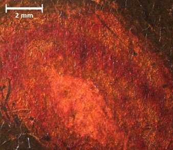
Burne-Jones’s glazes were applied over light underlayers in the red draperies, followed by transparent darker, warmer layers. For example, the deep crimson costume of the attendant at the far left has a complex build-up, painted in at least two red lakes, if not three, possibly including madder and possibly carmine, applied over substantial opaque under modelling in white, brown umber and pinks (fig.39).115
Elsewhere, overall brown toning, or ‘harmonising’ glazes were applied to lighter areas of flesh.116
In subduing his colours through extensive applications of brown glazes, it seems likely that he was influenced by the uncleaned appearance of the fifteenth and sixteenth century paintings he encountered in Italy, seen as they were through veils of yellowed varnishes and sooty dirt, in poorly lit churches. He may also have felt the aesthetic and historic values commonly associated with such a patina were entirely appropriate for this commission, situated as it was, within a pseudo-medieval setting.
Such ‘antiquing’ is apparent in the weathered appearance of the painted scrolls, rendered with a combination of scraping back to break up the letters, and brown glazes. The silhouetted leaves of the sky may even reference the aged and browned copper-containing greens for the foliage, originally much greener, which he would have seen in early Italian altarpieces. Some of Burne-Jones’s leaves are painted black or brown, while in others, underlayers of bright blue-greens containing emerald green were then toned down with heavy brown glazes (fig.40). There is also a black toning in crevices to the gilded pastiglia on either wing. Subsequent accumulations of dirt have deepened this effect, but do not completely account for it.
The resulting mannered, stylised beauty which incorporated references to the type of patina found on old master paintings seems far removed from early Pre-Raphaelite ideals or techniques. While in many parts of the painting, Burne-Jones began painting with bright, strong hues, he then subdued the colours, with subsequent opaque layers and glazes. This is seen in the Virgin’s robe on the right canvas (fig.41), which was initially painted with a strong, bright blue made from a mixture of Prussian blue and lead white glazed in pure blue. It also includes wet-in-wet brush strokes of blue combined with green or purple hues. He then toned the colour with a darker grey blue and, finally added streaks of transparent browns, to create an effect which recalls the aged appearance of discoloured azurite or deep ultramarine seen in early Renaissance representations of the Virgin.
The same process was used again in Gabriel’s sleeve, which is a bright purple mixture of synthetic ultramarine and red lake, toned down with an upper layer in grey blue containing complex mixture of ochre pigments, bone black and possibly an indigo blue or smalt.117
For the Botticellian dark green grass which is decorated with daisies, he toned down brilliant colours containing lead white, a bright emerald green, yellow ochre and green earth, by glazing in deep grey-greens.
Collaboration
The X-radiographs of the first version show a variation in technique which is not immediately apparent on the surface and suggests that another painter may have collaborated with Burne-Jones. In the Adoration scene, the painting of the two identically dressed female attendants on the left, one of whom is crouching down, differ from that of the other figures. Their more sculptural quality contrasts with the flatter, stylised medievalism of the other figures. The contrast is starker in the X-radiograph, which shows how modelling of their faces and costumes was established with immediate assurance in the underpainting, with thick lead white containing underpaint confined to the highlights, rendering a sharper chiaroscuro in the X-radiograph. By comparison, the other figures are shown to have been underpainted in thinner, continuous layers of white; here the deep shading in folds of drapery is formed by successive upper paint layers made from translucent coloured glazes which are not visible in the X-radiograph (see fig.23).
The side canvases also show a variation in technique, although here it is apparent in the trellis of roses. When placed side by side, the Annunciation canvases join together pleasingly to form a continuous scene (fig.42). This also helps to highlight different techniques applied to the two halves of the rose covered trellis, which are more clearly seen in the X-radiograph (fig.43). On the right canvas, stiff, sharply defined rose stems are underpainted with lead white in straight lines of high relief. The flowers also seem a little naive compared to the more sophisticated blooms on the left canvas, with their softer, broader, sinuous stems.
While such technical inconsistency across the surface might show Burne-Jones’s experimentation with different ways of painting, it seems feasible that in both of these examples we may be seeing the hand of one of his close friends and fellow artists, perhaps Morris or Rossetti, or indeed Georgiana Burne-Jones. This was a period when the concept of the workshop was frequently discussed, not least in debates over the authorship of recently acquired Medieval and early Renaissance paintings entering the national collections. With such historical precedent, an element of collaboration would befit Burne-Jones’s approach to the creation of his own Renaissance altarpiece. Burne-Jones, Rossetti and Morris were accustomed to sharing large-scale projects, notably for the wall decorations of Morris’s Red House, which took place from 1860–5.118
It might be said that a precedent for collaboration had been set in the painting of the Oxford Union murals of 1857‒59; here their group also included the artists Spencer Stanhope, Val Prinsep and Arthur Hughes. Such collaboration, a recognised aspect of the medieval guild system, accordingly aligned with the ethos of the firm of Morris, Marshall, Faulkner & Co. With work supplied by architects Street, Burges and Bodley the precedent for collaborative working practice, already seen in such projects as the painting of the Great Bookcase and the Prioress’s Tale Wardrobe, was to be formalised in a number of commissions for the furnishing of churches.119
Morris Marshall, Faulkner & Co.’s circular of 1862 stated five categories of craft offered by the group of artists, indicating their holistic and collaborative approach was key. As Morris wrote: ‘the work done must necessarily be of a much more complete order, than if any single artist were incidentally employed in the usual manner’.120
The furnishing of St. Martin-on-the-Hill, Scarborough, a church which was designed by Bodley, is one such example. Rossetti, Morris and Madox Brown collaborated on the painted decoration of the pulpit in 1863, and it is interesting to note that Rossetti’s figure in his Annunciation panel has both stylistic and technical similarities to the attendant’s figure in the Burne-Jones’s Adoration panel for the triptych. This suggests a comparison which, if nothing else, highlights their close working practices at this time (fig.44).
Conclusion
This early oil commission for the young Burne-Jones reflects the remarkable confidence which was being placed in him by one of the leading architects of the day. The technical study has elucidated his working processes in detail and revealed the extraordinary extent to which Burne-Jones was experimenting even at this early stage of his artistic development. Not only was his source material extensive and eclectic, but in making his Renaissance triptych Burne-Jones also relied on his first-hand study of Renaissance altarpieces witnessed and sketched on his recent travels through Italy. In painting the first version, he combined an eclectic array of techniques which came from traditional oil painting, furniture decoration and even by adapting some of his watercolour techniques to working in oils. Creating a beautiful Renaissance altarpiece which would glow with lustre in candlelight, he used pastiglia and gilding in a variety of different metal leaf, all with additional toning; these techniques came from his practical experience of decorating medieval-style furniture. He also combined modern materials and traditional techniques, such as using nineteenth century emerald-green to underpaint the face of Gabriel, then hatching with brushstrokes in flesh colour, producing an effect reminiscent of Duccio, the Italian painter of the late thirteenth and early fourteenth centuries. With no formal artistic training and little experience in the medium of oils, Burne-Jones drew on every aspect of his practical experience to create his surface effects.
Unlike Rossetti and his fellow artists, he aimed to achieve the final effects of an aged Renaissance painting fit for its ‘medieval’ church setting by applying a patina from toning layers. The sombre colours and golden highlights of the panels, once installed in the church, would have been enhanced by the light from the altar candles before them, an effect which Burne-Jones is said to have preferred to brightly lit spaces. In the real church, the unvarnished canvases of the second version of the triptych were framed without glass when they replaced this earlier one. Damaged by the wax which had spluttered onto them from the nearby candles, they were subsequently put behind glass protect them.
Technical evidence has also suggested that for his first major work he may have engaged the assistance of fellow artists in a collaboration, in line with the concept of the Renaissance workshop which was so relevant to his early collaborative productions for Morris Marshall, Faulkner & Co. By understanding Burne-Jones’s technical progression in painting the triptych, compositional and symbolic changes as well as revisions have been uncovered. The first version, Burne-Jones’s first major oil painting, represents in effect his early transition from the study and practice of theology to the study and practice of art. His interest in unique iconographic combinations – such as the placement of the apple and its removal in the second version, the shifting placement of the kings and the interest in the compositional architecture around the Virgin in the Annunciation – all evidence a thoughtful and deep study not only of painterly styles and method, but also the theological underpinnings of the Incarnation that he studied in the course of his education.
The compositional and stylistic differences between the two versions have also been explored both in terms of their religious significance, and Burne-Jones’s responses to the reality of designing a detailed triptych for a large and candlelit medieval-revivalist church. After seeing it in situ, Burne-Jones honed his craft to produce a second, more stylistically and technically homogenous work which, in his eyes, better served its function as an altarpiece. Freely available for all to see in this grand public space of the church, the triptych in both its versions united his two worlds of art and religion. As the architect Burges wrote, ‘in the very best days of Art, there were no academies and no exhibitions beyond churches and public buildings’, where ‘no payment was required and the pictures were always on view’.121
To Burne-Jones there could be no higher purpose.
Appendix: Chronology of the frames of both versions of the triptych
1861 The original Morris, Marshall, Faulkner & Co. frame was probably fitted around the first version and installed in St Paul’s Church for a relatively brief period while the second version was painted. The second version then took its place in the first frame within the church, and it is likely the first version was reframed in preparation for transfer to Plint’s estate. Only the central canvas’s frame now remains from this framing.
1860s The first version passed through several owners before being purchased by G.F. Bodley, who presented the triptych in a number of configurations including framing the two outer canvases together within one frame. Remnants of blue paint found along the edge of one of the outer canvases suggest that one of the presentations may have been painted blue.
Fig.45 Photograph from the Burne-Jones Memorial exhibition of 1898, of the first version of Edward Burne-Jones’s The Annunciation and the Adoration of the Magi 1861 in its second frame Peter and Renate Nahum at the Leicester Galleries
1898 The first version was included in the New Gallery’s Burne-Jones Memorial exhibition of 1898 (fig.45) where its originally intended configuration was ‘recreated’, as suggested by the outer canvas frames being of a notably different design to the central one.
1923 The second version went to Philip Burne-Jones’s studio, London for conservation treatment. Philip applied protective varnish to the canvases and recommended that they be put under glass, but did not comment on the frame.
1929 The second version had been put under glass by this time, as it was described as ‘difficult to see … It is even more difficult since it has been under glass: this became necessary as in 1923 peeling had begun on one wing … Sir Philip Burne-Jones was consulted … and very strongly advised that it be put under glass’.122
1934–46 During the incumbency of Rev J.C.G. Tiley, the altar itself was enlarged, and the second version raised by placing it on a wooden step or gradine. The original frame was entirely covered over by an elaborate gilt frame, with parts of the patterned frame between each painting obscured by plain wooden panels stained the same colour as the gradine. The three canvases were set as to be in one plane rather than presented as slightly hinged, as they had been earlier (see figs.4 and 5).
1934 The first version was presented to the Tate by G.F. Bodley’s son, G.H. Bodley. At acquisition, the two outer canvases were framed together. Framing company James Bourlet & Sons copied the existing central frame to make two new outer frames, so that the triptych could be presented in its originally intended configuration.
1955 The canvases of the second version were cleaned (of yellowed varnish) by the restorer Harold Buttery.
1975 The second version was exhibited at a Hayward Gallery exhibition of Burne-Jones’s work in the stained narrow timber frame (40 x 14 mm wide) that appears to have been fitted in place of the original Morris & Co. frame by Brighton Museum, into whose care the second version had been temporarily entrusted for security. The original frame was stored in the narthex of St Paul’s Church.
1977 The terms of loan to Brighton Museum were made indefinite because insurance for the second version could no longer be afforded by St Paul’s.
1990 A conservation treatment carried out by Brighton Museum in February is recorded as:
‘Painting: Secure loose paint, touch out scratches and old matt retouchings and scuff marks. Clean back, replace missing wedges and refit with mirror plates. Frame: Improve appearance in some way. Line rebate with velvet. Fit backboards. Frame painted matt black.’ The second version was included in the Louvre exhibition Polyptyques: Le table multiple du moyen âge au vingtième siècle, Paris, 27 March – 23 July 10 (catalogue no.32, pp.161–3).
1993 The second version was reunited with the original Morris & Co. frame for the Sotheby’s sale of Wednesday 3 November 13 in London. The Consistory Court of the Diocese of Chichester insisted on the restoration of the original Morris frame, and its re-unification with the triptych prior to the sale, under the guidance of Sotheby’s.
Rachel Scott is a Paintings Conservator at Tate Fiona Mann is an Associate Researcher in the School of History, Philosophy and Culture at Oxford Brookes University Katherine Hinzman is finishing her PhD dissertation, Love Between Worlds: Edward Burne-Jones and the Theology of Art, at the University of York Joyce H. Townsend is Senior Conservation Scientist at Tate Alastair Johnson is a Frames Conservator at Tate