Mostly in art, colour is descriptive – it shows us the colour of the thing you’re trying to represent. If you see a red vase, you paint it red! And you mix your colours to try to suggest all the different types of ‘red’ there are. But colours also have lots of different cultural connections and resonances. Think about 'singing the blues'? How about red hot anger? Or green with envy? But these connections aren't fixed – they are different across cultures and change over time: we don’t recognise all the colour associations in Shakespeare’s plays (though there are still some we do, like ‘lily-livered’).
Mixing colours
Mixing exactly the right colour is almost an art in itself. Tate has all the sketchbooks left in J.M.W. Turner’s (perhaps the most famous British landscape artist) studio at his death. Pages and pages of these are devoted to him mixing up the correct colours for his compositions.
Turner was painting at a time of great technological change for artists! Unlike the ready-made tubes of colour available today, Turner used pure pigment which had to be ground up and mixed with gum arabic to make watercolour paint. In his early works he used organic pigments and mineral pigments made from rocks and plants etc. But during his lifetime, new industrial processes meant new cheaper and brighter colours were available: cobalt blue, chrome yellow and emerald green.

Joseph Mallord William Turner
Colour Tests
(c.1799–1807)
Tate

Joseph Mallord William Turner
Colour Trials
(1791)
Tate

Joseph Mallord William Turner
Colour Trials
(1791)
Tate

Joseph Mallord William Turner
Colour Trials
(c.1797)
Tate
Colour Studies
Turner travelled widely across the UK and Europe. He tended to make pencil sketches for his landscape paintings outdoors and then work them up in watercolours once he was back to wherever he was staying. This meant he had to have both a good colour memory and also a good idea of how colours work when they are on the page.
When we look at a landscape outside, the further away something is, the more muted the colours are. If you then paint your background too brightly or strongly, our eyes might not ‘read’ it as receding into the distance, and you can lose the sense of depth.

Joseph Mallord William Turner
Norham: The Castle Seen from the Opposite Bank of the Tweed, Looking South
(1801)
Tate

Joseph Mallord William Turner
Norham Castle: Colour Study
(1797–8)
Tate

Joseph Mallord William Turner
Norham Castle: Colour Study
(c.1798)
Tate

Joseph Mallord William Turner
Norham Castle, Sunrise
(c.1845)
Tate
These colour studies show how Turner experimented with colours and views, looking at the same subject from different views and trying out different colour combinations to bring a scene to life.
Have a go

Joseph Mallord William Turner
The Lieutenancy Building and Church of Sainte-Catherine at Honfleur, Normandy
(c.1832)
Tate
Take your sketchbook outside and sketch a landscape scene. It doesn’t have to be a wide horizon with rolling hills or seascapes! You can sketch a street scene or your local park.
Pick something with a definite background and foreground, something you can see in the distance, with something more detailed close to you.
Make a few pencil sketches from different viewpoints getting down the information you need: the shapes and angles of the composition. If you want to work in colour later like Turner, note down your observations about the colour. But you could use coloured pencils or a travel watercolour set to mix/blend colours while you sketch.
Once you have a good selection of sketches, experiment with different colour combinations. Does changing the colours change how the image works in terms of space? Or how does it change how it feels?
Wild Colour
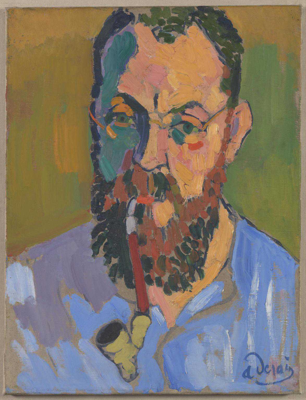
André Derain
Henri Matisse
(1905)
Tate
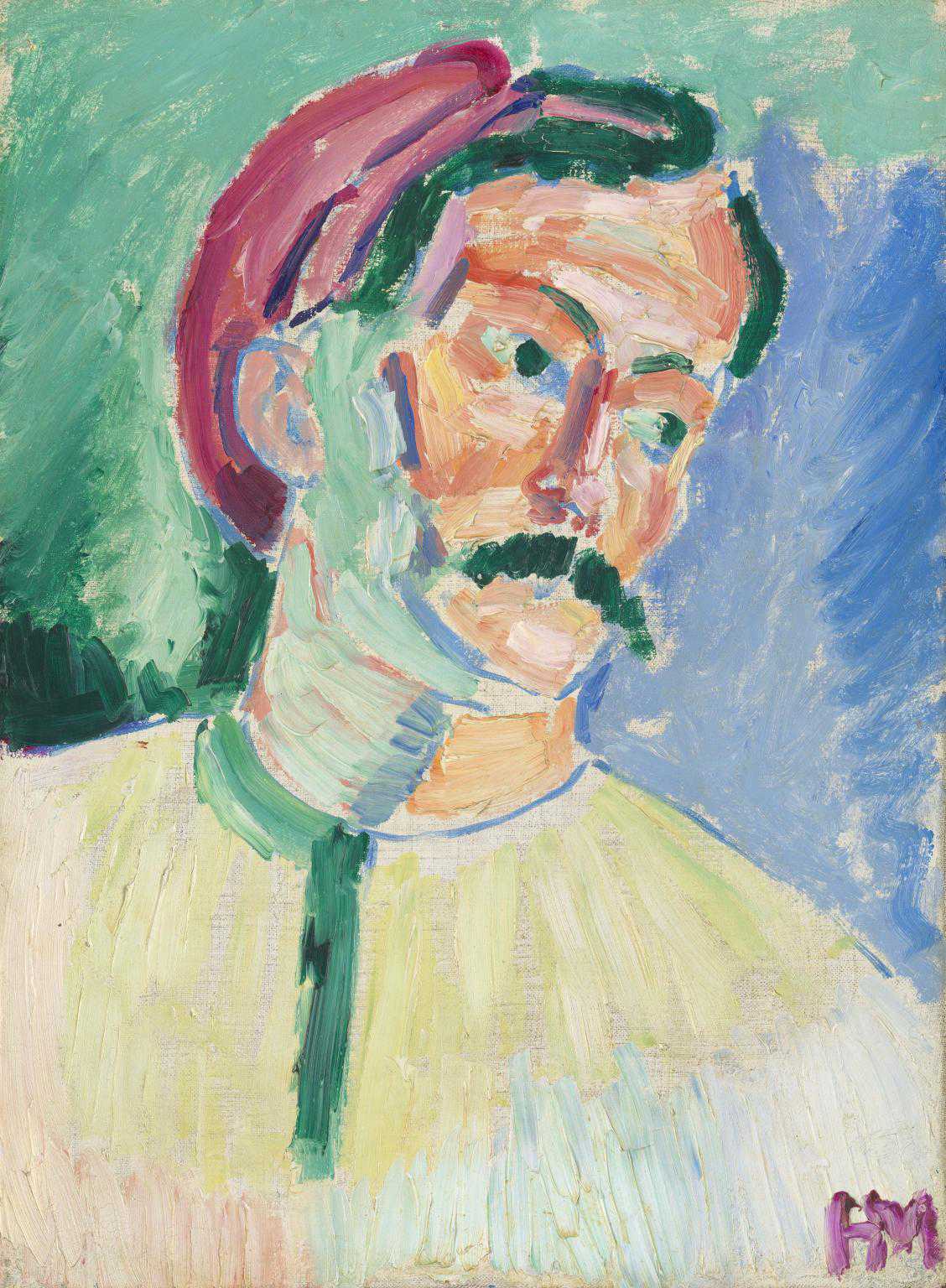
Henri Matisse
André Derain
(1905)
Tate
In the early 1900s, some artists started experimenting with non-representational colours. Looking at colour theory and the idea of ‘complementary colours’ they stopped mixing paint to match what they could see, and started to use it directly from the tube, or with minimal mixing. They wanted to make their colours seem brighter, by putting oranges next to blues and yellows next to violets, and use these striking colours not just to represent the world, but to express emotions.
When the critic Louis Vauxcelles saw the brightly-coloured works of Henri Matisse and André Derain in an exhibition in Paris in 1905, he reviewed them as being ‘les fauves’ or wild beasts. The name stuck and we now refer to their style of non-representational colour as Fauvism. Since then in European art, and in other cultures, artists have often used colour that is not related to representing how things appear.

André Derain
The Pool of London
(1906)
Tate

Vanessa Bell
Mrs St John Hutchinson
(1915)
Tate

Benode Behari Mukherjee
Conversation
(c.1960)
Tate

Eileen Agar
Figures in a Garden
(1979–81)
Tate

Nicola Tyson
Swimmer
(1995)
Tate

Norman Adams
Christ’s Cross and Adam’s Tree
(1989)
Tate
Colour is an optical illusion

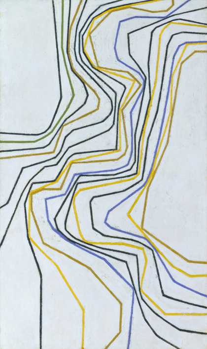
Joseph Mallord William Turner
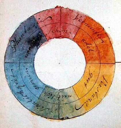
Lecture Diagram: Colour Circle No.1
(c.1824–8)
Tate
These ideas about colour theory and colour mixing were drawn from the scientific discoveries about light and colour. Isaac Newton proved in 1666 that light was actually made up of a rainbow or spectrum of colours using glass prisms – if you mix all the colours of light our eyes see this as white light. Painting is the opposite though. Pigments are absorbing all the other colours and reflecting back only the colour we see, and if you mix them up they get darker and darker, till they absorb all the colours.
In a way, colour is just an illusion. We can only see a portion of the spectrum of light, and some studies have shown we cannot differentiate colours if we don’t have a name for them. Our eyes and our brains are always looking for shortcuts, and colour perception (how we see the colours) can be changed by what those colours are surrounded with. Changing the lighting on a painting can dramatically change its colouring as we see it. Staring deep into one colour can also change what we see afterwards as our brains try to compensate and bring a balance to what we’re seeing.
Lots of artists like Ceal Floyer have made artworks directly with light rather than relying on pigments to mix colours.


Other artists have exploited this illusion of placing different colours next to each other to create paintings that seem to have 3d shape, or even to move as our brains struggle to reconcile the colours together.


Colour Mood
Colour can change our moods. Some artists have used colours to create meditative spaces.
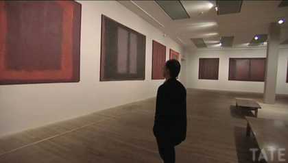
Mark Rothko is best known for his huge paintings of rectangular shapes of colour. In 1958, he painted a series of large-scale paintings known as The Seagram Murals, which had been commissioned to decorate the Four Seasons Restaurant in the Seagram Building in New York City. Rothko wanted to create works that would be shown together in a permanent installation. But as he painted, concentrating on working in deep colour fields of reds, browns and blacks, he became disillusioned with the idea of the paintings being decorative backdrops to fine dining. A critic who visited his studio described the colours as ‘darkly luminous’, and Rothko himself said: ‘I am interested only in expressing basic human emotions – tragedy, ecstasy, doom, and so on.’
Rothko refunded the money that restaurant had paid him and instead donated the murals to museums including Tate, with the instruction they should be displayed in a group together. When these works are on display often people come to sit and contemplate – losing themselves in the deep colours.
Other artists have used colours to express joy or excitement. Albert Irvin explained that his paintings are about his experience of being in the world. He named them after places, and this one is named for Empress Street in south London. He said that this painting was done with a sense of optimism and confidence and freedom to take risks. Do you think this comes across in the painting?

Albert Irvin OBE RA
Empress
(1982)
Tate
Blue isn’t always sad and red isn’t always happy – the play of colours and composition is much more complex than that.

Gillian Ayres CBE RA
Sundark Blues
(1994)
Tate

Aubrey Williams
Shostakovitch 3rd Symphony Opus 20
(1981)
Tate

Sandra Blow
Vivace
(1988)
Tate

Winston Branch
Zachary II
(1982)
Tate
Have a go
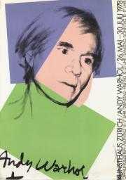
Andy Warhol
Andy Warhol
(1978)
ARTIST ROOMS Tate and National Galleries of Scotland
© 2024 The Andy Warhol Foundation for the Visual Arts, Inc. / Licensed by DACS, London
Colour doesn't always have to sit with the lines you draw. Andy Warhol was the master of offsetting his screen printed image with their colours. In this work he’s experimenting with laying down flat planes of colours almost as if they were collaged on.
Try making compositions of bold blocks of colour (they could be collaged or painted) and drawing graphic images on top of them. You could try using photocopies of a drawing (like Warhol used prints) and colouring on top of them with washes of thin paint or marker pens.
Try lots of different combinations. How do the colours you use affect how the image feels? Can the colours even change the meaning of the image?