Mark Rothko’s Red on Maroon
Philip Shaw
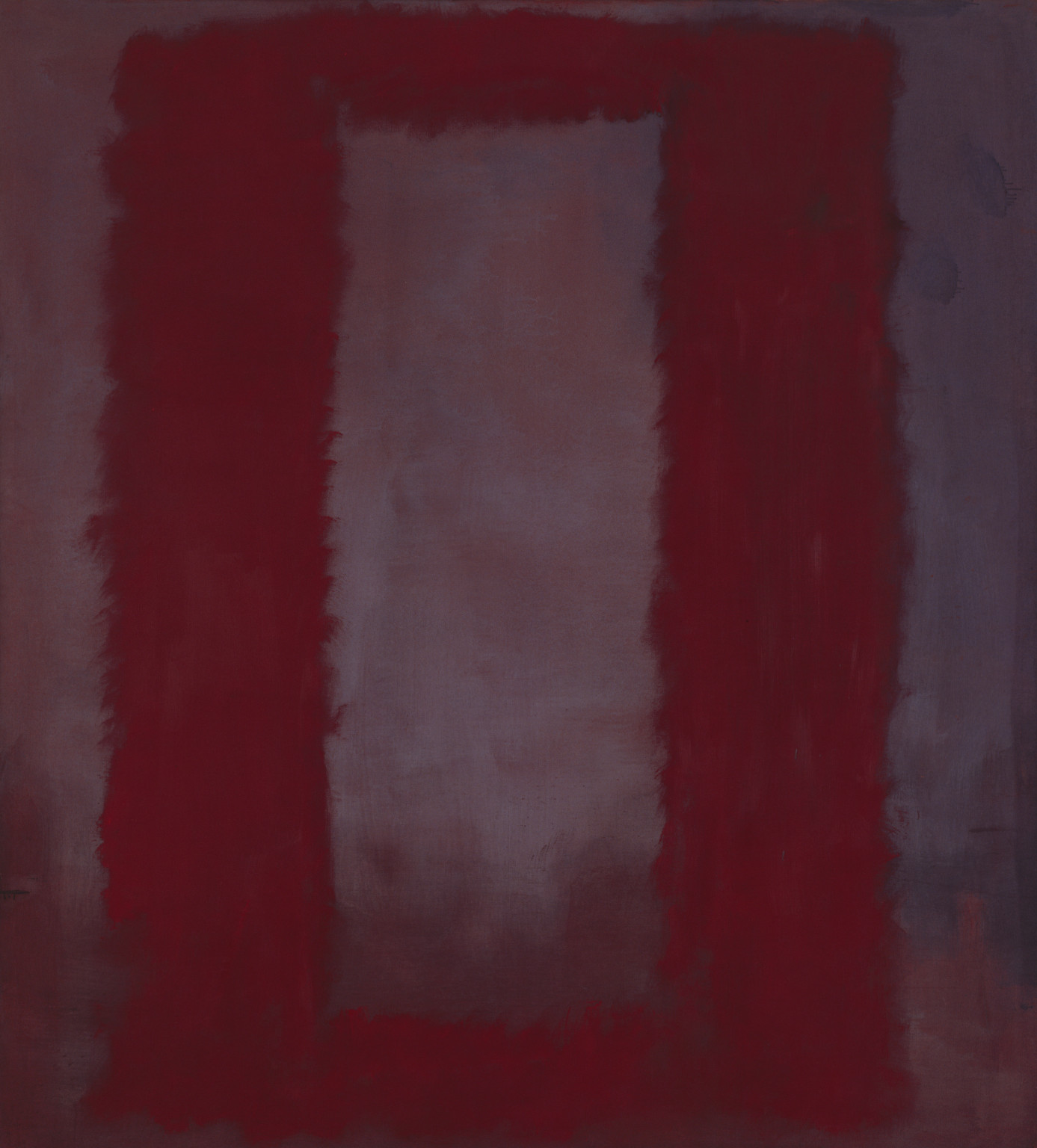
Mark Rothko 1903–1970
Red on Maroon 1959
Mixed media on canvas
support: 2667 x 2388 x 35 mm
Tate T01165
Presented by the artist through the American Federation of Arts 1969
© Kate Rothko Prizel and Christopher Rothko/DACS 1998
Fig.1
Mark Rothko
Red on Maroon 1959
Tate T01165
© Kate Rothko Prizel and Christopher Rothko/DACS 1998
In 1988, and then again in 2009, Tate Liverpool hosted a display of nine thematically linked paintings by the American abstract expressionist Mark Rothko.1 The chapel-like room in which these large paintings were hung was painted grey in accordance with the artist’s wishes; the lighting was strategically dimmed, creating a sombre, meditative atmosphere. Visitors to the room tended to linger; they observed the paintings with rapt attention, moving around, away from and towards individual canvases in an attempt to see more clearly. Sometimes they sat and closed their eyes; they may have been trying to adjust their vision to the relative darkness of the room, they may have been thinking about their lives or they may have been praying.
The paintings were commissioned in 1958 for a private dining room in the Seagram building in New York. When Rothko visited the room in which the works were to be displayed he decided to withdraw from the contract, possibly as a protest against the exclusive conditions in which the paintings would be surveyed. The nine ‘Seagram murals’ in Tate’s collection (other surviving paintings can be seen at museums in Washington and Tokyo) are united by simplicity of form – large vertical columns and frame-like structures predominate – and by their dark, fustian colour scheme: four of the paintings are titled Red on Maroon; five are called Black on Maroon. The example shown here belongs to the former series and was completed in 1959 (Tate T01165, fig.1). In many ways this particular Red on Maroon seems atypical of the series: a feathery, silver-grey veil appears to shimmer above a dark purple background; the red frame, which seems to hover above the painting, serves as a portal, inviting the viewer to gaze into the ineffable beyond.
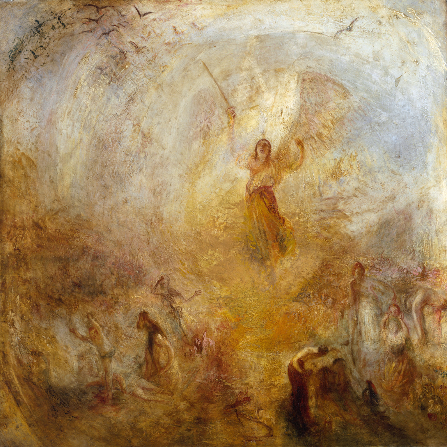
Joseph Mallord William Turner 1775–1851
The Angel Standing in the Sun exhibited 1846
Oil on canvas
support: 787 x 787 mm; frame: 942 x 942 x 73 mm
Tate N00550
Accepted by the nation as part of the Turner Bequest 1856
Fig.2
Joseph Mallord William Turner
The Angel Standing in the Sun exhibited 1846
Tate N00550
In this respect it is worth considering the effect of scale. Measuring 2667 x 2388 mm, Red on Maroon is extremely large. ‘To paint a small picture’, Rothko once commented, ‘is to place yourself outside your experience. However you paint the larger picture, you are in it. It isn’t something you command.’4 When enclosed in the windowless, claustrophobic space of the Seagram room, the viewer may well feel similarly overwhelmed. In his later works, particularly the Houston Chapel series and the grisaille paintings of his final phase, Rothko goes even further in equating the effects of scale and obscurity with the defeat of spiritual significance. In such works the force of the sublime seems utterly disabling; in an instant, the impulse towards transcendence is both raised and dashed. ‘Often, towards nightfall’, Rothko confessed, ‘there’s a feeling in the air of mystery, threat, frustration – all of these at once. I would like my painting to have the quality of such moments.’5
Notes
Further information about these paintings can be found at the following Tate webpage: http://www.tate.org.uk/whats-on/exhibition/rothko/room-guide/room-3-seagram-murals
Leo Bersani and Ulysse Dutoit, Arts of Impoverishment: Beckett, Rothko, Resnais (Cambridge: Harvard University Press, 1993), pp. 123-4.
Mark Rothko, Writings on Art, ed. Miguel Lopez-Remiro (New Haven and London: Yale University Press, 2006), p. 74.
Philip Shaw is Professor of Romantic Studies in the School of English at the University of Leicester and Co-Investigator of ‘The Sublime Object: Nature, Art and Language’
How to cite
Philip Shaw, ‘Mark Rothko’s Red on Maroon’, in Nigel Llewellyn and Christine Riding (eds.), The Art of the Sublime, Tate Research Publication, January 2013, https://www