Introduction
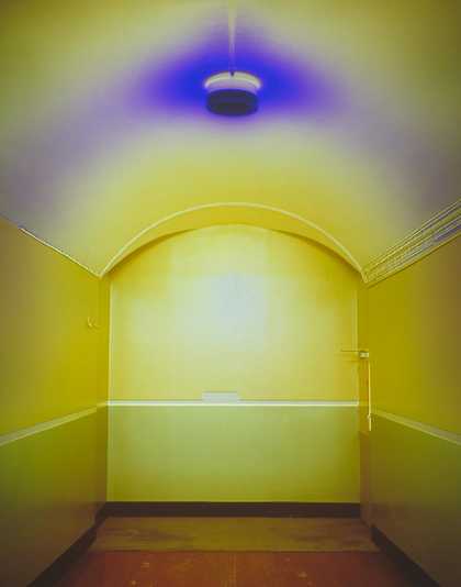
Catherine Yass
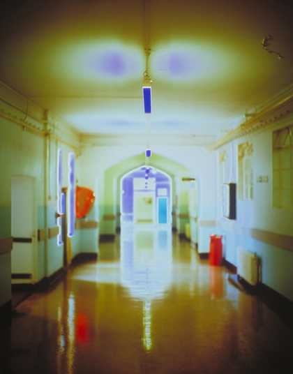
Corridors (1994)
Tate
There are all kinds of spaces. There are spaces we have built and there are spaces in nature. There are even spaces inside our bodies … what goes on in that space inside your head?! Spaces can be small and enclosed like the space under the stairs, inside a box or even inside a tiny seashell. Or they can be huge and open. Some spaces are crowded and busy – full of people or things. Others are empty and kind of spooky … what happened here? What might happen here?
Crowded spaces
Part of the crowd
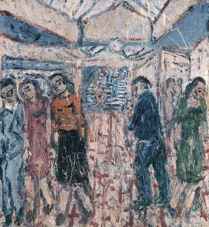
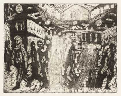
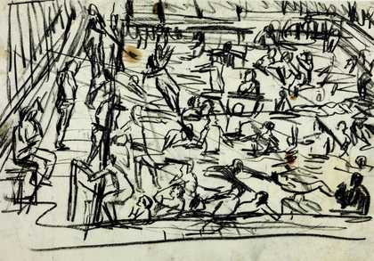
Have you ever been in a crowd at a concert, football match or in a busy shopping centre? What does being part of a crowd feel like? Leon Kossoff aimed to capture the jostle of crowded spaces in his drawings and paintings of streets, stations and packed swimming pools. By using gestural brush strokes and marks he puts across a sense of chaotic movement.
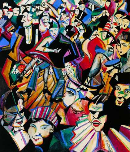
Christopher Richard Wynne Nevinson
Dance Hall Scene (c.1913–14)
Tate
The energy and buzz of a crowded space was also the inspiration for this scene of wild partying by artist Christopher Nevinson. The painting does not just depict the dancers, but puts across the excitement and sounds of being at the dance. We glimpse parts of faces and parts of bodies, but these all seem to merge together and merge with the patterns and structure of the hall itself. Nevinson was part of the futurist art movement. Formed at the beginning of the twentieth century, the futurists were inspired by the dynamism of modern life.
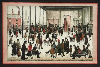
L.S. Lowry
Punch and Judy (1943)
Tate
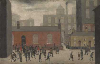
L.S. Lowry
Coming Out of School (1927)
Tate
L.S. Lowry also painted crowds in the streets and spaces of our towns and cities. But unlike Kossoff and Nevinson’s mass of figures, Lowry’s work shows the people in the crowds as isolated and separate from one another. Do you think he was saying something about how people can often feel lonely even in the busy spaces of our cities?
People watching: faces in a crowd
Do you enjoy people watching? Artist Raymond Mason did. While sitting in a café in New York, he sketched people passing by on the pavement outside. He used these drawings as the starting point for this sculpture. He modeled the characters he had seen using plaster, and then painted details of the faces and clothing.
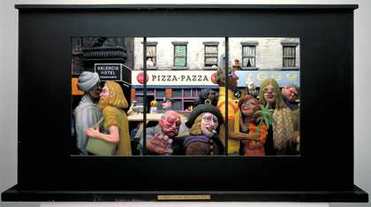
Raymond Mason
St Mark’s Place, East Village, New York City (1972)
Tate
The ‘space’ of the café window framed the crowd that Mason saw. By presenting his busy street scene in a box, he mimics the enclosed space of the café window so we too can see the people passing by.
You’ve been framed!
Photographer Martine Franck photographed the crowd waiting for a glimpse of the Queen at her Silver Jubilee celebrations. Franck has cropped the photograph so the figures spill out the top and sides. This emphasises the size of the crowd and the feeling of being trapped in it.
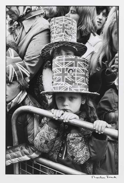
Martine Franck
Greenwich, London (1977)
Tate
She focuses on a young girl who looks bored and grumpy. Although out on the street, the girl is enclosed by the squash of people around her and also by the barriers that fence her in.
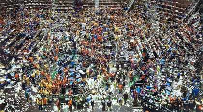
Andreas Gursky’s Chicago Board of Trade, II shows a busy trading hall packed with financiers trading stocks and shares. Viewed from above, the space is a dense hive of activity.
Gursky created this mesmerising image by taking lots of photographs of the scene. He then merged and manipulated them on a computer. He double-exposed several sections of the photographs making it hard for us to focus, and creating an all-over busy surface. The image becomes almost gestural and abstract like an abstract expressionist painting.
Using abstraction to capture a crowd
Other artists have also used abstraction to put a across the experience of crowded spaces.
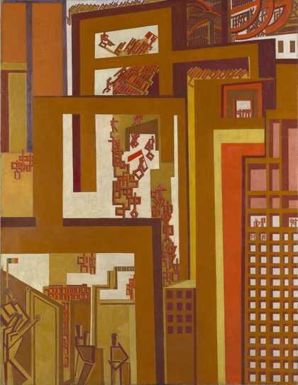
Artist Wyndham Lewis packs the composition of his paintings of cities and buildings with angles and diagonals. This suggests the claustrophobic feeling of modern cities. In his painting The Crowd you have to look pretty close to see the people – red stick figures dwarfed by the city buildings.
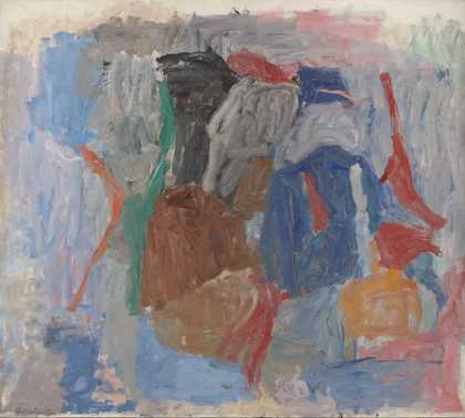
Philip Guston
The Return (1956–8)
Tate

Henri Michaux
Untitled Chinese Ink Drawing (1961)
Tate
In Philip Guston’s painting The Return, the cluster of shapes jostle on the canvas like figures in a crowd. The bold colours and short visible brushstrokes seem to make the paint flicker on the canvas. This adds to the sense of jostling movement. Henri Michaux’s ink drawing of gestural marks, although completely abstract, also suggests the movement of a crowded space.
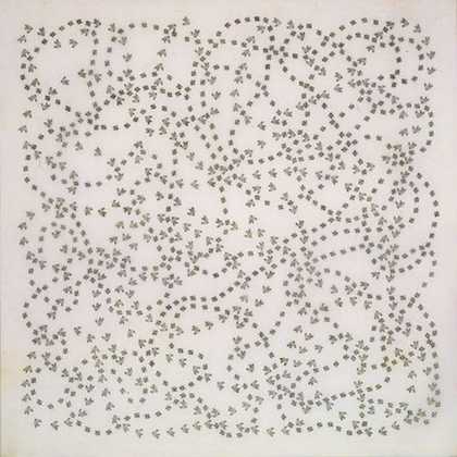
Leon Ferrari’s prints look at first like abstract patterns … until you realise that he is depicting a crowd of people viewed from above. They walk through a busy town square and create patterned trails as they dodge each other.
Spaces full of things
It is not only people who can make a space crowded! Artist Robert Therrien’s RED ROOM 2000-7 is a cupboard-sized room filled with 888 red objects collected by the artist.
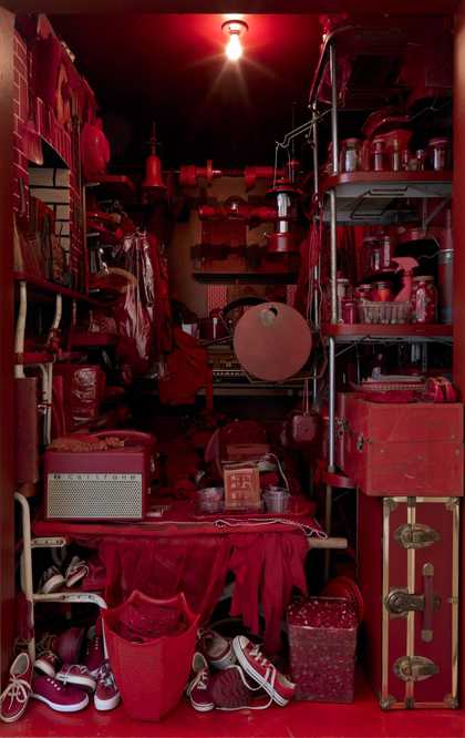
Robert Therrien
RED ROOM (2000–7)
ARTIST ROOMS Tate and National Galleries of Scotland
The objects range from kitchen utensils and building materials to clothing and electrical appliances. They are so tightly packed in to the room they seem to merge together. They look almost like a large monochrome painting. He places the things that are personal to him, such as his brother’s summer-camp sweatshirt, alongside more generic things. This blend of the personal with the general, and the everyday with the unreal suggests an underlying story.
… a different look at space
Sir Eduardo Paolozzi
28. Man Holds the Key (1972)
Tate
Sir Eduardo Paolozzi
Head (1979)
Tate
Sir Eduardo Paolozzi
Automobile Head (1954–62)
Tate
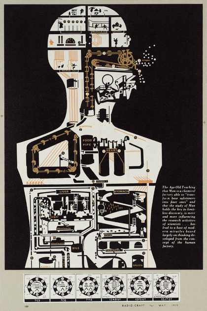
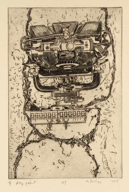
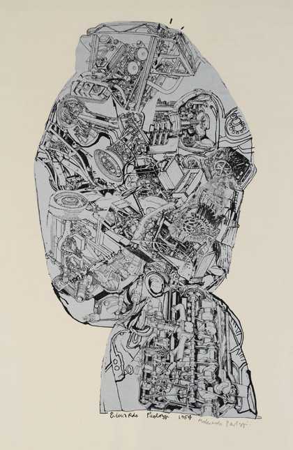
Eduardo Paolozzi made a series of prints exploring the spaces inside our heads and bodies. How do they work? What are they full of?
Paul Neagu
Ceramic Skull (1973)
Tate
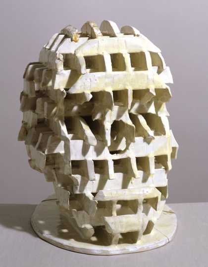
Paul Neagu’s Ceramic Skull 1973 takes a very different approach to imagining what the inside of our heads look like! By dividing the head into small spaces or cells, he suggests the different areas of our brain: spaces for emotions, spaces for thinking, spaces for memories.
Empty spaces
Creating atmosphere
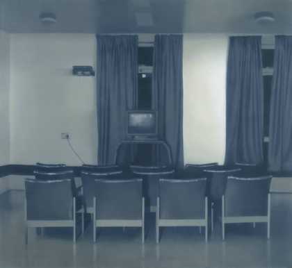
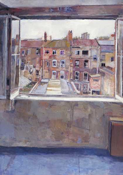
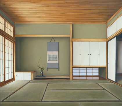
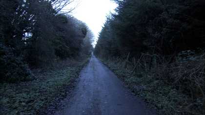
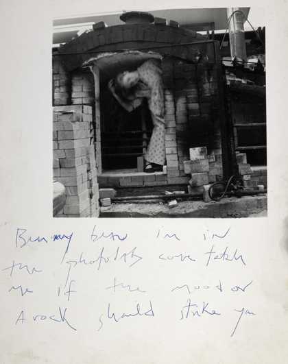
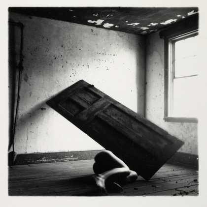
We have seen how artists convey the busy energy of crowded spaces. But spaces with nothing in them … surely not much there to inspire an artwork? Weirdly, empty spaces can often seem full of atmosphere! (They can also sometimes be slightly creepy.)
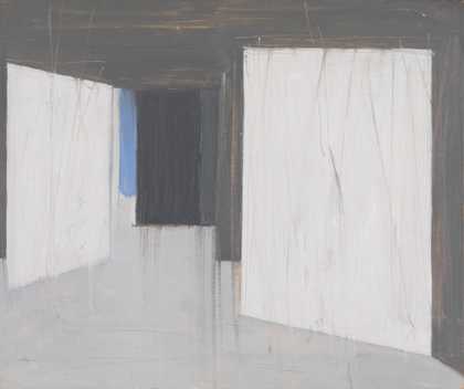
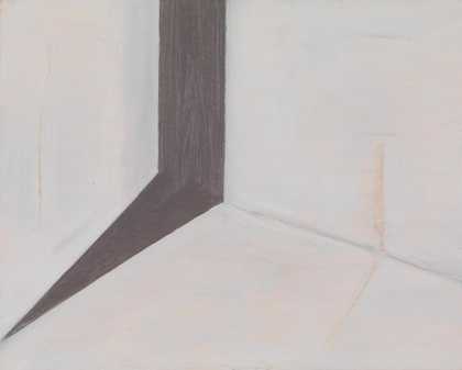
Vicken Parsons’s empty rooms are created very simply using just a few squares of off-white, grey and spot of colour to suggest walls. Darker grey and black shapes suggest shadows or an open door. There’s almost nothing to them – yet they’re powerful depictions of empty spaces. What might happen … who as just left … who might be hiding around the corner?
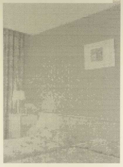
Ewan Gibbs
Wall (1999)
Tate
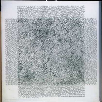
Artist Ewan Gibbs uses photographs of hotel rooms from holiday brochures as his source material. Drawing onto squared graph paper with ink, he carefully fills in each square of the paper with a mark or symbol. These marks recreate the various tones (lights an darks) of the photographs. No longer impersonal, bland hotel rooms, the rooms become subtly atmospheric and ghostly.
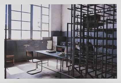
Catherine Yass’s depictions of empty spaces are very different – full of luminous yellows, blues and greens. She photographed empty corridors and other spaces inside a hospital.
To create these eerie photographs she manipulated the photographic film. Her technique involves taking two photographs of the space and then laying one on top of the other. One is a 'positive' image, the normal form of a photographic image, and the other is a 'negative' image. Yass has explained:
The negative image makes bright areas blue, so bright or transparent areas get blocked by the blue. The final picture is produced by overlaying the positive and blue negative images and printing from that. I think of the space between positive and negative images as a gap … an empty space left for the viewer to fall into.
So as well as photographing empty spaces, Yass’s technique also involves actually using an empty space.

