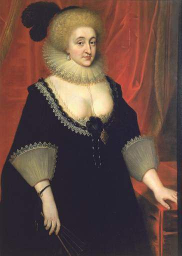
Fig.1
Paul Van Somer c.1577 or 1578 – 1621 or 22
Lady Elizabeth Grey, Countess of Kent c.1619
Tate

Fig.2
X-radiograph of Lady Elizabeth Grey, Countess of Kent

Fig.3
The reverse of Lady Elizabeth Grey, Countess of Kent, showing the wooden cradle fitted in 1917
This painting is in oil paint on an oak panel measuring 1143 x 819 mm (fig.1). The panel is composed of four vertical boards, glued together at butt joins. The width of the boards varies: from the left side they measure respectively 247–1259 mm; 240–277 mm; 48–59 mm; 235–261 mm. Overall the panel has developed a forward bow and has had a history of splitting in the two leftmost boards. The upper right area has old woodworm damage. The panel has a wooden cradle to help support the weakened wood (figs.2–3). It is recorded that the cradle was fitted in 1917 by Leggatt Brothers. The panel would have been thinned down from the back as part of the cradling operation; thus we have almost certainly lost the royal stamp that it should have had on the back, identifying it as part of the collection of Charles I.

Fig.4
Cross-section from the red curtain at the left edge, an area normally covered by frame. Photographed at x320 magnification. From the bottom upwards: white chalk and glue ground (not its full thickness); a few dark particles representing the very thin, oil bound grey priming; opaque brick-red paint of curtain; translucent crimson red glaze paint of curtain

Fig.5
The same cross-section as shown in fig.4, photographed in ultraviolet light at x20 magnification

Fig.6
Detail from infrared reflectogram of the head, showing the streaky priming and some underdrawing

Fig.7
Detail from infrared reflectogram of the left hand, showing the streaky priming and some underdrawing
The ground is made of powdered marine chalk (calcium carbonate) bound in animal glue (figs.4–5).1 It has a smooth surface. Infrared reflectography reveals that the ground is covered over with a grey, oil bound priming applied very thinly and streakily (figs.6–7). The thin priming is just visible as a line of black particles between the ground and the red paint in fig.4.
Underdrawn lines are visible to unaided eye at the sitter’s right shoulder marking outside edge of ruff (fig.6). More extensive drawing is visible in the full infrared reflectogram but it is not elaborate.

Fig.8
Detail of the face

Fig.9
Detail of the right eye

Fig.10
Detail of the left eye

Fig.11
Detail of the nose and mouth

Fig.12
Detail of the temple, ear and hair, with a pentimento drawing line for the original position of the earring

Fig.13
Close-up detail of the hair

Fig.14
Detail of the red curtain. Opaque red paint glazed with translucent tones of red made principally from lake pigment and black, applied streakily

Fig.15
Detail of the left hand resting on the tablecloth. The tablecloth is painted with opaque red paint glazed with translucent red lake glazes and thick black

Fig.16
Detail of the corner of the tablecloth, showing opaque brick red lay-in glazed with translucent red lake paint, black and finally opaque bright red for the highlights

Fig.17
Close-up detail of red tablecloth

Fig.18
Detail of the ruff

Fig.19
Detail of the left hand, with an alteration in the position of the index finger

Fig.20
Detail of the thumb

Fig.21
Detail of the black plume on the hat
The artist appears to have begun the work of painting by laying in the background drapery with opaque tones of muted red around a reserve for the figure. The principal pigment there is vermilion, mixed with lead white, black and earth colours. The rest of the painting would have been laid in with similarly muted tones, for example, the features of the face were laid in with very thin, mid-brown paint, which would be left visible to form the delineating shadows, strengthened with deeper glazes (figs.8–13). The assured wet-in-wet handling of the flesh tones is matched in the background with glazes of translucent red paint, which vary in concentration and therefore hue (figs.14–20). Further shadowing is achieved with addition of black pigment (fig.21). The glazes were applied with bold, multidirectional brushstrokes using a coarse brush, all rapidly executed with much wet-in-wet intermingling of the different shades. The final highlights on top of glazing were done with opaque vermilion paint, sometimes mixed with chalk, lead white, yellow ochre, lead-tin yellow and pipeclay.2 The black dress appears to have been done with a mixture of bone black and ivory black with lead white. The red lake pigment is not madder (which would have fluoresced brightly in cross-section) but otherwise could not be identified.3 Analysis of the binding medium of a highlight in the curtain revealed only natural resin, with chalk used to give body to the paint.4
There has been very slight fading of the red lake glazing.
March 2021