Take an in-depth look at the ideas, inspirations and development of the art of the Bloomsbury Group through the work of its three key artists: Vanessa Bell, Roger Fry and Duncan Grant
Vanessa Bell, Roger Fry and Duncan Grant were central to the formation and activities of the Bloomsbury Group. They were also the key artists in the group and their art has defined what we think of as 'Bloomsbury'. Find out about their shared ideas and inspirations and explore the development of their individual artistic styles.
Painting together
From 1911, when they became close friends, Vanessa Bell, Duncan Grant and Roger Fry often worked together painting the same things. Subjects included friends, (Lytton Strachey and Iris Tree were painted by all three artists), interiors and still-lifes.
These two paintings were painted side-by-side by Grant and Bell in 1914. The paintings show slightly different views of the same mantelpiece in Vanessa’s Bloomsbury home.
Although the paintings look similar there, are clear differences. Grant painted the moulding under the corner of the mantelpiece more exactly, whereas Bell simplified the scrolls to rectangular shapes. They chose different colours for the boxes, flowers and even for the background wall. Grant also added cut out pieces of painted paper to create a collage effect.
After 1915, when Vanessa Bell and Duncan Grant had become closer, the three artists rarely painted together. Fry felt excluded and complained in a letter to Clive Bell:
In painting Nessa and Duncan have taken to working so entirely altogether and do not want me…I find it difficult to take a place on the outside of the circle instead of being, as I once was, rather central.
However, a few years later Vanessa Bell felt that working so closely with Grant had was having a bad effect on her work. On holiday in St Tropez in 1921 they decided to paint separately, and only look at each other’s paintings at the end of their stay. From that point although they sometimes worked together or painted the same subject, but usually went their separate ways.
Shared adventures into abstract art
Fry, Grant and Bell all experimented with abstract art between 1914 and 1916. They used blocks of colour and sometimes experimented with collage.
As a student at Royal Academy Schools where she went to study art in 1899, Vanessa Bell was taught by John Singer Sargent. She was also greatly influenced by the paintings of James Abbott McNeill Whistler.
In a letter to her friend Margery Snowdon written in 1905 she described the influence of Whistler’s technique on her painting style:
You see my method is the same as Whistler’s – only he used many more layers than I should because he painted very thinly – which I cant, now at any rate, get myself to do. But the important point, which I believe I haven’t realized before, is that he didn’t put the right colour on at once. It was probably almost a monochrome to start with & I suppose he only got the right colour at the end – I expect that the most beautiful surface is got in his way – but I cant paint thinly enough to do that for one thing – and also in sketching I am not sure that it would be possible. Letter from Vanessa Stephen (Bell) to Margery Snowdon, [14 Aug 1905]
Towards abstraction
Vanessa Bell painted some of the most radical paintings produced by the Bloomsbury Group.
She was encouraged by her friend Roger Fry who introduced her to post-Impressionism and the work of painters such as Georges Braque and Pablo Picasso. This had an explosive effect on her technique and use of colour.
As for us we’re in a huge state of excitement having just bought a Picasso for £4. I wonder how you’ll like it. It’s “cubist” and very beautiful colour, a small still life. Letter from Vanessa Bell to Virginia Woolf, 19 October, 1911
In Studland Beach, which Vanessa painted in 1912, the people and landscape have been dramatically simplified. The crouching figures, beach houses and seascape are shown as flattened shapes and broad bands of colour.
In a review for a 1930 exhibition catalogue, Vanessa Bell's sister, the writer Virginia Woolf, described the feeling she got from Vanessa's paintings. Although written thirty years later she could be talking about Studland Beach:
No stories are told; No insinuations are made. The hillside is bare; the group of women is silent; the little boy stands in the sea saying nothing. Virginia Woolf, Recent Paintings by Vanessa Bell, Cooling Galleries, 1930
In the same year Vanessa Bell painted two artist friends, Frederick and Jessie Etchells, painting. Their faces are left blank without detail. Blocks of loosely-painted colour suggest the background.
In these paintings Vanessa Bell emphasises form over content (what the work looks like over what the subject of the painting is). This is the main theory of modernism. Four of her paintings were included in Roger Fry’s Second Post-Impressionist Exhibition in London in 1912, where they hung alongside artworks by Henri Matisse, Pablo Picasso and André Derain.
List of artists included in the Second Post-Impressionist Exhibition at the Grafton Galleries in London. Courtesy Tate Archive
Vanessa Bell also experimented with total abstraction. In Abstract Painting painted in around 1914, she used blocks of colour to build up her design. In doing so became one of the first artists in Britain to paint in an abstract style, confirming her position as a leading modern artist.
The influence of abstract art can also be seen in the backgrounds of figurative works. For example in her portrait of her husband’s mistress, Mrs St John Hutchinson 1915, background strips of colour are used add structure to the work. The Tub painted in 1917, has a simplified abstract background. With The Tub we also see Bell returning to a more figurative style. A letter to Roger Fry of 1918, provides a glimpse into her approach:
I’ve been working at my big bather picture and am rather excited about that. I’ve taken out the woman’s chemise and in consequence she is quite nude and much more decent. Letter from Vanessa Bell to Roger Fry, 1 January 1918
In a photograph of an earlier version of the painting, the bather is still wearing the chemise.
She and her close friend Duncan Grant spent much of their time in Cassis in the South of France, where they enjoyed the quality of the light. During this period, Bell started painting in a more realistic style. Her brushwork became tighter and neater and her use of colour was toned down. She describes these changes in a letter to Roger Fry, with perhaps a hint of regret.
I think Duncan and I have changed extraordinarily over the past 10 years or so I hope for the better. But also it seems to me there was a great deal of excitement about colour then – 7 to 10 years ago – which has perhaps rather quieted down now I suppose as a result of trying to change everything into colour… I wonder now whether we couldn’t get more of that sort of intensity of colour without losing solidity of objects and space.
Letter from Vanessa Bell to Roger Fry, September 19 1923
Vanessa Bell also became relatively successful around this time. She had her first major solo exhibition in 1922, and three further solo exhibitions. For one of these, at the Cooling Galleries, her sister Virginia Woolf wrote the catalogue introduction.
But Mrs. Bell has a certain reputation it cannot be denied…She is reported (one has read it in the newspapers) to be ‘the most considerable painter of her own sex now alive’… whatever the phrase may mean, it must mean that her pictures stand for something, are something and will be something which we will disregard at our peril. As soon not go to see them as shut the window when the nightingale is singing.
Virginia Woolf, Recent Paintings by Vanessa Bell, 1930, Cooling Gallery
Vanessa Bell continued to paint portraits, landscapes and interiors for the rest of her life. But gradually lost her place as leading modern artist as new radical movements such as surrealism and Unit One emerged.
Duncan Grant: A European artist
From the early moody portraits of friends to his bold experiments inspired by Pablo Picasso and Henri Matisse, Duncan Grant’s style was greatly inspired by the art he saw around him and on his travels.
Early influences
At Westminster School of Art where he studied from 1903, Duncan Grant became interested in the art of James Abbott McNeill Whistler, Edgar Degas and the impressionist painters. He was encouraged by a family friend, the artist Simon Bussy, who advised Grant to look and learn from the style of old master artists. (‘Old masters’ are respected artists from the past). Bussy also advised Grant to paint every day – which Grant did for the rest of his career.
The influences of Degas, Whistler and Bussy can be seen in the atmospheric mood of the portrait of Lytton Strachey which Grant painted in 1909.
In 1903 Grant had a sudden revelation. He tells the story that a voice directed him to go out into the world and learn all there is to know about painting. He made trips to Italy where he copied paintings by early Renaissance artists Piero della Francesca and Masaccio. He also travelled to Greece and turkey where the colour and design of Byzantine mosaics excited him. These Italian and Byzantine influences can be seen in paintings such as Dancers.
While studying in Paris in 1906, Grant visited the Louvre every day. (The Louvre is the national art museum in Paris). There he copied paintings by Chardin, Poussin, Rembrandt and Rubens. In Paris he also saw work by the impressionists at the Durand Ruel and Luxembourg galleries.
In this audio clip Duncan Grant shares his memories of these student days in Paris:
The influence of Picasso and post-impressionism
In 1909 Grant saw his first painting by artist Pablo Picasso. He was visiting the home of influential art collectors Leo and Gertrude Stein, who owned a number of artworks by Picasso. While in Paris he also visited Henri Matisse in his studio. He was inspired by the bright colours and bold simple shapes Matisse used in his paintings. During the 1920s and 1930s Grant visited Matisse and also Pablo Picasso regularly.
Listen to Duncan Grant describing a visit to Matisse’s house in the suburbs of Paris.
Grant experimented with the new approaches he saw these artists using, and his work was transformed. In 1912, Duncan Grant’s painting The Queen of Sheba, appeared alongside paintings by European post-impressionists at the Second Post-Impressionist Exhibition in London.
With paintings such as The Tub, painted in 1913,Grant emerges as a post-impressionist artist. The influence of Picasso’s primitive style can clearly be seen in its simple flat forms, bold colour and expressive brush strokes.
A radical innovator
One of Duncan Grant’s most original and pioneering works from this period is Abstract Kinetic Collage which combined sound light and movement. The collage is fifteen feet long and eleven inches high. Grant designed it to be unrolled while music played (a Bach concerto), so it was revealed bit by bit viewed through a hole. Grant wanted it to look as if it was moving and the abstract shapes dancing.
Success in later years
In 1920 art critic Clive Bell wrote a review of an exhibition by Duncan Grant and described him as the best painter in England.
At last we have in England a painter whom Europe may have to take seriously Clive Bell, on Grant’s Carfax Gallery exhibition, 1920
During the 1920s Grant enjoyed his greatest success. He regularly exhibited in the UK and Europe, was included in the Venice Biennale in 1926 and 1932, and his paintings were bought by museums all over the world.
His later paintings are more traditional in style. Gone are the experiments with collage, bold colours and flat surface decoration. The depictions look more realistic and the objects and people more three-dimensional.
Roger Fry is better known for his writing about art and for the exhibitions he organised, but he saw himself first and foremost as a painter. In 1891 he visited Italy to see the great art of the past. Through studying the old masters he learnt the importance of the structure of a composition (the arrangement of things within a painting). This was something that was important to him throughout his art career.
In Italy he also sketched and painted landscapes, which inspired him to paint some Italian looking landscapes when he got back to England.
Fry first became interested in modern French art from about 1906. However it wasn’t until after he organised the 1910 London exhibition Manet and the Post-Impressionists; which included work by Paul Cézanne, Pablo Picasso and Henri Matisse, that this influence can be seen in his painting style.
During a visit to Paris in the autumn of 1911 with Duncan Grant and Clive Bell, Fry first saw cubist works. These cubist works looked like nothing they had seen before. Objects, landscapes and people were depicted using geometric shapes. From this time we see a dramatic transformation from the gentle, poetic and traditional landscapes of Fry’s early career to angular and rather brutal landscapes. The hazy and soft forms of trees and hills have become geometric shapes often painted with a heavy black outline.
Like the other Bloomsbury artists Fry experimented with abstract art and, inspired by cubism, also with collage. He exhibited three works titled Essay in Abstract Design at his one-man show at the Alpine Club Gallery at 1915.
The chaos and horrors of the First World War, led to many artists turning their back on abstraction. They felt the need to express a sense of order and simplicity in their art. (This return to a more traditional approach after the First World War is often referred to as the 'return to order'). Fry's painting returned to a more traditional style and he became increasingly interested in creating a strong sense of design in his work as well as three dimensional form. Fry wrote to Vanessa Bell in 1916:
I’m at last throwing off the impressionism you infected me with and I’m getting back to a sort of idea of construction I’ve always had when I’ve been myself. I am myself again now you know after all those years of not being. Letter from Roger Fry to Vanessa Bell, 16 June 1916
In the 1920s and 1930s Roger Fry spent much of his time living and painting in the South of France at Cassis where Bell and Grant were staying. In a series of lithographs he published in 1930 based on the interior of French churches, Ten Architectural Lithographs, the solidity and structure of the arches, vaulted ceilings and interior spaces is very apparent.
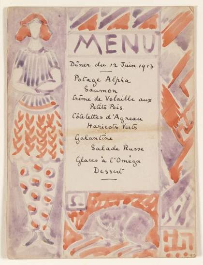
In 1913 Roger Fry set up the Omega Workshops. The workshops sold decorative furniture and textiles designed by contemporary artists and inspired by post-impressionist style. As well as providing opportunities for fellow artists, Omega gave Fry the chance to develop his own talents as a designer. Alongside the other artists he designed furniture and textiles and he also began to design and make his own pottery.
Collaborative projects
As a close-knit group who shared their ideas and spent lots of time together, collaboration was a natural part of the Bloomsbury Group's approach to creativity. Discover the richness and diversity of Bloomsbury collaborative projects...from house decoration to publishing.
Vanessa Bell and Duncan Grant collaborated on the decoration of a number of private houses, providing a design service for their friends. Close friends Mary and St John Hutchinson, and Maynard Keynes were their first customers. They later decorated rooms for Vanessa’s brother Adrian, and for Virginia and Leonard Woolf at 52 Tavistock Square. They also extensively decorated their own home Charleston farmhouse which they moved to in 1916.
Chateau d’Auppegard near Dieppe
In 1927, they created a large-scale decoration for the home of American artists Ethel Sands and Nan Hudson. Vanessa and Duncan found the household a little more proper and refined than they were used to! In a letter to Roger Fry, Vanessa complained:
The strain to keep clean is beginning to tell. Duncan shaves daily – I wash my hands at least 5 times a day – but in spite of all I know I am not up to the mark… It’s almost impossible to find a place into which one can throw a cigarette end without its becoming a glaring eyesore. Letter from Vanessa Bell to Roger Fry n.d. [1927?]
The work was carried out on the garden terrace in a style that was inspired by early Italian murals. It was clearly a success as ten years later Dame Ethel invited them to decorate another of her homes in Chelsea.
Penns-in-the-Rocks, Sussex
Between 1929 and 1931 Bell and grant worked together on a commission for Lady Dorothy Wellesley to decorate her house, Penns-in-the-Rocks, Sussex. The dining room was filled with colour. The curtains were pale mauve silk, appliquéd with yellow and orange and studded with sequins; and the carpet a mass of brilliant contrasts. The room was dominated by a series of murals stretching from floor to ceiling and separated by octagonal mirrors.
Lefevre Galleries, London
In 1932 they designed a music room for the Lefevre Galleries in London. Their designs were big news and were talked about in the press:
The two painters have swooped away from the defeatest, rather ‘triste’ good taste of their younger imitators, from tea-caddies, from quiet tiles and discreet sherds, and joined to their natural grace and measure a riotous sense of colour, a romantic splendour… Architectural Review, A Music Room decorated, furnished and painted by Vanessa Bell and Duncan Grant, Feb 1933
The theme was Autumn and the walls were decorated with six flower panels, each with a mirror included in the design. They also designed decorations for rugs, curtains, needlework panels on the chairs, lamps and cushions. Even the piano was painted by Duncan, repeating the pattern of leaves used elsewhere in the room.
From 1940-1943 Grant and Bell worked together on the Berwick Church murals; and their last major shared decorating task, a mural for the dining room of Devonshire Hill School in Tottenham, was painted in 1944.
The Hogarth Press
Hogarth Press publication, Walter Sickert: a conversation, by Virginia Woolf, with cover design by her sister Vanessa Bell
Title page of Julian Bell, Essays, Poems and Letters edited by Quentin Bell Used by permission of the Random House Group Limited
The Hogarth Press led to collaborations between writers and artists of the Bloomsbury Group. Its aim was to publish novels, poetry and books on politics, economics and psychology that might not appeal to more commercial publishers.
It was set up in 1917 by Leonard and Virginia Woolf using a small hand press on the dining table of their home, Hogarth House in Richmond. The first publication Two Stories, was written by Leonard and Virginia Woolf and illustrated by artist Dora Carrington.
By 1921 the Hogarth Press had moved to a new location in Tavistock Square in Central London and had better mechanical printing equipment. It published books by writers such as Katherine Mansfield, T.S. Eliot and Vita Sackville-West as well as Virginia Woolf’s novels. It also published translations of Russian novels and plays by Chekhov, Dostoevsky, Tolstoy and others. Translations of books by the psychologist Sigmund Freud were among its later publications.
Vanessa Bell worked with her sister and brother-in-law designing book covers and illustrating the books. She created the covers for most of Virginia Woolf’s books, and the first eight covers for a series Living Poets which began in 1928. She also designed the company’s logo, a wolf’s head, which was a pun on the name of the founders – Virginia and Leonard Woolf.
Other artists such as John Banting, William Nicholson and Graham Sutherland, were also invited to design book covers for the Hogarth Press. The covers looked different to the covers of other books at that time and gave the books a recognisable modern house style.
One book that was very much at the centre of the Bloomsbury circle was produced as a tribute to Vanessa’s son, Julian, who was killed in the Spanish civil war. Julian Bell, Essays, Poems and Letters was published in 1938. It was edited by his brother Quentin, and included contributions by members of the Bloomsbury Group including Maynard Keynes and David Garnett.
From 1914 right through to the 1930s, Duncan Grant and Vanessa Bell worked on a number of stage designs and costumes for theatrical productions
Duncan Grant first created stage scenery and costumes for a production of the Shakespeare play Twelfth Night in 1914. The play was directed by French theatre director Jacques Copeau for the Vieux Columbier theatre in Paris. In 1918 Grant again worked with Jacques Copeau on stage designs for the opera Pelléas et Mèlisande, with Vanessa Bell helping with fabrics and costumes. Grant continued to design sets in the 1920s.
In 1932 Duncan Grant was asked to design the set for a production of Swan Lake for the Camargo Society, a London group who created and produced ballet. Knowing that they needed other set designers, he recommended Vanessa Bell. Bell designed the set for the ballet High Yellow which was performed to Jazz music and set on a tropical island. In a letter to Roger Fry, Vanessa Bell described how much she enjoyed this new challenge of creating a tropical scene complete with palms, boats and a cocktail bar. Opening night seemed to be a success. Vanessa described Duncan’s set to Fry as ‘perfectly lovely’ and her own set more modestly as ‘quite successful’.
In fact, both stage designs were considered successful enough for them to be invited to work on several more ballets for the Camargo Society over the next few years.
The Bishop of Chichester came up with the idea of decorating Berwick Church in Sussex. He was keen to continue the tradition of wall paintings in Sussex churches. He also wanted to encourage a closer association between the Church and the arts.
Duncan Grant was recommended as a suitable artist as he was experienced in creating murals. In true Bloomsbury collaborative style, Grant teamed up with Vanessa Bell and her children, Quentin and Angelica, to work on the church which was only a few miles from their home at Charleston.
Planning the murals
Sketches were drawn up for approval. Grant painted Christ in Glory for the west side of the chancel while Vanessa Bell worked on The Annunciation and The Nativity for the two walls of the nave. Quentin’s contribution was the Wise and foolish Virgins, and Angelica planned a decoration for the south aisle. The artists posed for each other in biblical costume and also used local farm workers as models.
Objections to the designs
The Bishop liked the drawings which he was shown in March 1941, but there was a two-year delay before the work was completed. Some of local people did not want the church decorated at all and others objected to ‘modern’ artists doing the murals. They appealed to officials higher up in the Church, asking for the scheme to be scrapped. They were unsuccessful, but did win a small battle insisting that Duncan Grant’s depiction of Christ should be made ‘less fleshy’ and more spiritual.
How the murals were painted
After lots of discussions about the way the murals were to be made, it was decided that the artists would paint on panels in their studios. These panels would then be attached to the church walls. This was done under the direction of an architectural advisor, Frederick Etchells, an old friend of the Bloomsbury Group, who had abandoned painting for architecture.
The church transformed
The panels were dedicated at a service on 10 October 1943, with the sermon preached by the Bishop of Chichester. The murals were greeted with great enthusiasm and letters of praise poured in. Sir Charles Reilly, a promoter and fundraiser for the scheme, suggested that entering the church was now: ‘like stepping out of a foggy England into Italy’.
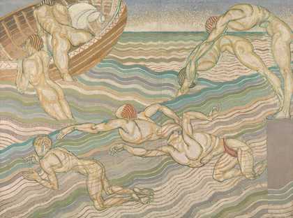
In 1911 Roger Fry was invited to organise the painting of some murals in the dining room at Borough Polytechnic in South London (now South Bank University). He persuaded Duncan Grant and two other young artists, Bernard Adeney and Frederick Etchells, to work alongside him. They created designs illustrating the theme of ‘London on Holiday’. Artists Macdonald Gill and William Rutherston were later also recruited because of the size of the space and limited timescale for the project. (The murals had to be completed during the students’ summer vacation).
The murals had a small budget of £100 so were painted in oil paint on panels of canvas which were attached to the walls. Usually murals are painted directly onto plaster walls using tempera paint, but this is more expensive.
Fry’s planning was informal. He chose artists who he trusted and who were available to work on the project, rather than choosing artists who painted in a similar style. He hoped that the different murals would work together as they had a shared theme and similar colours were used. To create a sense of unity, Fry also asked the artists to paint in a style inspired by mosaics – and use dark outlines around figures and other objects or landscape features in their paintings.
In a letter written nearly fifty years later, Bernard Adeney, one of the artists employed by Fry wrote about his experience painting the murals. A page from the letter, which can be seen in the slideshow at the top of this page, includes a plan of the dining hall showing the location of the murals in the room.
Although Duncan Grant’s two pictures Bathing and Football, reflected his interest in both early Italian art and Byzantine mosaics, the paintings look strikingly modern. This is not just due to the contemporary subject matter (bathers swimming in the Serpentine and footballers in Hyde Park), but also Grant’s interpretation of earlier styles. He was perhaps influenced by contemporary French artists, such as Henry Matisse and Paul Cezanne, whose work Roger Fry had introduced to him. Rather than being an accurately painted depiction of swimming and football, the figures in the paintings provide an impression of these activities. As a review in The Times commented:
Do not ask yourself, as you look at it, whether it is at all like the Serpentine or any bathers in it that you have ever seen. It is not, and is not meant to be. But, if you will not demand any illusion, you will find that it gives you an extraordinarily keen sense of the pleasure of swimming. In fact it acts on you like poetry or music. Mr Grant has used all his remarkable powers of draughtsmanship to represent the act of swimming rather than any individual swimmers. The Times, 9 September 1911
Lots of reviews of the murals appeared in newspapers. Most previous public murals had historic or symbolic subjects, with the aim of providing moral guidance for the viewing public. But the Borough Polytechnic murals, with their light-hearted celebration of contemporary life, did not try to teach any lessons. This provoked some criticism, and one reviewer feared that they would have a corrupting effect on the polytechnic’s working-class students!
However there were lots of positive responses as well. Duncan Grant’s paintings and those of Frederick Etchells who painted people enjoying an afternoon on Hampstead Heath, received the most praise.
The success of the murals helped further Grant’s career and brought him to the attention of the public. It also encouraged his lifelong interest in working on large decorative schemes.
Not all the decorative projects undertaken by the Bloomsbury group went smoothly. The commission Duncan Grant and Vanessa Bell were awarded to decorate shipping company Cunard's flagship cruise liner was a disaster and almost attracted Royal intervention!
The commission
In 1935 the shipping company Cunard White Star Ltd. invited Duncan Grant and Vanessa Bell, along with other artists, to create designs for decorations for the new flagship liner RMS Queen Mary. Grant was commissioned to paint three panels for a lounge and Vanessa Bell a small panel for a private sitting room next to the chapel. The artists were also invited to suggest colour schemes for the rooms and designs for the carpets and soft furnishings.
Benjamin Morris the American architect of the main public rooms, and Mr Leach who worked for the contractors, visited Duncan Grant to see his designs. Both men liked them and a contract was agreed. Work was to be completed by 30 November 1935 and Grant would be paid £1200 for the three panels – a huge sum in those days. Duncan Grant gleefully commented in a letter to Vanessa Bell that he would be ‘colossally rich’.
Duncan and Vanessa spent the summer in Rome. Duncan Grant used the time to work on his designs, creating half-size panels to work out his designs. One of the panels showed a Spanish dance (Seguidilla) the other two were paintings of female figures, The Flower Gatherers and The Sheaf.
First signs of trouble
When he returned to England however, Duncan Grant found out that the English architect overseeing the Queen Mary decoration had cancelled his carpet designs. When Grant wrote to Mr Leach for an explanation he also discovered that Cunard's Director had asked for the size of the panels, and the scale of the large female figures, to be reduced. Deeply upset, Grant replied to Leach pointing out that the designs had been approved more than three months previously. He went on to say:
I consider it rather late in the day to criticize my choice of subject… I have been working since the end of May on my designs, given up all other work, and put myself at considerable expense in consequence. Duncan Grant to Mr Leach, 21 September, 1935, as quoted in Francis Spalding’s biography of Duncan Grant
Negotiating with Cunard: A visit to Liverpool
When they received Duncan Grant’s letter, Leach and the architect visited his studio. The outcome was that Duncan agreed to modify the size of his figures. Vanessa and Duncan were invited to visit Liverpool to see work in progress on the Queen Mary. In a letter to her son Julian, Vanessa described the Liverpool visit and an expensive meal that was thrown in – courtesy of Cunard.
Vanessa, whose panel for the chapel had also been rejected as inappropriate, was invited to create another panel for the private dining room. Although annoyed at the attitude of Cunard, Vanessa seems resigned and philosophical:
In fact it is evident that the Cunard people, with Maynard’s friend Sir Percy at their head, have suddenly got rattled & are terrified that the ship will shock people including it seems the Royal Family. So they have gone behind the back of the American, Mr Morris, who’s in New York, & are doing their best to get rid of all the artists. We are not the only ones – I gathered most of them are being stopped or interfered with. Of course they have no excuse at all & I shall do my best to get paid in full…It’s all very tiresome & rather a blow – but if I get paid I suppose I shall soon get interested in other work & forget about it. I daresay one is really very silly ever to expect to be able to work for such people – one had better paint quietly as one wants to for oneself. Letter from Vanessa Bell to Julian Bell, 24 September 1935
A damaging blow
In February 1936, Duncan’s panels were completed and installed. Incredibly at this late stage, they were rejected again by Cunard’s Chairman Sir Percy Bates. He felt that they were not suitable for the room or for the type of fashionable clientele he hoped to attract: royalty, film stars, and wealthy business men. Although Grant was paid for the panels, he was furious and demanded that they be returned to him and that he receive compensation for damage to his reputation.
Cunard refused Grant’s demands, not realising that he had powerful and loyal friends who immediately leapt to his defence. Letters of protest arrived at Cunard from such important figures as Directors and Trustees of the Tate, the National Gallery and the V&A. The ‘unholy row’, as Vanessa Bell described it to her son Julian, even reached royalty. Kenneth Clark, Director of the National Gallery and a supporter of Grant, was on good terms with the King and promised to get the King involved in the debate!
Publicity and support
Bloomsbury member and friend of Duncan Grant, Clive Bell, wrote an article in The Listener, 8 April 1936, criticizing Cunard. He ridiculed the ‘frivolous and frightened attitude to art of rich people who are not sure of themselves’. Duncan himself also wrote a letter which was also published in The Listener, telling his side of the story.
The widespread press coverage frightened Cunard into returning the panels and paying compensation to the artist. The panels were exhibited at Agnew’s and Sons Gallery in 1937, and were very well received.
They are superb decorations and it seems a great pity not to use them. It is doubtful whether anyone else in Britain could have made paintings so vital in line and breathtaking in colour. By showing them Grant vindicates himself entirely. The Scotsman, 12 Nov. 1937
Despite the support and positive reviews of the paintings when they were exhibited, Duncan Grant’s reputation never fully recovered after the publicity surrounding the Cunard affair.


![Mary Hutchinson with Vanessa Bell's painting, The Tub, [1916] © Tate Archive](https://media.tate.org.uk/aztate-prd-ew-dg-wgtail-st1-ctr-data/images/maryhutchinsonwiththetub_1_y6CTlkm.width-1440_zEVEhL0.jpg)