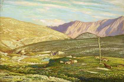
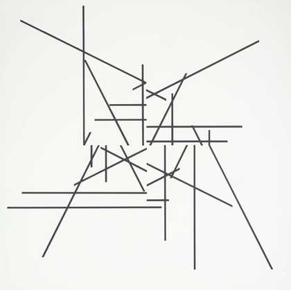
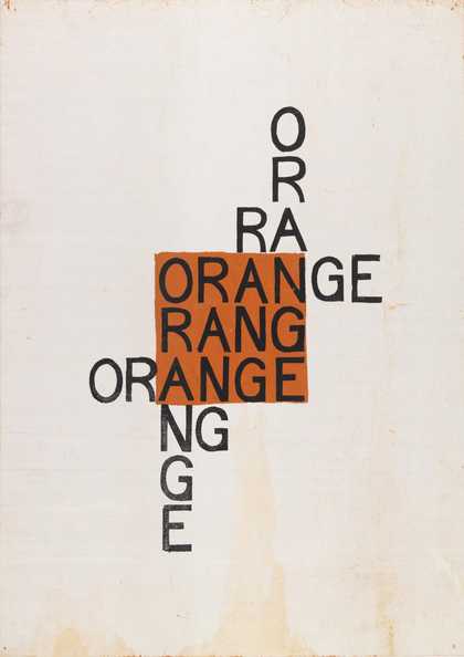
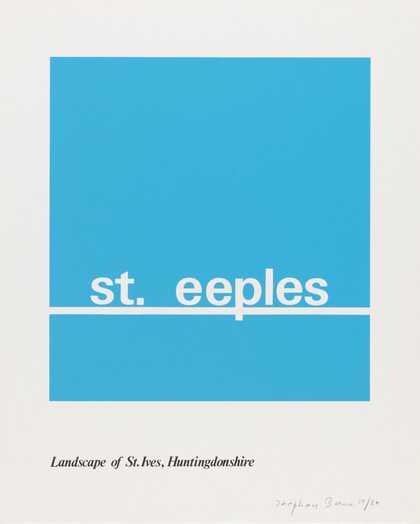
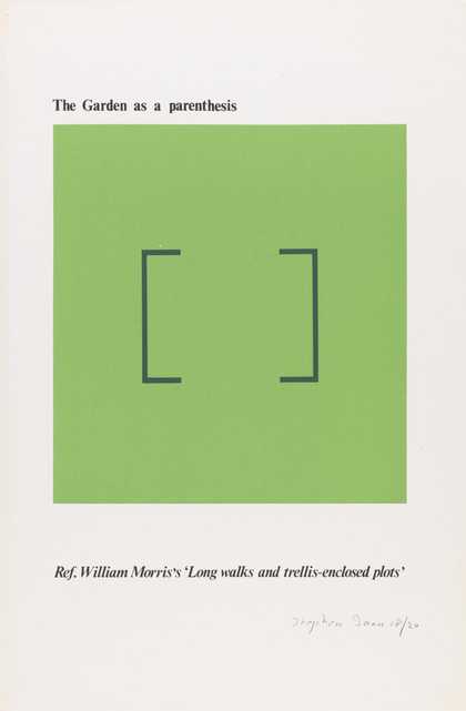
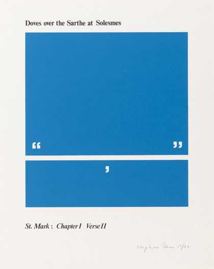
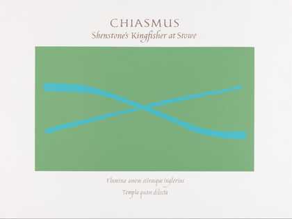
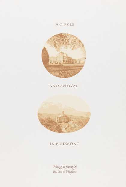
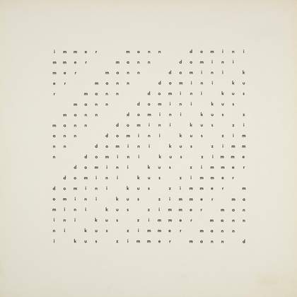
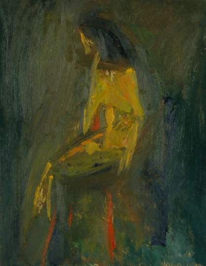
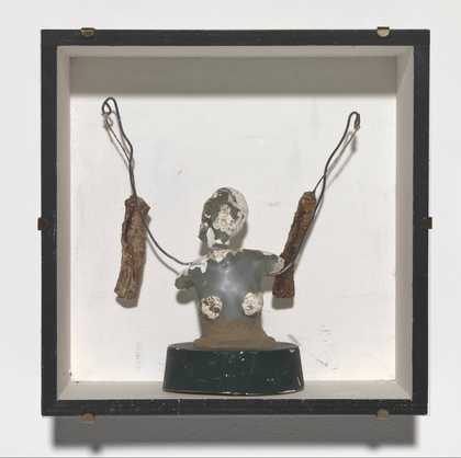
Prints and Drawings Room
View by appointment- Artist
- Stephen Bann born 1942
- Medium
- Screenprint on paper
- Dimensions
- Support: 583 × 455 mm
- Collection
- Tate
- Acquisition
- Presented by the artist 2017
- Reference
- P20832
Summary
Fleece 1967 is a portrait-format silkscreen print on paper. A central cruciform shape is formed of blue letters, the vertical spar of which spells ‘fleece’ and the horizontal spar, falling on the first ‘e’ of ‘fleece’, spells ‘ecce e ecce’; this is repeated four rows above and below this line but without the central ‘e’. In between, a field of letters printed in green provides permutations of the letters ‘c’ and ‘e’ found in both ‘ecce’ and ‘fleece’, the bottommost line being a single green line reading ‘ceec ceec’. The ‘poem’ was first composed in 1964 and titled ecce (lyric version) at around the time that Bann met Ian Hamilton Finlay (1925–2006) and was the subject of correspondence between them until 1967, when its final version was published in an unlimited edition in the Poem/Print series of Finlay’s Wild Hawthorn Press.
Fleece is one of a group of Bann’s ‘poem/prints’ in Tate’s collection that reflect at first his discovery of concrete poetry through his friendship with Finlay after 1964, and then the subsequent development of his own poetic language. In 1964 Bann had been introduced to Finlay’s work by his friend Mike Weaver, and together they visited him in Edinburgh that August; Bann has explained that the visit to Finlay ‘resulted in a frequent exchange of letters. Rapel (1963), his first major collection of concrete poetry, appeared to me to hold the promise of a new kind of poetic art, at once deconstructing language and reassembling its component terms to create a visual expression.’ (Stephen Bann, artist’s statement, 2016, for the website of the exhibition Design and the Concrete Poem, Lighthouse, Glasgow 2016, https://designandconcretepoem.wordpress.com/texts/, accessed 9 August 2017.) Bann engaged with this idea of deconstruction and reassembly that he had perceived in Finlay’s work, and this can be recognised in both Fleece and Orange 1964 (Tate P20831). The historian Deborah Cherry has concluded, ‘Bann is ever attentive to the image, its “generative force” and analytical power, to the ways in which visual media offer not a record of the past, but “historical culture in the making”.’ (Cherry 2006, p.1.)
In Fleece the lettering was rendered by the Scottish typographer Alistair Cant in an archaic cursive script that Finlay described as ‘Matisse-y’ – the contrasting colours also being Cant’s decision (in a letter to Bann, postmarked 23 May 1967, Finlay wrote of the ‘Matisse-y cut-out letters, irregular, but ultimately [in heaven]precise, which we initially imagined’, quoted in Stephen Bann [ed.], Midway, Letters from Ian Hamilton Finlay to Stephen Bann 1964–69, London 2014, p.241). Writing about Fleece, Bann has explained that ‘the content of the print was avowedly religious’ (Stephen Bann, artist’s statement, 2016, for the website of the exhibition Design and the Concrete Poem, Lighthouse, Glasgow 2016, https://designandconcretepoem.wordpress.com/texts/, accessed 9 August 2017). ‘ecce’ is a contraction of ‘ecce homo’, or ‘behold the man’, the words uttered by Pontius Pilate, presenting Christ to the people, bound, beaten and crowned with thorns, prior to his crucifixion. However ‘ecce’ could also imply not just ‘behold the man’ but instead ‘behold the lamb of God’ – the ‘fleece’ of the print’s title and the vertical spar of the central cruciform. Bann expanded on the background of the print:
Finlay had rightly deterred me from entitling it Crucifixion as being too obvious, but in the period when it was being discussed, both he and I were interested in the possibility that work of this kind might find a place in churches. Needless to say, this attitude hardly agreed with the implicit assumptions of most critics of the 1960s. John Willett judged the poem/print as being too like an altar-cloth in his review for the TLS (29 Feb. 1968). Finlay commented in a letter to me: ‘His assumption that an altar-cloth is ipso facto a bad thing, is innocently revealing.’
(Ibid.)
In the same year Fleece was also included in the anthology of concrete poetry edited by Bann for London Magazine Editions, concrete poetry: an international anthology (London 1967, p.167). This version differs from the print in being in black and white, using a sans-serif font with the six instances of ‘ecce’ printed in bold – thus also removing the cruciform shape. This particular treatment of the poem allies it more closely, than might be apparent from the print, to Finlay’s suprematist poems that had been included within his first published collection of concrete poetry Rapel, one example being Homage to Malevich (ibid., p.141) that had been produced in Perspex in 1966 (Tate T11735). In the introduction to his anthology, Bann used Fleece as a way of illustrating what he saw as the problem of iconography with regards to concrete poetry, stating:
The semantic element is, by definition, known, and the formal structure must in some way be animated by the meaning which it discloses. In Fleece, for example, the most hallowed of all pictorial images is identified by the meaning which pierces through the permutation of two letters. What value then accrues to the hanging ‘fleece’, or to the inclined head of the ‘f’?
(Ibid., p.26.)
In 1970 Bann additionally realised Fleece as a unique embroidery crafted by Hugh Pilkington.
Further reading
Stephen Bann (ed.), concrete poetry, an international anthology, London 1967.
Bob Chaplin & Stephen Bann, A Mythic Topography, exhibition catalogue, Royal Museum, Canterbury 1982.
Deborah Cherry (ed.), About Stephen Bann, Oxford 2006.
Andrew Wilson
August 2017
Does this text contain inaccurate information or language that you feel we should improve or change? We would like to hear from you.