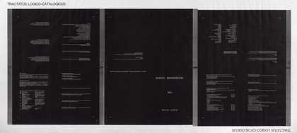
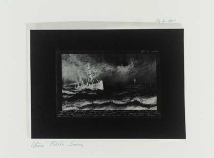
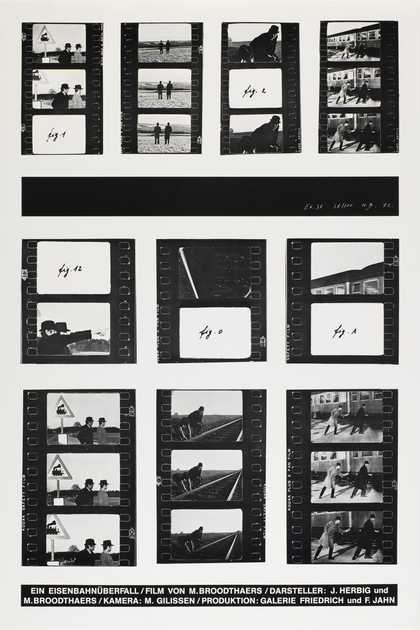
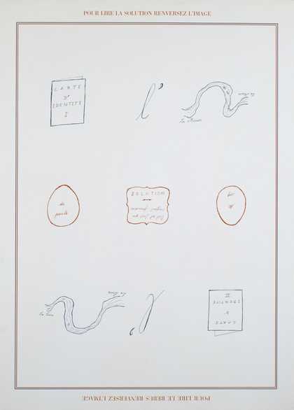
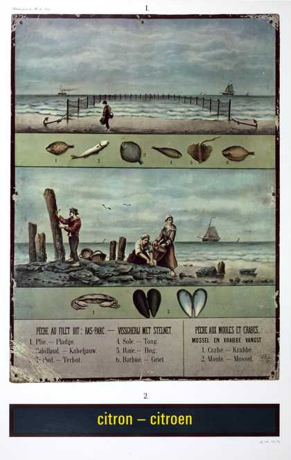
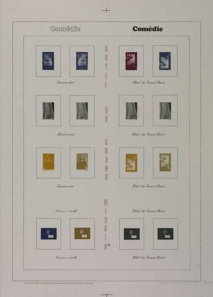
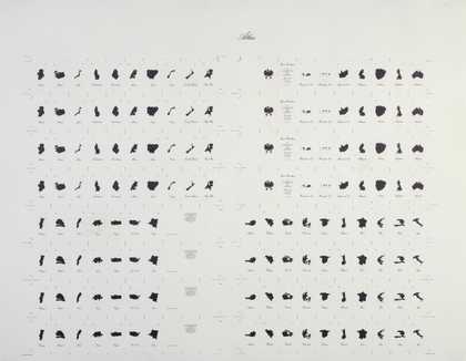
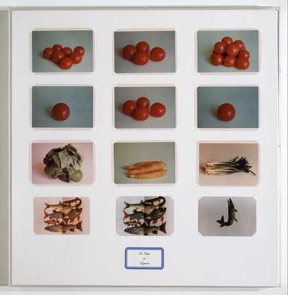
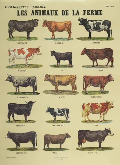
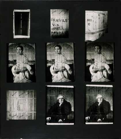
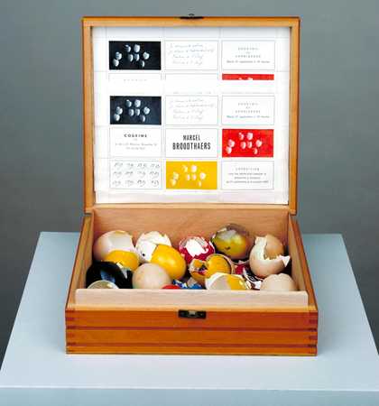
- Artist
- Marcel Broodthaers 1924–1976
- Original title
- Peintures
- Medium
- Oil paint on 9 canvases
- Dimensions
- Support, each: 800 × 1000 × 18 mm
frame: 800 × 1000 mm
displayed: 2640 × 3240 mm - Collection
- Tate
- Acquisition
- Purchased 1983
- Reference
- T03696
Catalogue entry
Marcel Broodthaers 1924–1976
Paintings
Peintures
1973
Letterpress on nine unstretched primed canvases
each: 800 x 1003 mm
Purchased from Galerie Michael Werner, Cologne (Grant-in-Aid) 1983
T03696
Ownership history:
Wide White Space Gallery, Antwerp; Galerie Michael Werner, Cologne, from whom purchased in 1983.
Exhibition history:
References:
The title of this work, Paintings, describes not only its medium, but also its subject matter. It comprises nine canvases that have been primed with white paint. Each of the canvases bears French words associated with painting, printed in elegant typographic script in various colours of either oil-based inks or thinned oil paint. There are sixteen different words in total, dispersed over the nine canvases. Together, the words fall roughly into three categories: those concerned with the practical aspects of producing a painting, those that describe the subject of a work and those that refer to art historical concepts. The first group of words includes ‘brosse’ (brush), ‘chassis’ (stretcher), ‘clous’ (nails) and ‘chevalet’ (easel). The second group includes the word ‘figures’ (figures), which appears eleven times in total, along with elements of the human figure: ‘yeux’ (eyes), ‘peau’ (skin), ‘oreilles’ (ears) and ‘cheveux’ (hair). The third set, dealing with artistic method and tradition, includes ‘style’ (style), ‘perspective’ (perspective) and ‘couleur’ (colour), as well as the ultimate commercial end of the process, ‘prix’ (price), which appears nine times. The work, which can be literally ‘read’, functions as a structural analysis of painting, translating its constituent parts into language, which is, in turn, presented in paint.
The choice and arrangement of words indicates Broodthaers’s concern with the institution of art history, and with the traditions and tools of painting. The central panel contains just two words, which may suggest the two parallel concerns of the traditional painter: ‘les figures’ (the figures) and ‘le style’ (the style), or content alongside technique. The inclusion, between these two words, of the numerals 1 to 9 may be an allusion to the traditional notion of an ideal composition informed by mathematical geometry, a reference echoed by the inclusion of the word ‘perspective’ on canvases three, six and seven. This may be read with some level of irony, since the canvases do not present any scene or sense of receding space often associated with naturalistic painting.
The inclusion of so many terms that relate to portraiture alludes to the means by which artists had traditionally interacted with bourgeois society. The generic nature of the features may point to a certain level of satire on Broodthaers’s part, conjuring the image of the painter churning out one portrait after another, using a standard toolkit of ‘mix and match’ elements. The large scale of the work and the frequency with which the word ‘figure’ appears (eleven times) conjure up the high traditions of painting historical subjects, exemplified, for example, by Broodthaers’s fellow Belgian Peter Paul Rubens (1577–1640). Broodthaers harnesses the elegance of such traditions through his use of script-style typography. However, he also uses it to undermine traditional artistic conventions. The composition does not convey any form of narrative and the subject of the painting is the painting itself, which ironically is largely printed rather than painted. It is left to the viewer to construct a relationship between its elements, one that will be subject to infinite change According to Broodthaers, this relationship is deliberately arbitrary, ‘in order to introduce and establish falsehoods in (artistic) reality’.1 Playing on the tension between artifice and the so-called ‘reality’ of artistic representation, Paintings questions the assumptions made by artists and art historians about pictorial meaning. The art historian Michael Compton has noted that it is the absence of any linear relationship between these verbal, written and pictorial elements that prevents the assertion of previously assumed facts.2 By highlighting these fundamental structural faults inherent in painting, Broodthaers undermine the ways in which the viewer interacts with an artwork and with the notion of art itself.
Such concerns reveal the influence upon Broodthaers of the surrealist artist René Magritte (1898–1967), whom Broodthaers had met and become friendly with around 1945. Broodthaers was fascinated by the way in which Magritte used words to undermine the assumptions associated with images. Writing in 1963 he had noted that ‘Magritte denies the aesthetic nature of painting (which does not prevent him, almost in spite of himself, from creating some beautiful paintings) … he continues to elaborate a poetic language aimed at undermining that upon which we depend’.3 Broodthaers made frequent reference in his work to Magritte’s now famous painting The Treachery of Images 1929 (Los Angeles County Museum of Art). The painting presents the image of a pipe above a caption that asserts: ‘Ceci n’est pas une pipe’ (This is not a pipe). This unstable relationship between words and images also underpins Broodthaers’s Paintings, a work in which images are eliminated and the formal components of a picture are reduced to words, highlighting the level of artifice involved in any form of artistic representation.
In an unpublished interview with George Adé in 1969, Broodthaers stated that one of the most significant ways in which Magritte influenced him was through the gift of a copy of the French poet Stéphane Mallarmé’s (1842–1898) experimental poem ‘A Throw of the Dice will never Abolish Chance’ (1897).4 Mallarmé’s work was innovative in its distinctive spatial arrangement, in which the words were printed in varying sizes and positions across the double page to emphasise the surrounding white space. Broodthaers explained the hold that the work would have over him:
The poem obsessed me for 20–25 years, and now that Magritte is dead, to liberate me at least partially I believed it necessary … to redo the roll of the dice on the notion of the image … my aim is to change the signs for the reading of a poem … to show the extent to which the word is carried by the form.5
As well as informing Broodthaers’s own production of books, this ‘obsession’ with Mallarmé’s poem is reflected in many of his text-based artworks. The distribution of words on blank canvases in Paintings recalls Mallarmé’s experimental syntax and typographical layout, and his exploration of the poetry of empty space. In this work Broodthaers investigates the tension between the words themselves, their meaning and the way that they appear on the canvas, just as Mallarmé had done in ‘A Throw of the Dice’. Broodthaers expressed the belief, particularly in relation to Paintings, that the meaning and feeling attached to a word is in part determined by its visual presentation on a page or other surface. The size of the lettering and the typeface employed thus act as fundamental carriers of meaning.6 The presentation of printed words in the style of calligraphic handwriting plays on the tension between the manufactured and the hand-made. The hand of the author is implied by the script-style font, yet denied by the mechanised nature of its printing. The element of authorial uniqueness inherent in the tradition of oil painting is thus partially undermined. Whether Broodthaers is in favour of this shift, or whether this work may be viewed on some level as a nostalgic plea for a return to traditional painting, is unclear. Most probably, it performs both roles.
The grand traditions of historical narrative painting are not Broodthaers’s sole point of reference. The presentation in Paintings of multiple rectangular canvases in a grid-like arrangement is also reminiscent of the minimalist concern with seriality and simple geometric forms. The inclusion of words that list the physical components of the work, such as ‘chassis’ (stretcher), ‘clous’ (nails) and ‘apprêt’ (ground), further point to the minimalist preoccupation with the physical components of a work, though Broodthaers counteracts the minimalists’ predilection for modern, industrial materials by using traditional ones. He wittily parodies the minimalist belief that art should have its own reality and not be an imitation of some other thing, by stamping the simple geometric arrangement with words that refer to subject matter and representation.
Paintings is one of a series of five works of the same title and date, all of which consist of nine canvases. The general title for the series is also Paintings. Between 1972 and 1975, Broodthaers made seven other series of nine-canvas works, with each series comprising five, or in one case six, works. The first of these series, from 1972, was titled Series in the French Language, also known as Series of Nine Paintings on a Literary Subject, and was first exhibited at the Galerie Yvon Lambert in Paris.7 Like the series Paintings, these works bore typographic text, printed onto primed canvas. The words and phrases included the names of well-known authors, coupled with seemingly arbitrary verbs (‘André Gide smokes’; ‘Paul Valéry drinks’). Broodthaers’s accompanying catalogue essay confirms that he had already begun to challenge the nature of the relationship between words and images and to question the role of the subject in a work. ‘The subject,’ he claimed, ‘is denied by its use as the operational means for the conquest of space’.8 Subsequent series were titled English Series 1973, Peter Paul Rubens 1973, Figure Series 1973, German Series 1973, Fish 1975 and Puzzle 1975, also known as Energy. Broodthaers had intended to make a ninth and final series to complement these, but did not live to complete the suite.
The canvases that make up Paintings were, like all eight sets, printed at the Imprimerie Laconti in Brussels (which closed due to bankruptcy in around 1978, at which time the printing plates for Peintures were lost). Broodthaers supervised printing sessions closely, preferring to be present throughout, and leaving detailed instructions in the case of his absence at the time of printing. Though he would specify the font in advance so that metal blocks could be prepared, he would make other decisions – such as the colour used and whether the print should be light or heavy – at the printing works, usually during the actual printing sessions. Tate’s work is accompanied by a two-page, handwritten certificate, which is dated ‘Cologne, September 1973’ and is in the Tate archive.9 The certificate confirms that the work was executed in August 1973. It gives instructions as to the order in which the canvases should be hung, according to a plan drawn on the first page of the document, which numbers the canvases from one to nine horizontally, starting with the one in the upper left corner. The certificate goes on to list the colour and weight of every word on each of the canvases. Broodthaers originally intended the nine canvases to be pinned directly to the wall, but as is the case with many such works in public museums, the canvases at Tate have been glazed and backed onto boards. This method of preservation and display has been approved by the artist’s widow, Maria Gilissen. She has also confirmed that the canvases should be hung between ten and twelve centimetres apart, making the overall dimensions of the work slightly variable.
Lucy Bradnock
September 2004
Supported by The AHRC Research Centre for the Study of Surrealism and its Legacies.
Notes:
Explore
- abstraction(8,615)
-
- non-representational(6,161)
-
- text(1,043)
- lifestyle and culture(10,247)
-
- high art(60)
- inscriptions(6,664)