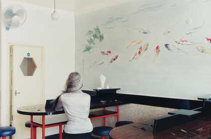
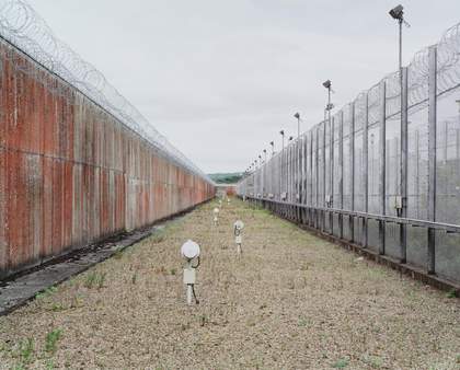
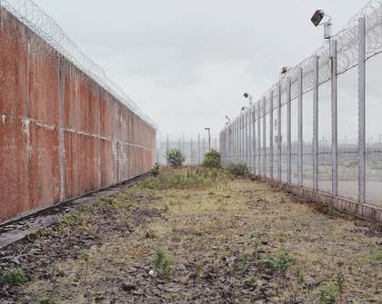
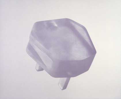
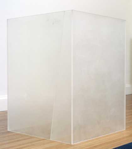
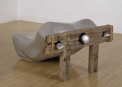
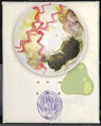
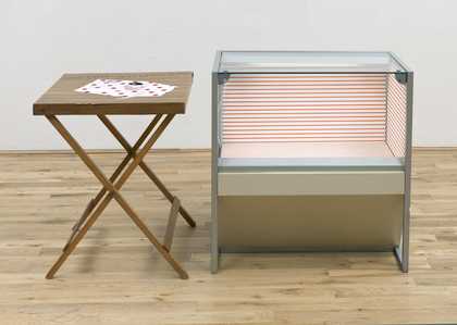
- Artist
- Alan Gouk born 1939
- Medium
- Oil paint on canvas
- Dimensions
- Support: 1708 × 4381 mm
- Collection
- Tate
- Acquisition
- Purchased 1987
- Reference
- T04925
Catalogue entry
T04925 Cretan Premonition 1985–6
Oil on canvas 1708 × 4381 (67 1/4 × 177 1/2)
Inscribed on back of canvas at top centre 'CRETAN PREMONITION | AUGUST ‘85–SEPT '86 | ALAN GOUK
| Alan Gouk’ and at bottom centre ‘CRETAN PREMONITION’
Purchased from the artist through Isabel Langtry (Grant-in-Aid) 1987
Exh: Selected Paintings 1982–86 by Alan Gouk, Smith's Galleries, Jan. 1987 (no catalogue)
Lit: Michael Phillipson, ‘Alan Gouk and the Place of Painting’, Artscribe International, no.63, May 1987, p.37, repr. p.36 (col.); [Sandra Higgins and Alan Gouk], preface in Alan Gouk: Selected Paintings 1981–89, exh. cat., Sandra Higgins Fine Art 1990, p.3, repr. p.5
‘Cretan Premonition’ consists of vigorously painted, horizontal bands of colour, most of which abut in the centre. The painting depends for its effect on the nuances of colour in the different layers of paint visible in each band, and on the textural qualities created by the brushmarks and areas of impasto, in a manner that is hard to define or summarise. Nonetheless, the left side of the painting may be said to be dominated by the following bands of colour listed in descending order (the names of the paints are taken from the artist's undated response to a questionnaire from the Conservation Department): blue (ultramarine, cobalt, monestial blue and ivory black); red (cadmium scarlet, cadmium red and Venetian red); dark green on pale green (emerald green and cadmium green); dark blue on pale blue (monestial blue and ivory black); dark pink (rose and cadmium scarlet); white; pink again; purple and blue (ultramarine, cobalt and cerulean blues); green (monestial green and cadmium green); blue; and pink. The right side has in descending order bands of violet (cobalt violet); dark blue with orange (cadmium orange); green (monestial green and cadmium green) and yellow (lemon yellow and cadmium yellow); blue with orange; an area of greys (ivory black over rose and magenta); dark blue (monestial blue and ultramarine) on pink.
T04932 was painted in the artist's studio in Hammersmith, London. In a letter to the compiler dated 29 June 1987 the artist wrote that the work was painted ‘entirely on the stretcher, on the floor, from all sides, and standing up vertically, turned round on both its horizontal edges’, although most of the painting in its last stages was done with the canvas on the floor. In this process the work acquired a small number of splashes and drips. There were no preliminary studies. The artist used Rowney's artist's quality oil colours, thinned with white spirit. This created a generally mat surface, which was enlivened in places with streaks of undiluted, and therefore glossy, oil paint. In his reply to the questionnaire sent by the Conservation Department, Gouk said that he had painted T04923 in at least four one-day sessions in autumn 1985, and again in at least a further four separate one-day sessions in July–August 1986 (the inscription on the back of the canvas, however, indicates September 1986). ‘In the interval the earlier painting, which was already quite thick, had completely? dried. The 1986 repainting covers all the earlier painting.’ The lower layers of paint, however, may be seen at the sides of the canvas, which remain visible within the box frame created by the Conservation Department following the painting's acquisition.
In his own catalogue note, written in May 1987 for the Tate Gallery, Gouk stated that he began ‘Cretan Premonition’ shortly after finishing ‘The Road to Mandalay’ (Midland-Montague International Bank, London). This work, which was painted between March and August 1985, also has a long horizontal format (it measures 64 × 142 in), and has strongly coloured horizontal bands abutting in the centre and overlaid with two separate vertical bands (repr. Smith's Galleries fold-out private view card, 1987, in col.). According to the artist, ‘Cretan Premonition’ took longer to paint than ‘The Road to Mandalay’, but is ‘fresher and less heavy laden’. ‘It builds on the discovery (for me) of the earlier painting, that you can have a complete and emphatic surface without it closing up into a spaceless wall.’ He continued:
The first few sessions on the painting took me to the end of September when I was interrupted by having to go back to the saga of St Martin's [Gouk taught at St Martin's School of Art, London, 1967–90], and wasn't able to summon up the right frame of mind to continue it until the following summer. In the interval I did little more than potter around on some smaller pictures.
When I did tackle it again in July 1986 I was surprised to find that I hadn't lost contact with it, and it was just a matter of strengthening and varying the colour juxtapositions, adding some strokes on the left, simplifying and calming it on the right. The basic structure and feel to the drawing of the painting were already there, and sufficed.
In the artist's view, the fact that the work was painted in oils is crucial to its effect:
This is quintessentially an oil painting. There are things happening in it which simply cannot be done with acrylic paint - the way for instance the orange strokes at top right take up the blue beneath and discolour, yet where the paint has bled out on either side of the brush's path it remains body-full orange with a distinct cutting edge to the paint; then the cadmium [lemon] sandwiched between, all wet-in-wet painting but the colours remaining distinct with their own distinct material quality. The way the cobalt violet above the orange and blue lies in the surface, but has its own grainy semi-translucency, its own kind of wet yet dry look, is also peculiar to oil paint. The paint has more plasticity, more body, and this gives the colour more chance spatially.
In the same note Gouk said that ‘Cretan Premonition’ was ‘a culmination of an impulse which began in 1976, with some very large thinly painted oil paintings on primed canvas’. ‘Then the paint was used very thinly and floated on in large fluid strokes, overlapping and mixing wet-in-wet on the canvas. I introduced a diagonal tilt to the sweeping drawing, which went right through from edge to edge.’ He continued:
The habit of dividing the painting into two zones of horizontal stroking which butt up or overlap in the middle of the picture comes from the smaller thicker oil paintings of 1981 and 1982, but expanded in scale, and stretched out literally, as wide as the dimensions of my current studio will allow. It has much to do with the length of stroke I can make with one brush-load on a painting of this size while stretching out across it on the floor. So there is still a muscular element involved which is very much mine, and affects the overall look and feel of my paintings, though I am still trying to shed it.
In a letter to the compiler dated 17 November 1990 Gouk discussed his use of large horizontal brush strokes in relation to the paintings of Patrick Heron and Kenneth Noland:
Much the most obvious influence on ‘Cretan Premonition’ is Patrick Heron's ‘Big Red Horizontal (Lund Humphries) Painting’ of 1957 [‘Horizontal Stripe Painting: November 1957 – January 1958’, T01541], which I studied closely in the basement at the Tate before embarking on my articles on Heron for ‘The Fifties’ issues, nos.34–5, of Artscribe Magazine [1983].
Studying this painting (I'd only seen it fleetingly before) prompted me to re-engage the broad horizontal brushstroke, and to attempt a comprehensive synthesis of my earlier influences, Hofmann's free-er style, Kenneth Noland's horizontal stripe paintings, shown at Waddington's in 1970, my friend Fred Pollock's loosely brushed horizontal band pictures of 1973–4 (which also owed a debt to the 1957 Herons), and my thickly brushed oils of 1981–2.
I had visited Kenneth Noland's studio in New York in 1972, and watched him working on a later variant of the horizontal stripe pictures (such as the Tate's ‘Another Line’), and subsequently wrote about them in ‘Principle, Appearance, Style’, Studio International, June 1974, which also discussed Fred Pollock's pictures in this context. At the time of writing, neither Fred nor I seemed to be aware of the precedence in Heron's vertical and horizontal brush strokes of 1957, for the kind of Matissean touch and subtle freely brushed adjusting which marked Fred's pictures of this time. So great was the prominence of the post-painterly abstractionists that we had forgotten the antecedence of Patrick's pictures and underestimated their influence.
So that painting ‘Cretan Premonition’ was an opportunity to redress the balance, and return the quintessentially European virtues to their original home.
This theme of the need to escape the influence of recent American art and to develop painterly virtues associated with the work of such European masters as Cézanne, Matisse, Braque, Picasso, Miró and Bonnard had been central to Gouk's work since the mid-1970s. In the 1987 press release which accompanied the Smith Galleries' exhibition where ‘Cretan Premonition’ was first shown, Gouk wrote:
so many American picture ‘formats’ exist to delimit and constrict the spatial potential of colour, confining it and preventing it from spatial action, whether long range or close-to; to chain down the colour in accordance with an academic concern with ‘the preservation of the continuity of the canvas surface’.
This is the great task for painting now, to re-discover this spatial resonance, as for instance Matisse achieves in ‘The Dance’, of a pressing, intimate spatial resonance in the colour-to get away from the feeling of painting as an impenetrable wall, and away from the mechanical processes of painting which guarantee an unfelt acceptance of the surface as a literal wall of paint (however thin) ...
This is what I have been working to get away from since 1980, when I first sensed, or recognised, that I had painted myself into a corner, or up against a wall, in pursuit of the American way of doing things ... The European painter should have something to paint, to bring out the best that is in him, even if that something has a purely imaginative existence. To cultivate the life of the imagination in artistic reverie, re-aligning the world in the free libidinous play of one's imaginative life; to lavish on this imagery all the loving care and attention as if it were physically present - that is how the most surprising and unexpected associations will arise.
The artist returned to the importance to him of the relationship between his painting and the physical world in a letter to the Tate Gallery dated 30 August 1993:
I have always, since my first mature works, which I'd date at 1969 ... tried to paint something, something sensuous, voluptuous, something positively related to the sensuous outer world, though it was approached by way of dredging something up out of the depths in the flux of painting as it were - a marriage of the inner life and the sensory world happening in the course of painting.
He rejected any description of his work as ‘expressionist’, defining the term to mean a translation or discharge of remembered emotion onto the canvas: ‘I see my painting’, he wrote, as ‘aspiring toward the objective, realist French tradition, positively oriented to the sensory world’. Having seen ‘Cretan Premonition’ on view in a display entitled ‘Painterly Abstraction in Britain’ at the Tate Gallery, he felt the work had successfully combined American and French influences:
All my efforts have been directed to paint a picture which will stand up internationally in direct comparison with the American pictures and the French pictures (Manet, Monet, Matisse, Picasso, Braque, Bonnard, Miró) - to form a bridge between them if you like - and it did strike me going round [the gallery] this time that that is just what ‘Cretan Premonition’ does.
In his catalogue note, written in May 1987, Gouk had written that it was his ambition, ‘already so resonantly achieved by Patrick Heron (and most recently with his ‘garden paintings’ of 1982–4) to paint an original painting which returns European painting to itself, and owes nothing at all to American influence’. He added, ‘I cannot yet claim that of this one [“Cretan Premonition”]’.
T04923 is one of four oil paintings with reference to Crete in their titles. The others are: ‘Cretan Desire’, 1986, (artist's collection, 32 × 162 in, repr. Phillipson 1987, p.37 in col.); ‘Cretan Amphora’, 1986 (artist's collection, 30 × 108 in); and 'Crete (Deep Waters), 1986–7 (artist's collection, 34 1/2 × 98 1/2 in).
In the May 1987 catalogue note Gouk discussed his interest in Crete:
‘Cretan’ represents for me an important moment of transition between two worlds. I went to Crete during the summer of 1967 after giving up my career as a British Council Exhibitions Officer, and before becoming a fully fledged painter, and starting to teach at St Martin's. It was a moment of complete freedom if you like, before a new burden was to be taken up. But it also means Minoan art, an undulation, a sensuous, vibrant, voluptuous undulation at the heart of both Minoan sculpture and painting - that marvellous drawing of the Octopus.
Illustrating this reference, Gouk later sent a photocopy of a decorated terracotta vase, found in the Palace of Knossos, Crete, and reproduced in a book he had found in the St Martin's library (Christian Zervos, L'Art de la Crète, néolithique et minoenne, Paris 1956, p.383). On this vase the arms of the octopus are represented by more or less horizontal, slightly undulating lines.
In the same catalogue note, Gouk continued:
And funnily, at the moment of re-discovering ‘Crete’, through this painting, helped by a Cretan poetess friend, I also discovered Ireland, and in discovering Ireland, I discovered myself.
And ‘Premonition’, because all this is merely hinted at as yet in this painting. The threads of it remain to be drawn out in the future. I've already made a start on some new work.
Later, in a letter of 14 July 1990, Belfast-born Gouk amplified on the relationship between his fascination with Crete and his Irish roots: ‘my identification I think is partly unconscious. The Irish being an island people, are all too aware of the fructifying and destructive powers of the sea (as of the unconscious itself). Their imaginative bestiary is full of sea-creatures.’ In the same letter Gouk explained the earlier reference to a ‘Cretan poetess friend’. This was Chrysa Damianaki, whom he had met through her research on the sculptor Brancusi. He wrote, ‘it was partly to commemorate our friendship that I gave the paintings Cretan titles ... but I must emphasise that it is not the subject matter of [her] poems nor their imagery that led me to title the paintings, just a feeling for Minoan art and culture. Their art is full of happy delight in the sensuous beauty of the world, and a vivid depiction of creatures and plants’.
In 1987 Michael Phillipson drew attention to the interplay between the physical qualities of Gouk's works and their suggestion of particular places. ‘The aura of “landscape”’, he wrote, ‘permeates all the horizontal paintings.’
Or, less directly, the possibility of landscape is pointed to through an intangible sense of place, an unpicturable ‘place’ perennially elsewhere but ensnared within memory and longing ... The titles often suggest this by naming actual places (Crete, Morocco, Samarkand, Sorrento) whose associations (with culture, climate, mood, light) are invariably ‘away-from-here’.
Regarding the Cretan works, he continued:
if we take Crete as a metaphor for Gouk's ‘place’, then we are drawn into painting as labyrinth, as thread, as cultural cradle, as Aegean heat-light. We are invited to recover what ‘Crete’ could represent for us through his paintings. In the very large ‘Cretan Premonition’, 1985–6, the horizontal reading is sharply fractured by a jagged off-centre ‘fault’ meandering away at the bottom; its interstice is filled with fragments of underpainting. Here the tongues of blue, red, orange and white, confront each other across the rift, as if defying themselves and us to override the ‘fault’ and make a ‘whole’ painting. Perhaps this rift, occurring in ‘Cretan Desire’, 1985–6, too, is the armature of the paintings' vibrating tension.
In the 1990 catalogue preface written by Sandra Higgins in collaboration with the artist, the horizontal bands of colour in T04923 and the other ‘Cretan’ works were described as having ‘eased out in a rhythm of smoother extended woven sheaves and elongated wave upon wave of smoothly stroked undulating lines’. The text continued:
They seem to weigh one half of the painting against the other as on a pair of scales, with a disruptive ‘seismic shift’ where two cliffs of wave-like motion butt up against one another in a sensation like the slow breaking of a wave at its crest. This phase found its fullest expression in ‘Cretan Premonition’, 1985–6, now in the Tate Gallery. It is as if the gnarled crustiness of ‘Quercus’ [1981, artist's collection] were enlarged and stretched sideways, allowing the ragged ends to rear up larger in view. It is more optically insistent from a distance, though less rich and inviting at close quarters.
In a letter to the compiler dated 21 July 1994 the artist commented on the above:
This last is a fair account of the overall architectural and spatial effect of the painting. But of course I could never have reached it if I had set out to paint such a thing. The result would have been too tight, too deliberated, and no doubt too graphic ... In fact it was some time, several years, before I was able to say what the spatial qualities of the picture were.
Painting is like swimming out of one's depth. It is only when you begin to get out of your depth that the picture really begins - or like a surfer riding out a wave, you keep on going, when everything is wet-in-wet and flowing away from one's grasp. That is when the readiest pleasures occur.
The artist has approved this entry.
Published in:
Tate Gallery: Illustrated Catalogue of Acquisitions 1986-88, London 1996