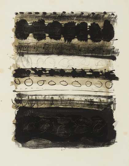
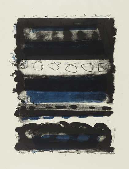
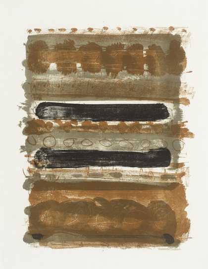
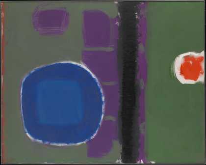
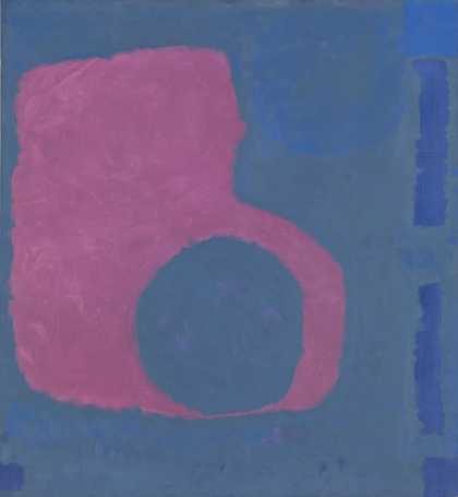
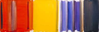
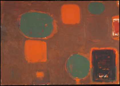
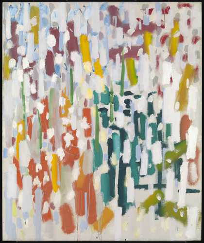
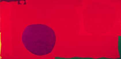
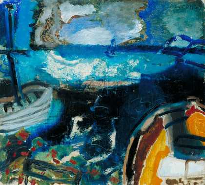
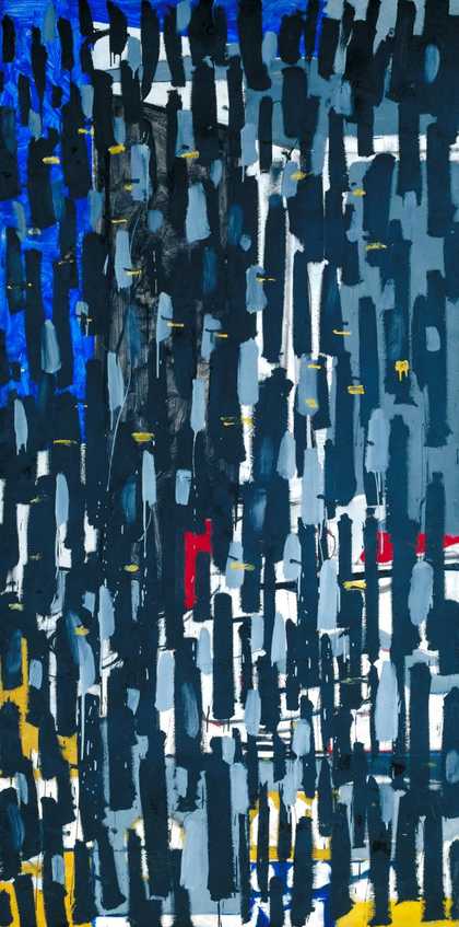
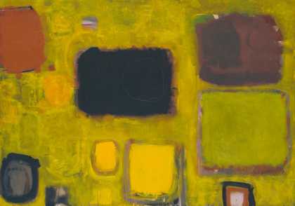
Not on display
- Artist
- Patrick Heron 1920–1999
- Medium
- Oil paint on canvas
- Dimensions
- Support: 2743 × 1548 mm
- Collection
- Tate
- Acquisition
- Purchased 1972
- Reference
- T01541
Display caption
Heron was a critic and painter who championed an approach to painting that assessed quality according to such formal values as the flatness of a composition and colour. Of his stripe paintings he wrote, ‘The reason why the stripes sufficed ... was precisely that they were so very uncomplicated as shapes ... the emptier the general format was, the more exclusive the concentration upon the experiences of colour itself.’ Heron resisted the total abandoning of subject matter and even such works as this have been seen in relation to landscape, the horizontal bands and colours perhaps suggesting the horizon at sunset.
Gallery label, February 2010
Does this text contain inaccurate information or language that you feel we should improve or change? We would like to hear from you.
Catalogue entry
Patrick Heron 1920-1999
Horizontal Stripe Painting: November 1957 – January 1958 1957–8
Inscribed ‘PATRICK HERON JAN–FEB 1958’ on back of canvas t.r. also ‘TOP’ with arrow. Inscription repeated on upright of stretcher. Also signed ‘Patrick Heron’ (circled) on lower half of stretcher upright.
Canvas, 108 x 60¿ (274.5 x 154.5).
Purchased from the artist through the Waddington Galleries (Grant-in-Aid) 1972.
Coll: Commissioned E. C. Gregory for Percy Lund, Humphries and Co Ltd 1957; at 12 Bedford Square, WC1 1958; returned to the artist early 1970; on loan to the Tate Gallery 1970–72.
Exh: Whitechapel Art Gallery, June-July 1972 (11, repr. in colour); Henry Moore to Gilbert and George, Palais des Beaux-Arts, Brussels, September–November 1973 (85, repr.).
Lit: Patrick Heron quoted in ‘Two Reception Rooms’, Architecture and Building, October 1958, pp.396–7 (repr.); ‘Offices at Bedford Square WC1’, Architectural Review, November 1958, p.324 (repr.); Ronald Alley, ‘Patrick Heron: the development of a painter’, Studio International, July/August 1967, p.20; Alan Bowness, ‘On Patrick Heron’s Striped Paintings’ in catalogue of retrospective exhibition, Museum of Modern Art, Oxford, May–June 1968, p.64; Patrick Heron, ‘Colour in my Painting’, Studio International, December 1969, p.204; Patrick Heron, Letter to the Editor dated 17 May, 1970, Art International, September 1970, pp.79–80; Alan Bowness, ‘Introduction’, Patrick Heron, ‘Notes on My Painting 1953–72’, in catalogue of retrospective exhibition, Whitechapel Art Gallery, June–July 1972; Patrick Heron, ‘The Shape of Colour’ (Text of the 5th Power Lecture), Studio International, February 1974, pp.65–67, repr. p.68.
Repr: Edward Meneely and Christopher de Marigny, Patrick Heron Retrospective (87 colour transparencies and text), 1970.
The following information has been approved by the artist:
The painting was made for the reception area at the London offices of Percy Lund, Humphries and Co Ltd, part of which was being redesigned by the architect Trevor Dannatt to include an enquiry counter, secretarial space, a switchboard and a small waiting area with additional office space in an adjoining room. One of the main features of Dannatt’s scheme was a lowered ceiling of painted wood slats hung edge downward at two levels and at different spacings between two deeper members running away from the canvas at right angles. The slats thus echoed and continued the stripes in the configuration of ‘Horizontal Stripe Painting: November 1957– January 1958’, which was commissioned for the end wall of the reception area just inside the entrance. The painting was conceived as an integral part of the architecture in terms of size and was made to fit the space allotted to it very closely. It was however commissioned—the artist told the compiler—on the basis of a small transparency of an earlier vertically striped painting—which happened to be T00962, ‘Scarlet, Lemon and Ultramarine: March 1957’.
The painting was delivered to Bedford Square by the beginning of February 1958 but the room was then not quite ready and the canvas hung in E. C. Gregory’s office for many weeks before installation. The painting remained in situ at Bedford Square until early 1970 when it was taken off the wall for photography and restoration by the artist (following the last decoration of the room, paint from the low end bar of the slatted ‘ceiling’ had been stenciled onto the picture). A sheet of perspex had already been fixed to protect the lower part of the surface of the picture, but it was now decided, in view of its extremely vulnerable position next to the entrance, that an overall protective frame should be made for the painting. This was devised by the artist, but when the painting was returned to the room it was found that the original measurements had been so precise that it was impossible to fit the painting into its position without damaging the architecture. Lund Humphries therefore agreed to exchange the painting for one of a smaller size, which now hangs in their Bradford offices. The space originally occupied by Heron’s painting in Bedford Square is devoted to a display of Lund Humphries’ publications.
Patrick Heron wrote an account of his interests and intentions in this painting for Architecture and Building (loc. cit.):‘My main interest, in my painting, has always been in colour, space and light. My interest in fact is always in space in colour and space in colour is the subject of my painting today to the exclusion of everything else. But the space must never be too deep or the colour too flat. Each painting has to adjust depth to surface in a new and unique manner. Just as you cannot place colour on a flat surface without partly destroying its flatness (it is a physical property of colour that different colours in juxtaposition appear to advance or recede), so also you cannot make marks on a flat surface without creating a purely surface organisation, i.e. a design. Painting has therefore to synchronise, in every gesture or statement, two distinct types of organisation—one is illusionistic depth, the other across the surface of the canvas. The chance to work out this perennial problem of painting (of flattening deep space onto canvas) within the physical setting of an architectural arrangement which invites it —this only occurs very rarely.
‘I believe that the actual spatial sequences of the room which has been designed at Lund Humphries are in a sort of contrapuntal relationship with the illusions of space which my canvas creates from its floating position on one of the walls in that room. Actual space is chopped up, marshalled, articulated and as it were modelled by the screens and counter and the hanging slatted ceiling, and this is done in such a way that this actual space marries with the illusionistic space in the stratified spatial bars which ascend in chords of different reds, lemon-yellow, violet and white up the length of my vertical canvas. As your eye climbs the “steps” of differentiated colour in my canvas, so you yourself may step back into the actual spatial areas of the room. Seen from straight in front, the bars of colour in the canvas ascend directly into the parallel bars of the slats overhead, which advance not only towards the bars of the painting, but into them—or so it seems, since the slats are brought right up against the surface of the canvas at a point 3 ft. below the top of it. The top yard of the canvas is thus designed to be read through the slats of the hanging ceiling. There is, therefore, a continuous progression of horizontal parallels right from the foot of the painting in front of you, up the canvas, and then backwards, right over your head, along the hanging grid of slats under which you are standing or sitting. And not one of these parallel horizontals is equal to another, either in colour, breadth, or in the interval of its placing. The colour bands on the canvas are obviously dissimilar in every respect; but that the double row of slats overhead should also be uneven in appearance is due partly to perspective and partly to the different spacing of the upper and lower rows of slats.’
Heron’s earliest paintings of this kind were done in March 1957, though they were preceded in 1956 by some with vertical brushstrokes of very liquid paint which were virtually striped in configuration. The striped paintings of 1957–58 (horizontal canvases divided by vertical stripes and vertical canvases divided by horizontal stripes, first done in March and April 1957 respectively) were much stronger in colour and more luminous than Heron’s previous work (in fact than most painting generally at this period), being painted in thin washes of pure colour which allowed the white of the canvas to shine through. The Tate Gallery’s vertically striped work ‘Scarlet, Lemon and Ultramarine: March 1957’ (T00962) is one of the earliest of the series. The present picture is the largest of the group—indeed, the artist has pointed out, it was one of the tallest pictures painted in Britain at this time. The stripe paintings continued until the summer of 1958 when, according to Ronald Alley (Studio International, loc. cit.), Heron ‘realised that they bore a slight resemblance to the sunset over the sea—the kind of effect which could often be observed from his house at Zennor and which may have influenced him sub-consciously.’
The artist wrote about these stripe pictures in ‘Colour in my Painting’ Studio International (loc. cit.):‘Early in 1957, when painting my first horizontal and vertical colour-stripe paintings, the reason why the stripes sufficed, as the formal vehicle of the colour, was precisely that they were so very uncomplicated as shapes. I realised that the emptier the general format was, the more exclusive the concentration upon the experiences of colour itself. With stripes one was free to deal only with the interaction between varying quantities of varied colours, measured as expanses or areas.
‘One was unconsciously resisting, perhaps, being side-tracked at that stage by the more complex interactions which are set up along the frontiers of colour areas when those frontiers are themselves more complex in character than the relatively straight lines which separated the bands or stripes in my 1957 stripe paintings.’
Patrick Heron has made it clear that these paintings have no connection with or debt to American painting. Indeed they anticipate by several years the first stripe paintings of Morris Louis. In Art International (loc. cit.) he wrote: ‘As far as I know, mine were the first colour stripe paintings to be exhibited anywhere at all.’
‘The first time I exhibited one of my stripe paintings was in April 1957 at the Redfern Gallery’s Metavisual, Tachiste, Abstract show… But it was in February 1958 that I held the one-man exhibition at the Redfern Gallery in London, at which the majority of my vertical and horizontal stripe colour paintings were first shown, together with a number of canvases in which stripes both vertical and horizontal were joined by floating, soft-edged sequences.’
‘All my stripe paintings were done in very thin oil colour (thinned with lashings of turpentine; and most of the colours were used unmixed, i.e. at full strength as they came straight from the tube—this has been my practice since about 1950 actually). A well-known New York art-critic saw most of these stripe paintings at my house in Cornwall in December 1957. About three years ago he again saw “Vertical Light: March 1957”… and immediately recalled having seen it on that visit to Cornwall ten years previously.
‘What is perhaps also relevant is that not having an American dealer at the time, I sent photographs of the stripe paintings to various people in New York, either in 1957 or early in 1958. In particular there was the idea that a certain New York magazine might publish an article on them: I can remember sending over some black and white and colour photographs of the largest of all my stripe paintings [in position at Lund Humphries]: this was a canvas over 9’ high and 5’ wide, consisting of about 30 horizontal bands of reds, yellows, violet and white which was completed in January 1958… [T01541]. The fact that, as far as I know, no reproductions of my stripe paintings were ever published in America doesn’t necessarily mean that these photographs failed to transmit my stripe image to New York.’
‘Sketch for Lund Humphries Mural: February 1958’, 20 x 12 in. (collection Mrs Susanna Ward), is one of four canvases related to the painting but is not a study in the ‘preliminary’ sense. The artist pointed out that with one exception he has never made large paintings from small ones.
Published in The Tate Gallery Report 1972–1974, London 1975.
Features
Explore
- abstraction(8,615)
-
- from recognisable sources(3,634)
-
- landscape(1,191)
- non-representational(6,161)
- formal qualities(12,454)
-
- space(177)
You might like
-
Patrick Heron Scarlet, Emerald, and Orange : July-September 1976
1976 -
Patrick Heron January 1973 : 6
1973 -
Patrick Heron Red Garden : 1956
1956 -
Patrick Heron Green and Purple Painting with Blue Disc : May 1960
1960 -
John Wells Painting
1962 -
Patrick Heron Purple Shape in Blue : 1964
1964 -
Patrick Heron Scarlet, Lemon and Ultramarine : March 1957
1957 -
Patrick Heron Brown Ground with Soft Red and Green : August 1958 - July 1959
1958–9 -
Patrick Heron Harbour Window with Two Figures : St Ives : July 1950
1950 -
Patrick Heron Azalea Garden : May 1956
1956 -
Patrick Heron Cadmium with Violet, Scarlet, Emerald, Lemon and Venetian : 1969
1969 -
Patrick Heron Boats at Night : 1947
1947 -
Patrick Heron Vertical : January 1956
1956 -
Patrick Heron The Long Table with Fruit : 1949
1949 -
Patrick Heron Yellow Painting : October 1958 May/June 1959
1958–9