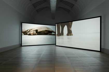
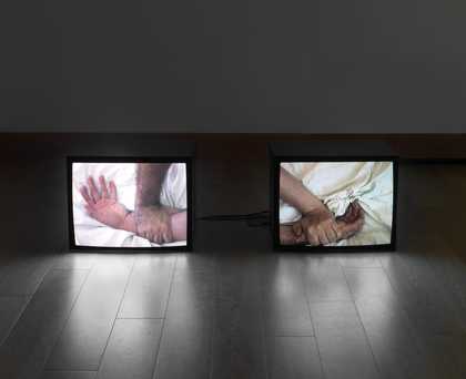
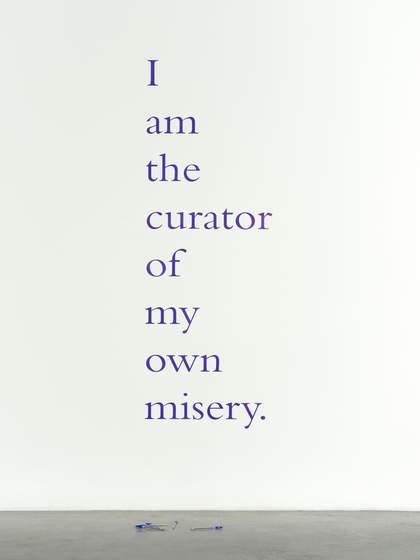
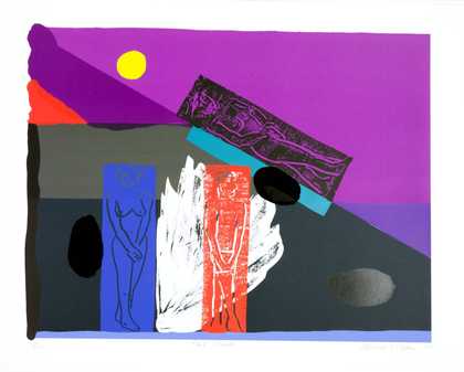
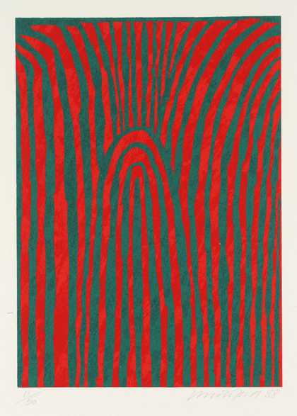
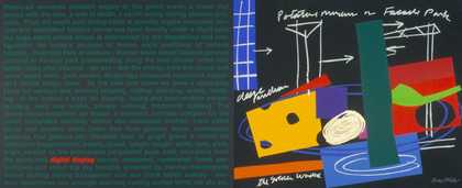
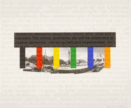
Not on display
- Artist
- Jim Lambie born 1964
- Medium
- Vinyl tape
- Dimensions
- Overall display dimensions variable
- Collection
- Tate
- Acquisition
- Presented by Tate Members 2006
- Reference
- T12236
Summary
Zobop is the collective title of an ongoing series of psychedelic floor designs by the Scottish artist Jim Lambie. Instances of the work typically consist of seven, eight or nine bright colours of vinyl tape applied to the floor in concentric lines that conform to the pre-existing architectural layout of the spaces in which Zobop is installed. Lambie has also created versions of the work entirely from black and white tape and from metallic spectra of golds, silvers and bronzes. He begins installing instances of Zobop by applying a strip of tape along the baseboard of a room or corridor (or at the joint where the wall meets the floor), until he has outlined the entire space with a single colour of a consistent width, which varies across installations from a couple of millimetres to a few centimetres. Next to this first strip of tape Lambie then adds another strip of a different colour that overlaps the preceding strip by precisely 2 mm, until he has made another outline of the room. Lambie then repeats this process of creating perimeters among perimeters until he has filled the entire square-footage of the floor plan in which he is working. The result is a design consisting of successively smaller circumferences of vinyl tape that is dominated by parallel lines of vibrant colour. Lambie has said that the pattern of colours in any given manifestation of Zobop is applied randomly, and this, coupled with the fact that the work is site-specific, means that each iteration is unique.
Zobop was first conceived in 1999 on the occasion of Lambie’s first solo exhibition at The Showroom in London. The artist has explained that the intention behind the work is to fill a room with rhythm while keeping the space itself free from physical obstruction, in a manner analogous to that of music. (Temkin 2008, p.220.) The titular word ‘Zobop’ was invented by Lambie, and as a linguistic coinage it might be compared with the twentieth-century neologisms ‘Be-Bop’ and ‘Re-Bop’, introduced in the 1940s to characterise the complex chords and syncopated rhythms of emergent jazz.
Since its inception Zobop has been constructed from vinyl tape mass produced by companies such as 3M and Oracal for both industrial and domestic use, easily available to ordinary consumers from office supply shops. The familiarity and accessibility of the material from which the work is created has provoked comparisons with readymade and pop art (see Temkin 2008, p.220). The art critic Jonathan Jones has argued that Zobop can be understood as a paradoxical mingling of utilitarian interior decoration on the one hand and the high-minded idealism of abstract aesthetics on the other:
ZOBOP suggests that changing the world begins at home, with a bit of crazy interior decor. We colour walls, we colour doors – why not floors? Do we leave floors plain (in today’s anti-carpeting age) because they make the world feel more solid beneath our feet? … ZOBOP is a formally seductive work of art, evoking abstract painting. Twentieth-century art wanted to disrupt perceptions, destroy preconceptions and open up new Utopian ways of seeing things; Lambie wittily links these high ideals to hippy colours and psychedelic pop.
(Jonathan Jones, ‘Five-Card Trick’, Guardian, 30 September 2000, http://www.theguardian.com/lifeandstyle/2000/sep/30/weekend.jonathanjones, accessed 9 February 2016.)
Lambie himself has avoided attaching any single overarching meaning to the work, stating that ‘People are free to bring to that piece or take from that piece whatever they want to. The work is a starting point for other people, not an end result for me’ (quoted in Raspail, Sans and Bourriaud 2005, p.326).
Further reading
Thierry Raspail, Jerome Sans and Nicolas Bourriaud, Expérience de la durée: Biennale de Lyon, Paris 2005.
Ann Temkin, Color Chart: Reinventing Color: 1950 to Today, exhibition catalogue, Museum of Modern Art, New York 2008.
Kelly Grovier
February 2016
Supported by Christie’s.
Does this text contain inaccurate information or language that you feel we should improve or change? We would like to hear from you.
Film and audio
Explore
- abstraction(8,612)
-
- non-representational(6,161)
- formal qualities(12,442)
-
- pattern(358)
You might like
-
Ian Hamilton Finlay IDYLLS END IN THUNDERSTORMS
1986 -
Ian Hamilton Finlay A LAST WORD: RUDDER
1999 -
Douglas Gordon I am the curator of my own misery.
2010 -
Bruce McLean Hot Slick
1989 -
Kate Whiteford Untitled
1988 -
Bruce McLean An Ideal Home
1998 -
Bruce McLean Designer Traffic Jam - Celebration of an Intersection
1998 -
Bruce McLean Facade Park
1998 -
Bruce McLean Great Arch of Art
1998 -
Bruce McLean Xerox City
1998 -
Anya Gallaccio White Ice
2002 -
Alan Michael Flags at Le Havre
2008 -
Anya Gallaccio preserve ‘beauty’
1991–2003 -
Jim Lambie Psychedelic Soulstick
1999 -
Ian Hamilton Finlay Je Vous Salue Marat
1989