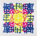
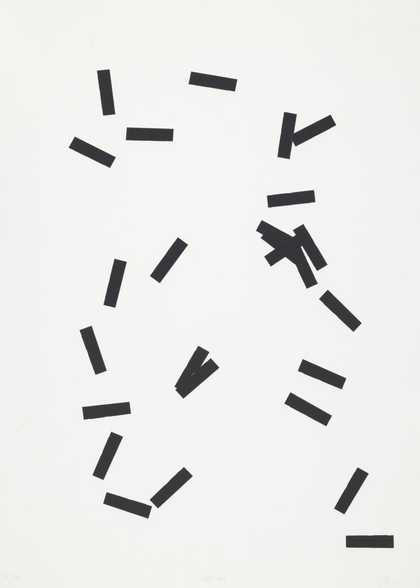
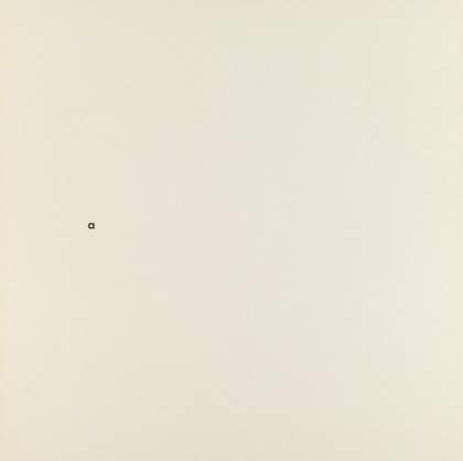
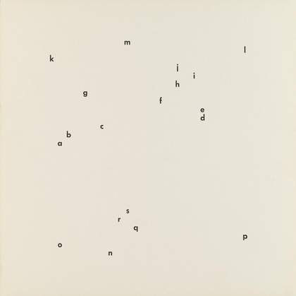
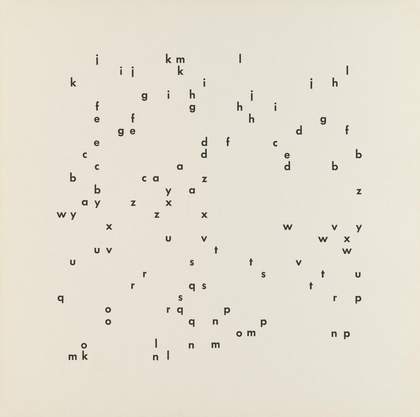
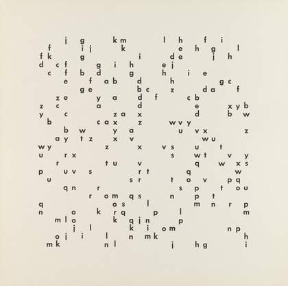
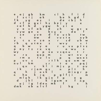
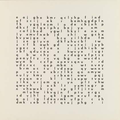
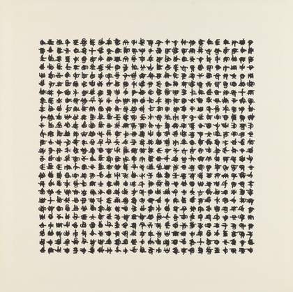
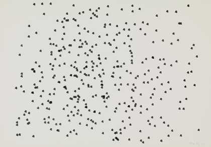
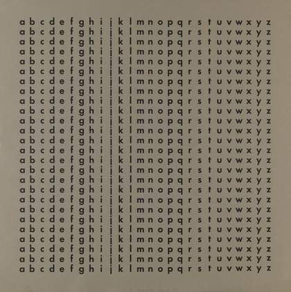
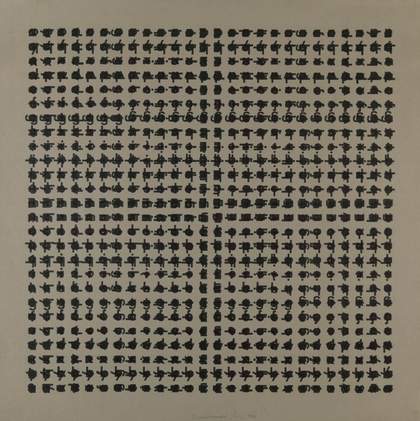
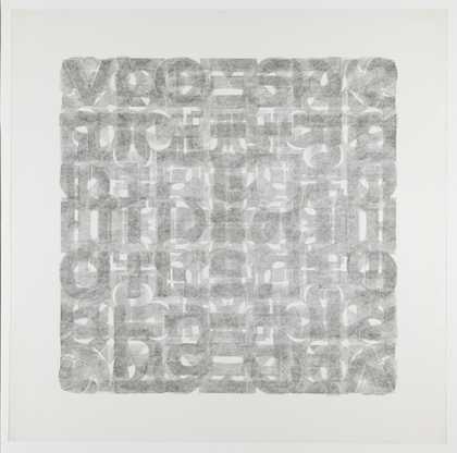
- Artist
- Hansjörg Mayer born 1943
- Medium
- Monoprint on paper
- Dimensions
- Unconfirmed: 480 × 480 mm
- Collection
- Tate
- Acquisition
- Presented by Tate Members 2013
- Reference
- P80977
Summary
alphabet square is a colour monoprint on paper by the poet, painter and typographer Hansjörg Mayer. It is comprised of a square grid of overlapping lower case letters printed in yellow, pink and blue. The four rows of blue letters form the sides of the square and overlap in the corners. The four rows of pink letters are arranged into two pairs of parallel lines, one pair vertical and the other pair horizontal. The four rows of yellow letters are arranged in pairs of two lines flush together, one pair running down the centre of the square vertically, the other across the centre of the square horizontally. The overall image created by the arrangement of the rows presents a central yellow square framed by a pink square, which is in turn framed by a blue square.
Although his family background was in printing, Mayer studied music and philosophy in Stuttgart under the mathematician, philosopher and poet Max Bense. In the early 1960s he started printing and making concrete permutational poetry grounded in his studies and in the context of the emergent Stuttgart Group of concrete poetry that coalesced around Bense. As poet and printer, Mayer was both creator of and mouthpiece for the group, and continued in this role following his move to England in the late 1960s, where he taught at Bath Academy of Art and Watford College of Technology.
Mayer’s main subject is the alphabet. With this he has experimented with the shapes of individual characters found in the twenty-six letters and ten numbers of the Futura typeface, not including capital letters and punctuation marks (four sizes of typeface in bold and semibold). His stripping back of typographic expression to a clear, concise and simple use of letter form echoes the new typography of the 1930s that emerged from Bauhaus teaching. His work also points to a correspondence between concrete poetry and concrete art, something also indicated by the work of former Bauhaus student Max Bill and the Hochschule für Gestaltung (Ulm School of Design) that Bill founded in 1953.
Mayer seeks a close correspondence between the optical structure of a letter or word and the phonetic structure of speech through his punctuation of text by space, and by shifting the emphasis on the eight different ways in which a letter can be printed (size and weight). Beyond such functional typographic exercises, experiments in purely autonomous typography (the form and presentation of individual letters) became the focus of his attention in the early 1960s in a sequence of portfolios and prints that were later dubbed ‘typoems’ by the Brazilian poet Haroldo de Campos.
Mayer is represented in Tate’s collection by a number of similar works, including a series of alphabet studies 1962 (Tate P80845–P80867) and an earlier portfolio of alphabet squares, alphabetsquarebook 1 1965 (Tate P80894–P80906).
Further reading
Stephen Bann (ed.), Concrete Poetry: An International Anthology, London 1967.
Publications by Edition Hansjörg Mayer, exhibition catalogue, Haags Gemeentemuseum, The Hague 1968.
Andrew Wilson
January 2013
Does this text contain inaccurate information or language that you feel we should improve or change? We would like to hear from you.