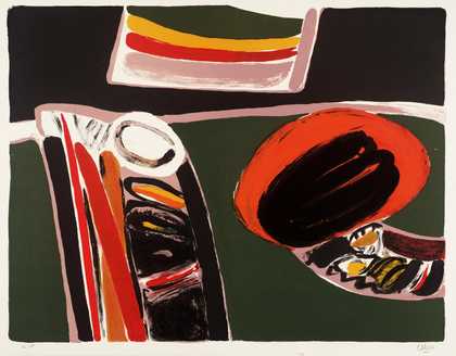
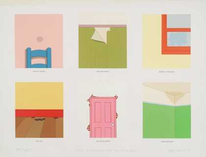
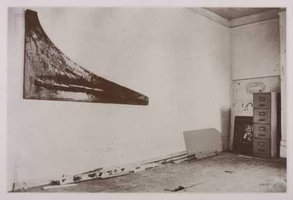
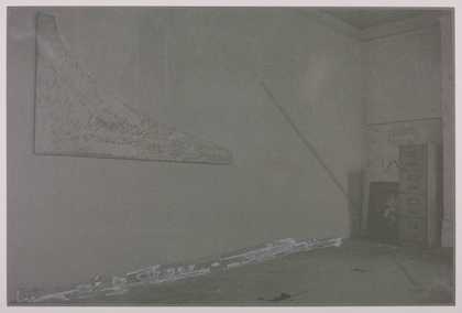
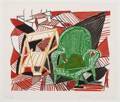
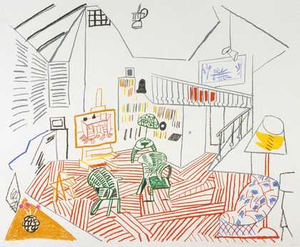
Not on display
- Artist
- Keith Milow born 1945
- Part of
- 15 23/55 55/46 66
- Medium
- Screenprint on paper
- Dimensions
- Image: 508 × 762 mm
- Collection
- Tate
- Acquisition
- Purchased 1971
- Reference
- P07092
Catalogue entry
Keith Milow b. 1945
P07090-P07095 15 23/55 55/46 66
P07092 PR3NT A
Each print inscribed ‘33/75’, b.l., and ‘Keith Milow 69’, b.r., and the title printed at b.r. of the image area.
Purchased from Nigel Greenwood Inc. Ltd. (Grant-in-Aid) 1971. Each print: silkscreen, 24 x 35¾ (61 x 91).
Where not otherwise attributed, the information below was given by the artist either in conversation with the compiler in 1970 and in July 1972 or in a statement on this suite written for the Tate Gallery in June 1972.
Three photographic images are employed in the suite. Each image is used in two of the six prints which the artist conceived as three pairs—Prints 1 and 2; 3 and 4; and 5 and 6. The idea of pairing is reflected in the title of the suite which refers to three pairs of dates—1915 to 23; 1955 and 1955; and 1946 to 1966. These dates, which ‘only refer to the prints on the slightest formal level’, allude respectively to Duchamp's work on the ‘Large Glass'; to two works made in 1955 in the light of Duchamp—Johns's ‘Flag’ and Rauschenberg's ‘Bed'; and to Duchamp's work on ‘Etant Données’.
The three photographs on which the prints are based show the interior of Milow's studio in Phipp Street, London EC2. All three photographs were taken by Mark Lancaster at Milow's suggestion, before Milow started taking photographs himself. Those used in prints 1 to 4 were taken in the summer of 1969, without any idea on Milow's part that he would use them in prints. The photograph in prints 5 and 6 was one of several of the same subject taken after work on the suite had begun, and with the intention of being used in it.
In the order in which they are used, the photographs form a linked sequence which describes the space of the studio. The view used in prints 1 and 2 includes Milow's work # (which is described in the entry on T01213 above); the view used in prints 3 and 4 includes some of the same floorboards, a geodesic sphere made by Milow which related to an abandoned project for sculpture, and the bottom edge of a work Milow never completed. A detail from this uncompleted work is the subject of the photograph used in prints 5 and 6. Dated December 1968, it consisted of a flat rectangular surface on the front of which Milow painted outlines of the shapes in a recent shelf-sculpture, fitting these shapes into the rectangle as economically as possible, and on the back of which Milow conceived an irregular vertical/horizontal grid. A sheet of black rubber was then laid over the picture surface, was screwed to it wherever it overlapped the grid on the reverse, and was then cut to accord to the lines painted on the front, each piece of rubber being allowed to flop freely from its screws. Milow commented that with the use of this photograph in prints 5 and 6 ‘I consciously begin playing the game of reproduction, but the subsequent destruction of the work altered that premise’.
Each of the rectangular photographic images is set in the same non-centralised position within its sheet. The broad right margin thus created was first intended by Milow to contain texts describing the activity within each print, and secondly to take his handwritten inscriptions, but was finally left blank. The compartmented ‘L’ shapes at all four corners are a parody of conventional printing registration marks, and are included as anti-spatial references, to stress each print's non-illusionistic character. Milow published the following statement on this suite in the catalogue of his prints exhibition at the Arnolfini Gallery, Bristol, in September–October 1971: ‘The three images employed were taken from photographs of my studio and work.
‘The basic premise was that in no way would the print medium employed imitate any pre-existent work in other media; therefore image reference was oblique in terms of artworks, though remaining figuratively clear.’
‘The prints for the most part consist of a field of colour and half tone screen, the image having been altered variously by hand then powdered metals were deployed at sometimes crucial, sometimes contrived incidents depicted.’
‘Often the colour was given as imitative of colour in metals and corrosion, and sometimes it was merely compensatory for colour already laid down.’
In his statement written for the Tate Gallery in June 1972, he added: ‘The first print was the most difficult to realise, although once we had established its final state the others emerged much as a consequence of the decisions made in PR1NT A.
‘The imagery was carefully chosen, not wanting to imitate or reproduce existing styles in my other work, which were anyhow, and most importantly, peculiar to the particular materials of whatever piece it might be. Somehow the imagery had to relate. It seemed to me that by using photographs of my studio I could establish a range of subject matter infringed by actual work and allowing incident of a different kind to occur.’
‘The first print called PR1NT A is printed in brown on a pale blue grey field. Alterations to the photographic half tone have been made with the addition of letratone. The painting was dusted with copper powder whilst the ink was still wet.
‘The second print, called PR2NT A, is printed in a translucent grey on the same translucent grey field. The photographic image has had areas scratched out with additions of letratone. The strips of wood in the photograph have been dusted with lead powder.
‘PR3NT A uses the second image, the positive half tone having been heavily scratched. A bar of letratone was put along the top which was subsequently dusted with lead powder when printed. The colour was an attempt to imitate the colour of copper. The field a red-brown. The image the cobalt green of oxidised copper. Because the background was darker than the positive image colour, the image is in negative.
‘PR4NT A is a halftone negative version of the second image. The diagonal which divides the print is dusted bronze. The lower left hand half of the print is covered with various letratone grids applied to the half tone and stuck around its edge. Because the negative half tone is printed on a faintly darker field grey the image is positive.’
Published in The Tate Gallery Report 1970–1972, London 1972.
Explore
- architecture(30,960)
- formal qualities(12,454)
-
- photographic(4,673)
- workspaces(918)
-
- studio(549)
You might like
-
Keith Milow PR1NT A
1969 -
Keith Milow PR2NT A
1969 -
Keith Milow PR4NT A
1969 -
Patrick Caulfield 18. ‘And I am alone in my house’
1973 -
Joe Tilson Transparency Clip-o-Matic Lips
1967–8 -
Michael Rothenstein [title not known]
1976 -
Jeffery Edwards Points to Remember when Buying a House
1970 -
Patrick Caulfield Small Window
1969 -
Patrick Caulfield Interior: Evening
1970–1 -
Harold Cohen Derrynan III
1967 -
Harold Cohen Richard VI
1967 -
Joe Tilson Transparency, Clip-o-Matic Lips
1967 -
Joe Tilson I - He, She and It
1969–70 -
Richard Hamilton Interior with monochromes
1979 -
Peter Hobbs Berck-Plage
1966