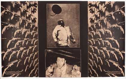
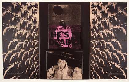
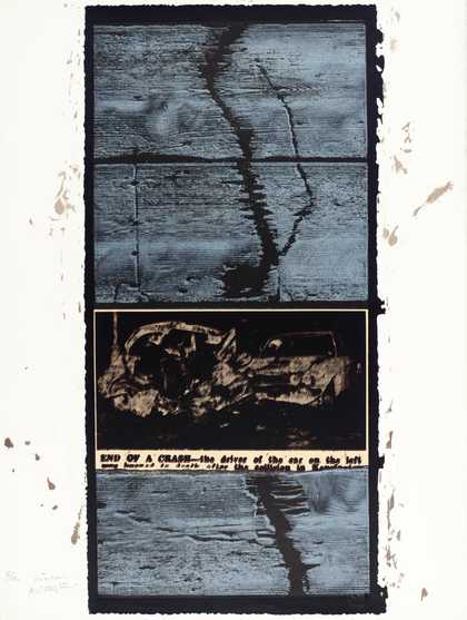
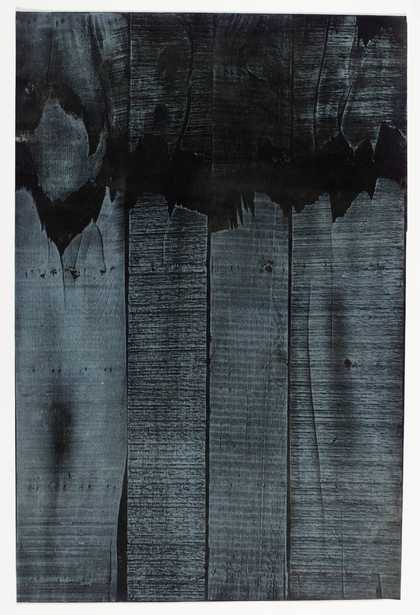
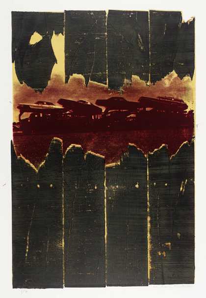
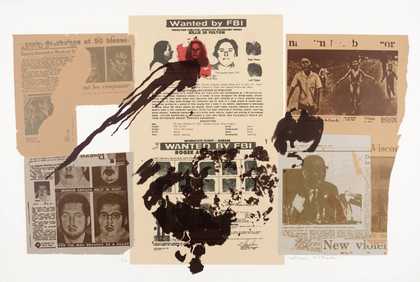
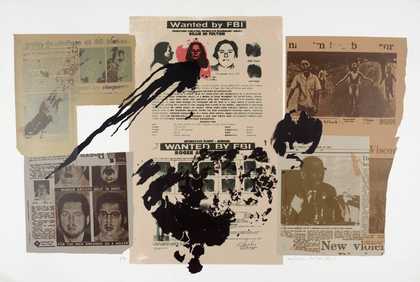
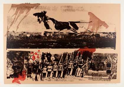
Prints and Drawings Room
View by appointment- Artist
- Michael Rothenstein 1908–1993
- Medium
- Linocut, woodcut, halftone block and line block on paper
- Dimensions
- Image: 685 × 590 mm
- Collection
- Tate
- Acquisition
- Presented by the artist 1987
- Reference
- P02948
Catalogue entry
P02948 RIP II 1968
Linocut, woodcut, half-tone block and line blocks 685 × 590 (27 × 23 1/4) on wove paper; unique proof printed and published by the artist
Inscribed ‘Michael Rothenstein’ below image b.r., ‘Working proof D’ below image b.l. and ‘RIP’ below image bottom centre
Presented by the artist 1987
Lit: Mel Gooding, Michael Rothenstein's Boxes, 1992, pp.15–16; Tessa Sidey, The Prints of Michael Rothenstein, Aldershot 1993, p.140 no.172a, repr. as ‘RIP’ p.134. Also repr. Michael Rothenstein R.A.: Prints of the 1950s and '60s, exh. cat., Redfern Gallery 1987, no.46, as ‘RIP-Variant’
‘RIP II’ shows a section of a tree trunk, printed in blue ink, split in two by a black drill, a large circular grey sprocket and black pincers. A drill, in two sections along the base of the trunk, is printed in red. The area between the two halves of the trunk is printed in cream.
This is one of several unique working proofs (exact number unknown) aside from the final edition of thirty-five impressions. This edition followed ‘RIP I’ (repr. Sidey 1993, p.141 no.172, as ‘RIP’), also an edition of thirty-five impressions with proofs, in which the drill sections printed at the base of the image were not included. These editions were all printed and published at the Argus Studio, Stisted, Essex, with the assistance of Shelley Rose. (He assisted along with other students at the studio from 1968 and was Rothenstein's official assistant in the period 1970–84.)
P02948 includes a bold example of woodblock printing. The emergence of this technique in Rothenstein's work is discussed in the entry on ‘Tournament’ (P77204). In ‘RIP II’ Rothenstein took an impression in blue ink directly from the surface of an elm wood trunk. The edge of the image is the edge of the actual tree trunk. In contrast, the other elements, all man-made, were printed by photomechanical methods: the drill and drill sections were achieved with line blocks, the sprocket with a half-tone block. The methods of printing used by the artist in P02948 reinforce the idea of the difference between nature and artifice through the mechanical process itself.
In conversation on 5 September 1991, Rothenstein told the compiler that in the case of P02948 he asked a friend to photograph the sprocket. The photograph was then made into a zinco. The zinco, or half-tone zinc plate, has dots of varying intensity which create an illusion of tone suitable for the translation of continuous tone images such as photographs. Normally, Rothenstein would take his own photographs and send them to a commercial blockmaker, specifying that the zinco should not be mounted type-high at nine-tenths of an inch, as was usual for traditional presses, since he wished to take impressions from things as ‘thin as paper and thick as great blocks of wood’.
The image of wood is the actual size of the tree trunk. The pincers and drills were taken from a toolmaker's catalogue of about 1900 (title unknown). The bringing together of disparate sources such as these excited the artist, because it contradicted the usual critical evaluation of prints based on ‘the beauty of the unity of means’. For the artist it represented the opposite, ‘the beautiful disunity of means’, and it was this that, in his view, gave energy and excitement to the image. Rothenstein was particularly fascinated by the conflict created by the collage element of the work. For him this effect was heightened by the contrast between the broken drill, which seems like a necklace around the base of the trunk, and the larger mass of the wood. The presence of the man-made objects, which may or may not be used as tools, does not in his opinion detract from the fact that the image is essentially about the wood.
The title of P02948 pinpoints Rothenstein's intended meaning, which centres around the idea of the violence perpetrated by man-made industry and technology against the natural world. In a letter to the compiler of 18 January 1992 he wrote, ‘For me the main shape was like a waterfall - or a double waterfall. In contrast the shapes of the tools are all edges metallic and confined and are suggested metaphors for cutting or working wood - hence RIP’. In answer to a question he stated in conversation that the word ‘RIP’ had had no connection in his mind with the initials ‘R.I.P.’, signifying ‘Rest in Peace’.
The theme of ‘RIP II’ relates directly to another edition of the same year entitled ‘Through’ (repr. Gooding, 1992, p.15) and also to several later prints, for example, ‘Clench’, 1969 (repr. ibid.), ‘Drill’, 1981 (repr. Michael Rothenstein: Works on Paper, exh. cat., Gainsborough's House, Sudbury 1982, [p.13], not in exhibition) and ‘Saw’, 1981, which superimposes the image of a saw onto a tree trunk (repr. ibid.).
The image of nature ravaged by machines is evident in Rothenstein's watercolours of the late 1940s, such as ‘Essex Plough’, 1947 (repr. Michael Rothenstein: The Early Years, exh. cat., Redfern Gallery 1986, p.5 no.36). The artist discussed this aspect of his early pictures in an interview for the National Sound Archive (‘Michael Rothenstein Interviewed by Mel Gooding’, National Life Story Collection: Lives of the Artists, British Library National Sound Archive, C466/02, 23–24/7/1990). In this Gooding identified the opposition of nature and artifice as the central dynamic of Rothenstein's work (ibid., p.60):
This might best be described as the encounter of opposites and entails the persistent juxtaposition in his pictures of categorically distinct objects whose relation is present as potential of energetic signification. Thus we may be disconcerted by the intervention into the natural and the organic by the mechanical and the angular in a way which suggests violation.
The photomechanical incorporation of machine parts into his prints, as in ‘RIP II’, immediately preceded Rothenstein's use of news photographs and objects distorted by erosion, or accidental or even deliberate damage, in a number of editions which further explore the theme of violence. These include ‘Pentagon Papers’, 1970 (repr. Sidey 1993, p.157 no.197), ‘Belfast’, 1973 (repr. ibid., pl.xxxvii in col.), ‘Jags’, 1973 (repr. ibid., p.158 no.210), ‘Violence’, 1973 (repr. ibid., p.159 no.212), ‘Crash’, 1974 (repr. ibid., pl.xxxix in col.), ‘Crunch’, 1974 (repr. ibid., p.160 no.215) and ‘New York City’, 1974 (repr. ibid., pl.xl in col.). The theme was also expressed in box assemblages made partly from screen printed images of violence such as the ‘Crashbox’ series of 1973 (repr. Gooding 1992, pp.50–1 in col.).
The artist's proof for the edition of ‘RIP I’ won the Gold Medal at the first International Engraving Biennial, Buenos Aires, in 1970.
The artist approved a draft of this entry.
Published in:
Tate Gallery: Illustrated Catalogue of Acquisitions 1986-88, London 1996
Explore
- abstraction(8,615)
-
- from recognisable sources(3,634)
-
- man-made(999)
- non-representational(6,161)
-
- colour(2,481)
- formal qualities(12,454)
-
- photographic(4,673)
- violence(331)
- tools and machinery(1,287)
- social comment(6,584)
-
- ecology(61)