Kikuji Kawada
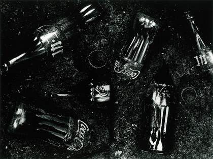
Coca-cola from the series The Map 1965
Gelatin silver prints on paper
279mm x 355mm
© Kikuji Kawada, courtesy the artist and Photo Gallery International, Tokyo
My first published photo book, The Map, took me five years to complete, beginning in 1960. In late 1961 a solo show with work from the series was held at Fuji Photo Salon in Tokyo, organised in three parts.
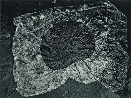
The first featured a ruined castle that was blown up intentionally by the Japanese army during the Second World War. The second comprised photographs taken a decade after the atomic bomb exploded in Hiroshima. They showed the stains and flaking ceilings of the Atomic Bomb Dome, the only structure left standing at the heart of the detonation zone. The third part concerned Tokyo during the period of economic recovery: images of advertising, scrap iron, the trampled national flag and emblems of the American Forces such as Lucky Strike and Coca-Cola, all twisted together, their order shuffled again and again. Some appeared as a montage to be presented as a metaphor. I dare not say the meaning of it.

Kikuji Kawada
Hinomaru, Japanese National Flag from the series The Map 1965
Gelatin silver prints on paper
279mm x 355mm
© Kikuji Kawada, courtesy the artist and Photo Gallery International, Tokyo
These works led me to attempt to create this photographic book, using the notion of the map as a clue to the future and to question the whereabouts of my spirit. Discarded memorial photographs, a farewell note, kamikaze pilots – the illusions of various maps that emerge are to me like a discussion with the devil. The stains are situated as a key image of the series by drawing a future stratum and sealing the history, the nationality, the fear and anxiety of destruction and prosperity. It was almost a metaphor for the growth and the fall.
On the back of the black cover box are written rhyming words that are almost impossible to read. The front cover shows that the words are about to burn out. Inside, the pages are laid out as hinged double fold-out spreads. The repetition of the act of opening and closing makes the images appear and disappear. I wanted to have a book design as a new object and something that goes beyond the contents. With the rich and chaotic nature of monochrome, it might be that I tried to find my early style within the illusion of reality by abstracting the phenomenon. As an observer, I would like to keep forcing myself into the future, never losing the sense of danger which emerges in the conflicts of daily life. I wish to harmonise my old distorted maps with the heartbeat of this exhibition at Tate Modern, twisting across the bridges of the centuries through conflicting space and time.

