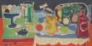
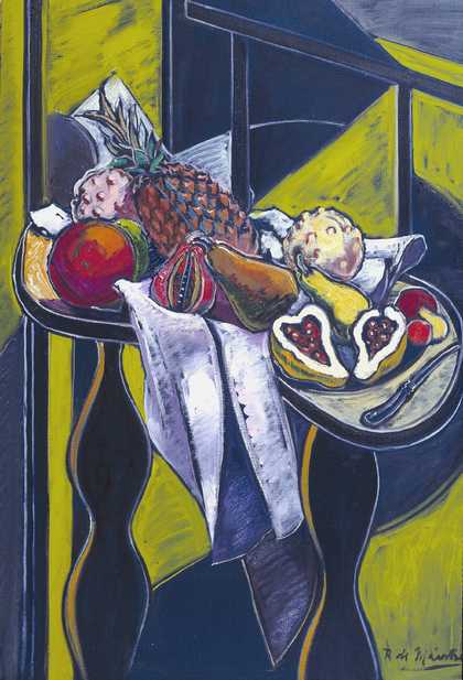
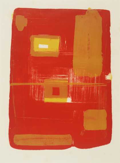
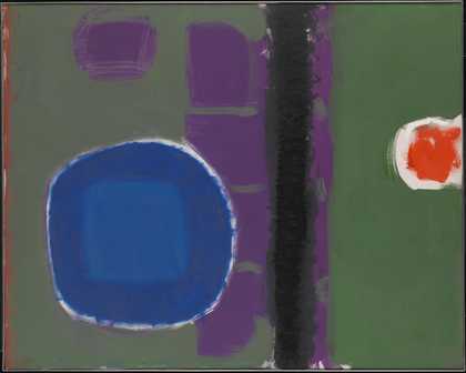
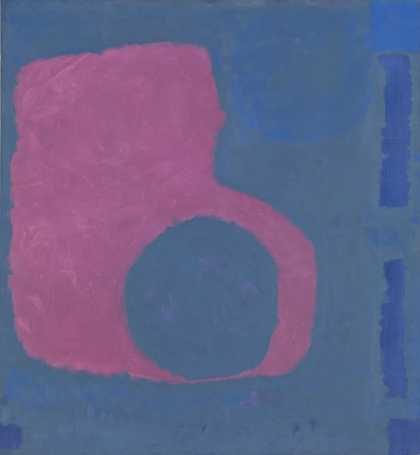
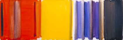
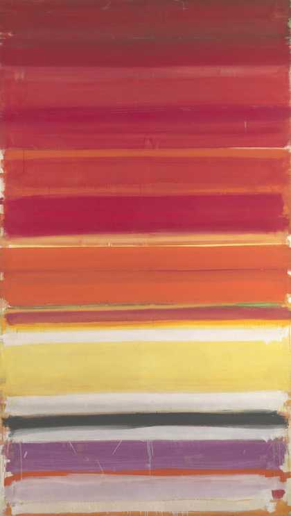
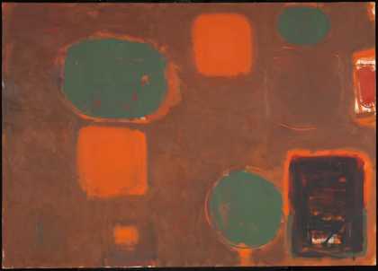
Not on display
- Artist
- Patrick Heron 1920–1999
- Medium
- Oil paint on canvas
- Dimensions
- Support: 457 × 914 mm
frame: 710 × 1167 × 93 mm - Collection
- Tate
- Acquisition
- Purchased 1994
- Reference
- T06850
Display caption
The attention to colour in this early still life by Heron reflects his enthusiasm for the work of Bonnard and Matisse. He commented that 'throughout my early life I had this tremendous battle against the total English contempt for anything they could call decorative ¿ The perfectly ordered surface gives great pleasure. That pleasure used to be run away from by the English'. The ceramics depicted in this work were produced by the Leach pottery, where Heron worked during the Second World War.
Gallery label, August 2004
Does this text contain inaccurate information or language that you feel we should improve or change? We would like to hear from you.
Technique and condition
The painting is an unvarnished oil painting on a commercially prepared lined canvas made by the artists’ cololurman C. Roberson. The canvas is stretched over a four membered stretcher and has been sized using animal glue, followed by a thin white priming layer.
The composition was initially sketched out using a madder crimson paint. These initial fluid and confidant outlines can be seen in the final composition. Madder crimson is a pigment that can be susceptible to fading if exposed to high light levels and so the painting is displayed under carefully controlled conditions. Heron has diluted some of his paints to produce thin washes of colour and in other areas has applied thick buttery paint. Most of the painting has been produced using single layers of bright colour, leaving a fair proportion of the white priming visible as part of the final composition. The artist has also scratched into the dark green paint of the fruit bowl to create some fine lines.
Analysis of the red paint identified the presence of vermilion pigment, with barium sulphate and chalk present as extenders. Analysis of the bright yellow paint identified barium chromate yellow pigment mixed with lead white. The paint was extended using chalk, talc or china clay. Magnesium carbonate was also identified which is suggestive of the use of Winsor & Newton paints.
The painting is in excellent condition with only some minor age cracks and drying cracks. The red paint of the background and bright yellow paint of the jug is water sensitive. Water sensitivity is often observed in unvarnished oil paintings of the twentieth century and is an area of ongoing research (see the Cleaning Modern Oil Paints project). The painting is presented glazed.
Further reading
Anna Cooper, Aviva Burnstock, Klaaas Jan van den Berg and Bronwyn Ormsby, ‘Water-Sensitive Oil Paints in the Twentieth Century: A Study of the Distribution of Water-Soluble Degradation Products in Modern Oil Paint Films’, in Issues in Contemporary Oil Paint, Eds. Klaas Jan van den Berg et al., Cham, 2014, pp.295–310.
Michael McNay, Patrick Heron, London, 2002.
Judith Lee
February 2017
Research on this work was undertaken as part of the Cleaning Modern Oil Paints project.
You might like
-
Patrick Heron Scarlet, Emerald, and Orange : July-September 1976
1976 -
Roy De Maistre Still Life: Fruit
1954 -
Patrick Heron Green and Purple Painting with Blue Disc : May 1960
1960 -
Patrick Heron Purple Shape in Blue : 1964
1964 -
Patrick Heron Scarlet, Lemon and Ultramarine : March 1957
1957 -
Patrick Heron Horizontal Stripe Painting : November 1957 - January 1958
1957–8 -
Patrick Heron Brown Ground with Soft Red and Green : August 1958 - July 1959
1958–9 -
Sir Matthew Smith Still Life with Clay Figure, I
1939 -
Patrick Heron Harbour Window with Two Figures : St Ives : July 1950
1950 -
Patrick Heron Azalea Garden : May 1956
1956 -
Patrick Heron Cadmium with Violet, Scarlet, Emerald, Lemon and Venetian : 1969
1969 -
Mary Potter Still Life
1959 -
Patrick Heron Boats at Night : 1947
1947 -
Patrick Heron Vertical : January 1956
1956 -
Patrick Heron Yellow Painting : October 1958 May/June 1959
1958–9