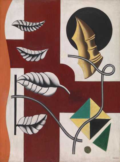
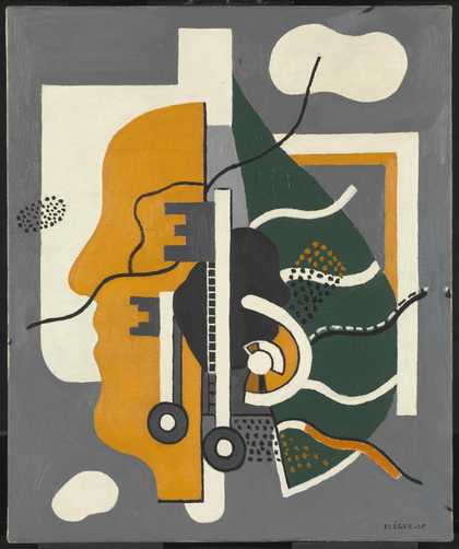
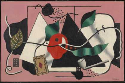
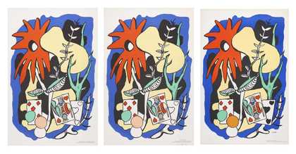
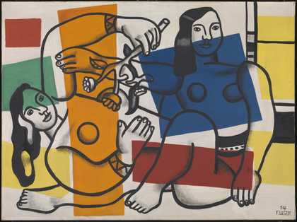
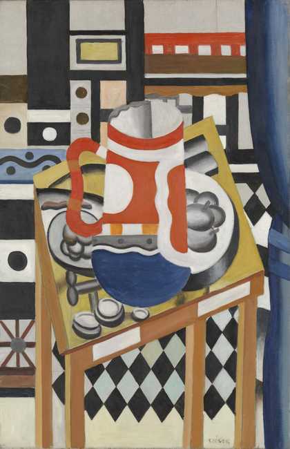
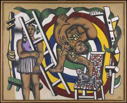
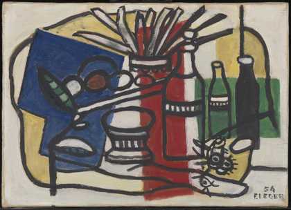
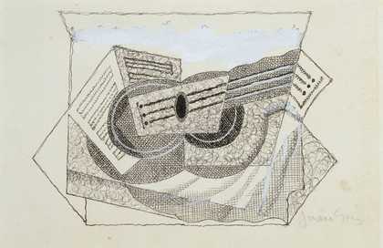
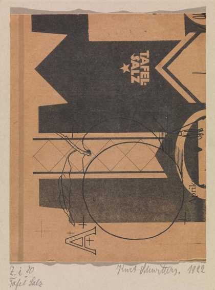
Not on display
- Artist
- Fernand Léger 1881–1955
- Medium
- Gouache on paper
- Dimensions
- Support: 194 × 278 mm
frame: 410 × 503 × 20 mm - Collection
- Tate
- Acquisition
- Presented by Gustav and Elly Kahnweiler 1974, accessioned 1994
- Reference
- T06799
Summary
Although Léger had already made paintings that incorporated letters in the late 1910s and in the 1920s, this was the first time that lettering itself would become the actual subject of his work. He layered the gouache heavily in the areas with black ink, treating it almost like oil paint. The artist painted separate areas of pure colour adjacent to each other and did not allow them to mix, saying: ‘I wanted to end up with colours which were isolated, a red that was very red, a blue that was very blue.’ (Quoted in Cassou and Leymarie 1973, p.13.) The colour of Léger’s gouaches has been described by the art critic Jean Cassou as ‘particularly exquisite ... Gouache seems to have been chosen especially so that Léger could show, in its use, his liking for restrained, subdued colouring that was strictly and completely pure.’ (Cassou and Leymarie 1973, p.13.)
In the mid-1920s Léger was in close contact with Amedée Ozenfant (1886-1966) and Le Corbusier (Charles-Edouard Jeanneret, 1887-1965), who were the chief advocates of the artistic movement known as Purism. His work from that period is seen as reflecting some qualities of the Purist style, and particularly clarity, starkness, stillness and frontality. This work combines Léger’s signature mechanical forms with a calm and restraint that are absent from previous Mechanical Elements compositions and can be seen as consonant with the ideas of Ozenfant and Le Corbusier. Paradoxically, however, the artist commented: ‘Purism did not appeal to me. Too thin for me, that closed-in world. But it had to be done all the same; someone had to go to the extreme.’ (Quoted in Cassou and Leymarie 1973, p.87.)
Further reading
Jean Cassou and Jean Leymarie, Léger: Drawings and Gouaches, translated by W.K. Haughan, London 1973
Giorgia Bottinelli, ‘Fernand Léger’, in Jennifer Mundy (ed.), Cubism and its Legacy: The Gift of Gustav and Elly Kahnweiler, exhibition catalogue, Tate Modern, London 2004, pp.67-8, reproduced p.70 in colour
Giorgia Bottinelli
September 2004
Does this text contain inaccurate information or language that you feel we should improve or change? We would like to hear from you.
Display caption
ABC is a preparatory study for the oil painting Nature morte A.B.C. (1927), which was owned by Daniel-Henry Kahnweiler. It is an abstract still life that features lettering reminiscent of early Cubism, combined with abstract elements on a tilted plane. Although Léger had already made paintings that incorporated letters in the late 1910s and in the 1920s, this was the first time that lettering itself became the subject of the work. Léger applied the gouache heavily in the areas with black ink, treating it almost like oil paint.
Gallery label, September 2004
Does this text contain inaccurate information or language that you feel we should improve or change? We would like to hear from you.
You might like
-
Charles Dufresne Spahi Attacked by a Lion
1919 -
Fernand Léger Leaves and Shell
1927 -
Fernand Léger Keys (Composition)
1928 -
Fernand Léger Playing Card and Pipe
1928 -
Sonia Delaunay Prose on the Trans-Siberian Railway and of Little Jehanne of France
1913 -
Fernand Léger Two Women Holding Flowers
1954 -
Francis Picabia Conversation I
1922 -
Lawrence Atkinson The Lake
c.1915–20 -
Jean Crotti Portrait of Edison
1920 -
Wols (Alfred Otto Wolfgang Schulze) [title not known]
c.1944–5 -
Fernand Léger Mechanical Elements
1926 -
Fernand Léger Trees
1923 -
Juan Gris Guitar and Music Book
1923 -
Juan Gris Pipe and Domino
1924 -
Juan Gris Still Life with Guitar
1924