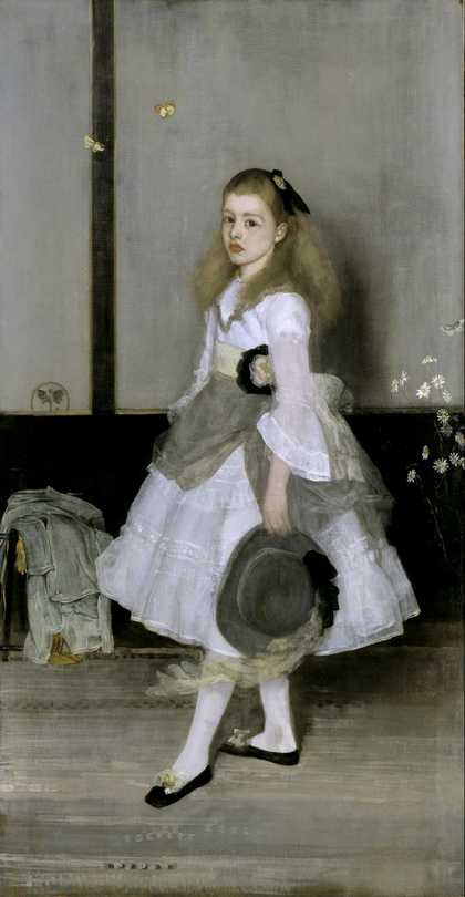
James McNeill Whistler
Nocturne: Black and Gold - The Fire Wheel (1875)
Tate
What is tone?
What is tone when we’re talking about artworks? You might also hear the words ‘tonal value’ too. It just means how dark or light a colour or a shade is. In tonal drawings or paintings the picture space is made using a range of lighter or darker shades of one colour. You can make a tonal drawing using pencil or charcoal. Build up the darkest shades by pressing harder with your pencil or working layers over another to get a denser shade. You might pick out highlights with an eraser, and then put in gradations of mark between the brightest and darkest shades.
The darkest tones...

Vija Celmins
Untitled (Desert-Galaxy) (1974)
ARTIST ROOMS Tate and National Galleries of Scotland
Can you make an artwork using only black? Vija Celmins has used only a graphite pencil to create these drawings of spaces that seem (or are) infinite. On the left is a galaxy and on the right is an image of a desert floor. She used graphite pencil on a white acrylic gesso ground. This means she prepared her canvas with a smooth white painted background. This smooth surface meant she could apply a lot of pencil and get a really dark black and a really bright white for the highlights. These drawings are both based on photographs.
But you can also create a painting from black pigments. Shirazeh Houshiary has used both paint and graphite for this abstracted work, while Gillian Carnegie has used thick black oil paint to build up a recognisable forest scene.

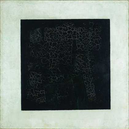
Gillian Carnegie
Black Square (2008)
Tate
Have a go

Vija Celmins
Desert (1975)
Tate
See if you can create a gradation from the lightest to the darkest tones with only a pencil or charcoal. Try using different pressures, and different softness of pencil: HB is the mid range and anything marked with an H is hard and with a B is soft. The higher the B number, the softer the pencil – you might find the graphite easier to work with with a softer pencil. You could start by creating a simple scale of tone across a page working from light to dark. Then try working from black and white photographs with high contrast like Celmins did to get used to creating these graded tones.
And the lightest tones
Can an artwork have no tonal value at all? Can all of it be white? What happens when we look at a white canvas? Our eye might search for patterns and marks, focus on the materials used, or maybe we enter into a meditative state, contemplating a feeling of emptiness.

Piero Manzoni
Achrome (1958)
Tate

Li Yuan-chia
Monochrome White Painting (1963)
Tate

Agnes Martin
Faraway Love (1999)
ARTIST ROOMS Tate and National Galleries of Scotland

Robert Ryman
Ledger (1982)
Tate

Bram Bogart
White plane white (1974)
Tate
Modelling with tone

Clive Branson
Still Life (1940)
Tate

William Scott
Still Life (1973)
Tate
Using tone in your drawing and painting allows you to create pictorial depth or space. If you apply a colour in one shade only, it can look like a flat graphic surface. Once you begin to add darker shades and highlights to your colours, we can begin to ‘read’ the flat picture plane as having depth or form.
Sometimes artists exaggerate the depth of tones to create dramatic feeling. Adding a light source can bring bright highlights and pools of shadow to invigorate a scene

Arthur Melville
The Blue Night, Venice (1897)
Tate

William Brooker
Still Life, New Studio (1974)
Tate

Sir William Rothenstein
Mother and Child (1903)
Tate

Duncan Grant
Lytton Strachey. Verso: Crime and Punishment (c.1909)
Tate

Joseph Wright of Derby
An Iron Forge (1772)
Tate

Sir William Rothenstein
The Doll’s House (1899–1900)
Tate
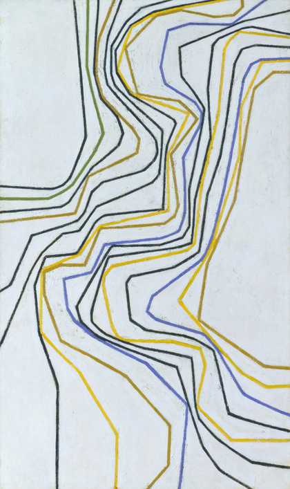
Colour that isn't just one colour

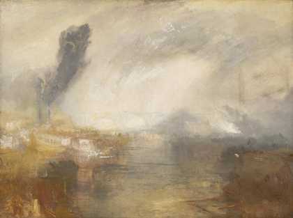
James McNeill Whistler
Nocturne: Blue and Silver - Chelsea (1871)
Tate
James Abbott McNeill Whistler created lots of tonal works, focusing on a limited palette for each work. But Whistler also took on another meaning of tone – tone in music. This painting is the first of Whistler’s Nocturnes. Frederick Leyland first used the name ‘nocturne’ to describe Whistler’s moonlit scenes but Whistler took it up and expanded on it. He said: ‘By using the word ‘nocturne’ I wished to indicate an artistic interest alone... A nocturne is an arrangement of line, form and colour first.’
Whistler wanted viewers to appreciate his artworks not for the story they told (like most artworks before the 1900s) but for the mood they created – like listening to a piece of classical music. Creating these beautiful, quiet paintings of the River Thames at night in using a palette of only one or two colours allowed him to try to capture the feeling of stillness and tranquillity.
But using shades and tones of colour doesn't have to mean that you are creating representational work (trying to create something recognisable). Many artists have created what are called ‘colour monochromes’. Monochrome means literally ‘one colour.’ Though we use it often to mean black and white, it can refer to anything that is just one colour. However, when you look closely at any artwork painted by hand, you begin to see the one colour is very rarely just one colour. Tone is created by the movement of the artist’s hand...

Edwina Leapman
Untitled Orange (1964–5)
Tate

Kim Lim
Blue Wash (1993)
Tate

Kim Lim
Blue Disc (1970)
Tate

Josef Albers
Study for Homage to the Square (1964)
Tate
© 2026 The Josef and Anni Albers Foundation/Artists Rights Society (ARS), New York/DACS, London

Yves Klein
IKB 79 (1959)
Tate
Translating colour into black and white
Before industrial colour printing, the only way to reproduce paintings was to create black and white prints of them. Some artists or printers then hand-coloured prints, but others looked for ways of representing the colours of a painting in comparable tonal values.

John Constable
The Glebe Farm (c.1830)
Tate

John Constable, David Lucas
The Glebe Farm ()
Tate
To make a print of this John Constable painting, Constable worked very closely with printmaker David Lucas. Constable and Lucas had to translate each colour into a shade of grey or black. Lucas used a printmaking technique called mezzotint. The printmaker rocks a toothed metal tool across a metal printing plate, creating lots of little dents or pits in the plate. When the plate is inked up, each pit holds a drop of ink. If you printed from the plate at this first stage the image would be solid black. However the printmaker creates the dark and light tones by gradually rubbing down the rough, bumpy surface to reduce how much ink is held in different areas of the plate. The roughest areas hold lots of ink and create velvety blacks, while the smoothest areas hold the least ink and create the lightest tones.
Try to translate a colour image – painting or photograph – into a black and white image. Think about how you can take areas of colour and represent them as a shade of grey, a bright highlight, or a deep black.
Mezzotinting is a difficult process so you could try doing this with a brush and ink instead. While creating a printing plate starts with creating the darkest areas and working out into the lightest areas, it’s easier to work the other way around in painting. Mark out the lightest areas that you don't want to touch with your ink at all. You can even use masking fluid or tape to cover them over so they remain white. Then create the next lightest areas with very diluted ink, adding water to your ink in a palette or on a separate piece of paper to create lighter shades. Then work down by grades, using more and more ink till you are into the darkest tones with undiluted ink. You can also do this the other way round –starting with dark paper and adding lighter and lighter tones with white chalk or crayon.