
Fig.1
James Rosenquist
Silo 1963–4
Oil paint on canvas, wood and Perspex
2870 x 3531 x 562 mm
Tate T01829
© James Rosenquist/VAGA, New York and DACS, London 2017
Silo 1963–4 (Tate T01829; fig.1) is an oil painting on canvas reproducing enlarged fragments from printed advertisements, a characteristic technique of pop artist James Rosenquist. Such practices developed from the artist’s work painting outdoor billboards in the mid- to late 1950s. This background tends to dominate accounts of his art, as critic Lucy Lippard has observed, casting the artist as a kind of ‘painter naïf, hauled off his scaffolding by some inspired entrepreneur’.1 Yet Rosenquist’s works also undertake substantial transformations of their sources. Commercial images take up a relatively small portion of Silo, which is dominated instead by a graduated blue field. The work features two three-dimensional components that add spatial properties to Rosenquist’s painted illusionism (fig.2): a T-shaped sculptural element in silver spray-painted timber and Perspex surrounds a compressed painted collage – including a small blackboard attached to the canvas – at the lower centre of the picture. Although freestanding, this unit is designed to sit flush with the surface of the canvas, such that the lower edge of the painting is required to rest on the floor for the two elements to correspond.

Fig.2
James Rosenquist
Silo 1963–4, detail
Photo © Margaret Stanks

Fig.3
‘Your “T-Zone” Will Tell You!’
Advertisement for Camel cigarettes
Published in Life, 17 February 1947, back cover
The upper portion of the canvas initially suggests a broad, blue sky. The ‘big blend’ effect it uses was one that, as Rosenquist later explained, the artist had mastered through having to ‘blend miles and miles of paint with a four-inch brush’ for outdoor billboards.2 But as if to confuse the possibility of reading this colour field of blue graduated to white as a sky, Rosenquist’s blend fades across, rather than down, the canvas. The sky refuses to sink behind the surrogate horizon line that demarcates its lower bodily terrain – a band across the bottom edge of the canvas depicting a section of a woman’s neck and shoulders. With nails painted to match its scarlet background, the subject’s raised hand holds a cigarette. The source of this image, as well as the T-shaped sculptural element, is a 1947 advertisement for Camel cigarettes (fig.3). The idea of a T-zone (‘T for Taste, T for Throat’) was one of several promotional hooks used by Camel to promote the ‘mildness’ of their brand.

Fig.4
‘Take a look at a dishwashing miracle!’
Advertisement for Tide dishwashing detergent
Published in Life, 29 October 1951, p.104

Fig.5
James Rosenquist
Dishes 1964
Seattle Art Museum, Seattle
© James Rosenquist
In Silo Rosenquist fills the T-zone shape that originally demarcated the mouth and throat of its female model with images of other products designed to be consumed. Some of these images can also be traced to specific advertisements. The drying rack filled with colourful tableware (a popular design manufactured by Harlequin Pottery, a lower-priced alternative to Fiestaware sold at Woolworths) was drawn from a 1950s advertisement for Tide dishwashing detergent (fig.4). The same dish rack appears in his painting Dishes 1964 (fig.5), but the fragment used in Silo is inverted, and the colour and placement of the vibrant plates in the background is modified. Here, it suggestively covers the throat of the figure with the crockery designed to hold food and drink. The visual content above these dishes is more difficult to read. Blurry foliage in the upper right of the T-shape furthers the work’s unstable reference to landscape painting. The upper left of the T-zone features yet more female hands, this time tearing a roll of kitchen film, imagery that appears to have been drawn from an advertisement for Cut-Rite wax paper (fig.6). Like the fragment of drying dishes, this reiterates the feminine labour that links the collage of kitchen images and the activity of food preparation and consumption with which Rosenquist fills the T-zone.

Fig.6
‘More women choose it… love to use it!’
Advertisement for Cut-Rite wax paper
Published in Life, 17 July 1950, p.55
More metaphorically, the Cut-Rite brand and image of torn paper might also be seen to allude to Rosenquist’s own labour of cutting printed fragments to compose his paintings. Drawn from Life magazine and other consumer publications from the 1940s and 1950s, the imagery Rosenquist favoured was that which he thought old enough to be ‘drained of associations’, but not old enough to provoke nostalgia.3 Photographs of his studios from the 1960s show these clippings in spectacular excess, a stock of imagery from which the artist could draw. Visiting with fellow artist Andy Warhol in 1962, Ed Ruscha thought this turmoil was ‘perfect for what he was doing, with visuals all over the walls and floor’.4 Despite disclosing such processes through images of his studio, Rosenquist originally preferred not to reveal his specific sources, concerned that this ‘could weaken the impact of the paintings’.5 By the 1990s, however, Rosenquist came to admit the clippings were relevant to the meanings of his art, and they have since been included in several publications and exhibitions.6 In the case of Silo, the scrap from the Camel T-zone advertisement he used as the basis for the painting was reproduced in the catalogue of his 2003 retrospective at the Solomon R. Guggenheim Museum in New York, a crumpled relic of the work’s genesis.7
Rosenquist’s unlikely combinations of commercial imagery have precursors in the juxtapositions of dada earlier in the century, as well as the brash commercial imagery favoured in the collages of British pop figures such as Richard Hamilton or Eduardo Paolozzi. But by repainting fragments from such sources in a realist style at an enormous scale, Rosenquist transformed the cubist and neo-dada origins of such techniques into something wholly more slick and spectacular. His fluent technique and bizarre shifts of subject and scale reminded others of the surrealist paintings of René Magritte and especially Salvador Dalí, whom Rosenquist admired for his ability to ‘make a picture that keeps seeing information long after you thought you had seen it all’.8 In recommending the work for acquisition, Tate curator Richard Morphet claimed Silo as ‘a prime example of the surrealist descent of Pop’.9
Rosenquist’s early career balanced fine art training with commercial art employment, a background he shared with many key figures of the pop movement. From 1952 to 1954 he attended the University of Minnesota, studying with painter Cameron Booth. Like many Americans of his generation, Booth had been trained by Hans Hofmann, and suggested that Rosenquist should also study with the influential émigré abstract painter.10 Rosenquist instead enrolled at the Art Students League in 1955, where he took classes with painters including George Grosz, Morris Kantor, Edwin Dickinson and Robert Beverley Hale.11 Rosenquist’s modest drawings and paintings in the late 1950s were broadly abstract expressionist in style, and were made while he worked for General Outdoor Advertising and Artkraft-Strauss as a billboard painter in Times Square and elsewhere in New York. In 1960, he quit painting billboards and moved into a studio in Coenties Slip in Lower Manhattan. Rosenquist’s space had previously been occupied by Agnes Martin, and his neighbours included Jack Youngerman, Ellsworth Kelly and Robert Indiana, artists whose varied melding of abstract and everyday imagery is echoed in works such as Silo.12
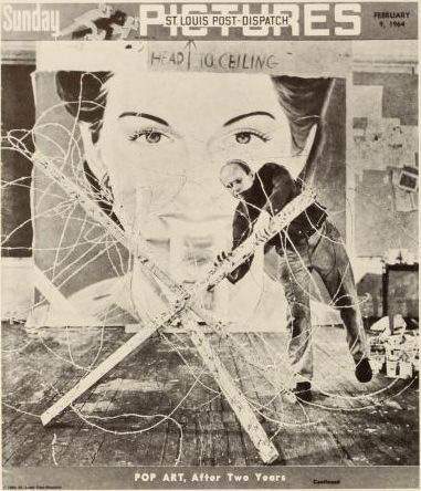
Fig.7
Front cover of the ‘Pictures’ supplement of the St. Louis Post-Dispatch, 9 February 1964, showing James Rosenquist in his studio with Tumbleweed 1963–6 and Candidate 1963
Silo is a revision of an earlier painting entitled Candidate, the appearance of which is preserved in photographs and the film footage included in this project.13 Candidate was made in 1963. In February 1964, the cover of the Sunday supplement of the St. Louis Post-Dispatch reproduced a photograph from late 1963 or early 1964 in which the work is seen in the artist’s new studio at 429 Broome Street, shown with the artist himself and his Tumbleweed 1963–6 (fig.7).14 The latter was one of several works made in the first months of his time in this larger studio, a space in which he would go on to make enormous paintings such as his World’s Fair Mural 1964 (Weisman Art Museum, Minneapolis) and the landmark F-111 1964–5 (Museum of Modern Art, New York).15 But the first works made in this space were occupied by the possibilities of ‘incorporating objects into paintings’, a shift that Rosenquist linked to his interest in the three-dimensional elements used by proto-pop figures such as Robert Rauschenberg and Jasper Johns.16 In line with such influences, art historian and critic Robert Pincus-Witten regarded Rosenquist’s experiments with ‘loose and arbitrary sculptural arrangements’ around this time as a kind of ‘combine’ painting.17

Fig.8
James Rosenquist’s studio at 429 Broome Street, New York, 1963
Candidate was first exhibited in Rosenquist’s 1964 exhibition at Green Gallery, his second and final solo show in the space. Photographs and film footage of the exhibition opening – attended by Warhol, Lichtenstein, Robert and Ethel Scull and others – show the work dominating the exhibition.18 Originally, the image of the woman’s face from the Camel advertisement was entirely visible, unobscured by the blue painted field that now dominates the work. The T-zone unit appears to have been clad in thinner plastic material than the Perspex it now uses – a thinner, more flexible looking film, although not quite as flimsy as the fragment of kitchen wrap Rosenquist subsequently painted into the T-zone of Silo. This thin plastic also seems to have covered the front face of the T-shaped unit, whereas this surface is unclad in the final version of the work. Inside this enclosed form, Rosenquist placed – as a period reviewer recorded – ‘a chair with a pan of water beneath it containing five artificial flowers painted with Day-Glo colors’ as well as a ‘25 watt light bulb’ that hung ‘over [the] smiling teeth’ in the painting.19 As a colour photograph of the work in Rosenquist’s studio indicates (fig.8), the interior of the T-zone featured a yellow border that tied with the palette of the other works he was producing at that time, and it increased the glowing appearance of the T-shaped element.

Fig.9
James Rosenquist
Nomad 1963
Albright-Knox Art Gallery, New York
© James Rosenquist
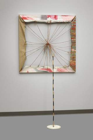
Fig.10
James Rosenquist
He Swallowed the Chain 1963
Yale University Art Gallery, New Haven
© James Rosenquist
In repainting Candidate into Silo, Rosenquist shifted some of the work’s initial emphasis on three-dimensional objects onto images. Several other of the sculptural constructions featured in the Green Gallery exhibition were also destroyed.20 The only ready-made object added to Silo was the small blackboard, an item that barely protrudes from the surface of the painting. As a surface itself designed to hold images, this old-fashioned slate represents a prescient reference to the possibility for a picture to be endlessly effaced and revised. According to a 1978 Tate conservation report, this blackboard had a ‘blue chalk scribble’ when it was first inspected by the museum, a detail that is no longer visible.21 Like the overpainted field of blue, the blackboard also functions as a monochrome, something of an homage to Kazimir Malevich’s Black Square 1913 (State Tretyakov Gallery, Moscow) drawn from the world of ordinary objects. Such everyday correspondences with high modernism were evidently of interest to the artist. As he explained to Lucy Lippard in 1965, he was ‘seeing abstraction everywhere’.22 Several other works shown at Green Gallery played with the tropes of abstract expressionist painting. Nomad (fig.9), beside which Candidate was exhibited, had attached to its surface a clear plastic umbrella covered in drips of paint, and corresponding pieces of paint-splattered wood on the floor below it. Capillary Action II 1963 (now in the collection of the National Gallery of Canada, Ottawa) repeated these Pollockian drips, in this case over a stretcher clad in transparent plastic mounted on a twiggy tree – as though nature had both grown out of abstraction and outgrown the limits of the frame. The exhibition also included the see-through canvas of He Swallowed the Chain 1963 (fig.10), which again shared the use of clear plastic film with Candidate. With its freestanding vertical bamboo element connected to a string design, the painted finish of this work again alludes to the excesses of gestural abstraction, but simultaneously appears to suggest the conventions of recessional perspective – a vision of painting as if viewed through a window. With its blank blue field straddling illusion and abstraction, Silo chimes with such ambiguous references to the conventions of painting.

Fig.11
James Rosenquist
President Elect 1960–1/1964
Centre Georges Pompidou, Paris
© James Rosenquist
The presence of the folding chair in Silo’s original incarnation as Candidate bears further consideration. Rosenquist had reportedly considered allowing visitors to the Green Gallery exhibition to sit in the folding chair, an idea that would have seen members of the gallery audience incorporated into its pictorial space for the consideration of the other visitors – a possible origin for his choice of the work’s title.23 But the presence of the plastic on the front of the T-zone sculpture would have prevented such interaction. The suggestion of an election in the original title of the work should not be ignored, however, especially given the artist’s persistent engagement with period politics. Michael Lobel’s James Rosenquist: Pop Art, Politics, and History in the 1960s (2009) carefully reconstructs the history of the artist’s President Elect 1960–1/1964 (fig.11), a work revised at around the same time as Silo. Reaching conclusions of considerable relevance to the revision of Candidate, Lobel argues that the meanings of President Elect, and the portrait of John F. Kennedy it contains, ‘only become comprehensible retrospectively, through the lens of the later revisions and reworkings’.24 ‘Its ultimate significance lies more in how it speaks to a process than to an end result,’ concludes Lobel, ‘and any account we offer of it will only be partial and incomplete.’25

Fig.12
James Rosenquist
Director 1964
Private collection
© James Rosenquist
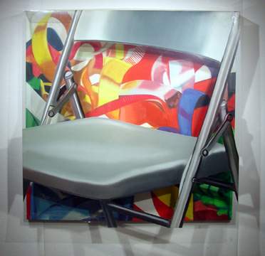
Fig.13
James Rosenquist
In Honor and Memory of Robert F. Kennedy from the Friends of Eugene McCarthy 1968
Private collection
© James Rosenquist
Although the content of Silo bears little evidence of a connection to the Kennedy assassination, it is a context that is worth considering among the work’s constellation of meanings. Rosenquist’s decision to exhibit an empty chair with a dish of flowers does suggest, to an extent, a memorial function for the work, especially as it was shown less than two months after the shooting. Another empty chair appears in Rosenquist’s Director 1964 (fig.12), whose painted content is notably similar to the final version of President Elect. But most intriguingly, Rosenquist later painted a chair of a similar design to that used in Candidate in a 1968 work dedicated to Robert F. Kennedy, politician and brother to John F. Kennedy, after his assassination that year (In Honor and Memory of Robert F. Kennedy from the Friends of Eugene McCarthy; fig.13). In this work the empty chair unmistakably evokes the absence of the painting’s titular subject. If the chair in Candidate was originally conceived to function similarly, it is a theme that seems ultimately absent from Silo, deferred perhaps to President Elect, a work that would more explicitly serve to remember the late President.
Perhaps one could draw the blandly attractive face of Candidate into contact with Kennedy-era image culture, but its interaction with the social sphere might just as easily have been one of disconnection, of the disturbing reality of business-as-usual humming along in the background of the national tragedy. In any case, the act of painting over the face of Candidate served to erase any possibility that Rosenquist’s painting might have suggested a kind of naïve nostalgia for the supposedly simpler times of Eisenhower’s 1950s. Perhaps this is why Stuart Preston, in his New York Times review of the Green Gallery show, took the title Candidate to suggest the work as a kind of ‘puzzling political satire’.26 The final composition of Silo is dominated instead by Rosenquist’s act of iconoclasm, veiling the face of recent history with a broad field of blank space, a blue sky open with possibility. If Rosenquist sought to obscure much of the legible content of Candidate, however, it has subsequently returned with a vengeance. Since its acquisition by Tate, the underlying facial features have begun to show through the overpainted field, a ghostly pentimento whose ever-increasing visibility is progressively blurring the boundaries between the past and present states of the work.
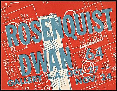
Fig.14
Flyer for Rosenquist’s exhibition at Dwan Gallery, Los Angeles, 27 October–24 November 1964
Dwan Gallery Papers, Archives of American Art, Smithsonian Institution, Washington, D.C.

Fig.15
James Rosenquist
Conveyor Belt 1964
Guggenheim Abu Dhabi, Abu Dhabi
© James Rosenquist

Fig.16
James Rosenquist
Wrap II 1964
Museum Ulm, Ulm
© James Rosenquist

Fig.17
James Rosenquist
F-111 1964–5
Installation view
Oil on canvas with aluminium, twenty-three sections
Museum of Modern Art, New York
© James Rosenquist
According to Rosenquist, the revisions that produced Silo were completed in mid-1964. The work was first shown in its revised form at his solo exhibition at the Dwan Gallery in Los Angeles in autumn 1964.27 The presentation of the work in Los Angeles avoided his having to show the already exhibited (even if substantially altered) work with his new representative Leo Castelli Gallery in New York. Rosenquist travelled to Los Angeles for the opening of the exhibition at Dwan Gallery in October (fig.14). Silo and Conveyor Belt 1964 (fig.15) were the largest and most expensive works in the show, priced at $9000 and $7500 respectively. Neither work sold. Of a total list of eleven works, five smaller works found buyers. These included Dishes 1964 (see fig.5), based on the same image of drying crockery contained within the T-zone, and Rosenquist’s lesser-known Wrap II 1964 (fig.16), a work whose content connects with the Cut-Rite kitchen paper image included in Silo. With its painted female hand holding kitchen wrap, this work contains a sculptural terrain of aluminum foil and barbed wire under a real plastic film, a juxtaposition that preempts the conflations between domestic and military products that would dominate Rosenquist’s next project, his enormous mural F-111 1964–5 (fig.17).

Fig.18
James Rosenquist
Fruit Salad 1964
Private collection
© James Rosenquist

Fig.19
James Rosenquist
Orange Field 1964
Private collection
© James Rosenquist
In the Dwan Gallery exhibition, the references to the domestic kitchen in Silo were also reinforced in smaller paintings of processed food such as Fruit Salad 1964 (fig.18) and Orange Field 1964 (fig.19) – the latter using the wiggling Franco-American Spaghetti that would reappear in F-111. But as with the evocation of minimal sculpture and colour field painting in Silo, these two images also suggest equivalents in New York School abstraction: the chunks of push-and-pull colour in the work of Hans Hofmann and the dripped fields of Jackson Pollock respectively.28 ‘Do we see a snide reference to his view of Abstract Expressionism in certain backgrounds[?]’, asked one critic of the Dwan Gallery exhibition.29 Perhaps Los Angeles Times critic Henry Seldis missed the mischievous tone of such references when he approvingly noted that Rosenquist’s ‘sensitive use of color’ offered ‘considerable aesthetic pleasures’. But like many critics skeptical of pop art’s explosive popularity, the show ultimately appeared to confirm to him the ‘gimmickry favoured by the current avant-garde’. For Seldis, it was Silo that was most guilty of ‘blatant absurdity’ in Rosenquist’s debut solo exhibition in Los Angeles.30

Fig.20
James Rosenquist, letter to Richard Morphet, 5 January 1974, Tate Conservation file
Silo does not appear to have been exhibited again until it was included in Rosenquist’s 1972 retrospective at the Whitney Museum of American Art, New York, where it was listed as being in the artist’s own collection – and had therefore probably been held in his studio in the intervening years.31 The work was acquired by Tate in 1973, purchased from London’s Mayor Gallery, which had bought the work directly from the artist. Not only did the purchase complement recent acquisitions of works by American pop artists such as Roy Lichtenstein’s Whaam! 1963 (Tate T00897, purchased in 1966) and Andy Warhol’s 1967 Marilyn series (Tate P07121–P07130, purchased in 1971), but Rosenquist’s painted collage technique resonated with the works of British pop artists such as Peter Blake, Peter Phillips and Pauline Boty. Although Silo is illustrated and included in the list of works for Lawrence Alloway’s 1974 exhibition American Pop Art at the Whitney, Tate actually declined to lend the work due to concerns over its condition.32 A 1974 letter from the artist (fig.20) details key information about the painting as it was being assembled in advance of Tate’s planned conservation work. At this time, the museum noticed that the small blackboard that formed part of Silo was missing. (A transparency held in the Tate archives, presumably from the Mayor Gallery, shows the work without this attachment.)33 The artist soon located the missing component. ‘I found the original blackboard!’, Rosenquist wrote from his studio in Florida several months later. ‘It popped up by surprise while cleaning the studio.’34 According to the artist’s instructions, this element was restored to its original location in the work.
In 2006 Tate conservators Rachel Barker and Tom Learner met with Rosenquist to discuss further conservation work, and an edited version of the resulting interview is published as part of this In Focus project.35 In the discussion, Barker and Learner covered a wide range of technical details concerning the making and materiality of Silo that will be useful for the ongoing condition requirements presented by the work. Although Rosenquist contemplates, in this interview, the possibility of removing the paint from Silo to reveal the original face (although not the ramifications of this in relation to the repainted T-zone, nor the differing sculptural components between the original and revised works), he repeatedly concludes that the increasingly visible signs of Candidate should be allowed to show through the surface of the work. ‘I think that you should leave it’, he states. ‘Let nature take its toll.’36 But the artist also admitted to Tate staff that he regretted the decision to paint over the work. In his 2009 autobiography, Rosenquist would reiterate this view, with an added barb:
In Candidate I did a huge painting of a woman’s face with a plastic letter T and a chair in front of it with a flower sitting on it. Then I painted out the face and called the new version of the painting Silo. I wish I hadn’t done that. It’s now owned by the Tate; I don’t think they ever show it. I’d like to get it back someday.37
Although Rosenquist’s work can appear to be characterised by hard edges between his painted collage elements, the finish of Silo is in fact surprisingly rough – as though this is a painting, like a billboard, not designed to be inspected close up. In painting billboards, Rosenquist would often use a stringline to divide up billboards into their respective parts, but in Silo the horizontal line between the blue field and the face is especially irregular, and appears to have lost paint after the artist removed tape used to mask off the upper blue field.38 Rosenquist’s interview with the Tate conservators covered a wide range of such technical details concerning the making and materiality of Silo that will be useful for the ongoing condition requirements presented by the work.
The material complexities of Silo are, in part, what makes the work such a fascinating case study – and one that can extend the insights into Rosenquist’s revision of his works that represent a central focus of Lobel’s important monograph of 2009. The artist’s own garrulous autobiography Painting Below Zero: Notes on a Life in Art (2009), co-authored with David Dalton and drawing considerably on earlier interviews, assembles his richly anecdotal recollections of the period. More recent writings by Melissa Mednicov and Thomas Crow have furthered the scholarly literature on the artist.39 Yet academic attention on Rosenquist still lags well behind that of artists such as Warhol and Lichtenstein. Furthermore, Lobel’s focus on the artist’s first pop canvases begun early in the 1960s and then his later monumental canvases such as World’s Fair Mural and F-111 passes over the more idiosyncratic works from the intervening years. Silo offers a useful opportunity to hone in on this lesser studied period of his work, building on existing scholarship to further explore Rosenquist’s complex engagement with art and consumer culture in the 1960s.