James Rosenquist was not the first American artist to make use of the T-zone graphic from Camel cigarette advertising, as he did in Silo 1963–4 (Tate T01829). In Study for Woman I 1950 (fig.1), Willem de Kooning had pasted the broad toothy smile and red lips from another T-zone advertisement (fig.2) onto the face of his figure, creating a striking, even disturbing, contrast with his otherwise abstract and fragmented female body. As this section will begin by suggesting, de Kooning provided an important example for Rosenquist’s art. Reconstructing the connections between the two artists, but also attending to their important differences, the essay will then explore how Silo can be understood – like de Kooning’s own most famous series of works – to be a painting of a woman, arguing that unlike de Kooning’s idols, however, Rosenquist’s women play with the image of the female consumer. Taking the T-zone as a metaphor for consumption itself, and registering the entanglement of both smoking and pop in matters of taste, the work can be seen to engage in the most dubious persuasive techniques used by the cigarette industry right at the moment that those very tactics were being regulated out of existence.

Fig.1
Willem de Kooning
Study for Woman I 1950
Oil paint, cut and pasted paper on cardboard
375 x 295 mm
Metropolitan Museum of Art, New York
© Willem de Kooning
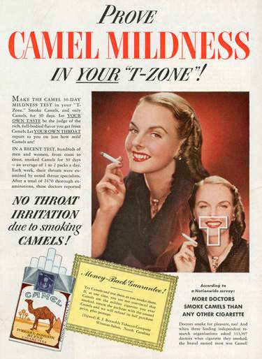
Fig.2
‘Prove Camel Mildness in Your “T-Zone”!’
Advertisement for Camel cigarettes
Published in Life, 17 January 1949, back cover
The source of de Kooning’s collaged lips in Study for Woman I had been identified in critic Thomas B. Hess’s 1959 monograph on the artist, a source that offers considerable scope for rereading via Rosenquist’s legacy.1 Rosenquist has since denied that Silo was directly influenced by de Kooning’s example: ‘Critics and art historians may try to join the dots, but I wasn’t aware of de Kooning’s T-zone when I did Silo’, he wrote in his autobiography. ‘Everyone was copying de Kooning, trying to imitate his energy.’2 Even if Rosenquist’s recollections are accurate, contemporary viewers noticed the link between the works, and the broader connections between the two artists are worth pursuing.

Fig.3
Willem de Kooning
Montauk Highway 1958
Los Angeles County Museum of Art, Los Angeles
© Willem de Kooning

Fig.4
Willem de Kooning
Easter Monday 1955–6
Oil and newspaper transfer on canvas
2438 x 1880 mm
Metropolitan Museum of Art, New York
© Willem de Kooning
Rosenquist’s acknowledgement that ‘everyone’ was copying de Kooning might indeed extend to his own consumption of de Kooning’s legacy. He had met de Kooning – along with other abstract painters such as Franz Kline and Milton Resnick – at the Cedar Tavern, the well-known artist’s haunt in Greenwich Village.3 Fresh to New York, the twenty-two-year-old Rosenquist hung out there ‘with the sole purpose of meeting the grand masters of abstract expressionism’.4 De Kooning’s influence has long since loomed large in Rosenquist’s artistic self-positioning. In his 2009 autobiography, for instance, de Kooning’s name appears roughly twice as many times as Andy Warhol’s, and it is indeed possible to connect the planar fragmentations of Rosenquist’s mature style to de Kooning’s example.5 For example, art historian Thomas Crow has made the convincing comparison between Rosenquist’s compositional tactics and broadly painted de Kooning landscapes like Suburb in Havana 1958 (private collection) and Montauk Highway 1958 (fig.3).6
But a work such as de Kooning’s Easter Monday 1955–6 (fig.4) might have had an even more direct resonance for Rosenquist as he imagined making the leap from the billboard to the gallery. Purchased by the Metropolitan Museum of Art soon after its first exhibition at the Sidney Janis Gallery in New York in 1956, the work’s acquisition had been at the recommendation of Robert Beverly Hale, one of Rosenquist’s teachers at the Art Students League. With its obvious and legible (though reversed) imprint of newspaper into the picture, Easter Monday literally registers the presence of the mass media sources that Rosenquist would go on to embrace. Visible on first-hand inspection, its advertisements for Cole Porter’s movie musical Anything Goes and cinemascope epic Alexander The Great, both released in 1956, with the latter starring Richard Burton as ‘the colossus who conquered the world’ (although only the first two words of the slogan remain legible in de Kooning’s work), elevate the kind of consumer imagery Rosenquist was then painting on movie billboards into the space of the gallery and the museum.7 As pop took over the New York art world, de Kooning drew his distinctly pop-style titles for works such as Big Gains 1964 (private collection) from the advertisements in the underlying newsprint.8

Fig.5
James Rosenquist
Untitled 1956
Acrylic, watercolour and india ink on paper
645 x 978 mm
Private collection
© James Rosenquist
Whether or not the presence of commercial sources in de Kooning’s art piqued Rosenquist’s interest, his initial engagement was – like many artists in mid- to late 1950s New York – wholly more imitative. Rosenquist’s 2003 retrospective included several small abstractions, such as Untitled 1956 (fig.5), whose palette and brushy yet carefully interlocking composition owes much, I would argue, to de Kooning’s example. The problem of de Kooning’s imitation by up-and-coming artists like Rosenquist was a topic with which Hess’s book directly engaged. ‘As de Kooning’s influence spread, it was diluted’, he wrote. ‘Today young painters blow up enormous pictures after a glimpse of small de Kooning sketches’, he claimed, noting that many imitations were based on ‘reproductions from magazines and newspapers’. The result, Hess thought, was that ‘the image of de Kooning’s work is distorted by exposure to its half-understood by-products’.9 But while Hess thought that the ‘by-products’ of de Kooning’s imitators were corrupting the meaning of his works, he paradoxically located considerable power in de Kooning’s own incorporation of material from the sphere of consumer imagery.
Like Rosenquist, de Kooning had begun his career as a sign painter.10 Hess describes how his early study of commercial lettering re-emerges in his abstractions, rendering the shapes of the alphabet ‘ambiguous’, suggesting at once ‘the letters of signs, ads, signatures, Tenth Avenue graffiti, a jotted note, sky-writing (BEER, 1,000 feet long, ineffably dissolving in the blue haze of the city)’.11 De Kooning’s use of colour equally capitalised on ambiguities derived from his engagement with popular sources. As Hess explained it, de Kooning favoured colours drawn from ‘the most banal and obvious’ places.12 On one occasion, de Kooning had indeed claimed that his palette had been inspired by the ice-cream flavours at the hotel and restaurant chain Howard Johnson.13 Here again, the similarity with Rosenquist’s own commercially derived language of colour is striking. Rosenquist would later speak of ‘dirty bacon tan’, or ‘yellow T-shirt yellow’, or ‘Man Tan suntan orange’. Consumer products served as chromatic surrogates for Rosenquist’s clients too: the artist recalls, for example, being told to add ‘milk’ to an image, or ‘more malt’ to a glass of whiskey.14
Above all, it was de Kooning’s women that Hess thought embodied his interest in the imagery of the billboard, references that most directly shed light on Rosenquist’s activation of his legacy. ‘The Women are “cousins” of the billboard goddesses’, Hess wrote in his characteristically fertile prose; a kind of American royalty ‘hiccupping with Byzantine dignity, rulers of a country that names its hurricanes “Hattie” or “Connie”’.15 Perhaps it was the memory of such vivid analogies that caused one critic to regard Rosenquist’s use of the T-zone motif in Silo – far from its self-consciously vulgar origins – as having ‘brought into being a creation of almost archetypal, mythical resonance’.16 In the oft-quoted passage of Hess’s book that most directly addressed his collaged mouth from the T-zone advertisement, de Kooning was claimed to have
indicated that his women are sisters to the giant ladies (girls?) that are pasted on mailtrucks and billboards – enormous public goddesses of droll sex and earnest sales pitches. He has also pointed out that the Women are masked by the ‘American smile’ – that ubiquitous, vacant, friendly, distant, polite expression (in one sketch for Woman, her smile was cut out of the ‘T-zone’ ad for Camels in Life magazine.)17
As this description discerns, de Kooning’s women were not quite the same kind of smiling billboard spokeswomen that Rosenquist was painting for a living. They were her ‘cousin’ or a ‘sister’, perhaps even the ‘bad girl’ of the family. In his book on Times Square cultural historian Marshall Berman cites de Kooning’s ‘raucous’ women (along with the covers of pulp fiction novels) as symptomatic of a ‘widespread yearning for “bad girls”’ at mid-century, desires in opposition to the healthy ‘cheerleading-type’ stereotypes favoured by American advertisers.18 If de Kooning’s incorporation of the T-zone served to establish the family relation that Hess identified, it also sought to resist such clean-cut clichés by incorporating it into a more unruly picture of bodily excess – and perhaps an erotic one, at least in the eyes of the male viewer that arguably stands as its assumed viewer.
De Kooning loomed large for Rosenquist, but he was hardly less prominent for early historians of pop seeking to construct a usable past for the movement. As art historian Richard Shiff has described, even Hess himself came to understand de Kooning’s incorporation of commercial sources as having preempted the subsequent (and, in his eyes, less original) tactics of pop.19 Such links offered a valuable avant-garde lineage for pop. Here, for example, is Sidney Tillim writing in Artforum in 1965: ‘Action painting as a movement may be finished, its aura of crisis repudiated, but the artists themselves remain to be dealt with, especially de Kooning, whose difficulties over the past decade recapitulate all of the frustrations which finally found an outlet in Pop Art.’20 For pop, it was de Kooning’s various incorporations of popular sources that seemed most worthy of emulation. In the case of Silo, critic Mario Amaya’s early survey of the movement in Pop as Art: A Survey of the New Super Realism (1965) appears to have been the first to use the T-zone to draw a specific connection between Rosenquist and de Kooning. Describing the impact of de Kooning’s work on pop, Amaya observed of Study for Woman I that ‘the same T-Zone symbol was to appear later in James Rosenquist’s work’.21
As his denial of any knowledge of the prior artistic use of the T-zone would suggest, Rosenquist’s engagement with de Kooning must also be tempered by its simultaneous status as a rejection of his artistic legacy.22 ‘I worshipped Willem de Kooning and Pollock and Franz Kline, but I never wanted to look as if I were copying someone else’s style’, Rosenquist has recalled.23 ‘I wanted to do something new.’ As he told critic Lucy Lippard in 1965, in terms that sound equal parts hard-edge and pop painter, his style sought to ‘avoid the romantic quality of paint and keep the stamp of the man-made thing’.24 ‘All the young artists around were splashing paint, and then when I saw what Jasper [Johns] was up to, I thought, you don’t have to do that’, he later explained.25 This evacuation of expressive force in favour of a cooler, more neutral sensibility was also conceptualised in commercial terms. Rosenquist stated that he wanted to paint his works ‘so well that they might sell something, as though it has to be done by noon on contract’.26 Although Rosenquist did frequently revise his early works, the crucial point was that they needed to appear pre-planned and efficient. ‘I thought I would be a stronger painter if I made most of my decisions before I approached the canvas; that way I hoped for a vision that would be more simple and direct’, he explained to curator Gene Swenson in 1964.27

Fig.6
Robert Rauschenberg
Erased de Kooning Drawing 1953
San Francisco Museum of Modern Art, San Francisco
© Robert Rauschenberg
Silo itself stands as evidence that revision and erasure were as central to Rosenquist’s art making as they were for de Kooning. If once a painting was finished ‘it still bothers the hell out of me, it’s not the end of a sequence for me, it’s a beginning’, Rosenquist stated in a 1967 interview with Swenson.28 According to another source Rosenquist’s revisions could unfold at a ‘breakneck speed’ – with ‘sometimes as many as five major changes a day’.29 The overpainting of the woman’s face in Candidate that Rosenquist undertook to make Silo undoes the skilled labour of his slick, enlarged reproduction of an advertising image – without the torment of de Kooning’s painterly labour, certainly, but nonetheless supplanting the work’s initial realism with something more fragmentary and abstracted. In this sense, Rosenquist’s pictorial reduction bears some relation to the simultaneous gesture of rejection and homage that has come to be epitomised by Robert Rauschenberg’s 1953 Erased de Kooning Drawing (fig.6), in which a lavish display of labour is devoted to expunging the marks of the master.
By way of further example, consider Rosenquist’s account of the practices of an unnamed painter with whom he shared a studio early in his career:
At one time I shared a loft with another painter. He would paint all day long. Then at night he would study his work, shake his head in disgust, and proceed to scrape the paint from the canvas. This went on for days. He would paint all day and scrape everything down at night. This process seemed to make the artist an unnecessary middle man. Why not just pour the paint on the floor and leave the canvas clean?30
Even if Rosenquist is describing someone in particular, his target also seems more generalised. Skill and efficiency are certainly at stake here: this is why Rosenquist would even claim that he preferred blank canvases to the idea of the painter as a tormented ‘middle man’ for his medium. His caricature of the processes of abstract expressionism bears comparison to the account of de Kooning’s methods as canonised in Hess’s monograph:
De Kooning can make a painting in a day, scrape it off in a few minutes, paint it again the next day – a painting a day for a year on the same canvas. He never paints over old pictures … De Kooning always keeps the surface fresh, painting up from clean canvas or paper. But if you paint on the same canvas again and again, ghosts of old pictures begin to haunt it.31
This is the kind of rhetoric that Rosenquist’s techniques unambiguously rejected, even if his paintings still relied upon processes of revision. But if ever a work of art was haunted by the ghost of its past incarnation, it is Silo; with its obliterated face now so unavoidably showing through its pale blue field, presenting an unavoidable trace of the alterations that Rosenquist’s supposedly pre-planned technique was meant to avoid. Rosenquist’s first version of this artwork, Candidate, returns to haunt its eventually more abstract realisation – as though the persistent memory of its figurative content can, like the residue of Rauschenberg’s iconoclastic drawing, never be properly erased.
Just as Rosenquist was ‘seeing abstraction everywhere’ in this period, the idea that recognisable content would somehow emerge from within even the most declaredly non-objective art typifies the artist’s interest in the borders between abstraction and figuration, as is suggested by an anecdote he tells concerning a gallery visit with Hans Hofmann:
I saw an exhibition at the Howard Wise Gallery on West 57th of this old artist whose teacher had been Hans Hoffman [sic]. And Hans Hoffman [sic] walked into the room … He said to this man who had been his student, ‘What’s that there?’ And he replied, ‘It’s winter solstice’ or something like that. And Hans says, ‘looks like Popeye to me. Looks like Popeye sitting in a chair, see, see his head.’ And there was Popeye. He had a pumpkin head, a stick body, big feet, hands, and it was supposed to be totally non-objective painting. Only colors. Feeling. And it embarrassed the man and from there onward there was Popeye.32
The idea that even an artist as self-consciously serious and elite as Hofmann would make out the popular spinach-munching sailor in a work of abstract expressionist painting – probably a work by George McNeil or Milton Resnick, the two former Hofmann students who showed at Howard Wise Gallery in this period – evidently appealed to Rosenquist. In the wake of pop, nothing in the gallery would quite seem the same again: abstract painting henceforth looked like comic strips, even to modernism’s staunchest advocates. Rosenquist’s playful and often parodic engagement with abstraction cuts across much of his work from this time, evidencing a self-consciousness about the position of pop within the broader stylistic domains of painting in the early to mid-1960s.

Fig.7
James Rosenquist
Woman I 1962
Private collection
© James Rosenquist
In Silo, the blankness of Rosenquist’s blue field equally refuses to obliterate the recognisable reference points of its underlying image. This tension is something that was embraced by de Kooning’s own incorporation of popular sources, but Rosenquist’s engagement with such images evinces a more diagnostic engagement with their commercial functions.33 As Lobel has observed, Rosenquist ‘certainly recognised the gendered dynamics of advertising, the way women – and more specifically, women’s bodies – were consistently used to sell products’.34 Rosenquist’s own Woman I 1962 (fig.7) – a title that can hardly have been selected without knowledge of de Kooning’s by-then iconic precursor – returns forcefully to the ‘good girl’ clichés that its predecessor eschewed, layering three equally generic female mouths as if to emphasis their bland interchangeability.

Fig.8
James Rosenquist
Untitled (Joan Crawford Says…) 1964
Museum Ludwig, Cologne
© James Rosenquist

Fig.9
‘Joan Crawford says – “I’ve made those mildness tests you’ve read about – my choice is Camels!”’ Advertisement for Camel cigarettes
Published in Life, 27 August 1951, back cover
For Untitled (Joan Crawford Says…) 1964 (fig.8), a work displayed with Silo in his Dwan Gallery exhibition in Los Angeles in 1964, Rosenquist also focused his attention on a woman from a Camel cigarette advertisement – in this case, an endorsement by actress Joan Crawford.35 This work relegates the cigarette that was the pictorial focus of the original advertisement – which also used the T-zone graphic among its imagery (fig.9) – to a cropped lower corner of the composition. The painting is unusual in preserving its source unaltered, the artist being satisfied, perhaps, that the fragmentations of its design elements and vacant airbrushed finish sufficiently realised Rosenquist’s pictorial incongruities in ready-made form. ‘What holds him about the head of Joan Crawford in a cigarette-ad fragment’, one critic observed of the artificial quality of this picture, is ‘the machine-like phoniness of its split lids and its mouth of plastic smoothness’.36 With its glassy eyes and bland, mask-like visage, Rosenquist’s female face arguably comes closest here to the flattened, standardised effect achieved in Andy Warhol’s screenprints of Marilyn Monroe.
Fig.10
James Rosenquist
Marilyn Monroe I 1962
Museum of Modern Art, New York
© James Rosenquist

Fig.11
James Rosenquist
Study for Marilyn 1962
Private collection
© James Rosenquist
Like Warhol (and de Kooning before him), Rosenquist had also turned his attention to Monroe, and these works proved instructive in establishing the unusual character of the female faces in Candidate and Untitled (Joan Crawford Says…).37 Consider his Marilyn Monroe I 1962 (fig.10) in which four fragments of the famous star refuse to cohere into much of a recognisable likeness, or his Study for Marilyn 1962 (fig.11), which uses a drinking glass – ironically rendered as opaque rather than transparent – to obscure the upper portion of the subject’s face. By painting over the mask-like face of Candidate, in Silo Rosenquist followed this tendency to fragment and obscure the female subject. It is significant that Silo retains two identifiably female hands: the carefully posed fingers that hold the cigarette and plastic wrap. ‘Hands for me have always been sort of an offering, a suggestion saying 2 cents off, buy this, try a new steam iron’, Rosenquist has explained, linking the image of the hand to the presentational conventions of the advertisement. Their frequent inclusion in his works functioned, Rosenquist explained, as a ‘powerful gesture that people would recognize’ from such consumer imagery.38
To regard Silo as an image of consumption, even with the majority of its original face obscured, is to understand the phenomenon at its most bodily level: the T-zone emerges as a kind of throat through which products are literally consumed. This is now startlingly corporeal in Silo: as the lips from the underlying painting have become increasingly visible through the surface of the picture, their location is such that the cocked fingers in the T-zone of Silo appear to be inserted into the mouth of the underlying painting, an almost erotic interaction between the two versions of the picture. The T-zone is itself a kind of x-ray in Silo, revealing the stuff being consumed, rather than merely framing the passage through which it moves.
In Rosenquist’s reimagining, the alimentary function of the throat plays on an ambiguity inherent in the idea of swallowing something. This signifies both the real digestion of consumable products (albeit, in this case, plates and plastic wrap, rather than the food for which they were intended), but also, more metaphorically, the idea of a consumer swallowing the claims of advertising. Indeed, when Tate curator Ronald Alley discussed Silo with Rosenquist, he jotted down a phrase that it is especially resonant in this regard, noting that the images in the work were ‘digested – almost fermented’.39 If Rosenquist did imagine that his lurid clippings might, in the condensed collage of the T-zone, somehow blend and ferment, Silo might even emerge as an image of the consumer intoxicated by (and perhaps even addicted to) the promises of Madison Avenue.
The transformation of this painting from Candidate to Silo makes the possibility for advertising to transcend either need or logic even more insistent: by painting over the head of his first version, Rosenquist rendered the blinding indoctrination of advertising at its most powerful. This consumer is literally unable to see the stuff she swallows. Rosenquist explained to Alley that the advertisement and the chair in Candidate were ‘for brainwashing’.40 The act of overpainting Silo extends this principal, literally submerging the head of its subject in a haze of blankness. Read in this way, Rosenquist’s representation of the mindless female consumer verges on sexism. But for all its participation in period stereotypes, its inflation of the clichés of cigarette advertising – the erotic focus on the mouth of the smoker, the almost pornographic rendering of the cigarette as an instrument of pleasure – can also be seen to lay bare such manipulations. As Rosenquist writes in his autobiography, reconstructing his views some fifty years later:
I’d see the Camel T-Zone ad with its surreal cut out around the smoker’s mouth and wonder, what is that? It had an endorsement that said ‘More doctors say Camels have less tar than any other cigarette.’ This was long before the connection had been made between smoking and cancer, but anybody could see how stupid this was – you already knew that cigarette smoke wasn’t any good for you. You just had to laugh at all this magazine advertising. It was so strange. What was Madison Avenue doing? It was on another planet.41
Since the mid-1950s, the health risks of smoking had become a matter of widespread public interest and concern. Selecting cigarette advertising at its most outrageous, Rosenquist’s use of the Camel advertisements engaged with its most questionable persuasive tactics. The timing of such attention was no accident: it was in early 1964 that American cigarette advertisers were threatened with government regulation. Released on 12 January, the same day as Rosenquist’s exhibition opened at Green Gallery in New York, the Surgeon General’s report entitled ‘Smoking and Health’ represented an official confirmation of the link between smoking and cancer. The story made front-page news across the country.42 The Federal Trade Commission responded quickly with a proposal that cigarette advertisements ‘contain a clear warning that cigarette smoking is dangerous to health’ and ‘prohibit any statement or implication … that smoking promotes good health or physical well-being’.43 In response to the proposal, the cigarette industry developed its own self-regulatory framework to ward off government controls, but even this more loosely worded plan forbade the use of unsubstantiated health claims, and banned any suggestion that smoking was ‘essential to social prominence, distinction, success or sexual attraction’.44
While Candidate was on display at Green Gallery, these regulations were the country’s leading news story. It is not difficult to imagine that the subject was on the lips of those in attendance – perhaps even those who can be seen smoking in the film footage of the opening night crowd.45 What is crucial here is that Rosenquist’s use of the T-zone, an advertisement whose copy combined the promises of success and health in its boast that ‘More Doctors smoke Camels than any other cigarette’, represented precisely the kind of claims that the impending controls sought to abolish. By painting over the majority of the work in its revision for Silo in mid-1964, in advance of its exhibition in Los Angeles at the end of the year, Rosenquist was, in a sense, registering the cultural impact of this regulatory change, subjecting his painting to the limitations facing the cigarette industry and their advertising agencies, rules that rendered many of the selling points used in the Camel advertisements from which he drew impossible to repeat. Furthermore, by painting the objects of consumption being swallowed by his subject, Rosenquist remakes the T-zone overlay into a wholly more disturbing cutaway, allowing the viewer to peer inside the subject’s vulnerable throat, like an x-ray on American consumer culture.
If de Kooning’s use of the T-zone had mainly read as an incorporation of vulgar popular imagery, period viewers of Silo understood it to hold a more specific significance in relation to the context of the ‘cancer scare’ – as the industry liked it to be so provisionally termed. As a reviewer in Artforum explained, Silo was thus ‘current by association’:
Two large panels that derive from old ‘T-zone’ ads become current by their association with the lung cancer fuss. They are about a pretty lie from a day for which we might long, a day when the simple pleasure of smoking was not accompanied by a reasonable certainty that we are committing suicide in the process. Nobody can say for sure that this is Rosenquist’s idea. He doesn’t force it … If we cannot be sure he is concerned with cancer we can be sure he is with consumption. Mass consumption of artificial goods.46
In other instances, Rosenquist’s work was indeed understood to critique the values of American consumer culture. ‘The artist clearly does not like what he paints’, wrote Mario Amaya in 1965.47 Rosenquist himself would eventually connect his chosen imagery with ‘the rejection of material things’ that characterised the countercultural values of the 1960s.48 But one should not too firmly accept such attitudes. ‘Far from being an art of social protest, it is an art of capitulation’, was how art historian Dore Ashton understood Rosenquist’s art in 1962.49 One could certainly find ways to support such a view. In 1965, for instance, Rosenquist accepted a commission from cigarette manufacturer Philip Morris to produce three prints for their 11 Pop Artists portfolios. The artist posed with senior executives from the tobacco company for promotional photographs, and even received a carton of cigarettes from the public relations agent of his patron as a thank-you gift.50 While making artworks that might seem to condemn consumer waste, he also accepted a commission from packaging manufacturer Container Corporation of America, and revised the work according to their demands.51

Fig.12
Front cover of Playboy, October 1963
Nor can one assume that Rosenquist’s use of the female image was straightforwardly critical of the visual culture of the female consumer on which it drew. In 1966 Rosenquist was among the pop artists who produced work for Hugh Heffner’s Playboy magazine, a painting reproduced in a January 1967 feature titled ‘The Playmate as Art’.52 Many of the most important figures of pop painting – including such unduly neglected artists as Rosalyn Drexler and Marjorie Strider – had played with the clichés of the pin-up in their contributions to the important First International Girlie Show held at New York’s Pace Gallery in 1964. Rosenquist’s images of the female body do establish more ironic distance from their objectifying sources than works by artists such as Mel Ramos or Allen Jones. But the fragmentation of the female body that Rosenquist so frequently applied to such images equally conforms with the same sort of tactics used in his commercial sources: in an image of Rosenquist’s studio from around the time of his Playboy commission, for example, the cover of the October 1963 issue of the magazine – with its own field of misty blue and erotically charged hand gesture – is visible on the floor (fig.12).53 With its strong horizontal compositional break, it is not difficult to imagine the image catching Rosenquist’s eye, its play between exposure and disclosure perhaps reminding the artist of the act of veiling by which the female subject of his own Candidate had been effaced.
The layered form of Silo appears both dense with references and yet ultimately of uncertain meaning, and perhaps the same ambiguities can serve to characterise Rosenquist’s attitudes towards his sources. Silo hedges its bets between the abstraction of colour field painting and the realism of the advertisement, and even between painting and sculpture itself, making it difficult to plot its position according to such conventional polarities. Even apart from their shared use of the T-zone, Rosenquist and de Kooning both made pin-ups that are hard to pin down. While Rosenquist may have later stated that the claims of the Camel advertisement from which he drew were unequivocally ‘stupid’, the more hesitant interpretation of the work given in Artforum provides a more accurate sense of the insecure motives that works such as Silo suggested to its period viewers. ‘Nobody can say for sure… he doesn’t force it’, was how works such as Silo were viewed in 1964. The idea that consumers somehow long to be able to swallow the ‘pretty lies’ of advertising, even when their claims seem thoroughly untenable, is the equivocal view of consumption that Rosenquist’s use of the T-zone faces head on.