In a photograph taken by Hans Namuth in the second half of 1963 for Vogue magazine (fig.1), Kenneth Noland’s Gift (Tate T00898) is seen hanging in the seventeenth floor New York apartment of the art critic Clement Greenberg.1 The giant canvas is positioned above the desk, the surface of which is covered with stacked paperwork, desk lamps and a world globe. The giant scale and mesmerising centralised design of the painting appears, in this context, disturbingly close to where Greenberg’s field of vision would have presumably rested when he sat down to write.2 Greenberg could have turned to his left and his view of Central Park for some optical relief, but otherwise Noland’s picture dominated the corner of his study, reinforcing the assertive power of the work’s design. In the photograph, Gift contrasts with the bookish clutter on the desk, hovering in front of the eternally absent body of the critic, the very vision of the bold colour, open form and flat composition that Greenberg regarded as ‘the only way to high pictorial art in the near future’.3

Fig.1
Hans Namuth
Clement Greenberg’s apartment, New York, 1963
Reproduced in ‘A Famous Art Critic’s Collection’, Vogue, 15 January 1964, p.94
What might the history of Gift tell us about Greenberg’s taste, and its impact on painting in the 1960s? What can the presence of works by Noland in the Vogue photo-spread on Greenberg’s apartment suggest about the relations between abstract painting and tasteful decoration in the 1960s? Although it is not clear when the work was received by Greenberg, its original title of Clement’s Gift conforms with those that Noland chose for several other works given to friends, including Tony’s Gift 1966, given to sculptor Anthony Caro, and Alkis’ Gift 1967, given to Alkis Klonaridis, the director of the Toronto-based David Mirvish Gallery that represented Noland.4 Noland’s titling convention not only indicates the status of these objects as an offering, but also subtly serves to flatter his ‘gifted’ recipients. Whether possessed by Clem, Tony or Alkis, it was the vision that these supporters demonstrated to Noland that his titles served to avow, a kind of testament to their superior taste. Noland understood such good taste to be central to understanding works of art. He later explained, ‘I think judgment’s crucial … and that has something to do with taste’, adding that, ‘Taste: we use it in the negative sense, but there is the best taste, you know. There’s the right taste. There’s the real taste.’5 Noland’s awareness of the contested status of taste reflects the central position of the term in the reception of his art.

Fig.2
Cover of Three New American Painters: Louis, Noland, Olitski, exhibition catalogue, Norman Mackenzie Art Gallery, Regina 1963
If Gift stood, at some level, for the superior judgement of Noland’s chief promoter, Greenberg himself would repay the compliment by actively using the picture in his efforts to promote the artist. In January 1963 Greenberg sent the work to be included in an exhibition he curated for the University of Saskatchewan at the Norman Mackenzie Art Gallery, Regina, titled Three New American Painters: Louis, Noland, Olitski. The shortened title of the painting was used in the exhibition catalogue (fig.2), suggesting that it had already been given to the critic by this date, although Greenberg’s catalogue essay implies otherwise:
Two of the Louises, Gamma and Number 33, have not been seen anywhere before; nor have two of the Nolands, New Problem and Gift. Eventually these pictures will be shown in many other places (if they are not sold too soon.)6
The text is not exactly misleading but is an example of Greenberg’s freewheeling boosterism, which was also evident in his recent foray into the commercial gallery scene as contemporary art advisor to dealers French and Company, in which role he organised exhibitions for both Noland and Louis.7 The essay also doubly obscures Greenberg’s ownership of Gift: the swift revision of its title from Clement’s Gift and its crediting to a private collection (somewhat contradictorily to its simultaneous representation as unsold) maintain its indeterminate ownership and obscure Greenberg’s affiliation with the artist. In the case of Gift, Greenberg’s allusion to its future exhibition and its possible future sale disguised the fact that it was the critic himself who exercised substantial control over these prospects.

Fig.3
Cover of Quattro Pittori Germinale/Four Germinal Painters, exhibition catalogue, Stati Uniti d’America, XXXII Esposizione Biennale Internazionale d’Arte, Venice 1964
A year later Greenberg lent the work for display again, this time at the thirty-second Venice Biennale, which opened in June 1964. In this exhibition Gift was involved in a landmark judgement of American art in the 1960s. Greenberg’s picture was one of thirteen Noland works – mainly from his circle series of 1958–62 – included in the national exhibition in the American Pavilion in the Giardini. Many observers considered curator Alan Solomon’s core selection of Noland, Louis, Johns and Rauschenberg for the exhibition Four Germinal Painters (fig.3) to represent a public contest between pop and the kind of abstract painting advocated by Greenberg. As a letter from Noland to Greenberg reveals, this competitive situation was not just in the mind of the critics:
Nothing but confusion here so I took off to Paris for a week, got back today and there’s more confusion. I got a collect call from Alan [Solomon] at Larry’s [dealer Lawrence Rubin] today saying he had decided to put Rauschenberg and Johns in two of the rooms at the pavilion and to put part of our pictures in the consulate. I told him I’d yank my pictures if he did, so he had to abandon that idea. So now he’s having a roof built over the court in front of the pavilion for R + J [Rauschenberg and Johns] and one picture each by the other guys. He’s so eager to try for a prize for one of them he can’t see straight. Bill Seitz (sp?) Museum of Modern Art was asked to be on the jury for America, but refused so Alan is proposing Alice Denney. They are planning the Ambassadors party and a press party at the consulate but none at the pavilion. I wash my hands of them. I told him off and will hand our pictures then I’m finished with it. You all were right and I was wrong.8
If Greenberg had predicted such problems, Solomon’s catalogue essay confirmed his loyalties, positioning Noland’s art as a kind of traditional modernism against which, in his view, the ultimately more radical achievements of Rauschenberg and Johns could be measured. Noland’s insistence that his work be shown in the main pavilion had major implications. It meant that Noland’s art ‘stood by itself in all its austerity’, as critic Gene Baro described, its seriousness appearing ‘more enshrined than exhibited’.9 But it also required Rauschenberg’s altogether less ascetic works to be relocated to the consulate building, outside the Giardini, jeopardising his eligibility for a prize. Noland’s act of refusal might even have secured the Grand Prize for him had it not been for Solomon’s prejudices. According to art historian Calvin Tompkins, dealer Leo Castelli claimed that should Rauschenberg have been found ineligible due to the exhibition of the majority of art outside of the main pavilion, ‘the award might go to another American – to Noland’ as a form of ‘recognition of the superiority of American painting in general’.10 In response, Solomon reputedly announced that ‘if Rauschenberg were disqualified, he would remove all the Americans from competition’.11 In the end Rauschenberg was awarded the prize, and this controversial (or, as Solomon would himself later term it, ‘engineered’) victory represented an important signal of a loosening of Greenberg’s tight grip on vanguard tastes.12
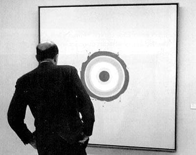
Fig.4
Clement Greenberg looking at Kenneth Noland’s 1960 painting Nieuport, c.1974
Photo © Cora Ward

Fig.5
Kenneth Noland
Blush 1960
© Kenneth Noland

Fig.6
Kenneth Noland
Spring Cool 1962
Private collection
© Kenneth Noland
Greenberg’s own evaluation of Gift might seem to have been secure by virtue of its prominent position in his office, but another little-known source provides a more precise account of Greenberg’s judgment of the painting in relation to Noland’s larger body of work. By early 1965 Gift was back in the United States, and the critic lent his work again for inclusion in Noland’s solo show at New York’s Jewish Museum. The work was again credited to a private collection. When Greenberg visited this show he recorded his impressions of the works in his personal copy of the exhibition catalogue. Many of the pictures are marked with single or double ticks, apparently indicating his judgment.13 It is tempting to imagine the scene via a widely reproduced image of the critic confronting Nieuport 1960 (fig.4) at the Museum of Modern Art international programme exhibition Two Decades of American Painting during its 1966 Tokyo run, in which he is seen contemplating the visual subtleties of Noland’s concentric forms. In the 1965 Jewish Museum catalogue, however, Gift was not among the eight works that received two ticks from the critic: despite his ownership of the work, it received only one. Nor did it merit the further (albeit cryptic) description he noted of other pictures. Blush 1960 (fig.5) and Winter Sun 1962 were ‘sweet in a good way’, while Spring Cool 1962 (fig.6) was ‘dreamy in a good way’. Other works, noted Greenberg of several pictures that did not earn a tick, ‘suffer under comparison’. Perhaps Greenberg’s silence on the work simply reflects his familiarity with a piece in his own collection, but it also suggests the possibility that Greenberg’s own preferences within Noland’s oeuvre had moved on.
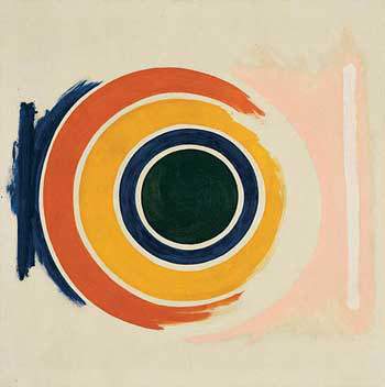
Fig.7
Kenneth Noland
No. One 1958
Portland Art Museum, Portland
© Kenneth Noland
Greenberg’s papers do not shed any light on why he swapped Gift for another work by the artist at an unknown date in the early 1960s, but these catalogue notes do indicate that, by 1965, he thought Noland capable of better paintings than the one that had hung above his desk. Of the works by Noland that remained in Greenberg’s collection when it was purchased by the Portland Art Museum from his estate, only four have dates of 1965 or earlier, which can therefore be considered possible substitutions.14 Of these the most likely candidate is No. One 1958 (fig.7). Given the critic’s important role in establishing Noland’s career, the foundational claims of this work’s title might have been particularly appealing, and perhaps even reminded him of other important artists that had favoured such origin claims in the titles they chose.15 No. One has indeed been claimed as the artist’s ‘first stained target painting’.16 Noland’s generous inscription on the reverse of the canvas equally sounds like a gesture of thanks appropriate for a work given as a gift. It reads, ‘To my friend Clem who has more to do with it than anybody’.17

Fig.8
Label from reverse of Gift
Photo © Tate
If we can speculate that Greenberg agreed to return Gift to Noland in exchange for a painting he deemed of superior quality (worthy, perhaps, of more than just one tick) or an earlier work of clearer art historical significance, the details of its donation to Tate in 1966 paradoxically confirms the artist’s own high regard for the picture. After the acquisition of Drought 1962 (Tate T00763) in 1965, Noland’s accountant and advisor Bernard Reis wrote to the gallery on the request of the artist: ‘Noland is of the opinion that he can be better represented in your collection by one of his later pictures and would like to donate one of his circle pictures’.18 Once Gift was agreed for acquisition Reis followed up to confirm its delivery and to further emphasise its significance, writing ‘I am quite sure … that when you see the picture you will realize why it is much greater importance than the picture now owned by you’.19 Reis’s surely tantalising remark might have concerned the aesthetic quality of the work, which would only be visible to Tate staff once they saw the canvas for themselves, but equally it could have alluded to the important detail hidden on the rear of the canvas: Noland’s inscription ‘Clement’s Gift’, and the residual label from the Venice Biennale indicating that the work was from Greenberg’s collection (fig.8).20 The illustrious provenance of the picture certainly bolstered its significance.
Greenberg’s views continued to matter for those selecting works for the Tate collection.21 Noland’s broader marketability was likewise reliant on Greenberg’s critical praise, as Noland’s dealer Andre Emmerich observed: ‘In the 1960s, word of mouth that an artist was well-regarded by Clement Greenberg often translated into commercial success’.22 The benefits that flowed from Greenberg’s support could hardly have been surer, but it was attention that would eventually become, as Emmerich attests, a ‘handicap’.23 As early as 1966, Solomon – whose support for Rauschenberg over Noland had played such a key role in the Venice Biennale – would inform the readers of Vogue that Greenberg had come to be regarded by his ‘harsher critics’ as ‘a dictator, or the pope of a new church’ and had ‘even been accused of telling artists how to make their paintings’.24
Greenberg’s influence on the making of Noland’s art was hardly a secret. When Noland had first met him at the summer session at Black Mountain College in 1950, he had responded well to Greenberg’s evidently forthright studio critiques. As fellow artist Cora Kelley Ward later recalled:
I saw Ken at the very beginning at Black Mountain College when Clement Greenberg was there, and I saw what he was painting and I saw him begin to understand Clem’s criticism much sooner than I did. He just, he seemed to listen and want to try that, try that; and I was also painting, but I felt it was an intrusion that Clem would say try that, try that … Ken just tried it.25
By the 1960s the sense that Noland’s art merely illustrated Greenberg’s views was an allegation that both artist and critic were forced to confront.26 In Greenberg’s words, his suggestions to the artist were ‘almost always … to tell him not to add anything more rather than to subtract something already there’.27 Art historian William Rubin’s account of Greenberg’s studio visits to Noland was roughly similar: ‘Once in a while, Clem might have said, “I think you have too much white around this canvas,” and sometimes Noland agreed or even later decided he had been right, but that Clem made the final aesthetic decision is absurd … Ken Noland struck me as one of the most headstrong individuals I ever met.’28 But Noland was resolute in his support of Greenberg’s gifts. ‘I would take suggestions from Clem very seriously,’ he stated. ‘More seriously than from anyone else. I don’t mind admitting that. I’m grateful for it. I’ll take anything I can get that will help my art.’29 Anti-Greenberg sentiment was set alight in 1974 by the revelation that he had stripped paint off sculptures by the late David Smith, and despite this Noland showed his support for the beleaguered critic by declaring that he would still not hesitate in making Greenberg the executor of his own estate.30
In the early 1960s Greenberg’s advocacy of Noland’s work had hinged on his understanding of the artist’s escape from the tasteful formulae of late abstract expressionism, a style he thought had degenerated into ‘ready-made effects’.31 ‘Painterly Abstraction has collapsed’, Greenberg explained, ‘because in its second generation it has produced some of the most mannered, imitative, uninspiring and repetitious art in our tradition.’32 It was, according to critic and curator Lawrence Alloway’s caricature of Greenberg’s views, ‘a cul-de-sac’ in the history of art.33 Greenberg instead advocated an approach to abstract painting that ‘puts the main stress on color as hue … Harking back in some ways to Impressionism, reconciling the Impressionist glow with Cubist opacity, this newer abstract painting suggests possibilities of color for which there are no precedents in Western tradition.’34 It is not difficult to imagine the glowing circle of Noland’s Gift staring down at Greenberg as he sat at his desk and attempted to look into the future, imagining, as he put it, ‘an unexplored realm of picture-making’.35 Given that the essay in which he made these remarks was first published in October 1962, it is indeed possible that the work above his desk was precisely what he was looking towards.

Fig.9
Cover of Post-Painterly Abstraction, exhibition catalogue, Los Angeles County Museum of Art, Los Angeles 1964
Greenberg’s most ambitious bet on the future of modernist painting was the exhibition Post-Painterly Abstraction (fig.9), which he curated for the Los Angeles County Museum of Art (LACMA) in 1964.36 Noland was, of course, included, although Gift was not – perhaps because the exhibition’s closing date would not have allowed time for the work to be dispatched for its more high-profile exhibition at the Venice Biennale that same year.37 In his essay for the LACMA exhibition Greenberg reiterated many of his views about abstract expressionism, the so-called ‘Tenth Street touch’ that had descended into ‘a set of mannerisms’ according to which ‘a dozen, then a thousand, artists proceeded in more or less the same ranges of color, and with the same “gestures”’.38 While he lamented the downturn in the progressive quality of the work he had previously espoused, Greenberg also admitted that, like post-painterly abstraction, pop art ‘partakes of the trend towards openness and clarity’. But ‘as diverting as Pop art is,’ he wrote, ‘I happen not to find it really fresh. Nor does it challenge taste on more than a superficial level … it amounts to a new episode in the history of taste, but not in the evolution of contemporary art’.39
In the 1963 exhibition catalogue for Three New American Painters Greenberg had positioned works such as Gift as representing ‘a threat to [the] existing tastes’ of the New York art scene in particular.40 For Greenberg, Noland’s physical distance from New York helped his ability to escape the stultifying pressures of good taste. He explained that from Washington, D.C., where artists like Noland and Louis had been based, ‘you can keep in steady contact with the New York art scene without being subjected as constantly to its pressures to conform as you would be if you lived and worked in New York’.41 Greenberg claimed that artists working in Washington were then better placed to ‘challenge the fashions and successes of New York, and also its worldly machinery’.42 Such ideas were not new to the critic. ‘Isolation’, Greenberg had written in 1948, was nothing less than ‘the natural condition of high art in America’.43 In Noland’s case the ‘isolation’ of living in Washington represented – as Greenberg saw it from his Upper West Side apartment – a kind of self-imposed exile from the pressures of fashion and taste that hampered artists in New York. In this respect Gift made for a paradoxical gift to Greenberg, as it was one of the first paintings Noland made after moving from Washington to New York in 1962.
In Greenberg’s eyes, Noland’s outsider status stimulated formal innovation. For instance, his embrace of the woven texture of his support differentiated his work from both the smooth, ‘precious-object look’ of hard-edged Bauhaus abstraction that had characterised some of the modernist work by European émigrés, and the ‘mannered’ surfaces of late abstract expressionism dominant in New York.44 Both kinds of art had, he thought, been absorbed into the norms of middle class taste. Noland’s challenge to the merely tasteful was an issue to which Greenberg would return elsewhere. ‘The continuing infiltration of Good Design into what purports to be advanced and highbrow art now depresses sculpture as it does painting’, he wrote in 1966.45 Pop, op and assemblage all appeared mere ‘novelty art’ to Greenberg, although he held out hope that minimalism might ‘still take more pointers from artists like Truitt, Caro, Ellsworth Kelly and Kenneth Noland, and learn from their example how to rise above Good Design’.46
Although it can now be difficult to pinpoint precisely what about a painting such as Gift might have challenged contemporary taste, it is clear that Noland’s unusual and sometimes discordant colour combinations did hold some potential to disturb period viewers. As Solomon wrote in the catalogue essay for the Biennale, Noland was able to combine colours that previously seemed bizarre or in ‘poor taste’.47 Noting the views of critics who thought that the Biennale Grand Prize should have gone to Noland rather than Rauschenberg, Time magazine emphasised the ‘unconventional color combinations’ of his work.48 He ‘dares to parallel magenta, russet, beige and maroon in a lollipop war of taste’, the magazine detailed, continuing ‘Sometimes he rams and jams his bright color bands into asymmetrical chevrons like a Disneyland sergeant gone askew’. Such descriptions probably fit best with Noland’s chevron series of the mid-1960s (see, for instance, Blue Veil 1963, Museum of Modern Art, New York), but even late circles such as Gift evidence this same enthusiasm for jarring combinations. Yet if such ‘flamboyant color’ pushed at the boundaries of good taste, it was also the decorative potential of such chromatic spectacle that ensured, as the same article notes, that these works could function as ‘wall hangings’ or ‘avant-garde tapestries’.49
In fact, as Noland’s stature grew his paintings were also understood as precisely the stuff of tasteful decoration. One critic thought that the French and Company exhibition of Noland’s circle paintings organised by Greenberg in 1959 was ‘tasteful, well-crafted and dull’ and Greenberg adversary Max Kozloff spoke of Noland’s ‘calculated elegance’.50 The frequency of such views mounted as the decade progressed and perhaps also as Noland’s work came to be seen in the context of fashionable interior décor – whether in the plush living room of Clement Greenberg illustrated in the pages of Vogue, amid the Louis XIII decor of Andre Emmerich’s apartment, between a Chippendale chair and a Roy Lichtenstein canvas in the living room of collector Richard Baker Brown, or even ‘flush with the ceiling’ above the dining room table of the Chicago financier Patrick Lannan.51 It was the cumulative effect of such sources that meant that by the 1970s abstract colour field painting appeared to critic Brian O’Doherty to be nothing less than ‘the ultimate in capitalist art’.52

Fig.10
Kenneth Noland
Lebron 1962
Acrylic on canvas
1514 x 1514 mm
Anderson Collection, Stanford University, Stanford
© Kenneth Noland
It was critic Harold Rosenberg who would pen the most scathing attacks on the tastefulness of Noland’s circles. In ‘Black and Pistachio’, an essay in Rosenberg’s collection The Anxious Object: Art Today and its Audience (1964), the critic tackled the connection between the rise of intensely hued colour abstractions and the fads of fashionable taste. His title set the tone for his position: ‘Pistachio green’ – something like the colour at the centre of Kenneth Noland’s Gift – had been a fashionable hue in the late 1920s, and enjoyed a brief revival in the early 1960s. Describing a group of Noland’s circles shown at the Jewish Museum as an ‘overexposing showcase for an unimpressive image’, Rosenberg claimed that a painting such as Lebron 1962 (fig.10) ‘suggests by its attractive forms and savory pastel shades an enlarged season pass to some expensive club’.53 Such effects were, for Rosenberg, a symptom of the failings of the exhibition as a whole: ‘Never has mere decoration been presented with more pretentiousness and remained mere decoration’.54
Rosenberg’s claims might have sought to undermine the reputation of Noland’s art through its purported connection with elite taste, and the critic’s ever-unnamed nemesis, but it is also possible to locate Noland’s decorativeness in more historical terms. Take, for example, the 1960 show of Noland’s paintings at the Jefferson Place Gallery in Washington, D.C., his earliest circular compositions that would directly lead to Gift. The artist’s dealer Alice Denney explained the scale of Noland’s art as a kind of movable mural. ‘I think people are going to buy paintings to cover whole walls’, Denney told the Washington Post. ‘The day of wall paper will be over’, she declared, suggesting that one of Noland’s 8 x 8 foot canvases would look particularly well on the ceiling. ‘Art is moving in that direction. Art is going to surround us more than ever before.’55 Far from the wall-covering of an exclusive club, Noland’s canvases were also understood to signal a more expansive incorporation of high modernism into the spaces of everyday life.
These were not new ideas for Noland’s art. As early as 1954 the artist had exhibited with the Georgetown Artists’ Group, participating in a show that installed works in local shop windows, seeming openly to address a consumer audience for his work.56 Another of Noland’s early Washington exhibitions occurred in the lobby of the Dupont Theatre, an art house cinema on Connecticut Avenue.57 In 1958 Noland again exhibited his work in a commercial setting, hanging one of his ‘large abstract murals’ in the window of the Chevy Chase interior design shop Modern Design to show that ‘giant sized paintings can harmonise with a pint-sized room’.58 The display used ‘simple furniture with strong, bright colors’ to ‘complement the outsized painting’, with lamps and indoor plants included to ‘prove that painting of this sort can be interrupted without jarring the viewer’.59 Noland even appears to have explained how decorators might make use of his paintings, as the Washington Post paraphrased:
Most people are afraid to buy a large abstract, says artist Noland, since they feel it will overpower their homes. Actually one of these decorative paintings can fill up an entire wall and blend in with the room’s color scheme, he says.60
This cannot be dismissed as the immature sales pitch of an artist not yet attuned to the critical risks of representing his art as home décor. When Noland showed his paintings amid the sleek Danish furniture and accessories at Modern Design it was some three years after he had been selected by Greenberg for the New Talent exhibition at the Samuel Kootz Gallery in New York. Nor were Noland’s quoted views on the use of painting in the domestic interior inconsistent with Greenberg’s own vision of what works of art were for. In Vogue magazine’s look inside Greenberg’s apartment and his collection, which included Noland pictures other than Gift in his living room and nursery, the critic addressed such functions directly, stating that ‘Big abstract paintings turn out to be astonishingly easy to live with’.61 He explained how ‘Representational, illusionistic pictures of the same size, though presumably opening up the walls behind them, would eat up a lot more of the surrounding space: their contents have a way of coming forward as well as receding.’
Greenberg’s theories might sometimes seem remote from social realities, but his vision of an advanced art for a cultural elite was not incompatible with its decorative functions in the domestic interior. No less than Matisse’s (1869–1954) vision of an art that would be like ‘a good armchair’ for the ‘businessman as well as the man of letters’, Greenberg’s understanding of the therapeutic potential of contemporary art emphasised its capacity to help modern man – as he urged the readers of the Saturday Evening Post in 1959 – to ‘take time out to stand and gaze’.62 In the case of Gift, the work stood as an explicit testament to the advanced vision of Greenberg himself. As Gift was sent from New York to Saskatchewan, then Venice, back to New York, and eventually to London, it was the validity of Greenberg’s own taste that was on display.
Not only did Noland’s art conform to the modernist imperatives of his leading supporter, but it was also intimately tied to the ‘advanced’ tastes of a social elite – the wider field of patrons who had to pay for their pictures and whose predilections drove the fortunes of abstract painting in the 1960s. This relationship between post-war abstraction and its patrons has been analysed by art historian T.J. Clark. Writing on the work of Hans Hofmann, Clark writes that ‘Seen in its normal surroundings, past the unobtrusive sofas and the calla lilies, as part of that unique blend of opulence and sparseness which is the taste of the picture buying classes in America’, the paintings come to function as the ‘visceral-cum-spiritual upholstery of the rich’.63 If Greenberg framed post-painterly abstraction as the only viable trajectory for high modernism after abstract expressionism, Noland’s rigorous yet flashy distillations of pure form equally anticipate such a fate. The sight of Gift in Greenberg’s own sparsely opulent apartment serves to embody its entanglement in the sphere of elite taste that secured the continuing success of abstract painting in post-war America.