
Fig.1
Kenneth Noland
Gift 1961–2
Acrylic on canvas
1829 x 1829 mm
Tate T00898
© The estate of Kenneth Noland /VAGA, New York/DACS, London 2016
Gift 1961–2 (Tate T00898; fig.1) is a square painting with a central image consisting of concentric rings circling an olive green core. Radiating outwards from this centre is a ring of muted grey-green, a thin ring of dark cobalt blue and finally a ring of pale ultramarine blue. The background is painted a warm earthy yellow, slithers of which are visible between the edges of some of the rings, and in the case of the white and blue circles this produces a vibrating effect. Such colour effects were of prime importance to the artist: ‘I wanted to have color be the origin of the painting’, Noland later explained of works of this type. ‘I was trying to neutralize the layout, the shape, the composition … I wanted to make color the generating force’.1
The work was made towards the end of a four-year period during which Noland concentrated on painting circular forms. From late 1958 until 1962 Noland painted about 175 such canvases, which became his first body of work to receive widespread critical attention.2 These works initiated the artist’s preference for painting predetermined formal designs in extended series, although his serial approach always allowed for considerable variation in colour and painterly character. In late 1961 Noland moved from Washington, D.C. to New York, where he was based for a year before buying a house and studio in South Shaftsbury in Vermont. Gift is one of about fifty paintings he made while living and working temporarily at the Chelsea Hotel in central Manhattan.3 According to a letter from the artist’s wife to the Tate Gallery, Gift was begun in the winter of 1961 and completed in early 1962, before Noland left New York.4

Fig.2
Kenneth Noland
Drought 1962
Acrylic on canvas
1765 x 1765 mm
Tate T00763
© The estate of Kenneth Noland /VAGA, New York/DACS, London 2016

Fig.3
Lord Snowdon
John Kasmin and Lord Dufferin in the Kasmin Gallery, London, 1963
© Armstrong-Jones / Camera Press
The painting was originally given as a present by Noland to the influential art critic Clement Greenberg, who had championed the artist’s work since the early 1950s. The initial dedicatory title of the painting, written in pencil on the reverse of the canvas, was Clement’s Gift. At some unknown date in the early 1960s Greenberg agreed with Noland to exchange Gift for another work by the artist, who subsequently presented the painting to the Tate Gallery in 1966. This addition to Tate’s collection followed the acquisition of its first circle painting, Drought 1962 (fig.2), bought from Galerie Zwirner in Cologne a year earlier. But even before these acquisitions Noland’s circle paintings had had considerable impact on the London art scene, constituting the opening exhibition of the Kasmin Gallery in 1963 (fig.3) and helping to define the venue as ‘one of London’s most independent and forward-looking galleries’.5 For commercial galleries and museums alike, Noland’s startlingly bold and expansive circular forms represented the height of international avant-garde taste in the early to mid-1960s.
Gift was painted on woven cotton duck – the same material used for making the sails of boats. Diluted pigment was allowed to soak into the fabric support, which left the largely unmodulated surface of the picture devoid of any obvious brushmarks, but produced slightly fuzzy edges that contradict the designation of such work as ‘hard-edge’.6 The decision to stain the canvas was understood by many critics to represent one of Noland’s key formal innovations. For Greenberg, Noland’s technique escaped the expressive impasto brushwork that dominated late-1950s gestural abstraction.7 He explained in a 1960 article that Noland’s painting ‘succeeds, when it does succeed, by reaffirming in the end (like any other picture that succeeds) the limitedness of pictorial space as such, with all its rectilinearity and flatness and opacity’.8 In line with Greenberg’s view of Noland’s ‘insistence on the purely visual and the denial of the tactile and ponderable’, critic and sculptor Donald Judd saw Noland’s stain process as an effort to escape the figure-on-ground illusionism of painting. ‘The paint is soaked into the canvas, it’s in the material and not on top of it’, he explained of Noland’s technique.9 ‘If it were on top’, Judd continued, it would ‘create further and more complex space’.10 The circles in earlier works from the series were painted on empty raw canvas, and Noland’s shift to painted backgrounds in works like Gift, as Judd noted elsewhere, ‘seemed interested in increasing the unity of the ground and his circles’, pointing the way forward to the even more expansive, intensely coloured and canvas-filling shapes of the artist’s subsequent series of ‘chevron’ paintings.11
Judd’s formalist understanding of Noland’s development follows Greenberg’s own claim that the defining characteristic of modernist painting was flatness.12 But as Judd later suggested, ‘almost all paintings are spatial in one way or another. As flat and unillusionistic as Noland’s paintings are, the bands do advance and recede’.13 The extent to which the circle paintings suggested the flatness of the canvas and the limits of its edges, or, alternatively, more illusionistic and expressive effects, became the key battlegrounds of contemporary debates surrounding Noland’s art. For Greenberg’s adversary Harold Rosenberg, seeking to contradict the claims of his rival, Noland’s circles appeared to ‘float away from the wall’.14 ‘Perhaps’, Rosenberg speculated, ‘the spatial illusion was deliberate and … Noland was quietly exploiting effects not contemplated by the formalist scheme’.15 Such contrary ways of seeing Noland’s circles were charged by the underlying methodological debates concerning the proper goals of modern painting that occupied contemporary critics.
The bold design of Gift demands the attention of the viewer; its concentrated, singular form can be grasped by the beholder almost instantaneously. This ability to perceive the totality of the work relates closely to the idea of the ‘gestalt’, a term drawn from psychology that became central to how many artists understood visual perception in the 1960s. ‘He [Noland] has invented what might be called a painting about focus’, explained a critic in the Times in 1963. ‘It rivets attention by insisting on a single, symmetrical, centralised field of vision, the whole of which is held in space and animated by the optical expansion and contraction of such an effect.’16 Noland would himself subsequently conceive of such properties in more social terms: ‘Imagine yourself looking across a street at a crowd of pedestrians’ and ‘suddenly one of them glances your way’, he told critic Philip Leider in 1968. Noland explained that he wanted his paintings to have ‘that quality of connection … but abstractly’.17
Gift is six-foot square, the artist’s preferred size for his circle paintings. Comparing the perceptual effect of Noland’s work to Leonardo’s Vitruvian Man, art historian William Agee has noted that it is ‘a dimension roughly approximate to the height and reach of a grown man’.18 However, the radiating rings in this series of paintings might suggest another relationship to the body, namely the pulse. Understanding the rings as pulsing fields of energy allows a connection to be forged between Noland’s paintings and his commitment to and practice of the therapeutic methods of psychoanalyst Wilhelm Reich. Under Reich’s tutelage the artist would have engaged in rigorously controlled breathing and muscular exercises designed to ‘centre’ him.19 Although Noland was reticent in discussing these interests, he did explain that the size of his paintings felt ‘right in terms of myself and wasn’t too much of a field’, or that ‘it was a field, yet it was still physical’.20 His choice of the six-foot module, in other words, was meant to operate right at the limit of human scale.21 Noland recalled the influence of the painter Willem de Kooning’s method for determining the size of his canvases: ‘If I stretch my arms next to the rest of myself and wonder where my fingers are’, de Kooning described in 1951, ‘that is all the space I need as a painter’.22 Such bodily equivalents contradict the idea that the effects of Gift can only be understood in visual terms.23
Born and raised in Asheville, North Carolina, Noland joined the United States Air Force in 1942, training as a pilot but ultimately working instead as a cryptographer.24 After the war he enrolled at Black Mountain College, an art school in North Carolina where the modernist painters Ilya Bolotowsky and Josef Albers were teaching.25 In 1948 Noland studied for a time with sculptor Ossip Zadkine in Paris under the G.I. Bill before moving to Washington, D.C. in 1949 to teach at the Institute of Contemporary Art and the Catholic University.26 He later returned to Black Mountain College to pursue further study and it was there that he first met critic Clement Greenberg and painter Helen Frankenthaler.27 In 1954 Greenberg gave Noland his first New York exhibition when he included Noland’s then broadly abstract expressionist-style work in the Emerging Talent show that he selected for the Samuel Kootz Gallery.28

Fig.4
Helen Frankenthaler
Mountains and Sea 1952
Oil on canvas
2200 x 2978 mm
Collection of the artist
© Helen Frankenthaler
In the 1950s and 1960s Greenberg became a central figure in Noland’s artistic circle. On a trip to New York in April 1953 Noland introduced fellow Washington artist Morris Louis to Greenberg at the Cedar Tavern, a well-known artists’ haunt in Greenwich Village.29 The pair also made a widely recounted visit to the studio of Helen Frankenthaler, where they saw her painting Mountains and Sea 1952 (fig.4). This work is often cited as the impetus for Noland’s and Louis’s interest in the effects of soaked-in paint stains.30 ‘We were interested in Pollock but could gain no lead to him’, Noland explained to journalist James Truitt in 1960, conforming with a narrative of avant-garde art that the artist might well have absorbed from Greenberg.31 ‘But Frankenthaler showed us a way,’ he continued, ‘a way to think about, and use, color.’32 Although this encounter has become a kind of origin myth for Noland’s art he would later play down its significance: ‘We were affected by a lot of other things too. It was an important event, but not that major’, he claimed in 1978.33
On the same weekend that Noland introduced Louis to Greenberg, Louis introduced Noland to his own New York contact, the paint manufacturer Leonard Bocour, a lesser-known but important figure in shaping the development of the artist’s intensely coloured paintings. Bocour manufactured Magna, the paint that would become Noland’s material of choice for the next decade.34 Magna’s acrylic pigment was suspended in an oil medium, and was able to be thinned with turpentine while maintaining its vibrant hues. As Bocour would come to promote, Magna was especially suited to working on raw canvas since ‘there are no deteriorating oils in Magna that would tend to rot unprimed canvas’.35 Although it is not known if such properties were discussed between Noland and Bocour, the artist’s introduction to the new acrylics just a day or two before he would see Frankenthaler’s use of thinned oils would prove, in combination, powerfully suggestive for his own future practice.
While the circular motif of Gift was made from the oil-based Magna, conservation work on the picture has established that its background colour was painted using a polyvinyl-based medium.36 This analysis supports what is known of Noland’s experimentation with new materials towards the end of the circle series. Bocour gave Noland samples from his new Aqua-tec range of water-based acrylics before they were available to the public, and Noland preferred this product for its ‘matte, even coverage that showed fewer traces of brushwork than Magna when it dried’.37 A letter from the artist’s representative Bernard Reis to Tate names the background of Gift as ‘Naples yellow’, although the colour today appears warmer than one would expect from either this pigment or its synthetic recreation, which has a cooler, white base.38

Fig.5
Detail of the top right corner of Gift showing the drip of white paint prior to its removal in 1995
© The estate of Kenneth Noland /VAGA, New York/DACS, London 2016
One detail of Noland’s Gift visible on all previous colour reproductions of the painting merits further explanation. When the work arrived at Tate in 1966 a thin splatter of white paint was visible at the top right of the picture (fig.5).39 Although its presence does not seem to have been noted in previous writings on the work, this gestural flick was wholly at odds with the otherwise crisp and deliberate order of Noland’s picture. The splatter also seems to confirm a particular orientation for the painting, which contrasts with Noland’s usual practice of determining the orientation of his work after it was made, and sometimes changing which way the circle was hung after seeing it on the wall. (The official viewing position of Tate’s own Drought 1962 (fig.2) was rotated ninety degrees by the artist when he visited the Gallery in 1965.)40 The conservator J. William Shank has established that the drip – probably white latex wall paint – was not part of Noland’s design. Shank confirmed this in correspondence with the artist, resulting in the removal of the unintentional splatter in late 1995, leaving only a faint trace of its former presence.41 However, the drip remained on all circulating reproductions of the work until new photographs were taken by Tate in 2015.
Ultraviolet examination of Gift during its conservation in 1995 revealed another important feature of the canvas that confirms how Noland ensured the symmetry of his composition – the literal means by which Noland ‘discovered the centre’ of his canvas.42 A small central pinhole beneath the middle green circle, filled and retouched so as to be invisible to the eye, suggests, as Shank observed, that the hole was ‘the anchor for whatever type of compass was used to create the pattern of circles’.43 According to other accounts Noland did indeed make use of pencil and string to establish the perimeter of his circles.44 Although Jeanne Siegel’s 1975 description of Noland’s methods excludes mention of such an instrument, it nonetheless paints a rich picture of the other studio practices involved in making circle paintings such as Gift:
sometimes he would start to work directly on the canvas or sometimes he would begin by mixing up about 40 jars of Magna … Then he would dip a Q-Tip into some jars and put some rings of color down on paper. This enabled him to see the color relations. From there he went to the paintings. Six foot paintings were made on sawhorses, larger ones on the floor. After marking the center of the paintings, he used circular shapes such as dinner plates or hoops to draw the rings in pencil. The rings were painted free-hand with brushes. The center one was always painted first.45
In selecting the central colour first and then working outwards, Noland’s original method seems to have been to select each hue intuitively, judging each chosen colour according to the effects he sought to achieve.46 In earlier circle paintings his bold primaries often appear to be unmixed. However, by the end of the circle series, as art historian Susan Fisher Sterling has suggested, Noland increasingly pre-planned his use of mixed colours and tints, a development that appears to be confirmed by the subtle variations used in Gift.47

Fig.6
Paul Klee
Arab Song 1932
Phillips Collection, Washington, D.C.

Fig.7
Augustus Vincent Tack
Blue Oval, painted by 1933
Phillips Collection, Washington, D.C.
Noland’s understanding of the interaction of colours was undoubtedly influenced by his studies with Bolotowsky and Albers at Black Mountain College, but would have also drawn on his understanding of Hans Hofmann’s influential ideas concerning the push-and-pull effects of colour.48 While he was in Paris in the late 1940s Noland came to believe that ‘there was no life really going on in art [in the city] … I just had this idea that there was more going on in the United States. I wanted to get back to see what was going on over here.’49 Such views were formed in part by diverging national conceptions of the modernist canon, shaped not only by the influence of émigré artists in the United States but also by the differing international tastes of museums and collectors. The French ‘knew about Picasso very much and about Matisse and Miró’, Noland recalled of his time in France, ‘[b]ut they knew nothing about Paul Klee or Mondrian’.50

Fig.8
Kenneth Noland
In the Garden 1952
Phillips Collection, Washington, D.C.
© Kenneth Noland

Fig.9
Arthur Dove
Me and the Moon 1937
Phillips Collection, Washington, D.C.

Fig.10
Georgia O’Keeffe
Red Hills, Lake George 1927
Phillips Collection, Washington, D.C.
Back in the United States, Noland was also influenced by the kinds of art he could see at the Phillips Collection in Washington, D.C. The more mystical and romantic modernist works on display there were important to the development of Noland’s abstractions and provide a different context to the abstract expressionism and international modernism with which Noland was most commonly associated by contemporary critics. For instance, he was attracted to the stained burlap of Paul Klee’s Arab Song 1932 (fig.6), and the dramatic colour effects of Augustus Vincent Tack, evident in works such as Blue Oval, painted by 1933 (fig.7).51 Duncan Phillips also acquired works by Noland for his collection, including an early picture In the Garden 1952 (fig.8), which evidences Klee’s influence.52 Other works, such as the glowing abstracted landscapes of Arthur Dove (for instance Me and the Moon 1937; fig.9) or the radiating bands in Georgia O’Keefe’s Red Hills, Lake George 1927 (fig.10), suggest further sources for Noland’s circle paintings, particularly April 1960, which is also in the Phillips Collection.

Fig.11
Josef Albers
Study for Homage to the Square: Beaming 1963
Oil paint on fibreboard
762 x 762 mm
Tate T02310
© The Joseph and Annie Albers Foundation/VG Bild-Kunst, Bonn and DACS, London, 2016

Fig.12
Wassily Kandinsky
Color Study: Squares with Concentric Circles 1913
Watercolour, gouache and crayon on paper
238 x 314 mm
Lenbachhaus Gallery, Munich
While the centralised compositions and serial production of Noland’s circles may invite comparison with Albers’s Homage to the Square works (see fig.11), a series he began in 1950, they eschew the deep recessional space that Albers’s portal-like designs often suggest. Earlier circular abstractions by Wassily Kandinsky (such as Color Study: Squares with Concentric Circles 1913; fig.12) or Sonia and Robert Delaunay (for instance Robert Delaunay’s Simultaneous Contrasts: Sun and Moon 1913; fig.13) all embrace the effects of layering that Noland would so assiduously avoid. Noland’s eschewal of overlapping planes, as well as the large scale of his paintings, differentiates his circles from these superficially similar abstractions. He laid this out explicitly to an interviewer in the 1980s: ‘Maybe having colors side by side is the best way to get around cubism’.53 Works such as Gift, then, realised Noland’s ambition to escape the asymmetry and dynamic tension that usually characterised earlier forms of abstraction, achieving the kind of ‘bland, balanced, Apollonian art’, advocated by Greenberg.54
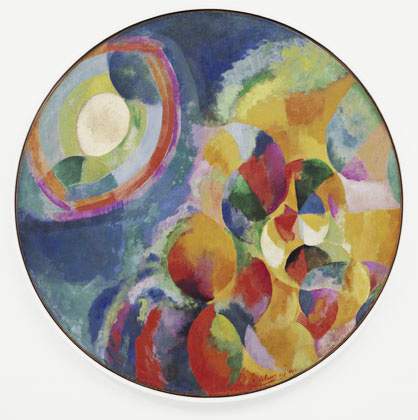
Fig.13
Robert Delaunay
Simultaneous Contrasts: Sun and Moon 1913 (date on painting 1912)
Oil on canvas
1345 mm diameter
Museum of Modern Art, New York
Accounts of Noland’s circle paintings often examine the series as a whole, rather than analyse specific works like Gift, despite the fact that they are, as critic John Russell would later observe, far from consistent, and ‘differ enormously both in feeling and in their emotional character’.55 Where earlier circles tend to feature energetic splashy effects, works such as Gift conform more precisely to the designation of Noland’s work as ‘hard-edge’ or, as Greenberg put it, ‘post-painterly’.56 Susan Fisher Sterling has compared Gift with Tate’s other circle painting, Drought 1962 (fig.2), describing the changing character of the series in its final stages, exemplified by these two works. According to Sterling Drought represents one of the last circle works for which Noland used a raw canvas background. In contrast, the tinted background of Gift produces a ‘more reciprocal’ relationship between image and ground.57 As Sterling describes, the colour combinations in this painting sound a ‘quieter, minor chord … its offbeat harmonies generating a more sustained perceptual experience compared to the sharp staccato beats of Drought’s oscillating yellow and blue circle pattern’.58
Sterling’s use of musical analogies to understand the two Noland circles in the Tate collection is not superficial. Noland approached picture making, as curator Karen Wilkin has described, ‘rather like a musician’ employing ‘chromatic harmonies and assonances as much for their emotive power as for formal reasons’.59 While a student at Black Mountain College in the late 1940s Noland had taken a course in music composition with the composer John Cage.60 The idea that music might provide a viable model for painting was also espoused by Greenberg, who held that ‘the advantage of music’ for modernist painting ‘lay chiefly in the fact that it was an “abstract” art, an art of “pure form”’.61 The relations between painting and music provided Noland with a lasting metaphor for his abstractions: ‘I like to think of painting without subject matter as music without words’, he explained of his work at a 1988 lecture.62
An advantage of using musical metaphors to understand Noland’s circles is that they help emphasise how the paintings’ expressive effects unfold over time. An unpublished lecture by art historian Shepherd Steiner, the most extended formal exploration of Gift to date, lavishes considerable description on the ‘bobbing and pulsing’ effects of the work:
What is crucial is receptiveness to somewhat warm, welcoming colors, and maybe an overall dissatisfaction with the hazy, almost dissipate lack of focus. Take the sharp blue circle. It should be allowed to stand out, even ring out loud enough to pull one in from somewhere in the gallery. Closer now, and with the white ring dropping away from the blue, the yellow surround should be permitted to set a mood. As for the central brown circle and olive green ring, they must be left alone if they are to suitably impress us in the end. This is not too difficult, for letting them do their own thing simply involved looking elsewhere. This musky brown and green interior expands precisely when one focuses on the sharp transition from blue to white. And because one is incessantly drawn to this edge, this sober looking painting begins to pulse.63
Steiner’s account of viewing Gift emphasises the endlessly shifting pictorial movement and changing points of focus that the painting enacts. ‘One eventually comes to realize’, he writes, ‘that all four framing edges of Gift, including the corners themselves, contribute to the spinning effect’.64
Noland seems to have understood that his circle paintings could produce a kind of rotating optical effect. After a discussion about these qualities, Tate curator Michael Compton wrote to the artist in 1966 to clarify the matter:
Some time ago when you came to the Gallery you said that you would consider giving us a brief statement about the picture, although I felt you were not too happy about the idea … Judging from what you said, when here, the spinning effect is a deliberate one, even though this would seem to contradict to some extent what Michael Fried, for example, has written about your work.65
Compton’s latter point probably concerns Fried’s suggestion that Noland’s ‘mature’ circle works represented an ‘eschewal of the last vestiges of traditional drawing and painterliness, such as the wavering armature motifs themselves and the ragged surges of color which sometimes appear as if cast forth by the rotation of the outermost concentric ring in his early pictures’.66 Compton observed that Drought contradicted the idea that Noland’s late circles abandoned such rotational effects, and as Steiner has suggested more recently, perhaps even a work as unpainterly as Gift does retain these qualities.
Noland’s reply to Compton politely declined to discuss the movement inscribed in his painting: ‘I wish there were some way I could explain or justify Drought that might be of some use to you, but in the end I’m afraid it would not help in being able to see the picture’.67 When Noland came to the gallery in 1973, Tate curator Ronald Alley was again left with the impression that ‘he doesn’t like (and doesn’t feel able) to make specific comments about his pictures. He considers that artists seldom have anything very illuminating to say about their own work and that their remarks may come between the observer and the picture’.68 Noland’s reticence to discuss his works with Tate staff, and his willingness to defer to critics such as Greenberg and Fried regarding their interpretation, confirms his faith in ‘eyesight alone’ as the only proper way to view his art.
But as central and direct a role as Greenberg played in the reception of Gift, and as rigorous and compelling as his accounts of Noland’s work can be, interpretations of the work need not be limited to those that comply with the theories of its prior owner. Other art historians have voiced the need to prise Noland’s art from the limitations of Greenberg’s framework. As Sarah Rich wrote in a 2010 article, ‘to see Noland’s paintings as nothing more than exemplars of Greenbergian self-reference is to leave out a great deal of his project’.69 Understandings of Noland’s art have, as David Anfam has claimed elsewhere, ‘suffered from the critic’s support by being typecast as shallow and/or formalist’ ignoring the ‘richness and range of associations that altogether contradict this stereotype’.70 In 2011 Paul Hayes Tucker put it succinctly: ‘Greenberg’s influence – as a brilliant but ultimately limiting formalist – is only one of many reasons why Noland’s art looked the way it did’.71 Gift provides a unique opportunity to investigate the rich range of associative connections of the circle series while still holding on to Greenberg’s central role in the development and advancement of Noland’s art.