In 1934 Marcel Duchamp – or more accurately his alter ego Rrose Sélavy – published in green felt covered boxes ninety-four loose notes relating to the development and function of his magnum opus The Bride Stripped Bare by her Bachelors Even, known familiarly as ‘The Large Glass’ (figs.1, 2). As well as being perceived as a kind of literary publication, the Green Box, as it has become known, can be – but seldom is – classified as a work of art in fine print. When viewed in this context, however, it is evident that the work bears many of the common hallmarks of a twentieth-century artist’s print publication. It was produced in a printing medium carefully chosen by the artist to best convey the conceptual aims of the piece. The quality of the paper stocks and inks were integral to the success of the work, and although not actually printed by the artist himself, Duchamp closely supervised all aspects of production. The main element, however, that set the work apart from other fine art print works of the time was its use of photomechanical, instead of the traditionally sanctioned autographic, printing methods. Here, as with many other aspects of his practice, Duchamp was a pioneer: the use of photomechanical print as a creative medium did not significantly enter the realm of fine-art printmaking until the late-1950s and early 1960s.
Duchamp was well placed to make such innovations, having more than a passing interest in the theoretical and practical underpinnings of both commercial and fine art print. Printing, in fact, ran in his family. Emile Nicolle – Duchamp’s maternal grandfather – had become on his retirement a skilled etcher and engraver. He was to gain the distinction of having several series of his prints purchased by the Louvre. Both Gaston and Jacques, Marcel’s elder brothers learnt the rudiments of etching from their grandfather before studying art in Paris. Jacques Villon was to become a successful printmaker and illustrator, distinguished for his technical and expressive skills in etching engraving and lithography. In 1905 Duchamp himself was to gain exemption from military service by working as a commercial printer in his hometown of Rouen. During this time he obtained practical experience in both typesetting and the reproduction of fine art – in this case, his artist grandfather’s etchings. Throughout his career Duchamp frequently drew on his print-based sensibilities to produce layouts for publications such as the 1922 Some French Moderns Says McBride and journals associated with the surrealist movement such as Minotaure and View.
Duchamp’s choice of print reproduction techniques
In a 1934 letter to his American patron Walter Arensburg, announcing his intentions to reproduce the notes made during the gestation and creation of the Large Glass, Duchamp revealed something of the strategic consideration he had invested in selecting a print process that could best serve his purposes: ‘I would like to get together all the notes of 1912, 13, 14 and 15 and have them reproduced in facsimile (using phototypography [collotype], which gives a very good idea of the original – especially for hand written notes).’ (fig.3) He also indicated that the process he had chosen was ideal for reproducing the main paintings and drawings which contributed to the composition of the Bride.
To assess the significance of Duchamp’s choice of printing medium, it is necessary to consider the range of printing processes available at the time. By the 1930s commercial printing had become increasingly sophisticated. In Paris Duchamp would have had the option of reproducing his notes photomechanically in any of the popular mediums, the main ones being halftone letterpress, offset lithography and rotogravure. Although all of these were able to produce reasonably convincing simulations of photographs and artworks for book and magazine illustration, Duchamp appears to have recognised that collotype, more than any other process, had the ability to transfer visual information accurately, with the least amount of distortion. To explain how collotype was able to achieve this, a look at the main method for rendering tone in print throughout the twentieth century reveals that, apart from collotype, all other printing processes were based on the halftone method. Although a convincing illusion of photographic tone could be created by breaking an image up into fine halftone dots, the choice of paper on which this kind of fidelity could be achieved was limited. Additionally, the range of colour offered by halftone printing, particularly in that era, was invariably flawed when compared to the original. On the other hand, collotype had a proven ability to print in continuous tone without the aid of halftone screen, thus offering photographic accuracy in fully permanent ink on a wide range of paper stocks.
I have no evidence as to what alerted Duchamp to the value of collotype over other mediums: it certainly was not a process widely used by his contemporaries or, for that matter, many fine artists since. Perhaps it was from viewing the remarkable accuracy of rare deluxe edition facsimile prints (the life-blood of the pan-European and American collotype industry), or quite possibly Muybridge’s collotype Animal Locomotion prints, which had influenced his famous painting Nude Descending a Staircase (1912, Philadelphia Museum of Art). Nevertheless, the choice of this medium can be seen to have enabled the notes and images of the Green Box to retain the essence necessary in Duchamp’s terms for activating the alchemical nature of the works ongoing afterlife.
It appears that Duchamp employed a particularly Parisian approach to the process of producing the boxes’ coloured prints. Instead of using a photographic colour separation technique (as was common in Germany at the time), the pochoir stencil colouring process was used. This involved printing a key collotype image in black ink and overlaying specially cut copper stencils which were used as a guide for the application of hand-rendered watercolour washes. Although this sounds relatively primitive, the detail of the continuous-tone collotype image combined with – in many cases a multitude of subtly layered colour washes – produced an image remarkably similar to the original. This was especially true for works on paper. Collotype was also flexible enough to print onto a variety of paper stocks and Duchamp capitalised on this by ‘scouring Paris’ in his words looking for paper to match as closely as possible his original notes. Not only did he match the paper but he also created a series of templates allowing the prints to be torn around their edges to replicate the shape of the scraps of paper on which the notes were originally written.
The Green Box was printed by the collotype printing plant of Vigier et Brunissen, Paris in an edition of 300 with twenty deluxe versions, some of which were pre-sold to various friends and collectors to help finance the project. This was not the only time Duchamp was to use collotype. The Boîte-en-valise, completed in 1941, also employed collotype and pochoir to reproduce the coloured drawings, paintings and ephemera contained in this work (fig.5). In this instance the prints were arranged in a suitcase in a manner ‘reminiscent of both a vanity case or travelling salesman’s case of supplies’, to form a miniature portable museum.
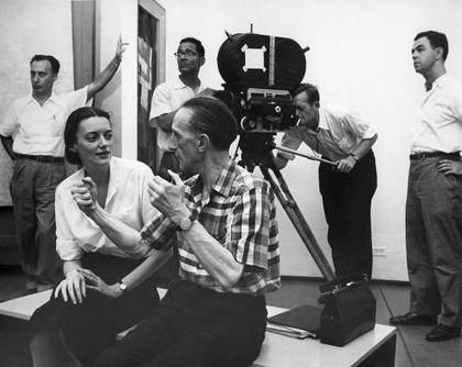
In 1957 George Heard Hamilton, an art history professor at Yale, published Marcel Duchamp from the Green Box in a limited edition of 400. This included a translation of twenty-five notes which, according to the author, featured some of the box’s peripheral jottings, especially those concerning readymades. While these translations had either speculated at some kind of order or totally ignored the possibility, British artist Richard Hamilton had managed, by 1956, to work through the notes to develop a diagram of the areas in the glass to which he believed the subject of the notes related. This he sent to Marcel Duchamp and, as is evident from a transcript of the reply, met with the latter’s approval. Not only was Duchamp pleased with how they had been deciphered, he also urged Hamilton to contact his friend George Heard Hamilton with a view to deciphering and translating the entire contents of his box.
Richard Hamilton’s interpretations of Duchamp’s work
The collaboration between George Heard Hamilton and Richard Hamilton eventually resulted in the 1960 publication of The Green Book which is described on its title page as ‘The Bride Stripped Bare by Her Bachelors Even, A Typographical Version by Richard Hamilton of Marcel Duchamp’s Green Box, translated by George Heard Hamilton’. While Heard Hamilton’s role was to translate the text from French, Richard Hamilton revealed in a lecture at the Victoria & Albert Museum in 1999 that his role had also been partially that of a monolingual translator. He explained that there was a definite advantage in not understanding French in that he was not tempted to accept something that sounded vague or nonsensical just because it was a direct or literal translation. Therefore, a great deal of time was spent in puzzling over what Duchamp may have been getting at in the notes and refining the English translation to best capture the underlying concept.
The greatest challenge, however, was to transpose the notes into type without losing the spontaneity integral to the contents of the Green Box. One of Hamilton’s main criticisms of previous translations was that they did not deal effectively with the alterations, highlights and annotations made by Duchamp. These often crucial clues had been relegated in most cases to conventional footnotes. It was decided that a more innovative approach to the layout and type font of the publications page was required, in order to convey some of the subtle nuances and conundrums perceived in Duchamp’s notes. This involved standardising a series of highlighting symbols, varying fonts and, most importantly, developing a suitable sequence to fit the format of a conventional book.
The results of this work once again received Duchamp’s praise. ‘We are crazy about the book,’ he wrote. ‘Your labour of love has given birth to a monster of veracity and a crystalline trans-substation [sic] of the French Green Box. … The Bride must be blossoming ever more.’
It is interesting to note Duchamp’s use of the word ‘trans-substation’ in this context. Although no such word exists in the English dictionary, it can be assumed that it is either a misspelling or mistranslation of ‘transubstantiation’ a word used by Duchamp in his 1960 essay ‘Le Processus créatif’. In this essay Duchamp highlighted the idea that in the creative act, two elements exist in relation to one another – the unexpressed but intended, and the unintentionally expressed. He wrote: ‘The creative act takes another aspect when the spectator experiences the phenomena of transmutation: through the change from inert matter into a work of art, an actual transubstantiation has taken place and the spectator is to determine the weight of the work on the aesthetic scale’. This statement provides several clues to what precisely Duchamp may have meant in his praise of Hamilton’s work. Although on face value it could be assumed that Duchamp is praising Hamilton for cracking the code of the glass, it is possibly a more subtle compliment praising Hamilton for transubstantiating the base materials of the work into something new.
A Reconstruction of The Large Glass
In 1966 the Tate Gallery held a major Duchamp retrospective and owing to the impossibility of including the original Glass because of its extreme fragility, Richard Hamilton rose to the challenge of creating what could be loosely termed a full-scale replica. For this project, he closely studied and interpreted instructions from the Green Box source notes, as he put it, to ‘reconstruct procedures rather than imitate the effects of action’. The result therefore can be seen as a new prototype rather than an exact facsimile.
Hamilton’s intense period of research did much to reveal the transferable and ongoing possibilities of Duchamp’s work, allowing the British artist to produce works that disseminated ideas about the glass from new perspectives. The experience can also be seen to have inspired Hamilton’s own practice. Besides being influenced by Duchamp’s complex strategies in conceptualising and conveying ideas, Hamilton also adopted the tactic of using the visual language of different printing mediums to emphasise his intentions.
Hamilton’s print works
While Richard Hamilton has worked in a multitude of mediums, his use of print has in many ways inspired and informed much of his practice. Like Duchamp, he has drawn upon on a solid grounding in both fine art and commercial print. Much of his early work, however, was undertaken in traditional print processes, such as drypoint and etching, where autographic gestures were made directly into the printing substrate before being printed in multiples. During the 1960s, however, Hamilton began to experiment with photography and photomechanical processes for generating images in print. His first forays into photomechanical printing can be seen to parallel his work in translating the Green Box. Prints such as My Marylin (fig.6) take original source material (in this case a group contact frames from a Marylin Monroe shoot by photographer George Barris) and interprets them through another medium – in this case screenprint – to transmute the essence and re-arrange the images into the syntax of another graphic language.

Richard Hamilton
My Marilyn (1965)
Tate
While screenprint acted as a bridge between the traditional hand-crafted and more mechanical approaches to image creation, Hamilton’s increasing interest in high-quality commercial printing techniques was to take his work to another conceptual level. If an image could be abstracted by synthesising it through the syntax of screenprint, why not explore the reverse possibility by employing more sophisticated printing processes to faithfully transfer the qualities of an image from another medium into print?

Richard Hamilton
Soft pink landscape (1980)
Tate
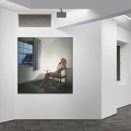
Although, as observed by Hamilton, ‘the working methods for using a high quality reproductive process such as collotype removed the artist’s hand from working directly onto the print matrix’, he was soon to recognise the creative value of the way the medium placed the onus on decision making rather than manipulative skills. An example of this new approach to print creation can be found in Soft Pink Landscape, 1980 (fig.6), owned by Tate. This work is the result of Hamilton’s work with collotype experts Heinz Hafner and Werner Kind, from Stuttgart. Using their extraordinary skills – honed through the craft of fine art facsimile printing – Hamilton was able in this instance to create a highly accurate reproduction from a photograph of one of his unresolved paintings. By manipulating the source negatives with airbrushed and drawn elements, two extra print layers were added to the four colour reproduction to take the image into an entirely new realm. This was embellished with a further forty screenprinted colours to both resolve the painting and create an image quality that could not have been achieved in either painting or conventional print.
Hamilton was soon to discover that the use of computers also offered comparable boundary crossing capabilities. The Marriage, 1998 (fig.8) also uses a similar combination of image capture and manipulation techniques to reproduce a pre-existing image and transform its qualities. Instead of using collotype and screenprint to transfer an image between media and transform it into something else, however, the photograph was both captured and manipulated digitally, giving in the final Iris print much the same expansive results as the earlier combination of collotype and screenprint.
Besides using computers for creating and manipulating his own images, Hamilton has also found new ways of re-examining and deciphering the many notes left by Duchamp using software such as QuarkXPress and more recently InDesign. The remarkable flexibility of these programmes in comparison to the gruelling manual paste-up operations originally employed to create his typographical solution for the Green Book, has allowed Hamilton to make even further inroads into the translation.
Typo/Topography of Marcel Duchamp’s Large Glass
In addition to the possibilities of text and layout, Hamilton has also employed vector-based programmes such as Adobe Illustrator to bring full circle over forty years of research. His recent print Typo/Topography, 2003 (fig.9) plots a schematic diagram of Duchamp’s Glass and overlays it strategically with the typography of the Green Book. Unlike the 1966 recreation of the glass, which was built by hand in the same materials indicated in the Green Box, this version takes a schematic approach rendered on paper in the form of a print. In many ways this project follows a similar methodology to that used for transcribing the contents of the Green Box into book form. This time, however, the detail of the glass is translated into the syntax of a cartographer. The vector-generated lines and contours objectively map the outlines of the glass with mechanical precision. Colours, blends and textures signify the materials crucial to the function of the Bride’s and Bachelors’ apparatus – these include chocolate brown, red lead, steel, gasoline and dust. Most importantly, however, the typographical notes that serve to bring the machine to life are meticulously superimposed into areas chosen by Hamilton to best describe the function of each element.

Richard Hamilton
Typo/Topography of Marcel Duchamp’s Large Glass (2003)
Tate
The production of Typo/Topography, like all his print works, was closely supervised by Hamilton. In order to commit the work to hardcopy, Hamilton employed the digital printing services of the Centre for Fine Print Research at the University of the West of England, Bristol. As it was desirable to produce a full size rendition of the original scale of the Glass, the Centre’s largest 60” Vector-compatible ink jet printer was used. The print was therefore created in two halves with the divide between the Bride and the Bachelors corresponding to that of the original.
Despite the often misguided perception that a perfect digital print is created by a simple keyboard command, the project emphasised the many parallels between the craft of the digital artist’s practice and that of previous analogue print production.
For this project, the accuracy of colour was essential. Because the vector file image was made up of hundreds of onscreen layers it was extremely difficult to adjust its colours globally, instead each layer had to be tweaked and then proofed in much the same way as a multi-colour screenprint run is prepared. This allowed elements, such as the red lead colour of the bachelors or the dust of the sieves, to match those sought by the artist. The resulting limited edition of seven was printed on 300 gsm Somerset Enhanced, artist quality paper, using pigmented inks, and signed and numbered by the artist.
Duchamp and Hamilton’s legacy to print
Although Duchamp is seldom cited as a printmaker, aspects of his work continue to hold resonance for contemporary print and photographic practice. In terms of print theory Duchamp’s astute use of printing techniques to convey the degree of information sought from an image precede the theories about print syntax put forward by Ivings in the 1950s and extended by Crawford and Jussims in the 1970s by at least a decade. Duchamp’s questioning of the notion of originality has also had a profound influence on modern print, ultimately triggering the revolution in print expression exemplified by photomechanically driven vehicle of Pop Art. Although Duchamp’s influence has extended to a wide range of contemporary artists, in many ways few have pursued the visionary implications of Duchamp’s work as keenly as Richard Hamilton.
Through his research and artwork, Hamilton has followed Duchamp’s shrewdly devised clues, transmuting them from media to media and syntax to syntax inducing new degrees of perception and meaning. Unlike many print-based artists, Hamilton has exploited the value of combining different print media to extract and convey ideas rather than simply honing skills in a single medium. While in previous decades Hamilton employed highly skilled printers from both the fine art and industrial sectors to assist in transferring images in this way, the expansive capabilities of computer technology have now more than adequately fulfilled this possibility. Through virtual simulation, a myriad of print languages lie at the artists fingertips. The photographic detail and resolution previously accessed by both Duchamp and Hamilton through collotype can now be captured and manipulated digitally with the spontaneity of a painter to produce prints which exceed well beyond the previous languages of print.
The same technology, however, can also assist in achieving the diametrically opposite. As Typo/Topography uniquely demonstrates, the logic of a single pure syntax can also be pursued digitally far beyond practical limits previously imposed by analogue practice. This work can also be brought back to hard copy without skipping a beat in the ongoing continuum of fine art print tactility and quality. Each of these possibilities now emphasise more than ever the potential of incorporating strategic decision making into the conception of printed artworks.
Notes

- Jacques Villon, exhibition catalogue, Fogg Art Museum, Cambridge MA 1976, p.25.
- Janis Mink, Duchamp, Köln and London 2000, p.14.
- Frances M. Naumann and Hector Obalk, Affectt Marcel, The Selected Correspondence of Marcel Duchamp, London 2000, p.188.
- Marcel Duchamp’s Travelling Box, exhibition catalogue, Arts Council of Great Britain, London 1982, pp.5–6.
- Arturo Schwartz, The Complete Works of Marcel Duchamp, London 1969, p.598.
- Arts Council of Great Britain, 1982, pp.3–5.
While the collotype process in this work successfully serves to recreate visually accurate miniature reproductions of his work, it was the 1:1 facsimile reproductions of the notes of the Green Box that generated something extraordinary.
Translations of Duchamp’s notes into English
The curiosity and fascination created by The Large Glass inspired a number of translations of the random presentation of the notes pertaining to its concept and function. The first was a translation into English by Jacob Bronowski of a selection of four of the original notes, published in the September 1932 This Quarter, known as the ‘Surrealists Issue’. This was two years before the publication of the Green Box. Other translations by Jennings and Roditi, in the London Bulletin and View respectively, were based in part on a 1935 article by the leader of the surrealist movement Andre Breton, ‘The Lighthouse of the Bride’, which contained a copy of the longest note in the box The Bride Stripped Bare.Richard Hamilton, The Collected Works 1953-1982, London 1982, p.183.
- George Heard Hamilton, Inside the Green Box (Appendices of The Bride Stripped Bare by Her Bachelors Even, Richard Hamilton & George Heard Hamilton), London 1960.
- Naumann and Obalk, 2000, p.354.
- From a recording of a lecture given by Richard Hamilton at the Victoria and Albert Museum, London, May 1999, taped by the author.
- Hamilton, The Collected Works 1953–1982, 1982, pp.184–6.
- Naumann and Obalk, 2000, p.368.
- Michel Sanouillet and Elmer Peterson eds. The Essential Writings of Marcel Duchamp, London 1975, pp.139–40.
- Hamilton. The Collected Works 1953–1982, 1982, p.212.
- Richard Hamilton. Prints 1939-1983, exhibition catalogue, Waddington Graphics, London 1984, p.44.
- Hamilton. Prints 1939-1983, 1984, p.9.
- Richard S. Field and Richard Hamilton, Image and Process, London 1982, pp.71–3.
- Lecture by Richard Hamilton, 1999.
- William Ivings, ‘Prints and Visual Communication’ in William Crawford, The Keepers of Light: A History and Working Guide to Early Photographic Processes, Dobbs Ferry 1979 and Estelle Jussim, Visual Communication and the Graphic Arts, New York and London 1983.