A book that consists only of printed patterns is not such a common thing nowadays. Once deemed superfluous by the Modernists, pattern has often mirrored the times we live in: the spiky 1950s, the psychedelic 1960s, geometric 1980s, minimal 1990s. So what was happening in the 1930s? I’m sitting in the Tate archive looking at a specimen book of pattern papers published by Curwen Press in 1928, featuring designs by Paul Nash, Enid Marx, Claude Lovat Fraser and others. The first page I turn to is a surprise – a bright, garish floral Duffy meets – Laura Ashley. A bit too much. I quickly turn to the back of the book and am rewarded with the woodcut prints by Paul Nash. The designs are put into a repeat and then printed as paper. I like them. They are very geometric, and although not directly printed from the blocks, the ink has a beautiful quality, especially where colours overlap. I think one of the reasons I like old books is because of old ink. It’s the same reason that I like hand-printed wallpaper, and I guess it is not always about the look of the design, it is also about quality of the printing. I don’t know if it is depressing or encouraging that, despite all the modern advances in print technology, I rarely see a good quality print. Like old vinyl, there is something so much more tangible about the quality of old ink.

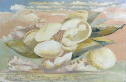
Albert Rutherston
Curwen Press pattern book 1928
Page design
Courtesy Tate Archive
I read the introduction written by Nash, which gives us an insight into the passion he felt for the use of pattern. He says the papers are “a humble part of the endless contribution to decoration which forms one of the most absorbing studies in the history of aesthetics”. He also tells us about what is thought to be the earliest known wallpaper in England, found in the master’s lodge at Christ’s College, Cambridge. A formalised pomegranate design derived from a contemporary Italian velvet or damask, it is traditionally dated to around 1509, but is more probably late sixteenth century. And he provides further information on the word damasquening, which my computer refuses to spell correctly.
So what has pattern to offer us now? In this new century, does it reflect a period of uncertainty? Or does it satisfy the eclectic plurality and individualism that was maybe lacking in pure Modernism? Or are we all just keeping our options in taste wide open? That said, since our interiors have become like a new wardrobe, a reflection and expression of ourselves, we are truly at the peak of a fashionable revival.