Ellsworth Kelly
Méditerranée 1952
Oil on nine joined wood panels, three in relief
150.5 x 193.7 x 7cm
Collection of the artist © Ellsworth Kelly
Christoph Grunenberg
In 1951 you did a number of paintings with random arrangements of bright colours. These works, in particular Colors for a Large Wall 1951, were a radical departure from your previous, mostly figurative paintings and from the collages experimenting with abstraction derived from observed phenomena of the visible world. Can you describe their genesis?
Ellsworth Kelly
In October 1951 I left Paris and went to the south of France. The summer before, observing how light fragmented on the surface of water, I painted Seine, made of black and white rectangles arranged by chance. I then started a series of eight collages titled Spectrum Colors Arranged by Chance I to VIII. Before this I had not used colour extensively. The collages employed different systems and arrangements, using chance to organise where a spectrum of eighteen colours would be placed.

Ellsworth Kelly
Colors for a Large Wall 1951
Oil on canvas mounted on sixty-four joined panels
240 x 240 cm
The Museum of Modern Art, New York, gift of the artist, 1969 © Ellsworth Kelly. Digital Image © 2009 The Museum of Modern Art/Scala, Florence
Christoph Grunenberg
Did you use a mathematical system with the early works?
Ellsworth Kelly
It was a chance system for the placement of colours on a grid. Numbered slips of paper each referred to a colour, one of eighteen different hues to be placed on a grid 40 inches by 40 inches. Each of the eight collages used a different process.
Christoph Grunenberg
Did you make conscious references in the arrangement of these works to the aesthetics of the colour chart?
Ellsworth Kelly
I never thought of colour charts at all when I was working on them. They were really an experiment. I wanted to show how any colour goes with any other colour. Above all, I wanted to learn about colour relationships. Many of the works of this period start from chance encounters, such as shadows on a staircase, the reflections of the sun on the River Seine and the exposed sides of buildings that showed the abstract black patterns where the chimneys had been. After the experiments with arranging colours by chance came my first works using the actual colour spectrum as a source (Spectrum I, 1953).
Christoph Grunenberg
Did finding those coloured papers in Paris help you to reach abstraction?
Ellsworth Kelly
I used them as an indication for the hue, as a guide only. When I painted I always mixed the colours that I wanted; all were bright and at their full intensity.
Christoph Grunenberg
Was there something about the light, the atmosphere and intensity of colour that was reflected in those compositions made in Paris and in the south of France?
Ellsworth Kelly
While working in Paris after the war everything was grey and, as I’ve said, I used very little colour. When I finally went to Sanary, I did Colors for a Large Wall. It was the first work I painted in the south of France.
Christoph Grunenberg
How did you come to execute Colors for a Large Wall in separate panels?
Ellsworth Kelly
Having done the collages and worked with the individual colour squares helped me to see that I could use a different canvas on its own stretcher for each of the 64 panels that make up Colors for a Large Wall. Each would have only one colour. This dispensed with the problem of composition, of internal divisions of the canvas. The division was a given of the material support, not something drawn on it.
Christoph Grunenberg
Was this transcending of the canvas the beginning of the idea of the mural, which you were very interested in at the time?

Ellsworth Kelly
Spectrum Colors Arranged by Chance II 1951Collage on paper
97.2 x 97.2 cm
Courtesy the Museum of Modern Art, New York, purchased with funds provided by Jo Carole and Ronald S. Lauder © Ellsworth Kelly
Ellsworth Kelly
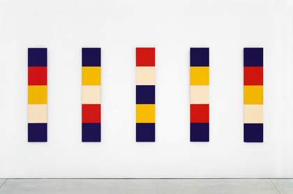
In the 1960s the Minimalists’ work was considered to be more or less what it is. The painting or sculpture represents itself. I feel that ten years earlier, starting in 1950, I was struggling with exactly the same problem. Colors for a Large Wall constructed of 64 separate panels becomes a “painting object” that separates the form – the painting – and the ground, which becomes the wall. The edge of one panel next to another panel is not the same as one colour painted next to another colour on a single canvas. When I want to do a painting with one colour overlapping another, it has to be a real overlap, not a depicted overlap. I didn’t want to paint an overlap, meaning that it would be a deception or illusion. I no longer wanted to depict space, but to make a work that existed in literal space. Thus, my recent works are one canvas as a relief over another canvas. Another important example of a panel painting that explores the idea of the mural was Red Yellow Blue White 1952. It’s the only one I ever did using actual dyed fabric of ready-made colours, which moves the painting into the realm of real objects. It consists of five vertical panels, each with five canvases. The vertical panels are separated on the wall and the intervals of the wall surface between them are part of the painting.
Christoph Grunenberg
Do you think the relief paintings, such as Méditerranée 1952, are coming more out of the early relief works, or out of the multi-panel ones such as Colors for a Large Wall?
Ellsworth Kelly
Both. Relief work figures predominantly during my time in Paris. After Méditerranée, the pictures were mainly paintings in multiple panels.
Christoph Grunenberg
How did your use of colour differ between France and the United States?
Ellsworth Kelly
In Europe at the beginning of the twentieth century, the Fauves – Matisse, Derain – were using bright colours in their full intensity, which continued with Kandinsky, Malevich, Kirchner, Léger and Mondrian. They employed all the colours of the spectrum. In the 1940s and 1950s the majority of the Abstract Expressionists in New York rebelled against this European use of colour and mostly used mixed colours. That is, the Abstract Expressionists did use bright colours sometimes, but they tended to paint wet-on-wet, which muddled their hues. As Matisse would say, a small patch of any one colour is far less intense than a large one of the same colour. I returned in 1954 to New York and showed paintings done in France at the Betty Parsons Gallery in 1956 with bright colours that wouldn’t really be used until the Pop artists in the 1960s. My idea of using colour at its full intensity, which began with Colors for a Large Wall, hasn’t changed in the 60 years that I’ve been painting.