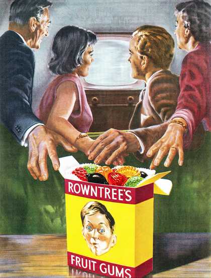
British advertisement for Rowntree's Fruit Gums from 1956
Neil Baylis/Alamy Stock Photo
In the years immediately following the end of the Second World War Britain’s hold on colour was uncertain; the yearning and appetite for colour was expressed over and over again, but its social impact was less clear. Colour was the language of the project of modernisation, but it was as though the experience of it had been forgotten in the grey war years and needed to be reintroduced into the national fabric and psyche. Moreover, like other drives or appetites, the taste for colour was not without its tensions and problems. It was ambiguous and powerful, and might require restraint as much as indulgence.
In November 1946, with paper rationing still in place, the illustrated weekly Picture Post introduced a colour middle section in a bid to maintain wartime circulation figures. It was devoted to a photographic look at the Royal Rooms at Windsor Castle, thus conforming to what would become a convention of depicting royalty in colour. To promote this important issue the Post ran a cover announcing in bold white lettering on red: ‘Colour Again’, with a photograph of a black woman in a décolleté top against a dark background, apparently modelling for a sketch. ‘Colour Again’: the colour of royal Windsor, or the colour of the skin of the woman? The overlaying of the vivid interiors of Windsor with the colour of race pinpoints the question of colour in post-war Britain. Colour was never just colour; it was also always something else, something more than simple hue or shade. Colour again: it was not so much a question of the return of colour, for it had always been there, as the emergence of a new and different colour world in the late-1940s and the 1950s, in which it took on greater meaning than it had ever had before.
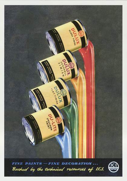
British advertisement for ICI Dulux paint from 1956
© Courtesy Cool-o-Rama
By the middle of the 1950s, the choice of colour seemed boundless. Paint companies were advertising ‘unlimited colour choice’, ‘a choice of 999 colours’ and ‘any shade you like’ mixed to individual specification. In 1953 Kinematograph Weekly, a trade newspaper for the British film industry, was carrying an advertisement for Technicolor with the slogan ‘colour attracts...’. The full-page Technicolor image shows a spiky cactus on a desert floor with a large pink flower and a butterfly heading for its pollen-laden stamen. The message is a clear one: colour is irresistible. And yet, as the poor insect risks being pierced by one of the threatening spines, perhaps it inadvertently suggests that the attraction of colour is so great that the consumer may be harmed if he or she gets too close. The meaning of colour seems always in excess of that envisaged by the people who are using it.
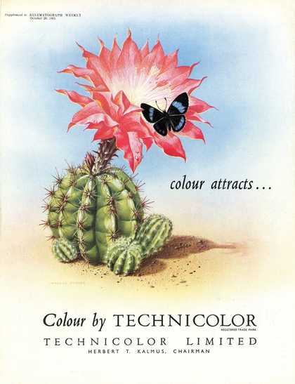
Technicolor advertisement published in Kinematograph Weekly, 29 October 1953
Courtesy BFI and Palgrave
If Technicolor was out to sell colour, then elsewhere advertisers were persuading companies to use colour to sell. Fruit sweets and jelly were frequently advertised in colour, cementing the association of colour with flavour and appetite. An advert for Rowntree’s Fruit Gums places the glistening sweets in the foreground and whilst the adults are unable to tear themselves from the television set in the background, they are equally unable to reach out for the glowing gums in their vivid yellow box. This chromatic superabundance was a sign of affluence and a society that was young, attractive and modern. If colour was youthful, however, there was also a perception that it was delinquent and risked becoming out of control. In an article on Technicolor, the cinematographer, writer and director Ronald Neame concluded: ‘Colour has been born ... this healthy and sometimes unruly child is growing rapidly every day.’ The image of colour photography as an ungainly and troublesome youngster was repeated in the professional press. In a review of recent aesthetic developments in the field, another writer observed: ‘The photographic print in colour ... is a naughty child. It won’t do what we want it to do.’ Too much contrast or discord was dangerous and needed to be handled with ‘the utmost discretion’; good manners and restraint were as important in the world of colour as they were in other areas of modern life. Once properly managed and planned, it could be used in the home and in industry to create cheerful and harmonious environments; when the population was fully educated to understand the meaning of colours, productivity, health and comfort would improve.
Colour was not a universal language, however. There was a distinctive quality to British colour, as well as a particularly British way of dealing with it. For many professional photographers and cinematographers there was a look to British colour that differentiated it from European and American. It was as though the weather, the rain, had infiltrated the film stock and dyes and had diluted the intensity of the hues. British colour was infused with a nationalist ideology that defined it in terms of the weather and the national character: misty, restrained and subtle. The 1951 study, Colour Cinematography, concluded: ‘There does seem to be a marked antipathy to excessive use of vivid colour – apparently popular in Hollywood – which may be due to a national liking for the restrained and rather sad tones typical of the British sentiment for colour during the last hundred years.’
It was a sentiment echoed by the painter, writer and curator Patrick Heron. From the late-1940s he was a passionate advocate of colour painting and waged war, in print and on canvas, on the dull poetic and literary atmosphere of British artists associated with neo-romanticism and the Euston Road School. In a bruising dismissal of Paul Nash he wrote: ‘Colour was, of course, by far his weakest point ... If a master of oil paint wants to communicate a certain grey-blue ... he will know how to express the wan, grey tone without resorting literally to wan, grey paint ... there should never be actual greyness, actual dullness of colour as in Nash’s biscuit landscapes, with their opaque mud.’

Patrick Heron
Scarlet, Lemon and Ultramarine : March 1957 (1957)
Tate
Colour was gradually and steadily being harnessed to ideologies of race and nation, according to which British colour was polite, rain-soaked and deferential. In fact, British colour was grey.
The British Colour Council was established in 1930 and was responsible for the standardisation, naming and coding of colour in the British Empire, or, as it was put in 1949: ‘The placing of colour determination for the British Empire in British hands.’ The first Dictionary of Colour Standards was issued in 1934, and new editions were produced regularly as colours were added to the ranges. Standard colours were produced for use in interior design, horticulture, bunting and for factories and offices; colour charts were created showing samples, initially on pure silk ribbon and, later, on matt, gloss and pile fabric surfaces. Each colour was named, numbered and coded.
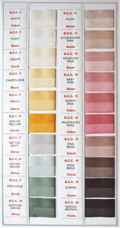
Colour swatches from The British Colour Council Dictionary of Colour Standards, 2nd edition, 1951
Courtesy Designed in Colour
In the second edition, published in 1951, 20 additional colours were added and took their place alongside the other swatches, such as ‘Kenya Red’ – BCC 237 – a colour that had been introduced in 1935 on the occasion of the marriage of the Duke and Duchess of Gloucester and so named because it reminded them of the soil of Kenya. Near to ‘Kenya Red’ was ‘Nigger Brown’ – BCC 20 – which continued to be included in the dictionary into the 1950s. This is the world of colour as it is given meaning in the historical conjuncture of post-war Britain. The council stated that its names were derived in three ways: from sensations in nature, for example, cherry red; from colours associated with period styles, for example, Wedgwood blue; and from the names of original pigments, for example, yellow ochre. So how is ‘Nigger Brown’ named? How is it comprehended? What did it mean to purchase the latest whipcord coat in ‘Nigger’, as advertised in Woman’s Friend and Glamour in 1951?
Colour in post-war Britain: it was the language of progress and modernity; it was the new Jerusalem and the old empire staking its colour claim in the motherland. It was the world of paints and advertising, of co-ordinated and clashing combinations and of educated and extremely unregulated desire. Colour in Britain after the war: bright; gay; the future; dangerous; unruly.
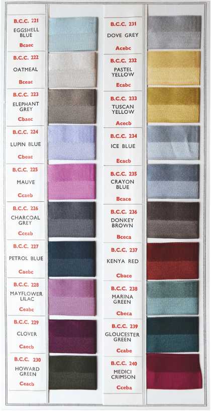
Colour swatches from The British Colour Council Dictionary of Colour Standards, 2nd edition, 1951
Courtesy Designed in Colour
Lynda Nead is Pevsner Chair of History of Art, Birkbeck, University of London. Her book The Tiger in the Smoke: Art and Culture in Post-War Britain is published by Yale University Press.
